

 One of the challenges of setting type, a major component of most design work, is getting all of the details just right. These seemingly small yet important aspects of setting type are what separate the amateurs and novices from the pros, and can make or break a job as well as a job interview (via your portfolio).
In today’s digital environment, designers are charged with doing their own typesetting – a skill that in pre-digital times, took many years to master. In the days of type shops staffed with experienced typographers (which is how it was done in my early days), it was their exclusive job to set type, both text and display, and to know all of the rules of professional typography. Now that ‘professional’ typesetting is done either by the designer, production person, or web master, one is expected to know everything that the seasoned typesetter of the previous days did, and in most cases, without proper training to do this. With all of the typographic rules, dos and don’ts, as well as the robust (and sometimes frustrating and counter-productive) features of today’s design software, it can be challenging get it all right!
A great way to learn (or refresh) your knowledge of the rules and guidelines of setting professional type, as well as to review typeset copy, is with a typographic checklist. This can keep you from committing type crimes, and assist you in finessing your typography for the most professional results. Here is a listing of what I consider the most important, as well as most frequently overlooked elements of setting type. You might want to save or print this list and review for each and every job, click on the links to learn more about each topic, or even make your own customized checklist from the topics below.
Typographic Typos
Just say no to these common typographic faux pas:
- Eliminate double word spaces between sentences
- Replace dumb quotes and apostrophes
- Check for correct use of hyphens, en- and em- dashes
- Do not apply fake scaling, bolding, and slanting
- Avoid computer-generated (fake) small caps
- Beware of all cap swash settings
Spacing and alignment
Balanced spacing and alignment play a major role in professional-looking type.
- Avoid poor justification
- Make sure kerning is even and tasteful
- Apply hung punctuation / optical margin alignment
- Check for proper vertical and horizontal alignment
- Use tracking appropriately, as necessary
- Check for appropriate word spacing and adjust as necessary
- Align initial letters properly
Finessing Your Type
The devil is in the details, so take heed of these important points:
- Adjust bad rags and hyphenation
- Avoid widows and orphans
- Use appropriate figure style and spacing
- Use diagonal fractions if possible, especially in OpenType
- Fine-tune size, position, and spacing of bullets
- Fine-tune position and spacing of ®, ™ and © symbols
- Adjust glyph positioning as necessary
Feel free to share this article with your colleagues, students, or anyone else who might benefit from its use!
This article was last modified on June 29, 2021
This article was first published on July 2, 2019
Commenting is easier and faster when you're logged in!

Recommended for you

TypeTalk: Axes Aren't Evil
TypeTalk is a regular blog on typography. Post your questions and comments by cl...
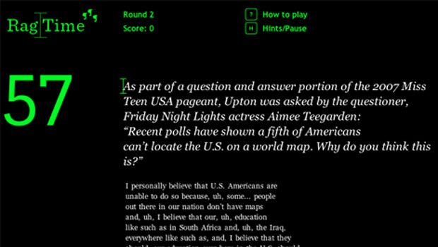
Rag Time Is Perfect Game for Picky Typographers
Fathom, an information design company, has created a game called Rag Time. With...
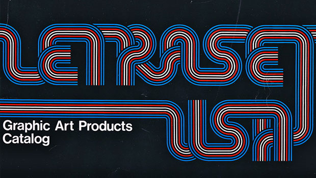
Scanning Around With Gene: When Letraset Was King
I was a freshman in college when I had my first confrontation with dry-transfer...