
Every designer and typesetter at one time or another needs to use one or more of these three symbols: registered, trademark, and copyright. What might seem like a tiny legal detail needs to be typeset thoughtfully in order to be legible, readable, and not draw undue attention to itself. If you just accept the default symbol in the font without paying attention to its size, design, and placement, you can wind up with either a huge, distracting symbol, or a tiny, unreadable one that looks like a smudge. Here are some tips to finessing these tiny, yet important, details.

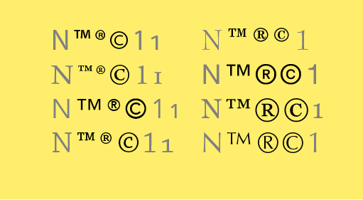
These three symbols, shown inbetween a cap and two styles of figures when available, vary in size and design from font to font. The ones on the left have the correct relationship to the caps and lowercase, while the ones on the right are either too small (top copyright symbol) or too large (lower trademark and registered trademark symbols).

Some font families that have been updated – such as Avenir and Avenir Next shown above – will adjust the scale of these symbols in the revised version to more closely resemble their intended usage.
Registered and Trademark Symbols (® and ™)
The registered and trademark symbols vary from one typeface to another. Some are related in design to the overall typeface, and others, not so much. These symbols are used at so small a size that they should be neutral in appearance, yet clear at the size they will be reproduced at. If their design is too stylized, hard to read, or just plain ugly, you can substitute the symbol from another font for all instances. An uncomplicated sans symbols for text usage (such as those from Helvetica, Arial, or Franklin Gothic) are a good choice, as they tend to be very readable and print cleanly and clearly at small sizes. When setting a headline, more latitude is given with respect to the design, as readability is less of a problem.
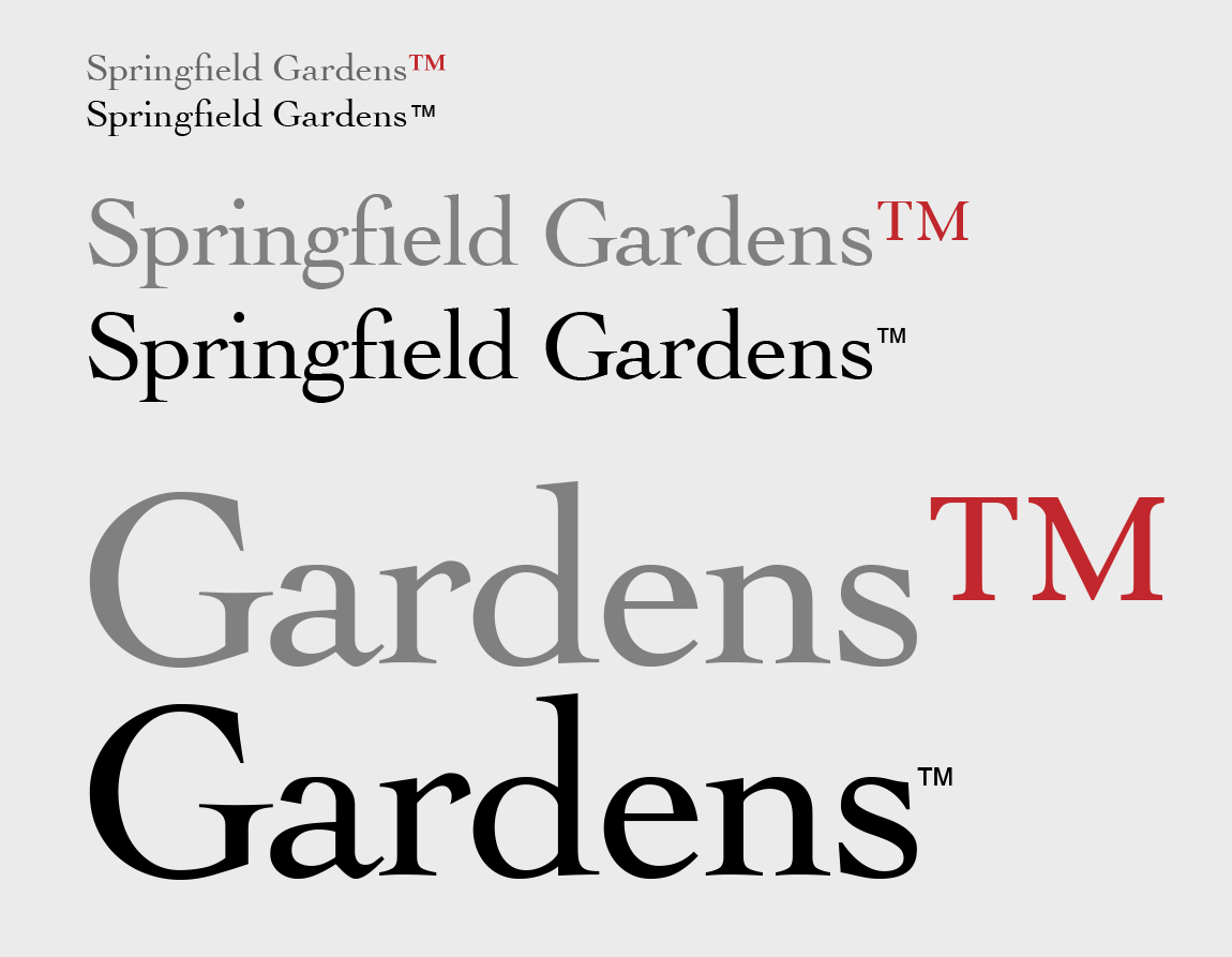
Size is important as well, especially since these symbols vary so much in scale from font to font. Therefore, when using a ® or a ™ after a word, the size should be adjusted as necessary, independently from the rest of the text, to look clear and legible, yet unobtrusive. Its proportion next to the neighboring word or glyph depends a lot on the final size of each appearance. A general guideline for text is to make these symbols a little smaller than half the x-height. As the type gets larger, the symbols can become proportionately smaller, especially in headlines. These symbols are legal designations, not exciting graphic elements, and making them too large can detract from the overall design.
Spacing, both horizontal and vertical in relation to the neighboring glyph, will then have to be evaluated. Once they are sized appropriately, you will most likely have to adjust the letter spacing using kerning, as well as the vertical position using baseline shift.

A general guideline for text is to make these symbols a little smaller than half the x-height. As the text gets larger, they should become proportionately smaller, especially when used in headlines.
Some symbols in serif fonts might not only appear too large, but their thin strokes can start to disappear at small sizes. It is always an option to use one from a sans serif font, such as the examples in black.
Copyright Symbol (©)
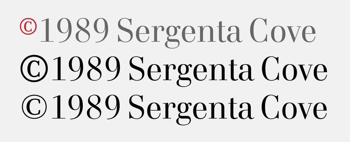
Unlike the registered and trademark symbols, the copyright symbol is most often typeset to more closely match the size of the cap height, which also works for most (but not all) figures. This glyph can usually be used just as it appears in the font, with little or no adjustment. But if it appears before a shorter oldstyle figure (such as an oldstyle 1 as in 1973) or an x-height glyph, it can be reduced a bit if it seems too large. Once sized the way you want it, check the horizontal spacing as well as the vertical position, and adjust with kerning and baseline shift as desired.
The copyright symbol in this font strangely is too small (upper). Enlarging it and adjusting the vertical and horizontal spacing is an improvement, but the circle looks too heavy (middle). The setting looks better when a symbol from another font is substituted (lower).

The copyright symbol in this example (set in French Script) is too high when used next to figures, which are shorter than the caps. Lowering it to center on the figures makes it more balanced.

These three examples set in Alfon Bold are all appropriate: the copyright symbol from each font looks good next to lining figures, oldstyle figures, and italic figures. Note that the symbol is rightly not italicized in the third example.
* * * * *
Paying close attention to these common legal symbols will contribute to the overall professionalism of your work. But keep in mind the client’s specs can supersede the designer’s aesthetics.
This article was last modified on May 23, 2018
This article was first published on May 23, 2018
Commenting is easier and faster when you're logged in!

Recommended for you

TypeTalk: Stroking Text in QuarkXPress
TypeTalk is a regular blog on typography. Post your questions and comments by cl...
Fonts to Help the Homeless
Good things often spring from the union of commerce, art, and charity, as these...
