
To hang or not to hang—punctuation, that is. The term hanging punctuation might not be familiar to some who are more familiar with the related terminology in digital typesetting: optical margin alignment. They are actually a bit different, but both serve the same purpose—to create optically (as opposed to mechanically) aligned flush margins, whether that be both margins in justified text or a single margin in F/L or F/R text.
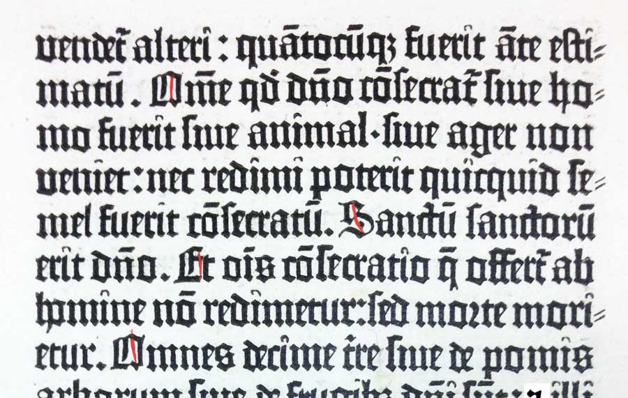
Hung punctuation was used by Gutenberg in the Gutenberg Bible. All double hyphens (a variation of the single hyphen often used in blackletter typestyles) are hung into the right margin. Page from The New York Public Library’s Gutenberg Bible, Book of Numbers, Rare Book Division.
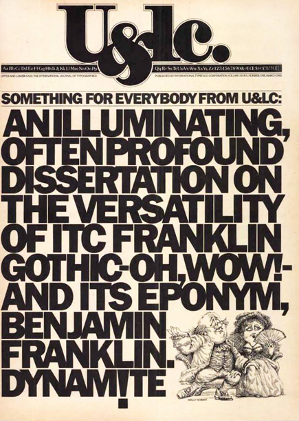
Herb Lubalin was known for his attention to every typographic detail, including hanging punctuation, as can be seen on the right margin of the text on this cover of U&lc (Upper and lowercase).
Hung Punctuation
Hung punctuation refers to the practice of extending lines beginning or ending with certain punctuation (such as quotations marks, hyphens and dashes, periods, commas, asterisks, and any other character that does not have a lot of vertical mass) into the margin of a flush edge of text to create the appearance of a more aligned edge. The punctuation then appears to “hang” in the margin of the text. This is done because a line that begins or ends with these punctuation marks can result in a margin that looks uneven. Hung punc (as it was commonly referred to) was—and still is—considered an advanced technique that was done with regularity by experienced typographers prior to desktop publishing. It became more challenging, if not impossible, to achieve in the early days of design software. But this is no longer the case.
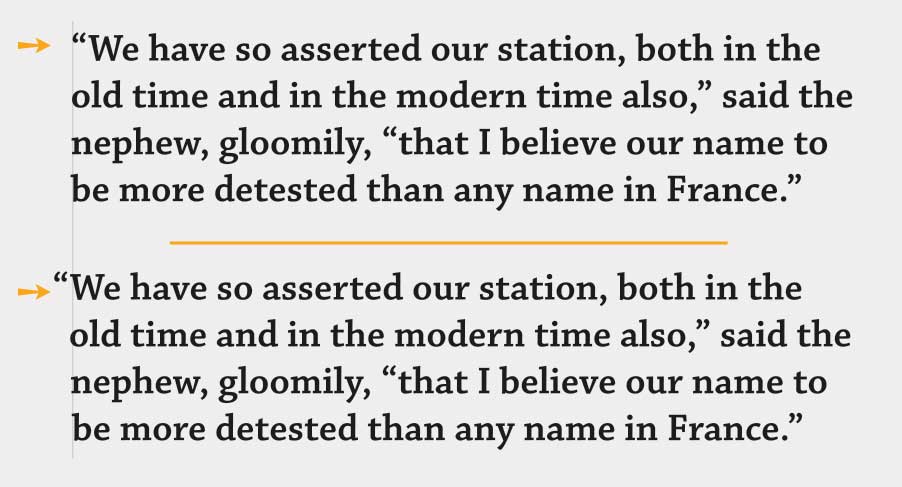
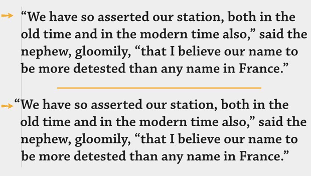
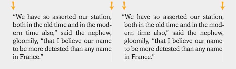
The optical alignment of this flush/left setting is marred by the negative space created by the open quote that begins this text (upper). The alignment is greatly improved by hanging the open quote into the margin (lower). Excerpted from A Tale of Two Cities, by Charles Dickens.
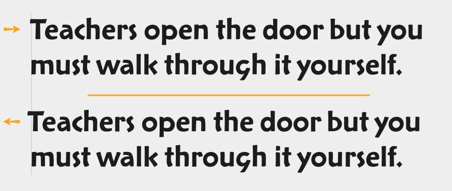
The alignment of both margins in this justified setting is interrupted by the negative spaces created by the quotes, hyphen and comma. When Optical Margin Alignment is applied, they hang into the margins, creating a neater, cleaner alignment.
Optical Margin Alignment
Optical margin alignment is the term used by many of today’s digital design programs. Optical margin alignment follows the same principle as hung punctuation, but takes it a step further. Not only punctuation, but any letter, numeral, character, or symbol that may disrupt the appearance of a flush edge are outdented, including cap A, T, W, and the numeral 1, as well as registered and trademark symbols. This sophisticated technique is not used to right a wrong as such, but is more a question of taste and professionalism.
InDesign’s Optical Margin Alignment feature not only hangs punctuation, but any character, number, or symbol which needs adjusting to create a cleaner alignment. In this case, it is the cap T.
Optical Margin Alignment in InDesign
While it’s not difficult to manually hang punctuation in headlines, subheads, and other large settings, many designers don’t bother finessing text settings in this manner due to the impracticality of making dozens of manual adjustments. The good news is that InDesign has the capability of creating a more optically aligned text margin with its Optical Margin Alignment feature. This is a little-known but extremely powerful feature located in the oddly-named Story panel. When it is activated (it is turned off by default), not only is punctuation pulled into the margin for a more uniform appearance, but so are serifs and the edges of certain characters with overhanging strokes, as previously mentioned. InDesign gives you control over how much these characters extend into the margin for the entire text frame.
To set optical margin alignment in InDesign:
- Select the text frame, or place the cursor within the text.
- Choose Window > Type & Tables > Story (or choose Type > Story).
- Select Optical Margin Alignment.
- Adjust the point size as necessary to get the results you want.
Note that the default setting for how far characters will extend into the margin is 12 point. However, it can be adjusted, as alignment doesn’t necessarily have to correspond to the point size of your text. Select a point size for the amount of overhang by starting with the size of the type and going up (or down) from there. Go by what looks good to your eye, not by the number, which can sometimes be considerably larger than the size of the text for a good alignment.
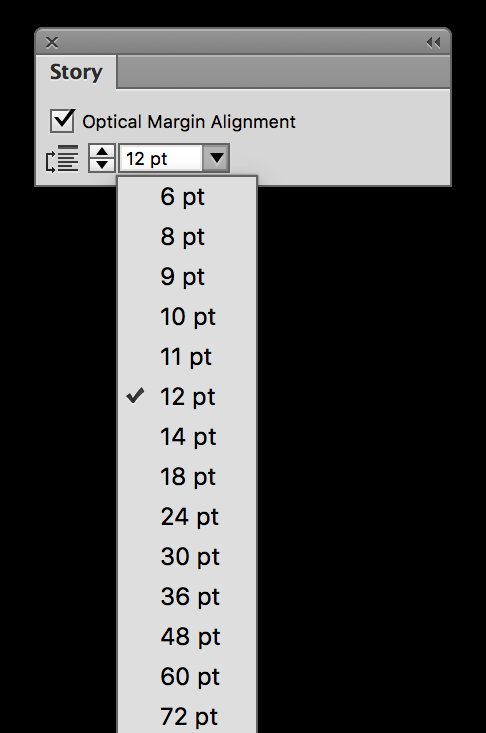
Optical Margin Alignment in InDesign is accessed via the Story panel, which you can find in the Type heading in the menu, or from its tab on the right in the Typography workspace. The amount of overhang can be adjusted from here as well.
Optical Margin Alignment in Illustrator
This feature exists in Illustrator as well, but it is greatly simplified. It can only be turned on or off with no ability to customize the value. Even so, if you are setting type in Illustrator, this does improve a spotty, unbalanced alignment.
To set optical margin alignment in Illustrator:
- Select the text setting, or place the cursor within the text.
- Choose Type > Optical Margin Alignment.
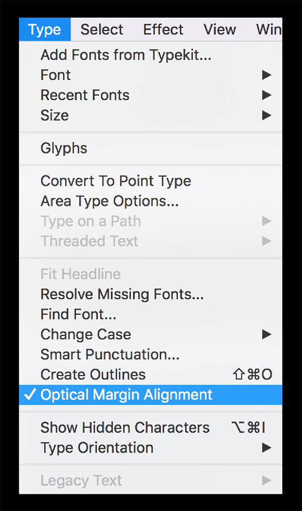
Optical Margin Alignment in Illustrator is accessed from the Type heading in the menu along the top. It is either on or off with no ability to change the overhang.
Helpful Hints
Here are some other tips when using optical margin alignment:
- Optical margin alignment can help to optically align centered lines that begin or end with one or more of these minimal characters.
- When using this feature on a bulleted list, the bullets will be moved, or “hung” into the margin—a look you might or might not like. If you don’t, you can turn it off for the bulleted list only.
- To choose this feature as the default for new documents, check Optical Margin Alignment when the InDesign application is open, but before you create a new document.
- When using InDesign’s Paragraph Styles, Optical Margin Alignment can be selected or ignored. Go to Paragraph Styles Options > Indents and Spacing > Alignment > Ignore Optical Margin.
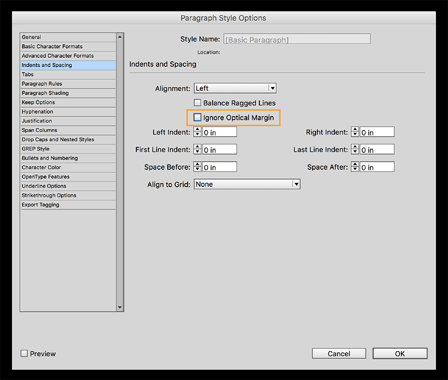
When using Paragraph Styles in InDesign, Optical Margin Alignment can be “Ignored” as desired.
Originally published March 9, 2016
This article was last modified on June 9, 2022
This article was first published on January 10, 2018
Commenting is easier and faster when you're logged in!

Recommended for you

Vernacular Typography Preserves Vanishing Species of Regional Type
When you go away on vacation, do you usually eat at a chain restaurant or a uniq...
How to Create Number Callouts in Illustrator
Learn how to create and quickly apply number callouts in Illustrator through the...

A Bevy of New Typefaces
Emigre has unveiled Jonathan Barnbrook’s Priori Acute, another member in h...