
The term ‘tracking’ is relatively new, being a product of the digital age, and refers to a feature of today’s design software related to letterspacing. It specifically pertains to the uniform opening or closing of the horizontal space between a range (more than two) of characters, whether it be a headline, caption, or an entire text setting. Adjusting letterspacing with the tracking feature can be applied in small increments to achieve subtle, gradual refinements which can help create more readable, balanced ‘color and texture’ of text. Tracking can also be used to create an airy, spread-out effect. It is often confused with the term ‘kerning’ which refers to the opening or closing of the space between two characters, and not a range.
Although a very useful function, tracking is one that is either confusing or unknown to many who use design or production software, as well as web designers who now also have access to this feature with current coding. Therefore, I will attempt to demystify this function, and explain the most common uses for it in typesetting and good design.
Three examples of different tracking: 0, +100 and – 50.
The Tracking feature of InDesign (as well as Illustrator) is located on the Character panel, as shown above.
When and How To Use Tracking
The ability to change the overall letterspacing of type is important when using digital fonts. This is because even though the overall space between glyphs in a digital font is predetermined by the typeface designer or foundry, their ‘one-size-fits-all’ scalable outlines and fixed spacing does not work for all sizes.
Back in the days of metal type, each and every size of a given typeface was a separate ‘font,’ so the punch cutter (the person who carves the first stage of metal type) was able to make slight adjustments to the design and spacing of each point size. This important feature, which allows the customization of every size of a font, has been all but lost with today’s digital type (with the exception of optical font sizes).
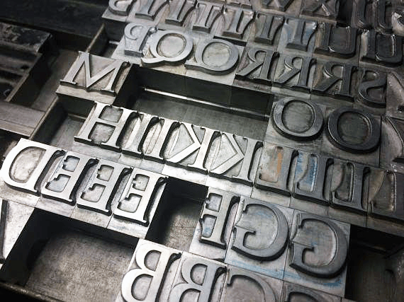
The glyphs of this hot metal version of (30 point) Goudy Bold don’t have a lot of added ‘space’ to their left and right. Text versions, i.e.11 point, would have more space to compensate for the optical illusion of type appearing tighter as it gets smaller.
The responsibility of making the type look good an every size now falls to the designer or production artist, rather than a highly-trained typographer. They must consider the spacing of any chosen font for every size in use, and then fine-tune the spacing with the tracking feature as necessary to achieve the most readable results. This is not a skill taught in school, but one that you can learn (if you’re lucky) from someone knowledgeable and experienced with these typographic refinements.
As mentioned previously, each digital font is spaced (and kerned) by its designer or foundry to look best at a particular size range. Yet type is often set at a size that is much smaller or larger that that target range. It is important to remember that as type gets larger, the spacing between glyphs will optically appear to be more open; therefore, overall spacing should become tighter in order to maintain good typographic color and texture. Conversely, as type gets smaller, the spacing will appear to be tighter, which can result in decreased readability. The smaller the type size, the more open the ‘actual’ spacing needs to be. Therefore, if you are using a typeface within its intended size range, you might not need to adjust the spacing at all. But if the built-in spacing is not ideal for the way you use the font, try opening or closing the tracking, which will help maintain good overall color and readability.
The Helvetica Neue Ultra Light font is spaced by the foundry for display use, so it looks fine with 0 tracking (top). But when used to set smaller type such as the 30 pt. setting below it, it can appear too tight (middle). Opening the tracking to +40 makes it easier to read (bottom).
Conversely, Scala Sans looks great at text sizes (top), but when set at much larger sizes, it appears too open (middle). Here is where negative tracking should be applied (specifically -45 unit in this case) to reduce the inter-letter spacing, making for more balanced, readable text (bottom).
When setting type in reverse – especially small text or type on a busy background – the type will appear tighter. When this is the case, open the tracking as needed to make it appear balanced, and improve readability. Other instances where tracking might be necessary include printing on porous or slick surfaces (fabric, glass and ceramics) that might cause the ink to spread, making the type look heavier and tighter. Also, lower resolution environments, especially newspapers which are printed on porous newsprint, might require more open spacing to avoid unintended crashing characters. On the other hand, billboards, trade show signage, and other very large display type might call for tighter spacing, no matter what the built-in spacing of the font is.
When setting small type in reverse (Helvetica Neue Bold shown in upper setting), it can appear too tight compared to the positive on negative setting (middle). When this is the case, open the tracking as needed to improve readability (bottom).
Keep in mind that when adjusting the tracking, even in very small amounts, other elements might change, such as line endings, hyphenation, rags, and totally number of lines. Therefore, when changing tracking, especially for small text, review your work carefully and make any last-minute adjustments needed to make your type look as good as possible.
This article was last modified on November 7, 2018
This article was first published on November 7, 2018
Commenting is easier and faster when you're logged in!

Recommended for you
TypeTalk: Teach Your Children Well
TypeTalk is a regular blog on typography. Post your questions and comments by cl...

TypeTalk: Measure for Measure, Typographically Speaking
TypeTalk is a regular blog on typography. Post your questions and comments by cl...
Helvetica vs. Arial: Do You Know the Difference?
While they might seem similar at a glance, these fonts are most definitely diffe...