

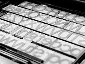
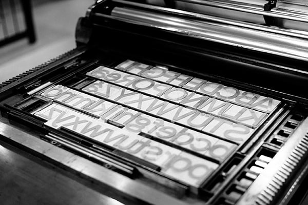
Erik Spiekermann is on a quest to make letterpress a viable and meaningful process in the age of all things digital. Last year he created HWT Artz, a font designed for the sole purpose of being cut as wood type using the pantograph process. Spiekermann’s method of digitally designing fonts for use in letterpress has led him to attempt many different processes, each with their own unique challenges. He’s not trying to re-create the imperfections of letterpress type—he points out there are Photoshop filters for that—but rather, in his words, “…to make good new type in large sizes for today’s type designers.”
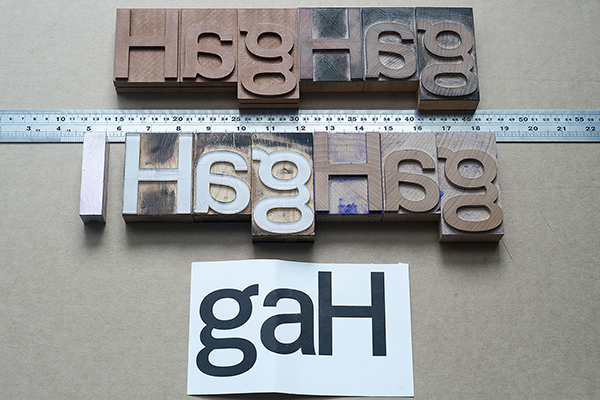
In addition to the pantograph process, he has attempted creating the perfect type using 3-D printing, CNC routing, and laser cutting. Most of the letterforms are crafted from different types of wood, but he has also tested newer materials, such as acrylic. Spiekermann has to re-define the font for each process, taking into account the strengths and weaknesses of each. Most recently, he teamed up with Wood Type Customs in Bucharest to create an entire set of his font FF Real in wood—maple to be specific. Along with Alexander Roth, lead graphic designer at FontFont, and type historian Ferdinand Ulrich, they created a clean, modern letterpress poster highlighting the new typeface set in very large type. Following in the footsteps of traditional letterpress samples, the poster features a sample of the characters available as well as the name of the typeface. Limited quantities of the poster are being given away to purchasers of FF Real collections.

It’ll be interesting to see where these endeavors take Spiekermann, as well as print in general. Print isn’t going anywhere any time soon, but it certainly is changing. People like Spiekermann show that it’s possible for designers to look to the future for new technology, without abandoning the craftsmanship of the past.
This article was last modified on August 20, 2015
This article was first published on August 20, 2015
Commenting is easier and faster when you're logged in!

Recommended for you

TypeTalk: To Everything, Kern, Kern Kern…
Q. What does the word “kerning” mean? A. The term kern originated as...

Type of All Eras & Nations at the Typographic Hub
Press Release UKType has been working with the Birmingham Institute of Art &...
FontStruct Turns Five
FontStruct, the free font-building tool sponsored by FontShop just celebrated it...