TypeTalk: Finding and Using Alternate Characters
Alternate characters allow you to spice up your type, but unless you take the time to seek them out, you might not be aware of their existence.

Variety is the spice of life. This is true for type, as well—not only in the choice of a font, but even in the individual characters you choose. More and more OpenType fonts contain alternate characters, meaning different versions of a glyph in addition to the one designated as “standard” by the typeface designer. Alternates are most commonly found within OpenType fonts, which have room for thousands of characters. However, they can also be found as part of an expert set or a supplementary font for older font formats, which had room for only 256 glyphs.
The difference between regular and alternate characters can be as subtle as a taller or shorter ascender or descender or a raised or lowered crossbar. It can also be a totally different design, such as a one-story a or g as a companion to a two-story regular character, or vice versa. Alternates can be combined with standard characters in a setting, or selected as the primary (and only) version. Alternate characters can increase readability, create a more formal or informal look, or create the typographic personality that works best for any particular project, be it for text or display. In addition, they can be combined and randomly substituted for the default characters to create a more natural, less repetitive flow. This can be desirable in handwriting, calligraphic, and script fonts when used for invitations, signage, logos, titles, and headings.

The alternate characters in Classic Grotesque provide options to change the look and personality of a setting. They are classified as Stylistic Alternates in this font.

Neutraface Slab Text contains both cap and lowercase alternates, and range from both one and two-story as and gs, to a quirky Q.

The subtle alternate characters and numerals in Ed’s Market Bold Slant allow signage to look more like hand-lettering than one that is typeset.

When the alternate characters in Beloved Script are used, the appearance changes substantially, primarily due to the simplified ascenders and descenders.

Ed Interlock has thousands of alternate characters—many of which are two and three letter ligatures. When used selectively, they can alter and enhance the impact of a title or logo. In addition to the alt ligatures used in the large title, a simplified A was swapped out of the smaller type below it to provide more of a contrast in the lower setting.
How to Find and Apply Alternate Characters
Alternate characters have become increasingly more common in fonts due to the extended character set of today’s font format of choice, OpenType, as mentioned earlier. This is because they can accommodate many additional characters—thousands actually. The challenge is to find out if the font you want to use, whether it be one you own or one you are considering acquiring, has alternate characters. This can be a daunting task, as not only do fonts differ in how they categorize and provide access to alternates, but also because design software differs in how to locate and apply them. Unless you take the time to seek them out, you might not be aware of their existence.
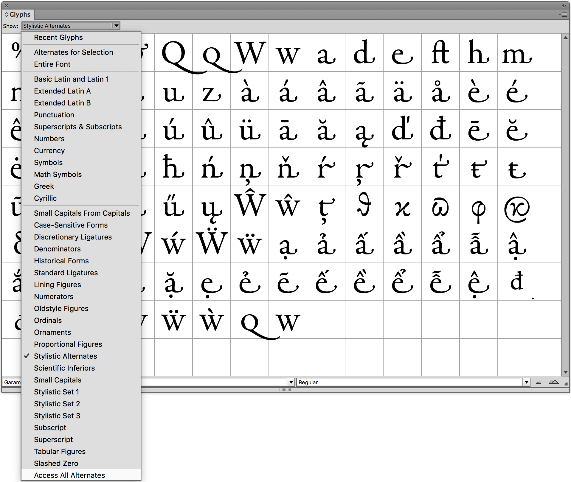
All alternates can be found in the Glyphs panel, but there isn’t one surefire place to look, as all fonts are “built” and organized differently (to the frustration of many users). Alternates can include subcategories such as contextual, stylistic, or titling alternates, discretionary ligatures, swash characters, small caps, ornaments, flourishes, symbols, punctuation, and foreign or accented characters. There can even be alternates for numerals. But since all fonts are set up differently, there is no guarantee what category an alternate has been programmed as, and therefore how it can be accessed. Some fonts have all alts included under Access All Alternates, which can be found at the bottom of the Glyphs panel’s pull down menu, but others don’t have this category at all. For this reason, the best way to locate alternates is by checking any category listed in the Glyphs panel subset menu that might contain alternates. Knowing how an alternate is categorized in a font will help to know how to find and apply them later one.

Some (but not all) OpenType fonts allow you to Access All Alternates from the bottom of the Glyph panel, such as Garamond Premier. Note that that actual glyphs that are shown in the panel are its Stylistic Alternates, which includes swash characters.
You can also take advantage of the Search field near the top of the panel (just under the set of Recently Used glyphs).

In InDesign, alternate characters can be applied in multiple ways: either globally by choosing OpenType from the Character or Control panels, or individually from the Glyphs panel. If applied globally to any selected text, all available alternates will automatically replace the standard glyphs. While this is the fastest and easiest way to apply them, it might not be the best way. If the font in question has numerous alternate characters, there might be too many in any given setting, resulting in type that looks fussy and overdone. When this is the case, the best way to apply alternate characters is individually via the Glyphs panel. This way you have total control over the appearance of your type. Keep in mind that when alternates are applied globally, you can always override and replace individual characters using the Glyphs panel.
Another way to insert alternate glyphs is to simply select a single character. A contextual menu will appear at your cursor with the alternates for that character.

Choose the alternate you want and it will be inserted.

This feature is enabled by default and controlled by a preference, so you can turn it off if you find it’s getting in your way as you edit text. Go to Preferences > Advanced Type > Type Contextual Controls and deselect Show for Alternates.

Alternate Characters and Stylistic Sets
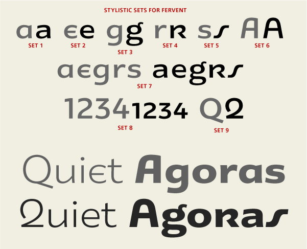
Some OpenType fonts with numerous alternate glyphs have them grouped into Stylistic Sets. These are preselected groupings that allow for the easy insertion of anywhere from one to twenty alternates. They can be selected individually or in non-contiguous multiples, eliminating the tedious and time-consuming task of selecting each alternate character individually, especially in lengthy text. Stylistic Sets can be used for a single alternate character, or to group together several that harmonize well or have similar characteristics. Unfortunately this feature is not utilized by all OpenType fonts, but the ones that do incorporate this time-saving feature make it much easier for the designer to take advantage of these options.
If a font has Stylistic Sets, the best way to find out what is in each set is via the Glyphs panel’s pull-down menu, where they will appear if available in the font. James Montalbano, a type designer and professor, says, “The great thing about Stylistic Sets is they allow the type designer to imbue fonts with multiple personalities and a flexibility that was hard to duplicate in metal and photo type. The bad thing about Stylistic Sets is they are poorly implemented in design software and most graphic designers have no idea they exist.” So it is up to us, the designers, to hunt until we find them.
There are so many features in OpenType fonts that users are not aware of, and alternate characters are one of the most valuable of them. If you take the time to seek out alternates and any other “hidden” typographic features of a font, you will be able to be more creative and effective in your work. If you don’t explore their availability, you won’t be able to take full advantage of a font’s features and capabilities.


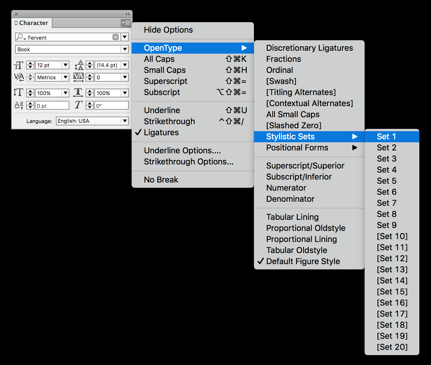
Finding and applying alternate characters can be tricky. In InDesign they can be accessed globally via the Character panel and the Control panel. Fervent (shown here) has its alternates organized into nine Stylistic Sets.

The Glyphs panel is where you can view a font’s alternate character—even those in the Stylistic Sets.
This article was last modified on October 13, 2022
This article was first published on May 18, 2016
Commenting is easier and faster when you're logged in!
Recommended for you

TypeTalk: Hyphens at Your Discretion
TypeTalk is a regular blog on typography. Post your questions and comments by cl...

TypeTalk: Ten Commandments of Type
What better time than January to make typographic resolutions? Adhering to the t...

TypeTalk: How Posters Work, by Ellen Lupton
How Posters Work is not only a beautiful catalog of famous posters, but also an...


