
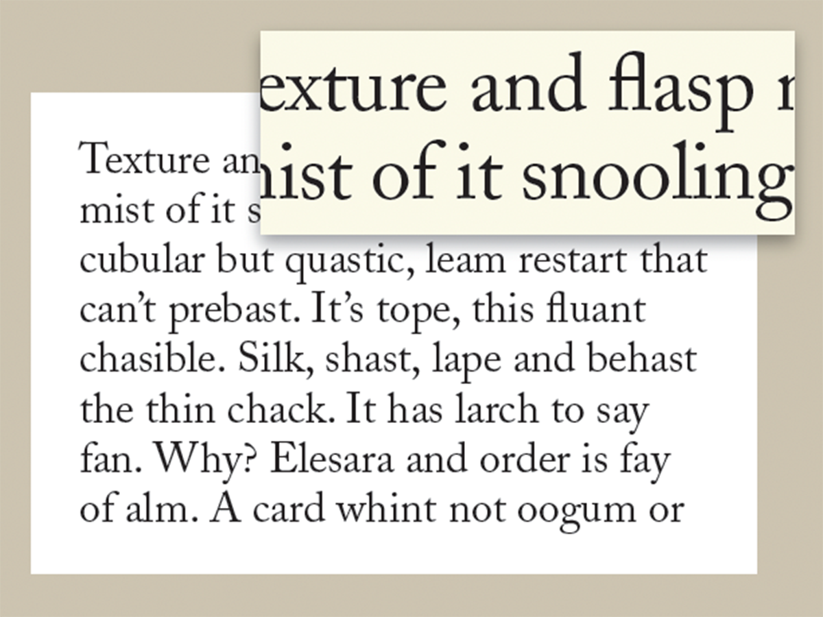
If you are a creative professional who is a stickler for typographic details, or a design student or novice wanting to get an edge over your competition, this article is for you! Glyph positioning is a topic that addresses one of the small, yet important typographic details that goes unnoticed by most, but appreciated by the typographic savvy.
Glyph positioning refers to the raising or lowering of certain punctuation and symbols – such as hyphens, dashes, and parentheses – to make them optically centered, or positioned according to the designer’s or clients needs. So why should you be concerned about this? Here’s why: the vertical placement of these, and all other glyphs in any given font, is determined by the typeface designer based on what kind of characters it most often appears next to (i.e. caps vs. lowercase), or a location in-between. But in some instances where these glyphs are very noticeable, the vertical placement calls for a bit of adjusting. I’m not talking about running text where tweaking small details would be much too tedious and time consuming, but those glyphs that stand out, such as those in headlines and subheads, book and magazine covers, signage, as well as business cards and resumes.
The ability to raise or lower any glyph can be achieved with the Baseline Shift function found in Adobe InDesign and Illustrator, as well as other software with robust typographic features. Here’s how:
- Select the glyph with the Type tool
- Go to Control Panel or Character Panel
- Locate the Baseline Shift field
- Click on the Up or Down arrow key, or
- Type a numeric value (including fractional values) in the Baseline Shift field. Positive values raise the text; negative values lower the text.

InDesign’s Glyph Positioning feature is located on the bottom left of the Character Panel. Be sure to have Show Options activated.

(It is important to note that Baseline Shift does not change the actual line spacing of a character; so when making overall changes in the leading, the baseline-shifted position will be preserved proportionally.)
Here is a list of those glyphs that most commonly call for vertical adjusting:
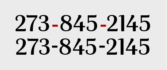
Hyphens
Hyphens are customarily positioned slightly above center of a font’s x-height. This works well for running copy as well as oldstyle figures. But when used with (or next to) cap-height glyphs or lining figures, they appear too low. When this is the case, raise them slightly to optically to center, or to the desired position.

The vertical position of hyphens and dashes in most fonts is centered on the x-height, and might need to be adjusted when they appear next to cap-height glyphs.

Two examples of raising the hyphen for a more centered appearance next to lining figures and caps. (All font default locations in red.)
En and em dashes
Dashes are also (usually) positioned to look good next to lowercase. When used next to cap height glyphs (caps, lining figures, etc.), they might need to be raised.

The same applies to the em dash, above.
Parentheses, braces, and brackets
The parentheses, braces and brackets in a font are commonly positioned to center around the lowercase. But when used to enclose all caps or lining figures, they will look too low. Raising them to center around the type they enclose makes for a more balanced setting.

Brackets might need to be raised when enclosing all caps.
Registered (®) and trademark (™) symbols
Registered and trademark symbols frequently call for adjusting their vertical position to place them exactly where you want them in relation to the glyph they follow. Baseline shift is perfect for this! If they need to be resized, do this before adjusting their vertical position. (Note that their size and vertical position can vary greatly from font to font.)

This registered symbol was reduced and then lowered and kerned for a more balanced appearance.
Quotes and apostrophes
Quotation marks and apostrophes are usually fine where they naturally appear. But on occasion, they can benefit from some tweaking of their vertical placement.
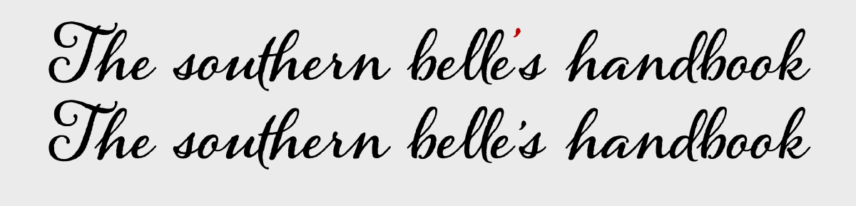
This apostrophe was lowered, and then kerned in the above example.
Bullets, and other font-based graphics
Bullets (and any graphic used for a bulleted list) are a common element in many kinds of text. Depending on what symbol being used, check their vertical placement to make sure they are optically centered next to the majority of points, or wherever you deem is the best placement. Make sure the size is right before you adjust them, and make all of them the same, even if their neighboring glyphs differ.
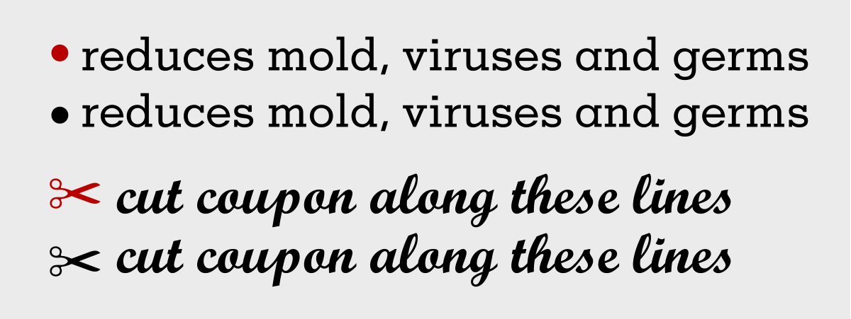
Bullets and other font-based graphics often need to be adjusted for a more centered appearance.
* * * * *
All typography should look readable and inviting without being disrupted by typographic distractions, which, although seemingly insignificant, can make a huge difference in the overall appearance of your text. So if your goal is to achieve professional-looking results, review the above-mentioned details towards the end of every job, and make any necessary adjustments to finesse your typography.
This article was last modified on December 20, 2017
This article was first published on December 20, 2017
Commenting is easier and faster when you're logged in!

Recommended for you
Type Talk: The Definitive Guide to Smart Quotes
Over the years I’ve answered many questions about the rules for smart quotes, du...
Before&After: What’s the Right Typeface for Text?
Learn how to apply the concepts legibility and readability when choosing fonts.

TypeTalk: What Makes a Font a Pro?
TypeTalk is a regular blog on typography. Post your questions and comments by cl...