
An initial letter is the first character of a sentence that is enlarged, positioned, and styled in a decorative or graphic way. It is commonly used to draw attention to a paragraph, chapter or section, article, ad copy – any important text in print and the web, as well as other digital media.
Initial letters can be both creative and functional. They can help spice up a layout by creating visual interest, thereby drawing attention to any important content entry point. They can also create emphasis, and establish or reinforce typographic hierarchy. All in all, the use of initial letters can be a dramatic and powerful way to add visual appeal and drama to an otherwise mediocre or unremarkable layout.
Initial letters can be either capitals or lowercase (thus my preferred term initial letters, and not initial caps as they are frequently referred to). They can be set in the same exact typeface as the neighboring text, a different weight or variant, or they can be set in a completely different typestyle. Highly contrasting weights and versions, as well as elaborate, decorative, calligraphic, or ornate typestyles in contrasting colors are often used and can work well.
Here are some of the most common initial letter styles:
Raised Initial
A raised initial, also referred to as a stick-up initial, is one whose baseline aligns with the first line of text, and whose body rises above it. It is much less complicated to execute than a dropped initial. When setting a raised initial that is the first letter of a word (as opposed to a single letter word such as A or I), make sure you space the rest of the word close enough to the initial to read as a word.

(left) A large raised initial in a striking color. (right) This ‘almost’ centered raised initial makes a dramatic statement. Both from Oprah magazine.
Dropped Initial
An initial that falls below the first line of text is referred to as a dropped initial. This is the most common initial treatment, and calls for precise placement and alignment on all edges to achieve a professional result. Dropped initials should optically align (as opposed to mechanically align) with the baseline of a line of type. When the height of the initial is intended to align with the first line of type, it should align with some element of that line, whether it be the cap height, an ascender, or even the x-height – whichever works best for each particular instance. For the most tasteful and pleasing appearance, go at least three lines deep.
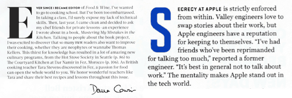
(left) This classic drop cap treatment is counterpointed by the signature on the bottom right. Food and Wine magazine. (right) A condensed sans font and the addition of color make this drop initial stand out. Fortune magazine.
Overlapped and Contoured Initials
An initial can overlap the text in some manner, often partially sitting behind and sometimes rising above the text. The key to a successful execution of this approach is to keep the color of the initial light enough so that it doesn’t interfere with, or reduce the readability of the overlapped text. Text can also be contoured around an initial.
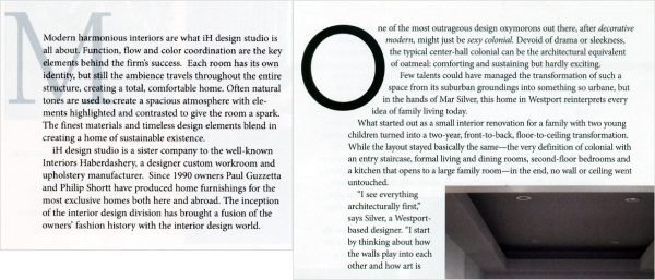
(left) This overlapped, or layered initial creates a subtle yet sophisticated look. Note the initial character is kept in the text to maintain its readability in this advertorial. (right) Text wrapped around an O makes for an elegant, eye-catching treatment. New England Home’s Connecticut magazine.
Boxed and Reversed Initials
There are countless approaches that can add visual interest and originality to initial characters. An initial can be placed within an outlined or colored box, or set in reverse and dropped out of a box of black or any color, or even a texture – pretty much anything you can think up!
Decorative Initial
Sometimes a very unusual, elaborate, or ornate initial can do a lot to enhance a design. Some fonts contain swash characters or other alternate letterforms that can be used as initial letters, while others contain decorative initials designed primarily for this purpose. In addition, some very interesting and unusual initials are available as .eps picture files. They are worth looking into, especially if your project is primarily text-based with few or no illustrations or photos, and could use a bit of livening up. Handwriting, graffiti, or even photographs showing real or organic letterforms can also render very interesting and original results.

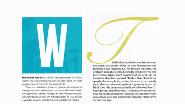
(left) This oversized initial dropped out of a cyan box makes a strong graphic statement. Money magazine. (right) A decorative script initial sets just the right tone in this article about actress Sharon Stone. AARP The Magazine.
Lowercase Initial
Not all initials need to be capital letterforms! An interesting initial treatment can be achieved with the use of a lowercase character, often followed by a small cap text lead-in. This approach can render a distinctive look suitable for some designs.
Initial Word or Phrase
Try setting the first word or short phrase with a drop initial approach. The ability to actually read the initial treatment can draw the reader in with more information than just one character.
Initial Symbol
Sometimes the best initial letter is not actually a letter, but a symbol or a graphic. This technique can become one that is repeated throughout a magazine, brochure, web site, or any instance benefiting from a reinforced theme or branding.

(left) An initial letter can be replaced by a symbol. (right) This illustrated initial sits midway between two paragraphs. The Advocate and The New York Times Magazine.
A few things to keep in mind when using initial letters:
- Proper alignment is key to well-executed initial letters.
- Don’t repeat the letter you use as the initial cap in the text unless its size, style, and position make it difficult for the eye to connect it with the rest of the word.
- Avoid the use of too many initial letters in one layout. One per length of copy or long section is enough.
Initial letter treatments are not limited to the above styles: use your imagination, experiment with different approaches, and have fun with it – just keep them tasteful, readable, and appropriate to the content and the rest of the design.
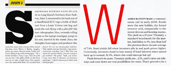
(left) A chunky drop cap signals the beginning of this text-heavy editorial spread from Rolling Stone magazine. (right) This initial combines two styles: dropped and raised. Money magazine.
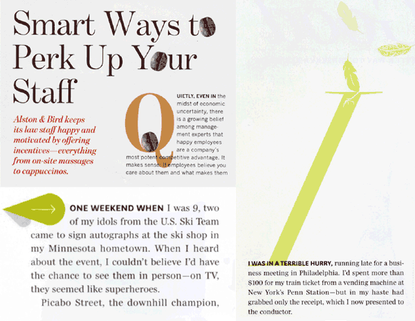
(upper left) An illustrated graphic can be used instead of an actual character for an initial treatment. Oprah magazine. (lower left) The addition of a coffee bean to this dropped initial ties it in to the headline as well as the content in this advertorial. (right) A raised cap becomes an illustration in this article from Oprah magazine.
*Check out some more creative uses of initial letters in this article about U&lc magazine.
This article was last modified on August 19, 2015
This article was first published on August 19, 2015
Commenting is easier and faster when you're logged in!

Recommended for you

Tip of the Week: Choosing the Right Amount of Leading
How to set the right amount of line spacing or leading in InDesign to make any t...

Using Color Fonts in Photoshop with Fontself
Color fonts have been touted as the Next Big Thing. They aren’t universall...
Design Inspiration from the Alphabet Logo
Sometimes “getting back to basics” for inspiration involves going wa...