 Posters are one of the most exciting, expressive forms of communication in the world of graphic design. They combine type, image, and color to convey a message or an idea. The best posters are designed to relay information in a manner that appeals to the intended audience in an eye-catching, engaging way. As a medium of communication, the poster has a long history and a wide range of social functions, from selling a product to promoting an event or a cause. Despite the rise of digital media, the print poster remains a vital, and oftentimes radical, form of visual communication.
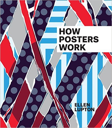
One person who knows all about posters is Ellen Lupton, author of How Posters Work. This book is a catalog of her curated poster show of the same name, which was recently held at Cooper Hewitt Museum in New York City. Ellen Lupton is a curator of contemporary design at Cooper Hewitt, Smithsonian Design Museum in New York City, as well as Director of the Graphic Design MFA program at Maryland Institute College of Art (MICA) in Baltimore. In addition to authoring numerous articles on design, she is also the author of Thinking with Type, a beautiful, informative, highly-regarded book used by students, designers, and educators worldwide. Lupton is a 2007 recipient of the AIGA Gold Medal, one of the highest honors given to a graphic designer or design educator in the US.
Now that the exhibition has ended, the How Posters Work catalog is a permanent visual record of this outstanding show and a forever keepsake, whether you’ve seen the show or not. It is illustrated with over 150 works from the collection of Cooper Hewitt, Smithsonian Design Museum, including a diverse range of posters, from avant-garde classics and rarely seen international works to contemporary pieces by today’s leading graphic designers. The catalog provides a stunning education, demonstrating how some of the world’s most creative designers have mobilized principles of layout, composition, psychology, and rhetoric to produce powerful acts of visual communication.
“This is not a book about posters. It is a book about how designers see,” says Lupton. For that reason, the book is organized around active design principles. The 14 subsections are: Focus the Eye, Overwhelm the Eye, Use Text as Image, Overlap, Cut and Paste, Assault the Surface, Simplify, Tell a Story, Amplify, Double the Meaning, Manipulate Scale, Activate the Diagonal, Make Eye Contact and Make a System. Let’s look at some examples to illustrate these principles.
Focus the Eye
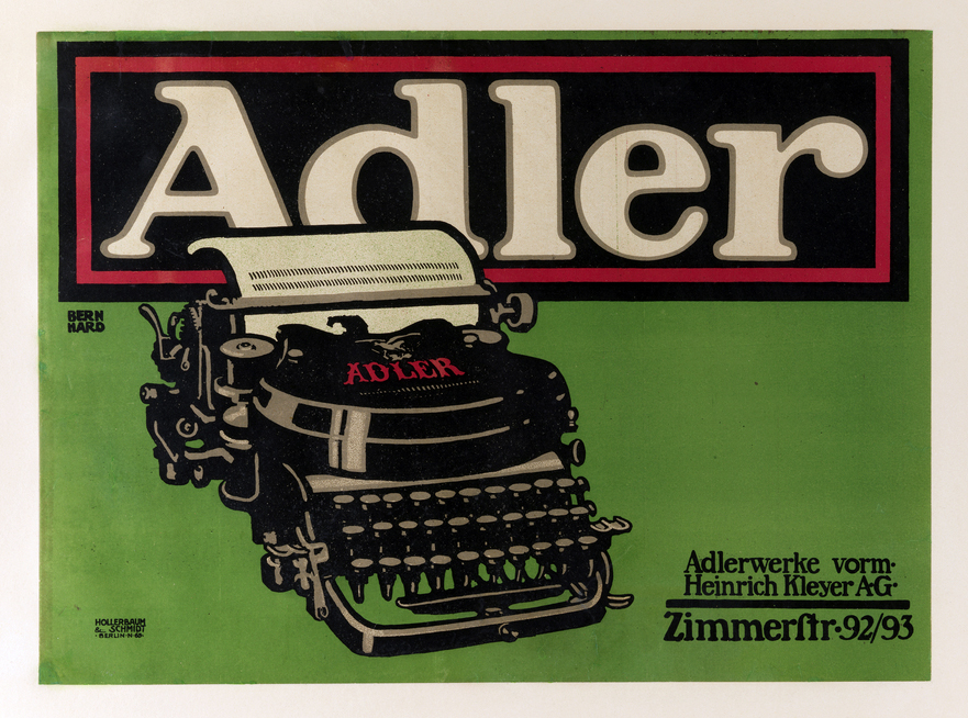
One of the most basic ways designers can make a viewer take notice is to make an image big and put it in the middle of a space. Color and form can also be used to bring attention to a central element, as seen in Lucian Bernhard’s famous 1909–1910 “Adler” poster. It features a centered product name at the top, counterbalanced by a starkly rendered typewriter.
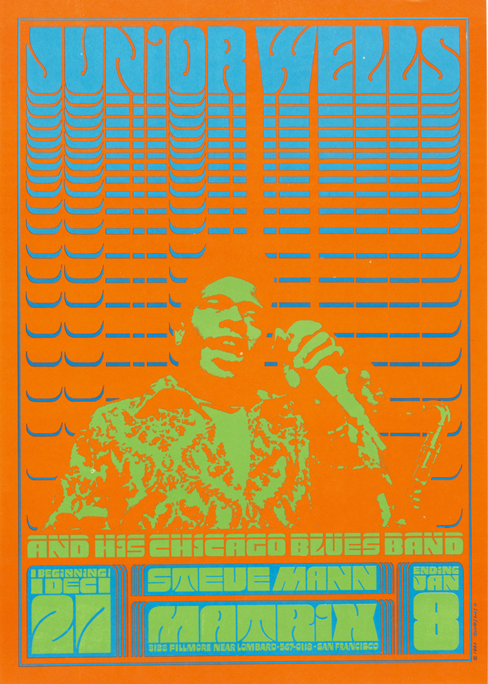
Overwhelm the Eye
Designers can engage the viewer in an optical experience and lead the eye on a restless journey by incorporating dense patterns, wandering lines, and competing colors. Highlights of the works in this section include psychedelic posters of the 1960s, such as Victor Moscoso’s 1966 “Junior Wells.” It most definitely overwhelms the eye with its psychedelic, fluorescent colors.
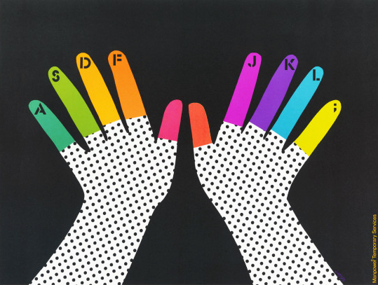
Simplify
Designers often simplify an image in order to direct attention to a message or product. This poster, designed by children’s book illustrator and graphic designer Lois Ehlert in the late 1970s for Manpower Temporary Services, exemplifies this principle with its bright, playful, decorated hands indicating typing.
Cut and Paste
Splitting images apart and combining bits and pieces to create new meaning is central to the design process in the cut and paste method. This poster designed by Andrzej Klimowski in 1991 uses cut and paste collage to play with scale, creating surreal imagery in this movie poster. Photographs are enlarged, cut, and layered; text is rotated and placed vertically. The result is disorientating—the poster appears to condense scenes (disrupting the plot line) with spectacular effect.

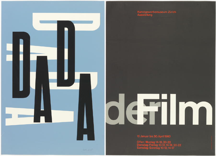
Overlap
Designers use various techniques to conjure illusions of depth within the flatness of two-dimensional space. The most basic technique for simulating depth is to overlap two or more elements, as seen in Paul Rand’s classic 1951 poster “Dada,” which creates a rudimentary sensation of depth as black letters float in front of white ones (left). A similar technique is used in Josef Müller-Brockmann’s 1959–60 poster, which is considered a masterpiece of modernist design. By overlapping the word Film with the article der [the], Müller-Brockmann used typography to explore the principle of cinematic montage (right).
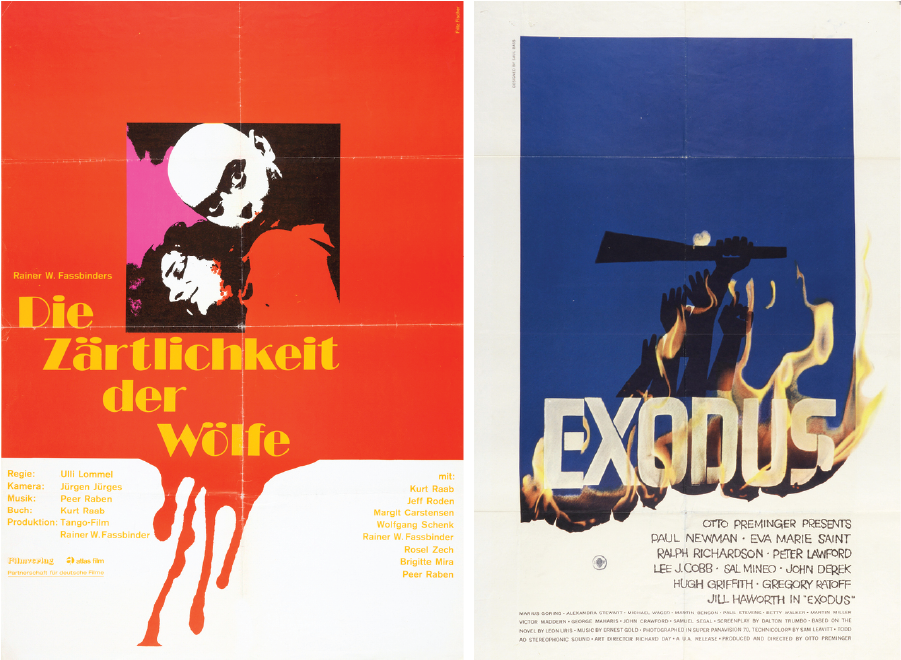
Assault the Surface
To focus the viewer’s attention, designers may bend, burn, melt, and vandalize the image to unlock its power. Examples of this technique include Fritz Fischer’s 1973 movie poster for Die Zartlichkeit der Wolfe (The Tenderness of Wolves) and Saul Bass’ 1961 ad campaign for Otto Preminger’s film Exodus.
Activate the Diagonal
Diagonals help the eye cut across the surface and penetrate its depths. This approach is illustrated in this poster designed by Takenobu Igarashi in 1975, whose architectural structures and typography are positioned on the diagonal.

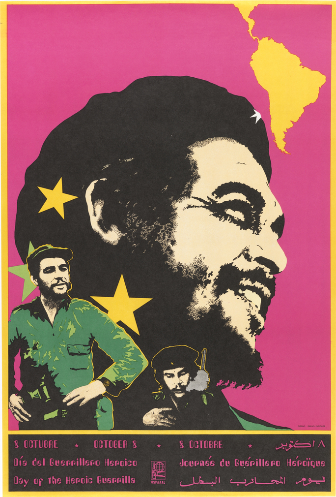
Manipulate Scale
Designers often exaggerate scale differences in order to amplify the illusion of depth or create visual tension among the elements of a composition. This technique is used in this poster by Rafael Enriquez, dated 1980. The large heads establish a point-of-view character, while the smaller elements suggest thoughts, memories, and actions.
Use Text as Image
In poster design, typography is often used to enhance or obscure a message through the size, style and arrangement of letters. This poster designed by John Neuhart and Alexander Hayden Girard in 1961 showcases the text by using brilliant colors, dynamic patterning, and uninhibited ornamentation.

Tell a Story
Visual narratives inspire viewers to ask, “What just happened?” or “What will happen next?” Designed by Lawrence Beall Smith in 1942, this poster promoted U.S. involvement in World War II with an illustration of three children playing with an American flag and a war plane in the shadows of a swastika.

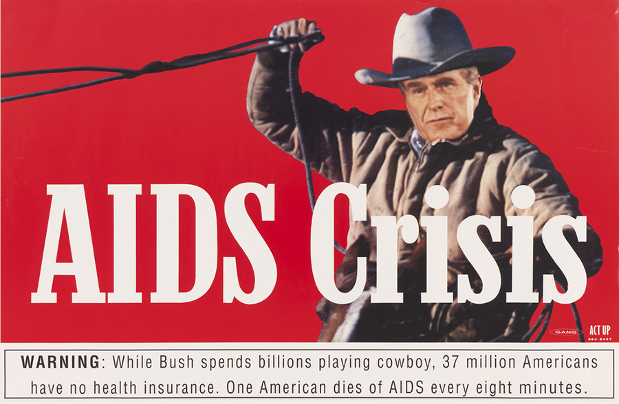
Double the Meaning
In order to create humor and tension, designers sometimes build multiple meanings into a single image. This poster designed by GANG for ACT UP in 1990 uses a visual metaphor to get its point across. Visually comparing President George H. W. Bush to the Marlboro Man, it critiques the administration’s emphasis on military spending and its neglect of healthcare research and reform.
Amplify
Designers may use arresting images and provocative language to communicate the urgency of a message. Lowercase letters can seem calm and conversational, while uppercase letters can project anger or agitation. This technique can be seen in Art Chantry’s 1982 “Ready for War” poster.

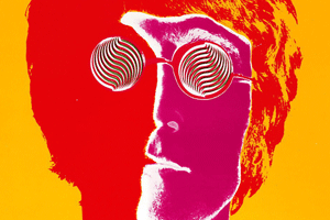
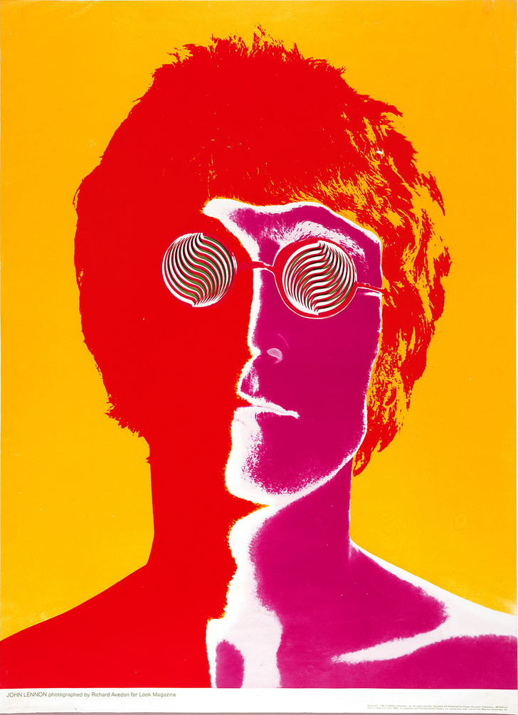
Make Eye Contact
Graphic designers intuitively grasp the emotional draw of eye contact. The human brain responds to images of eyes, even when they are hidden or distorted, such as in Richard Avedon’s 1967 “John Lennon” poster.
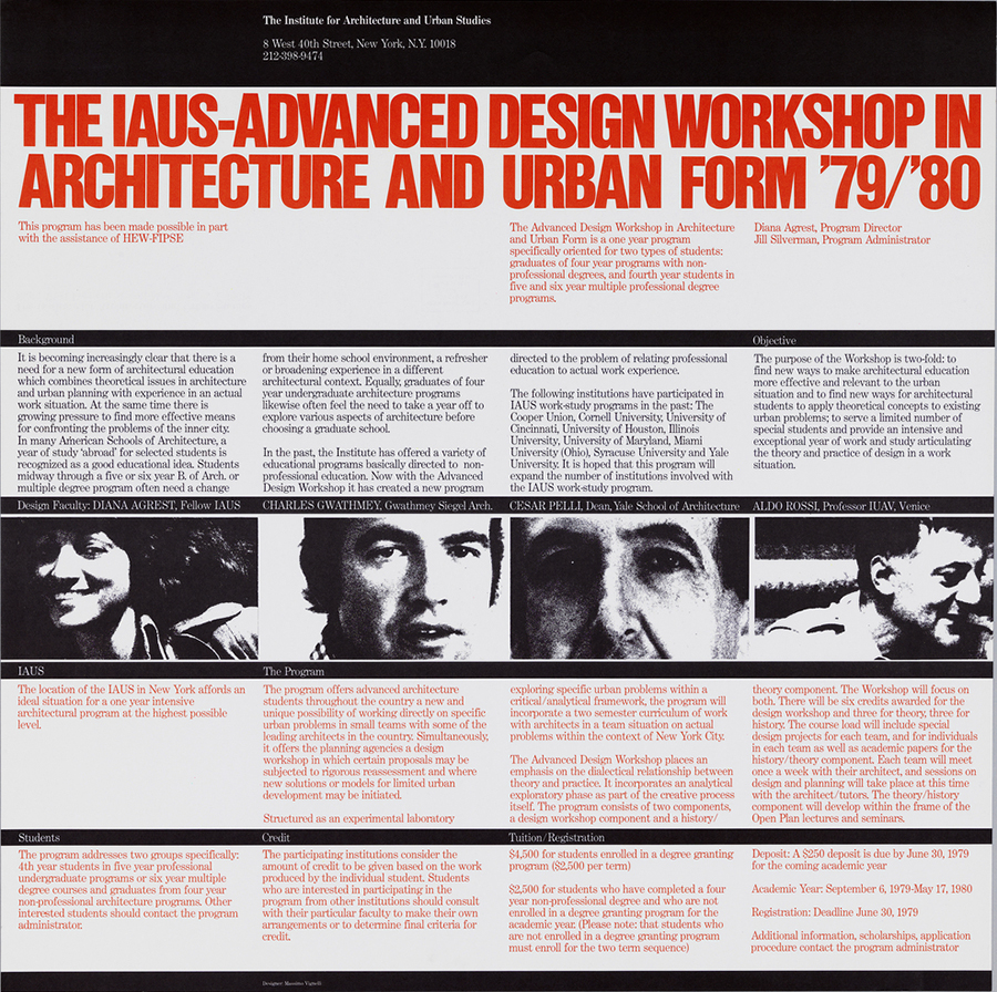
Make a System
Designers create a system of colors and forms to create a recognizable identity and address spatial relationships among visual elements. Visual systems allow for uniformity and change, repetition and variation. This poster by Massimo Vignelli, dated 1979–80, incorporates an information system that employs horizontal grid lines as visual and structural elements.
This article was last modified on October 5, 2022
This article was first published on February 24, 2016
Commenting is easier and faster when you're logged in!

Recommended for you

How To Create Sharp Digital Type Images
Images that contain type make frequent appearances on websites and blogs, ebooks...
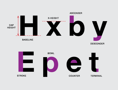
TypeTalk: Parts of a Character
TypeTalk is a regular blog on typography. Post your questions and comments by cl...