

One of the most important, and some would say the most challenging aspect of graphic design, is selecting the appropriate typeface(s). Whether it be for text, display, or something in-between, this process and eventual choices contribute greatly to the final outcome, and whether it hits the mark and meets the objective – or not.
Every typeface has its own personality and conveys a different mood, message, or feeling. Display, or headline typefaces are usually stronger and more assertive, sometimes trading legibility at smaller sizes for a more powerful impact. Typefaces intended for small text will usually emphasize legibility – or the ability to distinguish one character from another – and therefore are subtler in design, with personalities that tend to whisper rather than shout. Then there are typefaces that can be used for both text and display sizes.
Knowing the intended size range is not enough to make a selection; there is a lot more to choosing (and combining) type designs than that! Here are some factors and unofficial rules to consider that will help you narrow your search and ultimately make the right choices.
Design Goals
The number one consideration in selecting a typeface for any project is knowing your goals, or more specifically, the goals of your client. As a designer, your primary responsibility is to meet your client’s objective using your design and problem-solving skills. It is not to make their job into your own personal award-winning design statement – unless you can accomplish both at the same time! Every design project calls for a different approach: an annual report might call for a typeface with a high degree of legibility that also captures the spirit of the company, while a travel brochure might need to evoke the allure of a foreign land; a book cover might need a type treatment that catches the eye and tells a story at first glance, while the inside text might call for a pleasing, legible text face that doesn’t tire the eyes after long lengths of copy. In addition, a web site or gaming app might call for type that quickly attracts and captures its audience and lets them know the mood of what is to follow.

This travel brochure (left) uses fonts as well as color to generate the vibe of Mexico. The annual report designed by Paul Rand (right) has a similar color palette, yet is a much more serious yet still engaging treatment.

The cover of this book (left) uses type and image to express mystery and intrigue, yet the text inside is clean, simple, neutral and legible.
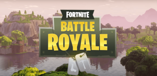
The type used for this popular video game is designed to be easy to read at any size and resolution – from a smart phone to a large monitor.
Know Your Audience
In order to identify the most appropriate typefaces for a job, it is essential to identify the age, interests, attention span, and other demographics of your intended audience. Different typefaces (and type treatments) will attract a different audience – both overtly and subliminally. Children are drawn to easy-to-read, childlike fonts; seniors to larger settings that have more clarity and readability; teens to edgier, more expressive designs. Once you identify your audience, identify how much reading you are asking them to do, and what information you are expecting them to walk away with. Once you know the answer to these questions, it will be much easier to narrow down your typeface choices.
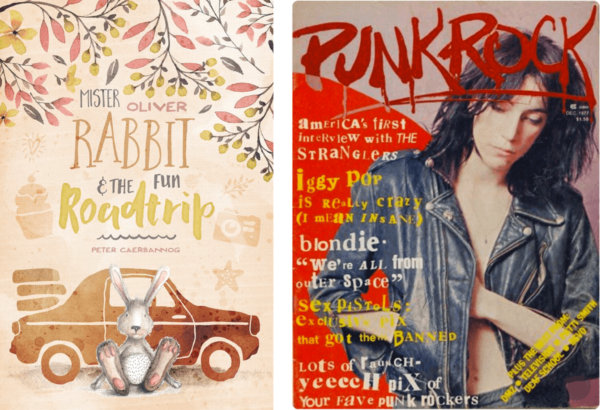
A children’s book and a punk magazine, albeit from the 70s, use very different typefaces and design treatments to attract and appeal to totally different audiences.

Keep the type large, legible and readable when designing for the visually-impaired.
What is Your Intended Type Size
At the onset of any design project, it is important to know the intended type size range of each chosen typestyle. Will it be used for a headline, subhead, running body copy, or all three? Will you be setting very small text for captions or credits? Or perhaps larger sizes for signage, trade show booths, or even a billboard? Or will it be applied to digital media with no fixed type size, or even style? All of these usages require typefaces that are either intended for or useable at these sizes. Therefore, it is always wise to see for yourself how it looks at both the smallest and the largest of the intended size range.
While some fonts can be adapted to a broad range of sizes with the help of a bit of tracking or kerning, others will either become hard to read or lose the defining characteristics they were initially chosen for. So be sure to do your homework beforehand to avoid any surprises or unwanted results. (Read more about Font Sizing in this link.)

Different typefaces are meant for certain size ranges. Those settings in red are not being used within their optimal range. Set in Impact, ITC Flora, and ITC Bradley Hand.
Consider the Type & Background Color
The actual color of the type against its background should also be taken into consideration when selecting a typeface, especially with text type. If white or light-colored type is to be dropped out of a dark color or image, the weaker design details (such as thin strokes) might not stand up to any potential ink spread, tint, or color screening, as well as a low-resolution environment, such as the web. In any scenario where the type size is small and the contrast between the type and the background is low (or even worse, unknown as it can be with inconsistent color in digital media), choose a typeface or weight variant with heavier serifs and/or thin strokes, and a bit more overall strength and punch. (Read more about Reverse Type in this link.)
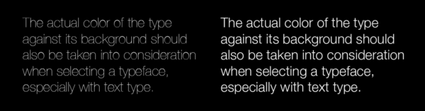
When placing type on a dark background, don’t use a design with very thin strokes that might break up or start to disappear (left). Go heavy enough so it holds up and remains readable and inviting (right).
Is Legibility Important?
You’ll often hear type described as being legible and/or readable. Although they both relate to the ease and clarity with which one reads type, they actually refer to two different things: legibility refers to the actual design of the typeface, while readability refers to how the type is set, or arranged. We’ll concentrate on legibility as it directly relates to selecting the right typeface for the job.
So are all typefaces designed to be legible? Not necessarily. This is more of a consideration for text designs where the degree of legibility relates directly to holding the reader’s attention for the length of the copy. Display designs are generally used for a few words in larger settings where the objective is to be instantly noticeable and to convey a mood, feeling, or message, so legibility might not of primary consideration. But in any case, you need to know if this is one of the important to the goals of the project, and then choose accordingly. (Read more about Legibility and Readability: What’s the Difference? in this link.)
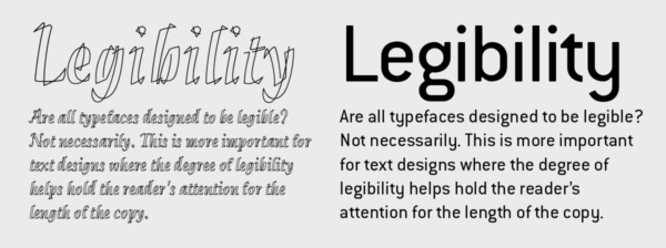
The typeface on the left, Klee, is inspired by the expressionistic work of artist Paul Klee, and can be used in small settings where legibility is not of primary importance. In comparison, the setting to its right set in ITC Conduit is extremely legible, and in fact can be used for both text and display settings.
Printing Method
When type is used for print, make sure to take into consideration the intended printing method and what effect it will have on the type, especially the thin strokes and counters. If reproduced with offset or digital printing with regular ink and no special effects, the results should be fairly true to the actual letterforms. But when using other printing methods, including letterpress, thermography, screen printing, embossing, or the use of metallic inks, the integrity of the letterforms might be affected, resulting in the thin strokes breaking up, counters filling in, or an other unexpected and unwanted outcome. In this case, do your research before making your typeface selections.

The surface upon which type is placed can have a major effect on how it appears: fabric can be a very coarse, porous surface for ink, while glass will absorb little or no ink, which just sits upon it and can bleed. Take this into consideration when selecting type for different surfaces, and allow for any properties that can affect its appearance when printed.
Print or Digital Usage
When selecting a typeface for print, take into consideration the kind of paper or surface it will be printing on. This is especially true when the desired typeface has extreme weight contrast with very thin strokes or serifs, or has small counters which run the risk of closing up. Different papers and surfaces receive ink differently, which can alter the appearance of the type, making it appear heavier or lighter, and in some cases, start to break it up entirely. For instance, newsprint and some textured papers are very porous and can make the type appear too light, while some coated papers and surfaces such as glass, plastic, and Mylar, don’t absorb ink well, resulting in type that can appear heavier than intended. Take all of these factors into consideration when choosing a typeface in order to assure the best possible outcome.

The digital outline of this M (left) has ink traps designed to absorb ink spread that can occur with newsprint. The image on its right is enlarged from 6 pt phonebook type, and is quite fuzzy and heavy.
Low-Resolution Environments
If the type is to be used in a low-resolution environment such as some computer monitors, projected images, and porous newsprint, be sure to do some testing and/or research in order to know how it will perform before making your final selection. Once again, you might want to avoid typefaces with very thin strokes, small counters, sharp curves, and extreme angles, any of which might not reproduce well at lower resolutions.

This is an example of how different types looks at both high and low resolution. Note the thin serifs of the upper setting are breaking up, reducing legibility, while the sturdy low-contrast font used below it is readable at both.
This article was last modified on June 29, 2021
This article was first published on February 6, 2019
Commenting is easier and faster when you're logged in!

Recommended for you
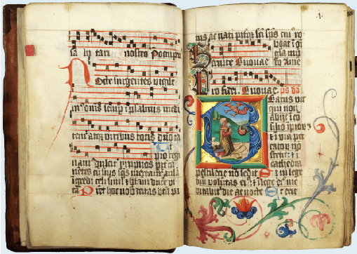
Illuminated Manuscripts with Decorated Initials
Illuminated manuscripts can be a wealth of inspiration even for modern designers...
TypeTalk: Type Classifications
Type classification is a system used to divide typefaces into categories. This i...
Breaking The Rules of Typography
By purposefully and intelligently breaking the rules of good typography, you can...