

Setting type in reverse (white or light-colored type on a dark background), is a design technique frequently used to help to establish hierarchy, create emphasis, or just to create a striking, dramatic effect.
Using this kind of styling does not come without its own risks, and often requires special considerations in the selection of the font and the background in order to maintain optimum readability. This is especially true with smaller type, which can be easily compromised by inappropriate choices that can degrade the type when reproduced for print or digital use: thin strokes or serifs can break up, small counters can fill in, and a busy background or weak color contrast can make it hard to read.
Here are several important factors that need to be taken into consideration when setting type in reverse:
Selecting a typeface
The choice of typeface is critical to an effective and readable reverse treatment. It should be something sturdy enough to hold up to the medium or method of reproduction. Avoid using type with ultra thin serifs or hairline strokes (as in high contrast designs such as many Modern and Bodoni designs), as these can break up or disappear totally when printed or converted to pixels.
In addition, take caution when using a very heavy typeface with small counters (the enclosed or partially enclosed negative spaces of a glyph, such as the interior of a lowercase e or a), as these can fill in, again reducing character recognition. Most sans serif designs are a safer choice, but serif designs with study serifs can be used with success.
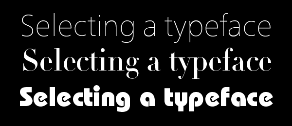
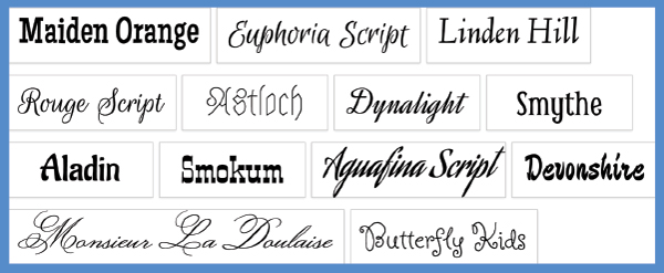
When choosing a font to reverse, stay away from those that are ultra thin, have hairline serifs, or have tiny counters that might fill in.
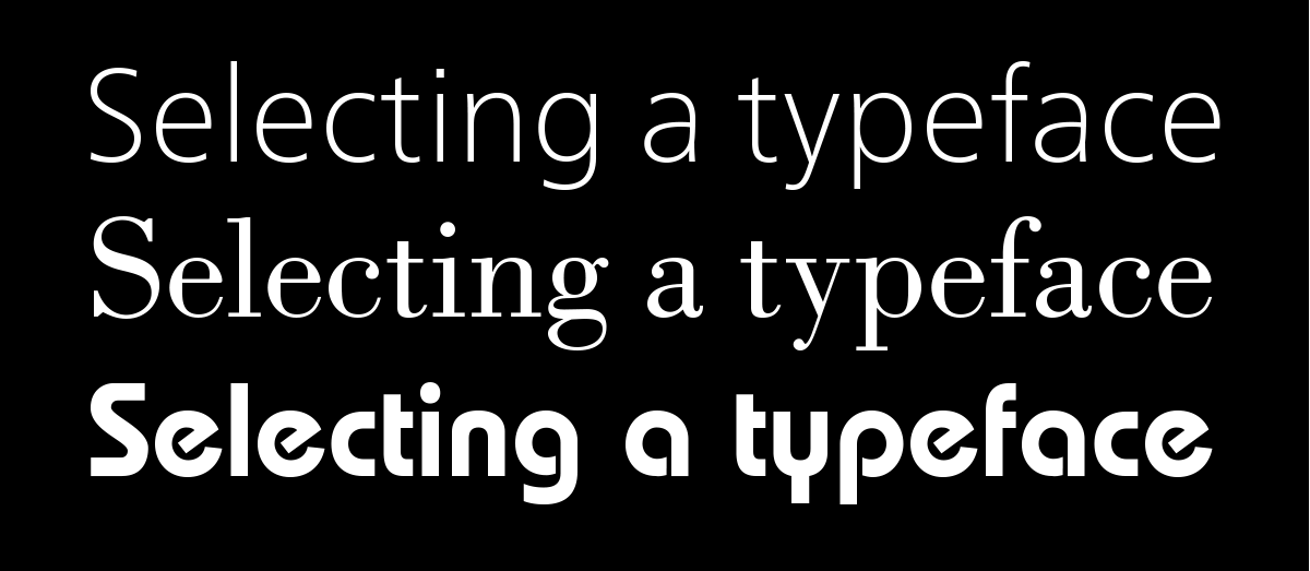
These fonts are a better choice than those above them.
Choosing a background color or image
When deciding on a background for the type, select a color or image that has an overall dark value (degree of lightness or darkness). Avoid type and background combinations that are close in value, as well as very bright or fluorescent colors that can distract the reader. If for digital use, check how your selected color will look on a broad range of devices, operating systems, apps, and any other variables.
When selecting an image for a background, the area behind the type should have an even degree of darkness, or value, so it doesn’t obliterate any of the small type. While reversing type out of a solid, dark background will result in a consistent appearance, an irregular or vibrant background can make the type harder to read. This is especially so when you reverse type out of a busy image or pattern, bright colors, or variable values. Type reversed out of a more uniform pattern and color range will give the best results. If the background needs to be created, drawn, or photographed, it makes sense to have a layout first with the relative type placement determined so that the location for the type placement can remain relatively dark.
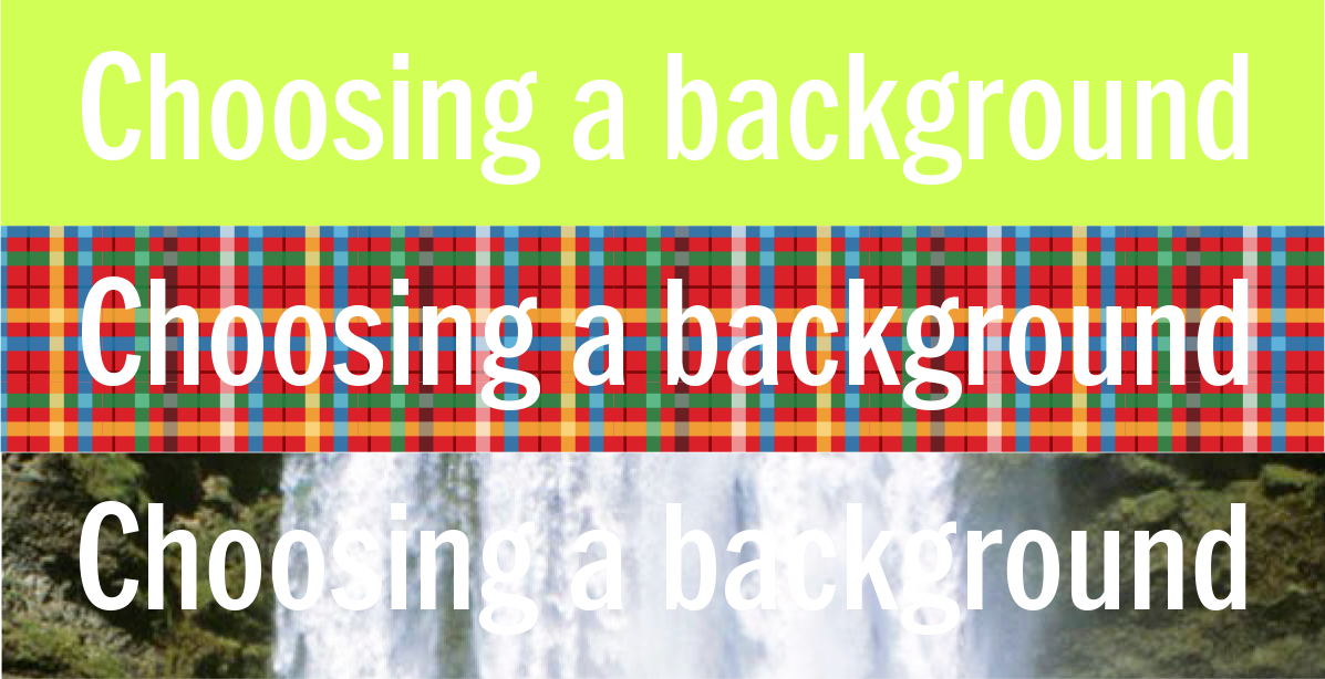
Stay away from background colors, patterns, or photographs that compromise readability.
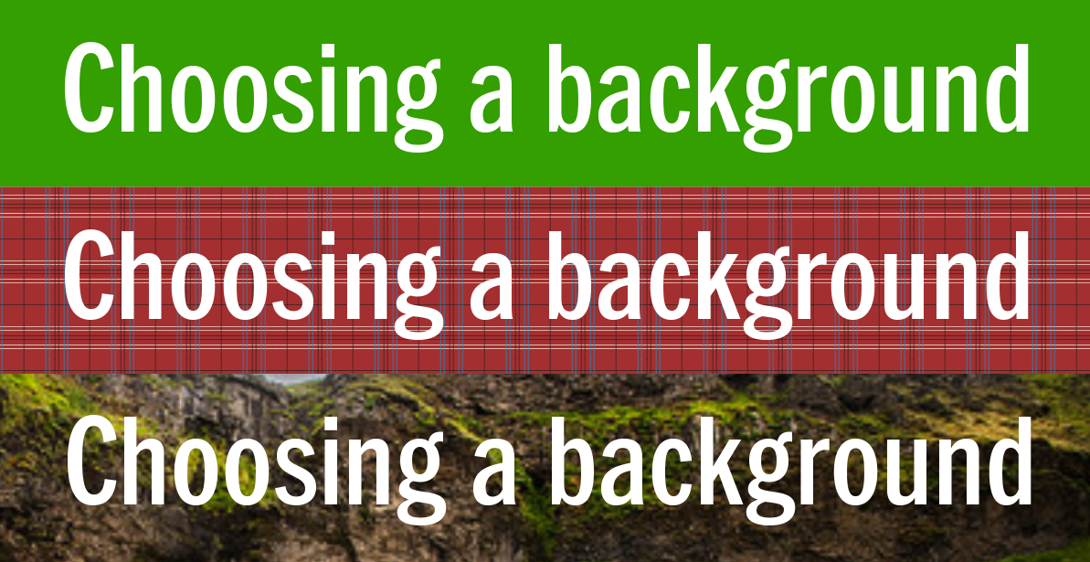
These are better choices as they have darker, and more consistent values than the previous examples.
Applying letterspacing
In general, light type on a dark background can look tighter than black type on white, or something similar. This is especially true with small text, which can appear too tightly spaced and dense when set in reverse. When this is the case, open up the tracking as necessary to achieve the optimum ‘color and texture’ for maximum readability.

When small type is set in reverse (middle), the letterspacing can look tighter than when set on a white or light background (upper). When that is the case, open up the tracking to compensate for this optical effect (lower). The bottom example was tracked +45.
Consider the medium
Last but not least, the appearance of type can be affected by the medium it is either applied to, or intended for. When reversing type for print, the printing surface (i.e. coated or uncoated paper, fabric, plastic or glass), and its overall density and porosity can make type heavier or lighter when the ink is applied. When used for digital devices and media, the pixelation of the type will also affect how it appears. This is less true with today’s high-resolution monitors and other devices, but not everyone has these. Therefore, it is critical that the designer knows in advance who their audience is and what range of devices they use.
* * * * *
All in all, reversing type is an important tool for any designer, but it must be done in a way that maintains a high level of readability and glyph recognition so as not to loose your readers’ interest.
This article was last modified on June 29, 2021
This article was first published on January 3, 2018
Commenting is easier and faster when you're logged in!

Recommended for you
Open Source Fonts
In the recent past I’ve written about Free Fonts – the pros and cons, the ins an...

Type How-To: A River Runs Through It
The principal goal of typography is to create text that’s easy and pleasant to r...

TypeTalk: Horizontal Alignment
TypeTalk is a regular blog on typography. Post your questions and comments by cl...