

Ringside is the latest typeface family from Hoefler&Co. Famous for creating long-lived typefaces that are marked by both high performance and high style, H&Co’s print, web, and mobile fonts help shape the communications of the world’s foremost publications, institutions, and brands. In 2009, the company became the first type foundry ever to be recognized by the National Design Awards at the White House, an honor it received again in 2011. H&Co typefaces are in the permanent collections of both the Smithsonian Institution and the Museum of Modern Art in New York.

Ringside is an expansive, stylish sans serif family that was designed not only for versatility, but also to avoid the blandness of many digital super-families. Instead of relying on homogenous shapes that can be predictably stretched in different directions, each version has customized design details intended to ensure that every style is visually distinctive. Ringside was a team effort by the designers at Hoe?er&Co. A three-year project, Ringside was led by H&Co. founder Jonathan Hoe?er, senior designer Sara Soskolne, and type designer Troy Leinster, and features additional contributions by Andy Clymer, Colin M. Ford and Jordan Bell.
Ringside includes 172 font styles, making it H&Co.’s largest family ever. The family comprises three different kinds of fonts. The multipurpose Ringside fonts designed for print, include 96 styles: six widths, each in eight weights, each in roman and italic. For the web, the companion Ringside ScreenSmart collection has been specially designed and engineered for the screen, with 60 styles comprised of six widths, each in ?ve weights, each in roman and italic. For business users, there is Ringside Office, which are four packages optimized for use in business applications like Microsoft Word, PowerPoint, and Excel.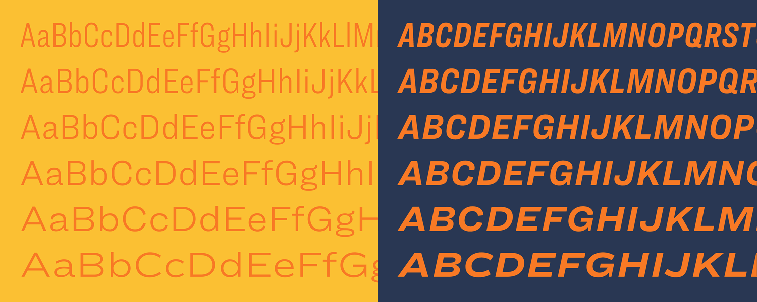


Twenty years ago, H&Co.’s Knockout collection was designed to celebrate the beauty and diversity of nineteenth-century sans serif wood types, one of America’s great contributions to type history. Picking up where this project left off, Ringside is a sans serif shaped by new challenges, new in?uences, and new ideas. Where Knockout was designed for headlines, Ringside is made for text. Its proportions, ?t, and details are designed to thrive at the smallest sizes, and each of its weights and widths includes that most essential quality of a dependable text face: a companion italic. Extended character sets that include tabular ?gures and fractions ensure that designers can use the fonts to express even the most complex information, as well as six parallel families of ScreenSmart webfonts ensure that Ringside performs ?awlessly on every kind of screen. 

What’s In A Name?
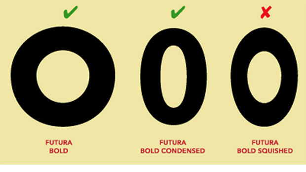
As mentioned earlier, the idea for Ringside grew out of the Knockout typeface, which in turn grew out of Champion Gothic, one of H&Co.’s ?rst typeface commissions designed for Sports Illustrated in 1990. Since Ringside has been steeped in this heritage, its family name pays tribute to the boxing ring. The various versions of Ringside echo one of the family’s core design strategies: in its more compact styles, Ringside’s round letters like O are racetrack-shaped, with ?at sides and curves at the top and bottom, but in the family’s wider widths, they become fully elliptical. Shapes with either kind of side can be called a ring.
Family Members
Ringside Narrow and Regular have the familiar visual rhythm of a text face. Both were designed with especially small sizes in mind, and include tabular ?gures that are carefully ?tted to avoid appearing overcrowded. Compared with the more compact widths, these styles of Ringside have rounder sides and more open gestures, making them exceptionally legible when set small, even with their heaviest weights.
Ringside Compressed and Condensed, the family’s two most compact widths, are designed for environments where space is truly at a premium. Ringside Compressed is a good candidate whenever content includes long numbers, such as ?nancial statements, catalogs, technical notes, directories, or annual reports. Its next wider cousin, Ringside Condensed, is a reliable choice for data that includes large numbers of columns, such as weather, sports, or ?nancial statistics.
Wide typefaces don’t customarily have tabular ?gures, but Ringside Wide and Extra Wide include them for use in tables with lots of short numbers, such as menus, price lists, tables of contents, or way?nding signage. Typefaces with wide proportions can give prominence to short numbers that are easily overlooked, and help avoid the need to enlarge the text size. And the inclusion of scienti?c characters, such as superiors, inferiors, and mathematical operators, makes Ringside a reliable choice for presenting dimensions.

Ringside was designed not only for versatility but to avoid the bland plasticity of many digital superfamilies.


* * * * *
All in all, Ringside is worthy of serious consideration when a stylish, sans serif superfamily is desired for print, web, or mobile devices.
This article was last modified on January 16, 2023
This article was first published on March 1, 2017
Commenting is easier and faster when you're logged in!

Recommended for you
Morisawa Font Library Now Available Outside Japan
Morisawa, one of the most prestigious type foundries in Japan, first made its fo...

Drop Cap Tips: Kerning and Sizing
InDesign can make decent-looking drop caps at the push of a button, but I always...
TypeTalk: Why Distorting Type Is a Crime
Ilene Strizver explains why not to distort type and what to do instead.