

Slab serifs are hot! Also referred to as square serif or Egyptian, slabs are enjoying a lengthy renaissance, and as such are currently a very popular and still useful category of typestyles. These sturdy, full-bodied designs, with their thick, squared off, slab-like serifs, can be seen anywhere from magazines, newspapers and book covers to posters, logos, packaging and branding, web sites, and much more. They command attention and project strength, confidence and conviction.
Most slab serifs exhibit extreme legibility, making them excellent choices for both print and digital environments in both high and low resolution. While the older, traditional slabs didn’t come with italics and were intended for display usage, many that have followed contain more features, and are useful for both text and display, especially the lighter weights.
Many designers tend to fall back on Clarendon, which has become the gold standard of slabs. But there are many more to choose, all with differing design details, personalities, and features – from traditional slabs to the geometrics that followed, to more modern interpretations. For this reason, choosing the right slab can be a bit daunting. Narrow it down by considering these questions:
- Style: traditional or modern? Geometric, rectangular, or humanist?
- Will it be used for text and/or display? Is it legible at required sizes?
- Are italics needed? If so, are true italics or obliques preferred?
- Does the family have all the weights and versions needed?
- What about condensed, extra condensed, compressed or extended versions?
- Does it have the figure styles required? What about small caps?
- One or two-story a and g?
- Is it appropriate for the required medium: print, web or other digital usage?
I explored many slab designs and have selected eighteen as standouts for their design, range of weights, features (such as small caps and multiple figures styles), and overall versatility. The list begins with the all-time classic slab Clarendon, and continues in alphabetical order. Small caps, when available, are used in the typeface name.
Clarendon URW was designed by Robert Besley in 1845 for the Fann Street Foundry in London, England, and Clarendon has had many revival versions in the years since. Although originally designed for display with no italics, most Clarendon revivals have an expanded set of weights, versions, and in some cases, additional characters. Many foundries have developed their own version of Clarendon. This particular version was reworked by Hermann Eidenbenz and Eduard Hoffmann in 1953, and has the largest range of versions. Clarendon is a timeless design that is still relevant today.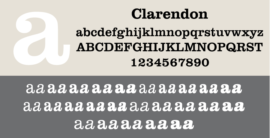
Adelle is a slab serif typeface designed by Veronika Burian and José Scaglione. It was conceived specifically for intensive editorial use in newspapers and magazines, but its personality and flexibility make it a real multiple-purpose typeface. While very legible when used for text, its energetic character becomes evident when used for larger settings such as subheadings and headlines. Adelle Sans is its sans companion.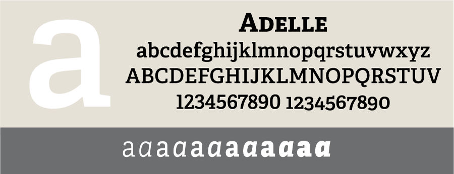
Amasis designed by Ron Carpenter is a slab serif design with a humanist influence. Its renaissance structure and subtle stroke variation serve to create a typeface that is useful at a large range of sizes as well as in low-resolution environments. Its almost industrial look retains a delicate elegance: a combination that is quite difficult to accomplish.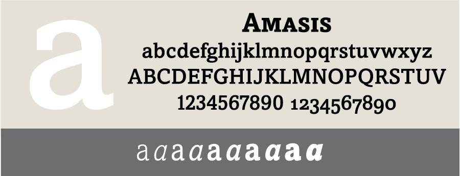
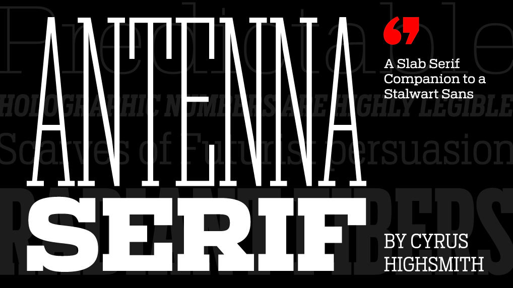
Antenna Serif is Cyrus Highsmith’s counterpart to Antenna, adding clear-cut slabs to squared-off curves. The typeface’s athletic build lends itself to newspaper, magazine, and web usage. With its 56 styles – seven weights in four widths, each with italics – Antenna Serif is it a versatile performer for both strong heads and vigorous bodies.
Archer was originally designed for Martha Stewart Living magazine, but developed a strong following when it was made commercially available. It was designed by Hoefler&Co. to be hard-working yet warm and friendly, straightforward yet attractive. While the original 16 versions create a lovely and very legible texture for text, the recent addition of six heavyweight versions allows Archer to have a more boisterous voice when needed.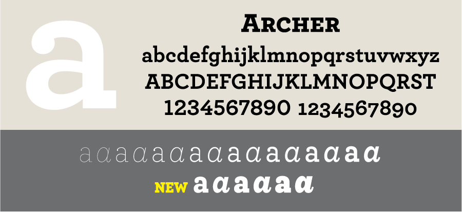
PMN Caecilia designed by Peter Matthias Noordzij is a slab serif with large counters, subtle changes in line thickness, and a taller than usual x-height. Designed to represent the writing of a broad-nibbed pen, PMN Caecilia has curved, angled, and vertical strokes. Because the lines of this typeface follow writing patterns rather than shapes, it is considered by many to be easier to read. The Amazon Kindle uses the PMN Caecilia font family as a standard.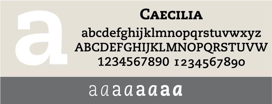
DIN Next Slab was designed as a companion to DIN Next. Its character shapes remain simple and counters open, ensuring high levels of legibility. The light and medium weights perform remarkably well in continuous text, while the heavier designs are commanding at large sizes with no decrease in character legibility.

Egyptian Slate is a strong, stylish slab designed by Rod McDonald as a companion to his humanist Slate typeface. From a svelte light to a commanding black, this versatile, assertive type family works well in a variety of environments.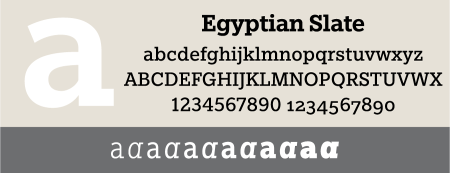
Enclave was designed by James Montalbano of Terminal Design to shake off the 19th century Egyptian characteristics that have limited the range and appeal of traditional slab serifs. This distinctive design is highly readable as text, and its large range of weights with lively italics make it a perfect choice for editorial and corporate design.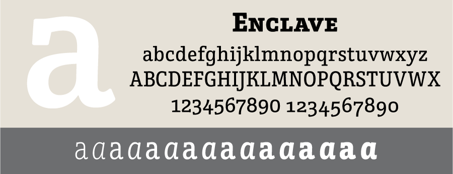
Foro was designed by Dieter Hofrichter to have an appealing flow, warmth, and less harshness than many other slabs. Its humanistic shapes and proportions render it excellent for text, and its clear and distinct details are an advantage in display sizes. It is a companion to Foro Rounded.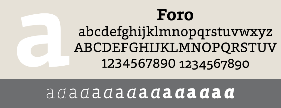
Heron Serif, with its regular and condensed versions, is a refined, versatile family capable of working well in both headlines and small text. Heron Serif, as well as its companion Heron Sans, are both born of hard iron and steel, but galvanized with Font Bureau designer Cyrus Highsmith’s warmth and energy.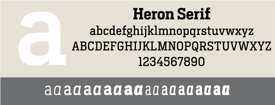
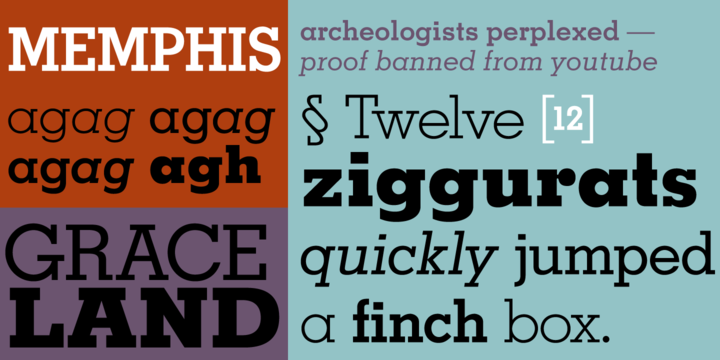
Memphis is a geometric slab serif family designed by Rudolph Wolf in 1929, and was one of the most popular display fonts of its time. Named after the ancient Egyptian capital of Memphis and often referred to as “Futura with serifs,” this family was one of the first revivals of the original slab, or Egyptian style.
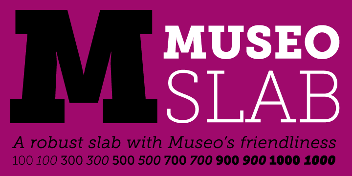
Museo Slab is a modern take on the traditional slab: stylish, robust, and very legible. Designed by Jos Buivenga, the Museo Slab font family is a warm, contemporary design designed as a companion to the friendly and quirky Museo, and Museo Sans.
Neutraface Slab is House Industry’s followup to their monster workhorse, Neutraface. Neutraface Slab features five display weights, four text weights with italics, plus a unique stencil style. The complementary display weights can make a statement that ranges from thin and delicate to bold and bombastic.
Rockwell is a very American geometric slab serif slab serif typeface that was originally modeled after a 1910 font called Litho Antique. Revived by Morris Fuller Benton in the 1920s, the typeface was reworked and published in 1934 by Monotype. This sturdy design is suitable for anything from light print design to very bold type.

Salvo Serif was initially designed by Font Bureau’s Cyrus Highsmith for several AARP publications to be “hopeful, informative, alive, embracing and delightful” as expressed by their art director. Its 30 styles including Regular, Condensed and Extra Condensed versions, make Salvo Serif extremely versatile. The Salvo superfamily includes Salvo Sans.
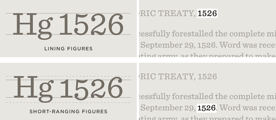
Sentinel was designed to address the many shortcomings of the classical slab serif. This fresh take offers a complete family that’s serviceable for both text and display. Planned from the outset by Hoefler&Co. to flourish in small sizes as well as large, Sentinel contains features like short-ranging figures that make it a dependable choice for text, as well as a full range of italics.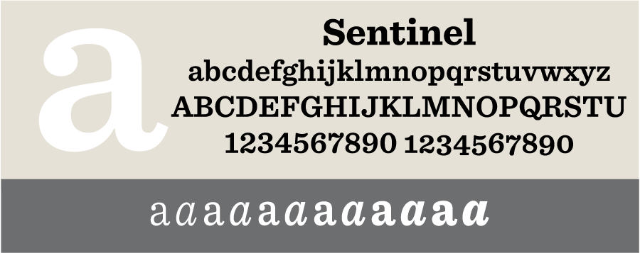
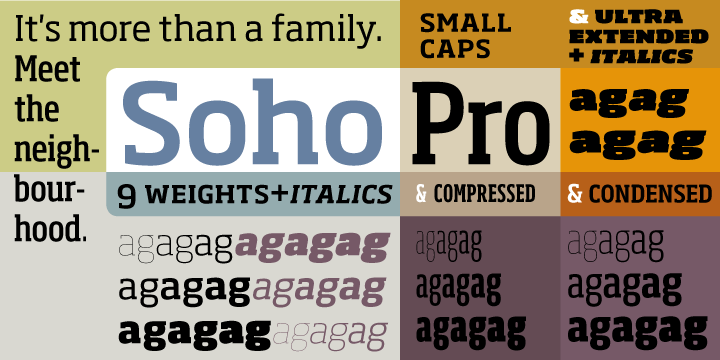
Soho was designed by Sebastian Lester to work well in the most technically demanding of corporate and publishing environments. Its unique rectangular skeletal structure sets it apart from other slabs, and its range of weight gives designers endless possibilities whether for corporate identity, product branding, text or display use. Soho Gothic is its companion sans.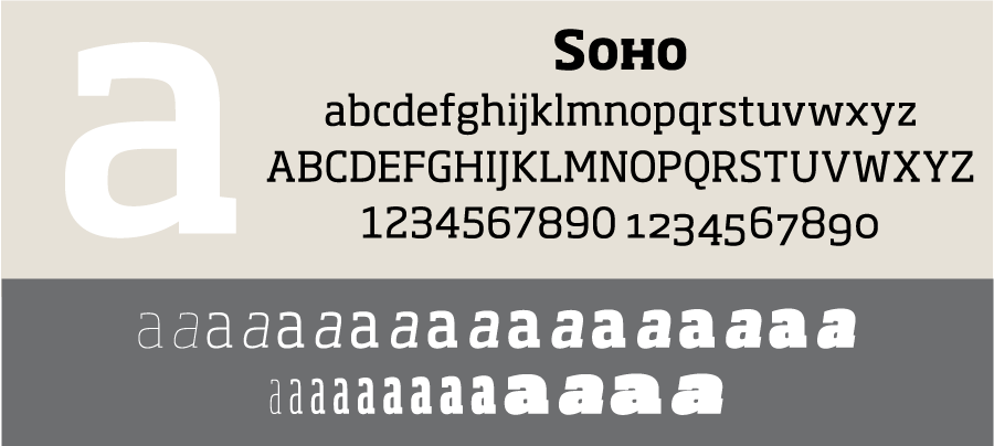
* * * * *
These are some additional slab serifs worth consideration (including some mentioned in the comments):
Bodoni Egyptian
Geometric Slabserif
Giza
Lexia
ITC Lubalin Graph
Nexa Rust Slab
Neue Aachen
Sánchez
Serifa
Silica
Did we miss your favorites? Let us know in the comments.
This article was last modified on October 21, 2015
This article was first published on October 21, 2015
Commenting is easier and faster when you're logged in!

Recommended for you
Over 400 Free Commercial Use Fonts
Press Release MacAppware, a division of 128bit Technologies, has announced its F...
Inkwell: a Type Family for Expressive Writing
A very striking and unusual typeface family recently caught my eye: Inkwell. Thi...
Hermann Zapf, ITC & Apple: The History of ITC Zapf Chancery & ITC Zapf Dingbats
On June 4th 2015 we lost one of the great ones. I’m speaking of Hermann Zapf, th...