

There are some terms in typography that are frequently confused with each other because they are related in meaning—but still different. Legibility and readability are two such terms. These terms are important for designers to know, as they contribute to the language we use to talk about fonts, typesetting, and design. Legibility and readability both relate to the ease and clarity with which you read any particular setting of type, but they actually refer to two different concepts. Legibility is related to the design of the typeface and the shape of the glyphs, while readability refers to how the font is arranged, or typeset. Both are particularly important when setting text or any smaller type sizes.
Legibility
The legibility of a typeface is a product of its design and relates to the ability to distinguish one glyph from another when reading. Factors contributing to a typeface’s legibility include the following:
x-height: This term refers to the height of the lowercase x from its baseline. The taller the x-height, the more legible the typeface tends to be.

Figure 1. Both text blocks are set in 18 point, but the one set in Enclave (right) is more legible, primarily due to its taller x-height, than the one set in ITC Golden Type (left), with its short x-height.
Character width: The easiest type designs to read are those that have an ‘average’ overall width. Very condensed as well as extended designs are less legible, especially for smaller settings such as text, subheads, and credits.

Figure 2. When comparing text set in ClearviewText Book Compressed (left) with text set in ClearviewText Book (right), you can see that the version on the right has a greater degree of legibility than the very narrow version to its left.
Weight: Extremely light and extremely heavy weights are more difficult to read, so if legibility is your goal, stick to something in the middle. Book weights (also called regular weights) are so named because their legibility means they are most often used to typeset books for that very reason.

Figure 3. Neither ClearviewText Extra Thin (left) nor ClearviewText Black (right) have the same high degree of legibility for lengthy text that the Book weight on the right side of Figure 2 has. Save these weights for shorter settings and when maximum legibility is not a requirement.
Design traits: The overall shapes and design traits of a typeface, if too quirky or fussy, will reduce legibility. While this might be acceptable for shorter display settings, stick to simpler typeface designs for lengthy text settings.
Stroke contrast: Extreme stroke contrast (that is, the ratio of thick to thin strokes) can reduce legibility as well. This is especially true of modern designs such as Bodoni and Didot, whose thin strokes can appear so thin when reproduced in print or on the web that they can become challenging to read when used too small, at lower resolutions, or for lots of text.
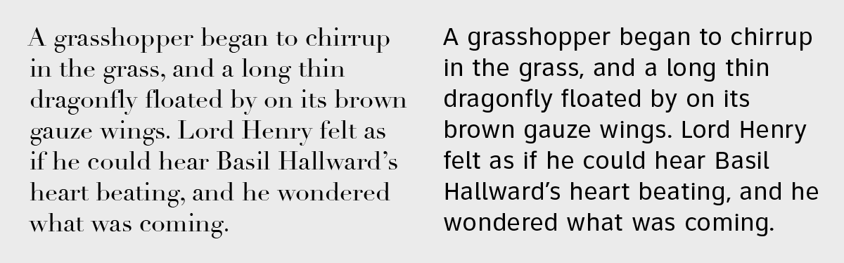
Figure 4. The extreme stroke contrast of Didot (left) can make it harder to read for small settings, as compared to ClearviewText Book (right).
Counters: The smaller the counters (enclosed or semi-enclosed negative shapes) of a typeface, the more challenging it can be to read. This is a factor when using very heavy weights, and it’s made even worse in smaller settings. Avoid this by knowing ahead of time how a particular typeface looks at the intended size and medium.
Figure 5. Aachen Black has very small counters and should be saved for larger display settings. The upper example looks fine, but the lower setting loses its legibility as the counters start to get smaller, and in some environments will appear to fill in.
Serifs or lack thereof: While serifs are generally believed to enhance legibility, this is not always the case. All of the above factors contribute more to legibility than serifs: a sans serif design with neutral features can be more legible than some serif typefaces. In addition, many professionals believe that what you read most, you read best. Therefore, in the U.S., where running text in books, magazines, and newspapers is typically typeset using serif text fonts, readers are most comfortable and familiar with them and therefore find them more legible. By contrast, sans serif fonts may appear more legible to audiences in countries where they are more commonly used.
Keep in mind that not all typefaces are designed to be legible. This is more of a consideration for text designs, where the degree of legibility relates directly to holding the reader’s attention for the length of the copy. Display designs are generally used for fewer words in larger sizes, where the objective is to attract a reader’s eye and to convey a mood, feeling, or message. In this case, legibility might not be of primary consideration.
Readability
Readability is related to how the type is arranged (or typeset) and therefore is controlled by the designer. Factors affecting type’s readability include:
Type size: When setting text, the smaller the size, the more challenging it can be to read. This is especially true for seniors, children, and those with visual impairments. For these reasons, the demographics of your intended audience should be taken into consideration when deciding on a size for text.
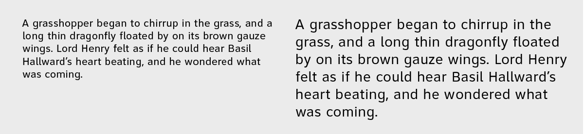
Figure 6. The smaller type on the left is harder to read than the larger type on the right.
Type case: All cap settings for lengthy text are more challenging to read due to the lack of ascenders and descenders. These contribute to character recognition, so stick to upper and lowercase when readability is of prime importance.

Figure 7. The all cap text on the left is more challenging to read.
Line spacing (aka leading): Tight line spacing impacts readability negatively. The amount of line spacing needed to improve readability will depend on the size and design of a typeface, as well as its x-height. Therefore, when ease of reading is of high importance, make sure there is enough line spacing to maximize readability, which in general is at least two to three points for print, and a bit more for smaller digital devices.
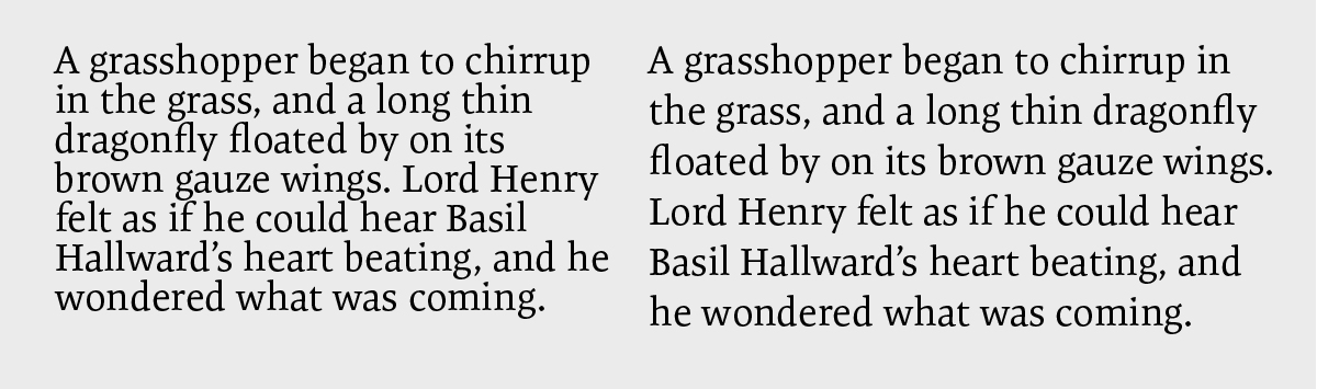
Figure 8. Tight line spacing reduces readability, as you can clearly see in this setting of Expo Serif set in 18/18 point (left) and 18/23 point (right).
Line length: When the line length (or column width) is too short, it can result in hyphenated words, which reduce readability. In addition, the eyes have to make many ‘returns’ that can cause fatigue and reduce comprehension. On the other hand, very long lines can cause confusion when shifting from the end of one line to the beginning of another. For best readability, stick to ‘average’ line length, which is usually between 45 and 70 characters.
Color, or contrast: Make sure there is enough color contrast between the type and its background. This is important when you are using black and white (and tints of the former) as well as color. When styling type for digital usage, be sure to allow for variation from one device, platform, and settings to another, as they can vary dramatically in how they display color and contrast.
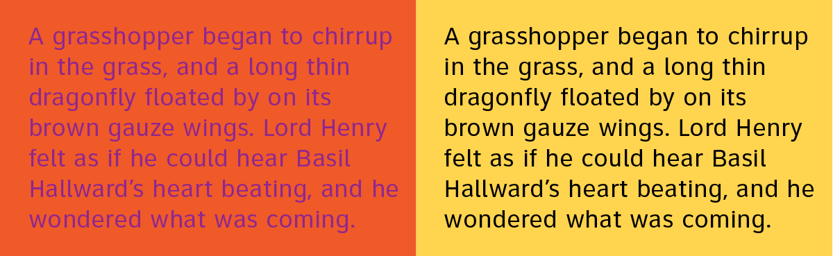
Figure 9. The high contrast between the type and the background on the right ensures good readability.
Since these readability factors are chosen by the designer, not inherent to the text, even very legible fonts may lack readability when set in certain ways. In addition, not all factors affecting readability are equally significant. For example, although generally speaking, smaller type size is harder to read, you may be able to improve a font’s readability by setting it slightly smaller, but with wider line spacing.

Figure 10. A legible typeface such as ITC Flora can sacrifice readability when set with tight line spacing (18/18 point, on the left), while its readability improves dramatically when set smaller, but with more line spacing (16/24 point, on the right).
This article was last modified on October 20, 2021
This article was first published on April 25, 2018
Commenting is easier and faster when you're logged in!

Recommended for you
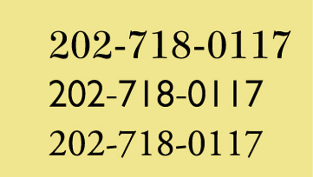
TypeTalk: Setting Phone Numbers
TypeTalk is a regular blog on typography. Post your questions and comments by cl...

Scanning Around With Gene: Dymo-Mite! The Art of Labeling
I’m on a new (and what I hope will be final) kick in a lifetime of efforts...
InDesign Type: Choosing the Right Leading
By understanding and applying a few key principles, you can determine the proper...