

Word spacing is one of those typographic details that we often take for granted. That is, most people think that the default word spacing of any given font is fine, due to the fact that it was determined by the type designer. But this is not always the case. Whether for text or display settings, there are some instances where you can improve word spacing with some manual intervention.
Word Spacing for Text Type
The word spacing for text settings is important because it affects readability. Appropriate spacing should not be so small that the words start to run into each other. Nor should it be so large that the text is sprinkled with oversized spaces between words, which can be distracting (even unconsciously) and interrupt the rhythm of reading. A good rule of thumb for word spacing for text settings is that it should approximate the width of the lowercase n or o of each particular font. This is because word spacing should be in proportion to the overall width of any given type design. That is, the word spacing of a condensed typeface should be narrower, while the word spacing of an expanded design should be wider.
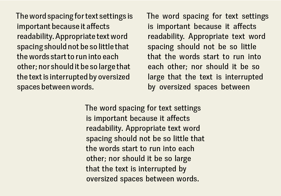
Word spacing should neither be so narrow that the words start to run into each other (upper left), nor so large that it interrupts readability (upper right). The third setting (lower) is the most balanced and readable.
While it is true that the word spacing of a typeface is a predetermined value for each font (and differs from font to font), you can modify it in most design software. Why would you need to do this? Some commercial fonts have too much space between words, which can lead to visual hesitations that reduce readability. When this is the case, you can set the word space to around 80 to 85 percent, or whatever value improves the overall color, texture and readability.
NOTE: There is never a need for double spaces between sentences when setting type on your computer, as was standard in typewriter days. In fact, it is a serious type crime in professional typography.
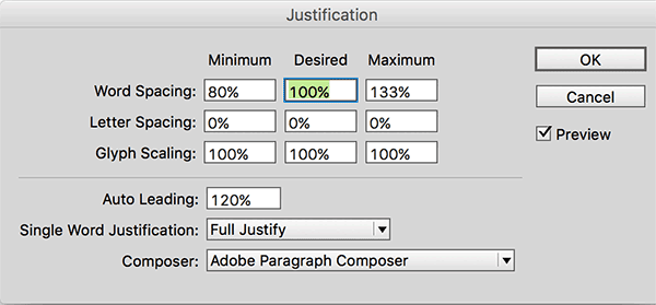
You can change the word spacing of any text (not just justified text) via InDesign’s Justification dialog box by adjusting the Desired Word Spacing value.
Adjusting Word Spacing in InDesign
The ability to change the word spacing of any selected text is a somewhat hidden yet useful feature of most design software. Although this is done via the so-called Justification settings, you can actually use it to adjust the word spacing of text with any alignment. Here’s how you do it in InDesign:
- With your cursor in the text you want to change, choose Type > Paragraph. Then, from the panel menu in the top right corner, choose Justification. Alternatively, press Command+Shift+Option+J (Mac) or Ctrl+Shift+Alt+J (Windows).
- Enter a value in the Word Spacing row in the middle field labeled “Desired.” The value will be a percentage of the normal, or built-in, value of the selected font. The Desired value must be between the Minimum and Maximum values, so adjust these as necessary even though it will have no effect on non-justified text.
You can also edit the Justification options in a paragraph style so you have consistent word spacing everywhere that style is used. To do this, choose Paragraph Style from the Type menu, then double click on the Basic Paragraph style to see the Paragraph Style Options dialog box. Repeat the instructions above to set your desired value.
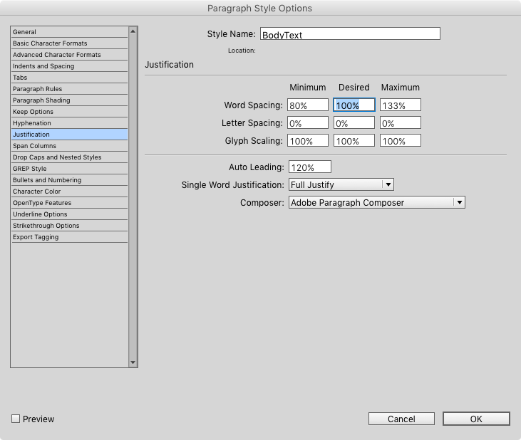
Adjust word spacing in InDesign’s Paragraph Style Options dialog box.
Bonus tip: Whenever you edit word spacing, be sure to select the Preview checkbox, so you can see the effects of what you’re doing immediately. This will save you repeated trips back to the dialog box to tweak the values.
Word Spacing for Headline Type
As type gets larger, the space between words appears more open, even though the actual ratio remains the same. Therefore, the word spacing for headline or display type should be slightly less than what you’d use for text. This is especially true when using a typeface that is intended for text settings for larger sizes. In addition, the word spacing for headlines and other large settings can frequently look uneven due to the differing shapes of the characters surrounding the space.
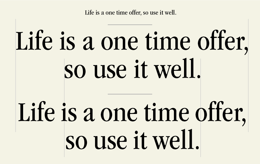
When a text typeface (upper) is used to set display sizes, the word spaces can appear too large (middle). The appearance is improved, albeit subtly, by reducing the word spacing to 85% via the Justification settings (lower). Set in ITC Garamond Narrow.

The word spacing in this headline (upper) is inconsistent because of the larger volume of white space around the A and T, and the F and T. It is easily improved (lower) by reducing these word spaces to make them visually consistent with the other word spaces via the kerning feature of your software.
The most precise way to adjust the word spacing in display type is to use the kerning feature. (Yes, you can kern a space to a character and vice versa!) This way you can customize each space depending on the characters surrounding it.
For InDesign users, there are keyboard shortcuts to adjust local word spacing quickly and easily:
- Select the text or headline you want to adjust.
- Press Command+Option+Delete (Mac) or Ctrl+Alt+Backspace (Windows) to decrease word spacing by 20/1000 of an em.
- Press Ctrl+Command+Option+\ (Mac) or Ctrl+Alt+\ (Windows) to increase word spacing by 20/1000 of an em.
- Add the Shift key to these shortcuts to increase/decrease word spacing by 5x more (100/1000 of an em).
Note that these shortcuts change all the word spacing of the selected text evenly, so for best results you might still need to go back and fine-tune your display type with a little kerning.
This article was last modified on January 20, 2022
This article was first published on December 16, 2015
Commenting is easier and faster when you're logged in!

Recommended for you

Download Second dot-font Book for Free
From digital to print to digital again—that’s the path John D. Berry...

Free Photo-lettering App from House Industries
House Industries is known for producing high-quality typefaces and artwork, as w...

Fontology Offers the Tools for Learning Typography
Whether you’re an experiened pro or just getting started learning the ins...