
How to Get Started with Accessible Design
Learning how to meet accessibility requirements can make you a better designer.


This article appears in Issue 24 of CreativePro Magazine.
Picture this scenario. You develop a beautiful brand, spending months on the project. You collect target audience information, you painstakingly lead the client to understand their brand story, and you develop a brand guidelines document, complete with primary and secondary color swatches. You get your first project using the new branding: the annual report. And just as you get stoked to start, the client says, “By the way, the annual report needs to be accessible.” Record scratch. Um, excuse me? What does that even mean? Before you know it, you find out the colors you’ve selected for your beautiful brand don’t pass accessibility standards for people with disabilities. Now what? Before you run away, hear me out. Accessibility is fun! You’re probably already doing the legwork, and all you need to start designing something accessible is a little bit of knowledge about my favorite part of the process: getting InDesign (or Word, mostly) to do the work for you. You’re reading this magazine, so you have at least a tiny bit of interest in how to get design programs to work for you. If you have that perfect balance of brilliant and lazy, I have great news! InDesign can give you a PDF document that passes, at minimum, the Adobe Acrobat accessibility checker. But we’ll get to all that. First, a few more words of encouragement. When you’re first thinking about designing with accessibility, don’t get bogged down in the specifics. Stop making accessibility so complicated! It’s not. Can someone read your yellow curly script font on a white background? It doesn’t take a certified accessibility consultant to say “no.” All you need is empathy, awareness, and common sense. Master the concepts, and you’ll breeze through the standards. Before we look at InDesign’s features for digital document accessibility, let’s
start with the basic concepts: what accessibility is, why your client or employer is (or should be) asking for it, and easy (I promise) ways you can tweak your workflow to deliver accessible documents.
What Accessibility Actually Is
For printed and electronic documents, accessibility is ensuring that the greatest number of people can access your content, even if they can’t read the words or see the images and design. That can seem like a tall ask—so tall that designers tend to get scared of the concept and ignore it. That’s a shame, really. We can do so much to improve experiences for so many people. Accessibility also makes your designs better. Take the standards for color contrast: If you use the wrong two colors for text and its background, people with low vision—whether it’s a permanent loss from aging or the temporary effects of the sun glaring on their phone screen—won’t be able to see your work. Color contrast is not only a box to check to pass an accessibility test (or a legal obligation; see the sidebar “Americans with Disabilities Act and Section 508”), it’s also a key, foundational premise of good design—and we all should be pursuing it anyway. But making your digital documents accessible means creating good, accessible design plus using your design tools efficiently. I got started in accessibility because I was a new hire. (I was full of energy and ready to say “Yes!” to everything.) That got me going. But I kept going because accessibility is fun. It’s fun to master your design software and make it work for you. It’s fun to learn new shortcuts and workflow strategies. And it’s fun to share that knowledge with others as insider tips. (Stay tuned!) It certainly doesn’t hurt that accessibility provides an objective reason to advise clients against their favorite low-contrast color combinations. (Have you ever had a client who really loves terrible color combinations? A big fan of bright green on bright blue? Accessibility standards can come to your rescue.)
Key Considerations and When They Matter Most
I’ve intentionally mentioned digital document accessibility a few times so far. That’s because it’s important to distinguish that there are a variety of use cases for accessibility. For example, the font size you use for a digital document doesn’t really matter, because people with visual impairments can zoom in on screens to make the text as large as they need to, or the size of the text is irrelevant for those using screen readers to read the text aloud (Figure 1).
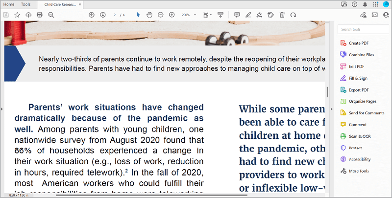
Figure 1. The caption of the photo in the layout shown is set to 9 point. Users can zoom in if needed to read the text at a larger size. Here, the PDF is zoomed in 200%.
Two standards
The key concepts come from two sets of internationally recognized accessibility standards, WCAG (Web Content Accessibility Guidelines) and PDF/UA (Universal Accessibility). Each country determines which standards to follow, and many (including the United States) adopt the recommendations made within these two standard sets. WCAG primarily addresses websites and mobile applications, while PDF/UA addresses PDFs. But, as we’ve seen before, some overlaps exist in how both standards address:
- Color contrast: Text elements on a color background must meet or exceed specific contrast ratios based on the luminescence values of the two colors. Many tools are available for designers to ensure that color combinations meet this standard.
- Logical heading levels: Text elements must flow in a logical order. For example, your level one heading, referred to as H1 in accessibility, should be the title of the document. H2 should come next, followed by H3, and so on. Think of your heading levels as an outline for how to navigate your content—that’s exactly what a screen reader will do as your document is converted to the spoken word for a user with visual impairments.
- Alternative text: All non-text content that aids in the understanding of the content must include alternative text (alt text).
- Artifacting: If you have decorative visuals that are not needed to understand the content, then you need to artifact them. In other words, you need to hide the content from assistive technology so users can more efficiently navigate the document without getting bogged down in visual fluff.
- Labeling form fields: Fillable forms, whether online or in a PDF, will need special attention to function correctly with assistive technology. For more about accessibility and interactive PDFs, check out Chad Chelius’s “Creating Accessible PDF Forms.”
Accessibility Workflow: What to Address, When
Ideally, when you create an accessible digital document, you will want it to be a PDF. You could provide a Word (DOCX) or PowerPoint (PPTX) document, of course, but they are not nearly as accessible—and end users could edit your content. When you’re looking for the best tool out there to generate an accessible digital document, look no further than our favorite tool: InDesign.
Start with color contrast and tables
The first accessibility concept to review on a project is the color contrast of the palette you are using. This is among the hardest issues to fix (or remediate, as we say in the world of accessibility) after a project has been finalized. You’ll notice how many brands don’t incorporate accessibility, particularly color contrast, into their branding. But you can guide them after the fact. For example, if a client’s brand calls for the main colors to be bright green and bright blue, you can remediate by adjusting the tints and shades of the colors to create usable variations of the branding colors. You can use several tools for testing color contrast, but the one I’ve found most useful is the Colour Contrast Analyser (Figure 2), available free for macOS and Windows from TPGi, an accessibility consulting firm.
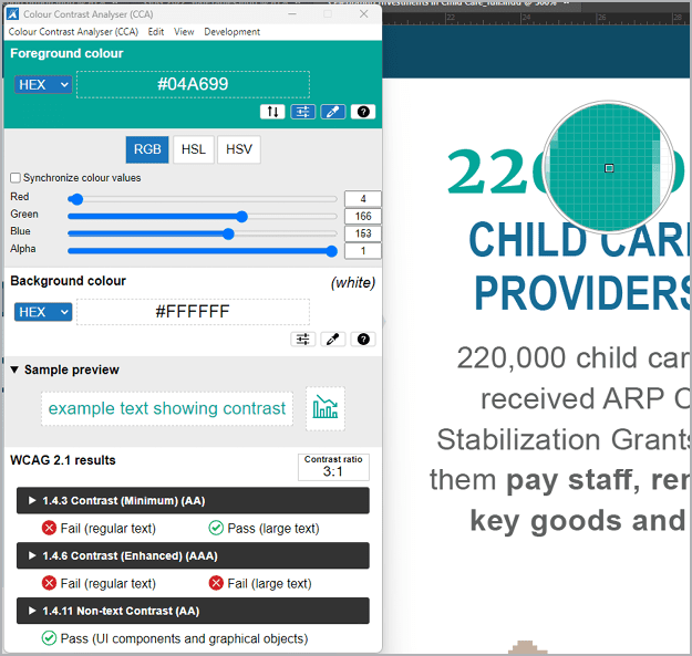
Figure 2. The Colour Contrast Analyser allows you to sample any colors on screen to test for color contrast ratio requirements. It lets you know whether your foreground and background colors have enough contrast to pass muster.
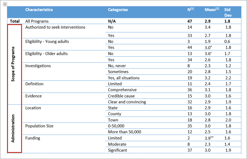
Figure 3. This table has row headers than span multiple rows, making it an irregular table.
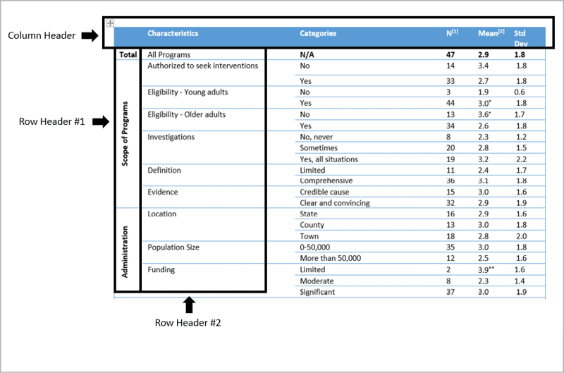
Figure 4. A better alternative would be separate tables for each of the main row headers from Row Header #1: Total, Scope of Programs, and Administration.
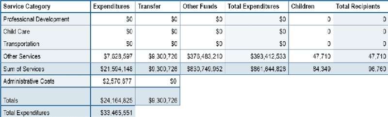
Figure 5. As designed, this table would be considered irregular, because it isn’t rectangular or square. You can turn this into a rectangular table, preserving the design while making the table accessible for screen readers by making sure each cell is structured for accessibility.
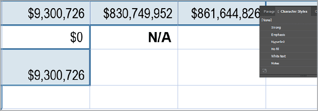
Figure 6. Each cell aligns with a row and a column. There are no merged cells. To make a cell blank, type not applicable …
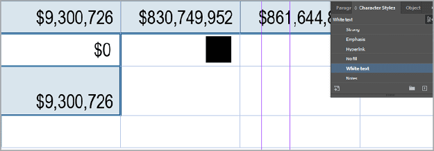
Figure 7. … then apply a character style (White text) to hide the text from sighted users.
Before you export
Have you ever had the pleasure of receiving an Illustrator logo file from your client, thinking “Yes! They had a vector file!” And then opening it to find a TIFF or another raster format image file on the artboard instead? If you’ve experienced this frustration as a designer, you can have a sense of what individuals using screen readers and assistive technology experience when they open a PDF and find it contains no tags. For people who need assistive technology, it’s functionally a blank document. Tags are the foundational information needed to make a document accessible. Without tags, screen readers and assistive technology cannot perceive the content, let alone speak out the text hierarchy (H1, H2, etc.). The text hierarchy makes up what we refer to as the tag tree. As a designer, you have the superpower of being in almost complete control of the tag tree. And you’re probably already doing the hard part! This is so easy that it gives me a rash to see PDFs without tags. A few clicks are all it takes! To create an accessible digital document, you need to use paragraph styles consistently throughout the document. This allows InDesign and Acrobat to work together to map the styles from InDesign to the correct tags in Acrobat. You can easily see where you have manual overrides in your document by turning on the overrides highlighter in the Character Styles or Paragraph Styles panels (Figure 8). Click the [a+] icon and—voilà! All the manually formatted text within your document is highlighted.
![Figure 8. Highlight manually formatted text in your document by clicking the [a+] icon in the Paragraph Style or Character Style panels. The headline starting with “Searching for Care ...” is highlighted, indicating a paragraph style needs to be applied. Select the manually formatted text and click the + button in the Paragraph Styles panel to create and apply a new style.](https://creativepro.com/wp-content/uploads/2023/09/Figure-8_800-fs8.png)
Figure 8. Highlight manually formatted text in your document by clicking the [a+] icon in the Paragraph Style or Character Style panels. The headline starting with “Searching for Care …” is highlighted, indicating a paragraph style needs to be applied. Select the manually formatted text and click the + button in the Paragraph Styles panel to create and apply a new style.
<P> tag. To specify the tag mapping, you can open the Edit All Export Tags panel from the Paragraph Styles panel menu (Figures 9 and 10). 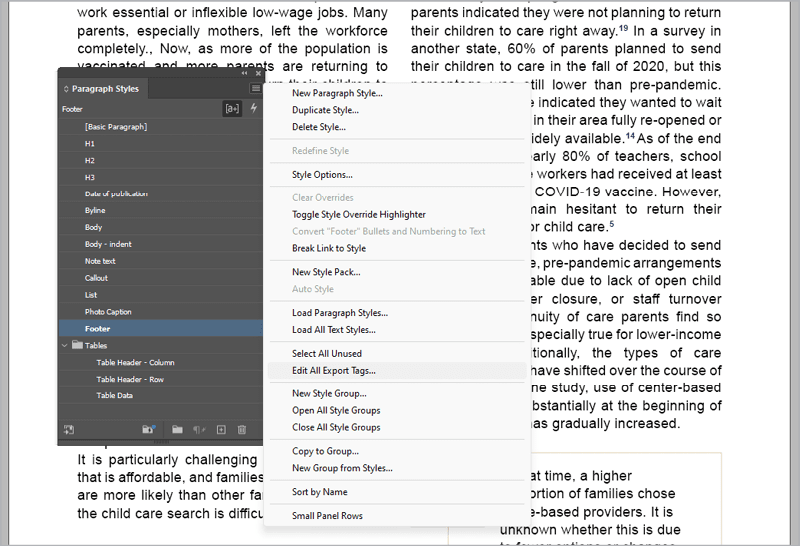
Figure 9. Use the Paragraph Styles panel menu to access the Edit All Export Tags dialog box.
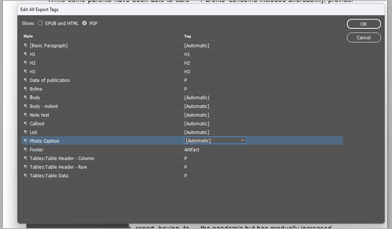
Figure 10. You can use the Edit All Export Tags dialog box to specify how InDesign should map your paragraph styles to tags.
- Heading tags:
<H1>,<H2>,<H3>, etc. to<H6> - Body text tag:
<P> - The artifact tag
Not all tags recognized by Acrobat and screen readers are available from InDesign. In those instances, such as bulleted lists, it’s best to leave the export setting as [Automatic]. Next up is adding alternative text (alt text) to the needed visual elements of your design to create an equivalent experience for those using assistive technology. Who should do it? It makes sense for whoever decided the original visual would be needed to be the person to write the alt text. For example, an author would write far more effective and appropriate alt text for a complex chart than the designer who produced the document. Check out Dax Castro’s “Writing Effective Alt Text” for more guidance on alt text and best practices. Warning: Accessibility testing tools cannot judge the quality of your alt text. If you have any alt text, your document passes the text. This can be a big problem if you use AI to autogenerate alt text. Only a human can make sure that your alt text is relevant and meaningful. If you’re a savvy organizer of media, you can have the alt text for your visuals live within the metadata of your image files. Adobe Bridge is great for this (Figure 11).
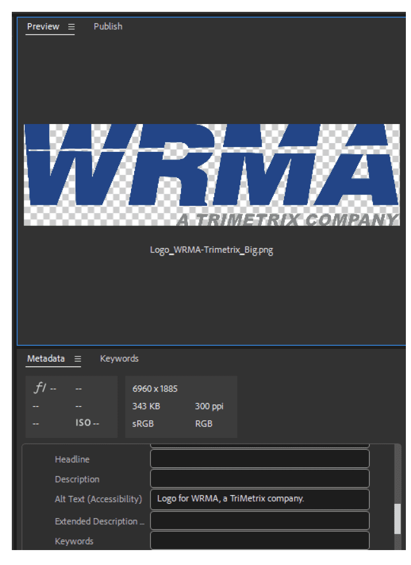
Figure 11. The metadata fields available from Adobe Bridge can map to fields in InDesign.
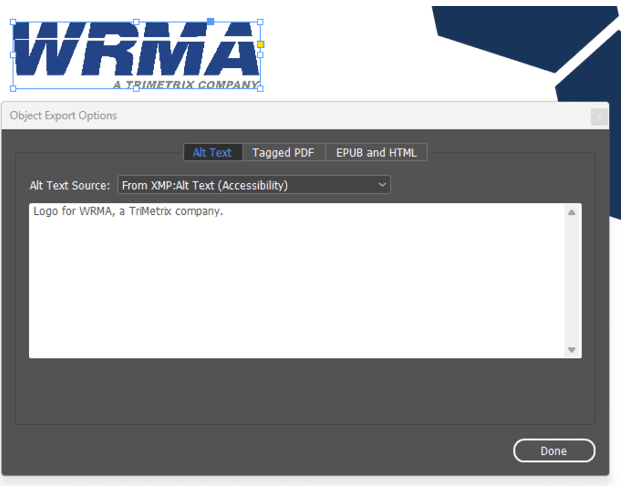
Figure 12. Use the Object Export Options panel to map your alt text source to the metadata you entered in Adobe Bridge. The metadata gets pulled into InDesign and will export as the alt text in Adobe Acrobat.
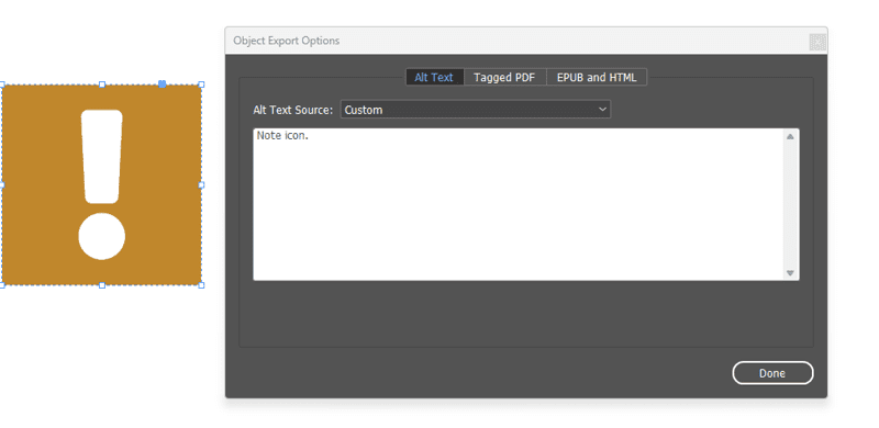
Figure 13. From the Alt Text Source menu, select Custom to add your customized text.
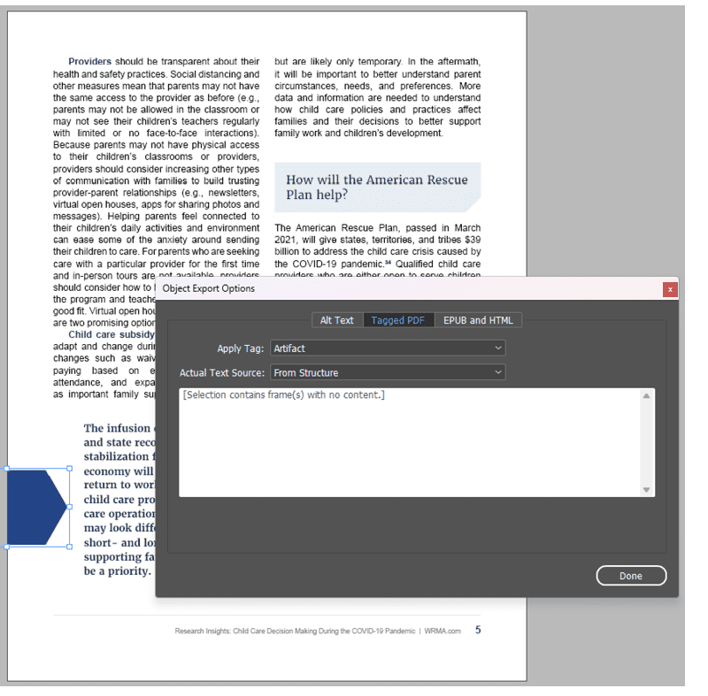
Figure 14. The blue hexagon is visual fluff that draws sighted readers to the callout text. It does not convey any meaningful information, so it can be marked as an artifact.
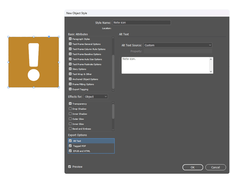
Figure 15. It’s possible to use object styles to apply the same accessibility settings to any number of objects in your document.
Exporting from InDesign
Check over your InDesign file before you export it, making sure you’ve addressed any of the issues listed above. You can do so manually, and you can also run a script that Keith Gilbert wrote with input from Chad Chelius to provide an initial summary of accessibility results (Figure 16).
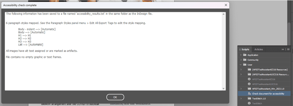
Figure 16. Use Keith Gilbert’s Accessibility Check Complete script to perform a set of initial accessibility checks from within InDesign.
Accessibility Testing
Now you can test the PDF for accessibility!
- Open your PDF, and access the tag tree.
- To see the tag tool, go to the Navigation pane, which is on the left side of Acrobat (older version) or on the right side (new version, Figure 17). Right-click within the pane and select Accessibility Tags.
- Control/Command-click a tag to open all tags, and then use your keyboard arrow keys to advance line by line down the tag tree. In accessibility, we refer to this as walking the tag tree (Figure 18). Did all content get properly tagged in the InDesign export? If not, it will need to be remediated.
- Run the built-in accessibility test in Acrobat. In the new version of Acrobat, click Prepare for Accessibility in the Tools panel on the left side. Then choose Accessibility Check. If you’re using the older version of Acrobat, click Accessibility in your tools panel. (You will need to add it if you have not done so yet.) Then choose Accessibility Check (Figure 19).
- Leave all the settings as the default, and select Start Checking. When you run the test, you’ll see two checks that need to be done manually: logical reading order and color contrast. Guess what! We’ve already walked the tag tree to ensure proper tagging and reading order, and we tested for color contrast first thing.
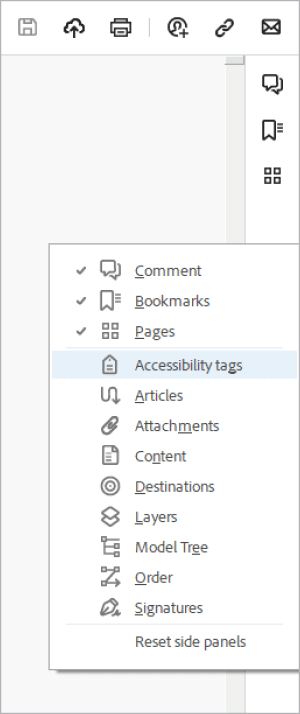
Figure 17. Use the Navigation pane on the right side of the new Acrobat experience to find the accessibility tags.
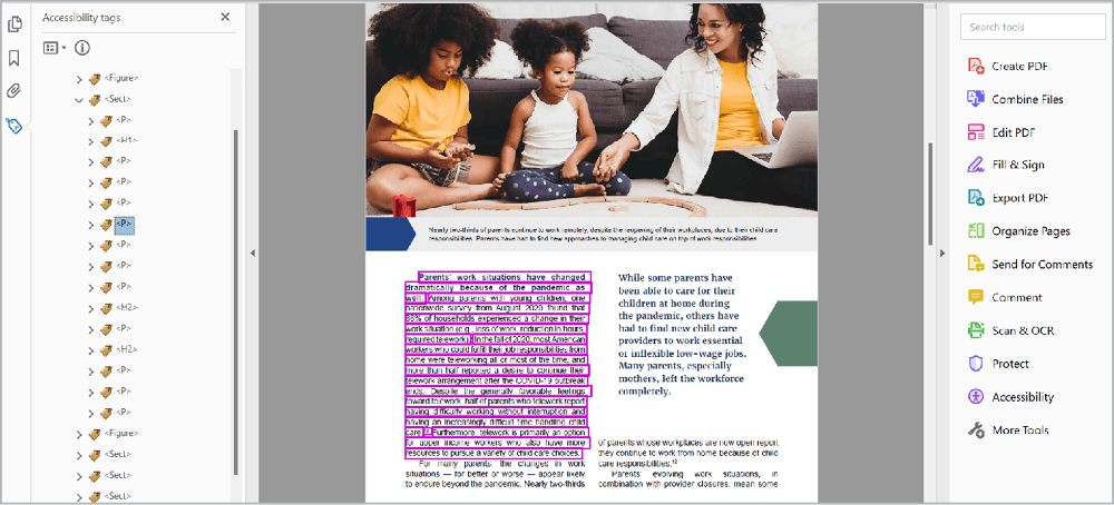
Figure 18. Use your keyboard arrow keys to navigate down the tag tree, checking to make sure all the content is in there.
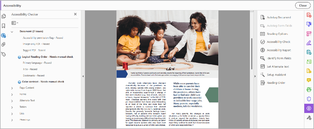
Figure 19. Logical Reading Order and Color Contrast are two checks that require a manual review.
- Test the document using an advanced accessibility checking tool, such as CommonLook’s PDF Validator or axes4’s PDF Accessibility Checker (PAC) 2021. Note that these checkers are Windows-based; all the accessibility work I do is on PCs. If you’re working on a Mac, you will need to use Parallels or some sort of emulation software to use these checkers. The first time you run these checkers, you will get hundreds, if not thousands, of errors. Don’t panic! Most of these errors are duplicated throughout your document and can be quickly resolved through your manual review. Use these results as the next step in your accessibility journey. Keep learning about the more advanced steps you can take to help your content comply fully with accessibility standards.
- The last step: Test your document using screen readers—or, better yet, pay someone who relies on screen readers to test it for you. NVDA and JAWs are two tools my team uses to ensure the documents are usable by screen reader users. Our accessibility specialist put together a free online learning module that provides an overview of accessibility testing if you’d like to learn more.
Love for Word and Frustrations with PowerPoint
As designers, we love to hate Word. But I’ll let you in on a little secret: Word has paragraph (and character) styles! And just as you can do in InDesign, you can map your styled text to tags in your PDF document. The resulting export isn’t as good as a properly done InDesign setup and export, but it’s better than starting from scratch. Speaking of starting from scratch, PowerPoint lacks styles and creates lots of unnecessary tags, so—to be honest—the resulting tag tree in a PDF exported from the program is always going to be a hot mess (Figures 20 and 21).
Figure 20. Like InDesign, PowerPoint creates container tags for each text box, adding unnecessary tags to the document.
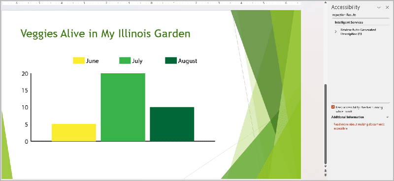
Figure 21. Despite the PowerPoint accessibility tool, you need a knowledgeable human to recognize accessibility issues in the files placed into PowerPoint—like this chart, which would fail color contrast ratios.
What’s an Accessibility Specialist?
An accessibility specialist is one role of many in the emerging accessibility job market. I strive for a clean Adobe accessibility test before I send my documents to our accessibility specialist. Our team builds accessibility in the content creation stage, and it informs our editorial and design choices. Once we have a final version that’s designed, copy edited, and approved by the authors, we route it to our accessibility specialist. He then takes care of the more advanced accessibility steps not covered in this article, such as ensuring proper tag structure for hyperlinks and using magic tricks to resolve irregular tables, so we produce documents that meet the U.S. Department of Health and Human Services accessibility standards that our team is required to achieve. For more about this critical industry and the careers that are emerging, see Dax Castro’s “Careers in Accessibility.”
Stick to the Source
You might be tempted to make any needed fixes directly in the PDF. But pause for a moment. Are there any needed fixes that you can make in the source file (InDesign, Word, PowerPoint, etc.) to get a better export? If so, make those edits there. Why? Imagine the extremely unlikely scenario (wink) that the authors come back with “just a few more edits.” That means you will have to edit the source file again, export it again, and remediate it again. It also means that all the effort you put into fixing the original PDF in Acrobat could be lost because you had to export a new file. Do your future self a solid and make as many accessibility fixes in the source file—once.
Shift Your Perspective
Accessibility is situational, making it easy for designers to feel overwhelmed and limited. But work to shift that perspective. It doesn’t take an expert in accessibility to make a seismic difference. All it takes is to use your design tools correctly in the first place. The next time you’re working on a digital document, try to think about what you can get your source file (e.g., InDesign, Word, PowerPoint) to do for you. How can you use your design and technical super skills to get a more accessible output? What’s one takeaway you have from this article that you can implement right now into your workflow to improve people’s ability to access your content? Throughout your accessibility learning, strive for progress over perfection. Good luck!
Commenting is easier and faster when you're logged in!

Recommended for you

Make a Continued Heading in a Table
You probably already know that InDesign has a feature that lets you put headers...

Scanning Around With Gene: The Almost-Lost Art of Decal Printing
If all my dreams came true and I had unlimited time and funding, I’d spend a goo...
This Month in InDesign Articles, Number 140
Our editor in chief, Mike Rankin, is out on holiday this week, which means I get...