
Writing Effective Alt Text
Learn how to evaluate graphic content and provide meaningful descriptions.


This article appears in Issue 11 of CreativePro Magazine.
As designers, we’re often very busy and have just enough time and energy to make our deadlines. Why should we care about alt text, which adds another task to our checklists? What makes this particular task worth the effort? In this article, I’ll make the case that high-quality alt text is fundamentally important in publishing and show you how to efficiently incorporate it into your workflow.
When digital content is read by people with low vision, cognitive disabilities, or blindness they often use a program called a screen reader. Along with reading the text on the screen, this software announces key elements to help the reader navigate a document. For example, the screen reader announces such page elements as headings, tables, lists, and figures (graphics).
The Web Content Accessibility Guideline 1.1 is devoted to text alternatives, and its Success Criterion 1.1.1 Non-text Content recommends: “All non-text content that is presented to the user has a text alternative that serves the equivalent purpose.” Simply put, if you have meaningful graphic content, describe it. In a document, there are two types of content—text and figures. Figures can be photos, infographics, charts, graphs, or any other graphic element.
Is a Graphic Meaningful or Decorative?
Non-text elements that are included purely for decorative effect do not need alt text; they are tagged in the PDF as background elements (or as artifacts) so the screen reader ignores them. In InDesign, you can tag these elements as decorative through the Object Export Options dialog box: Choose Object > Object Export Options, select the Tagged PDF tab, and then from the Apply Tag menu choose Artifact (Figure 1). This tag tells a screen reader to ignore your object.
Advanced Tip: You can set up an object style with the Artifact property applied to quickly designate decorative elements in your InDesign documents.
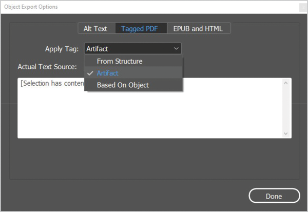
Figure 1. InDesign’s Object Export Options dialog box showing the Tagged PDF option for applying an Artifact tag to a decorative object
Alt Text Basics
In most cases, alt text should be brief and to the point. Not too long ago screen readers would cut off descriptive text after a certain number of characters. While this is no longer an obstacle, alt text cannot be paused. It cannot be stepped through incrementally. Think of it as a slide. Once you start, the only way to go back is to start from the beginning and listen all over again. So, keep it brief and direct. Develop two or three meaningful sentences. Alt text should convey in words the same information that is communicated by the image. If you’re stuck about what to write for alt text, ask yourself:
- Why did I put this here?
- What story am I trying to tell?
- What do I want the reader to know?
Figures, Captions, and Alt Text
Let’s clarify the meanings of some basic terms regarding alt text and accessibility. A figure is any non-text object; it could be a photograph, chart, graph, infographic, or other image. A caption is a text-based description that usually appears immediately above or below a figure to provide additional or anecdotal information beyond the image content. Alt text, or alternate text, consists of descriptive text designed to provide a meaningful description of a figure. What if the caption accurately describes the related image just as alt text would? In these cases, you could choose to artifact the image or the caption, depending on your preference, to avoid presenting the same description twice. In the example shown in Figure 2, the alt text description supports the caption and therefore both would be required.
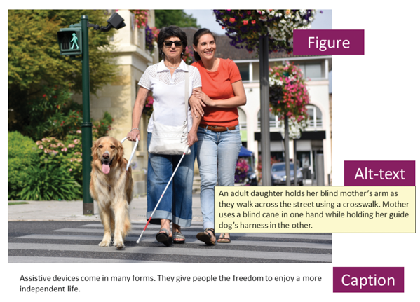
Figure 2. Captions are not always good replacements for alt text.
Speeding Up Your Workflow
If you handle a large volume of images like a collection of corporate-approved photography, consider embedding the alternate description into the metadata of your images. In InDesign you can then access these pre-set descriptions via the Object Export Options dialog box. For Alt Text Source, choose From XMP:Description to get instant access to the stored description within the metadata of the image (Figure 3) and greatly speed up your workflow.
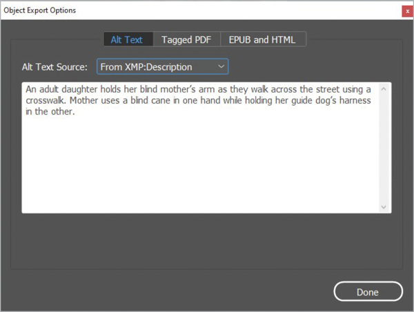
Figure 3. The Object Export Options dialog box allows you to access embedded metadata like the title and description to speed up the task of making a document accessible.
The easiest way to add metadata to your images is using Adobe Bridge. Select your image, then assign the appropriate description in the Description field of the image (Figure 4). Easy access to metadata and a large preview help you to describe images quickly and accurately in Bridge.
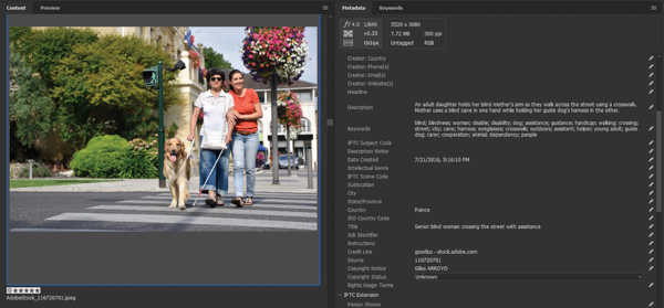
Figure 4. Adobe Bridge is the easiest way to add metadata to individual or bulk images.
Alt Text vs. Actual Text
Many people are confused when it comes to the two options for providing an image description. Alt Text and Actual Text properties serve two different purposes. The easiest way to remember when to use Actual Text is when there is a one-to-one replacement for what appears in the image. Suppose you have an image of decorative price tags spelling out the word Sale. Telling the reader “the letters S A L E are superimposed on red tags with strings hanging at uneven lengths” wouldn’t provide any additional useful information, right? Therefore, in this example, you would type the word SALE in the Actual Text properties to appropriately voice the word in the image (Figure 5).

Figure 5. When appropriate, add Actual Text in the Tagged PDF area of the Object Export Options dialog box.
Alt Text Dos and Don’ts
Here are a few quick guidelines you can employ to create or improve the quality of a piece of alt text.
Don’t start with Image of…
Unless otherwise stated, it is assumed that alt text is describing a photo. Alt text does not need to include phrases such as This is an image that shows… or This is a photo of… It is sufficient to use wording such as Bar chart shows… or Aerial map showing… Alt text should simply describe the meaningful elements of the photo.
Be brief but meaningful.
Although alt text should be brief, if your graphic displays numbers or a trend or quantitative information, your alt text should as well. A phrase like Bar chart showing sales for 2022 is brief but does not give readers enough detail. Alt text should convey in words the same information that is communicated by the image so readers understand its significance and purpose in the document: Bar chart showing a steady increase in sales from 2011 to 2021 ending with a high of $1.3 million.
Do not include figure numbers and titles as alt text.
The screen reader will read the figure number and title before it announces an image so including that information in the alt text would be redundant. If, however, the number and title are embedded in the figure (such as on a map), then include the number and title in the alt text because the screen reader does not read every word on an image. Continue by adding alt text to describe the meaning of the image.
Avoid alt text descriptions that rely on color.
Avoid using color to describe elements in your image or figure such as “Red icons on the map indicate road blocks.” Someone may not be able to see how many or where they are, so describing items in this way provides no useful information. A better description would be “15 red icons show a concentration of roadblocks around 15th Avenue and Main Street.”
Be quantitative when it matters.
Suppose your report includes a photo of a crowded highway and a chart of traffic patterns. Whether 37 or 29 vehicles appear in the photo doesn’t matter; readers need to know the scene is a road clogged with traffic. For the bar charts, numeric details do matter and are vital to understanding. The appropriate alt text could be Bar chart shows traffic significantly increases on Thursdays and Fridays between 5:00 p.m. and 6:00 p.m.
Keep punctuation simple.
When writing alt text, use correct punctuation (so the screen reader knows when to pause). Commas are short pauses, and periods are long pauses. Avoid excessive punctuation within the alt text.
Avoid acronyms, links, and excessive symbols.
Alt text should not include URLs, excessive symbols, bulleted entries, or other non-text elements. Each screen reader may interpret these items differently. Some may ignore them, and others are simply not accessible, as in the case of hyperlinks.
Five Questions for Effective Alt Text
If this image weren’t here, would the reader miss out on important information? If the image is purely decorative, marking it as an artifact in your source file will cut down on extra steps later for accessibility.
What type of object is it? If the image is a photo, do not begin the text with Photo of…, but do declare figure types, such as:
- Aerial view
- Heat map, county map, state map, regional map
- Bar chart, line graph, pie chart
- Organizational chart
- Infographic
What is the scope? Describe the limits of the object. If it is a bar chart, pie chart, or line graph, what are the date ranges, values, and so on?
What are the key elements? Usually, the legend on your chart or graph will give you this type of information. Look there to get direction on what meaningful elements the alt text should discuss.
What are the key data points or main takeaways? In the case of charts and graphs, what are the key data points? What is the overall trend? What information is most important to know (the takeaway)? Remember, if the chart or graph contains quantitative information, the alt text should contain at least one datapoint or trend.
Putting It All Together
Give the five questions a test drive with the following image. What alt text description would you provide?
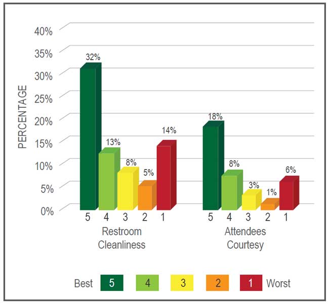
It’s not decorative. It’s a bar chart. The scale is from 1 to 5 with 5 being best. It shows restroom cleanliness and attendee courtesy. 32% of restrooms received a 5 for cleanliness and 18% received a 5 for attendee courtesy. (Note: Depending on the author, the key takeaway here might be different than you think. Always ask the author for the intent or key takeaway.)
Final Alternate Description: Bar chart showing restroom cleanliness and attendee courtesy rated on a scale from 1 to 5 with 5 being best. 32% of restrooms received a 5 for cleanliness, and 18% received a 5 for attendee courtesy.
Summary
With the help of InDesign, Bridge, and some targeted questions, adding alt text doesn’t have to be the deadline breaker you fear. Empowered by the deductive strategies discussed in this article, you should be able to evaluate any content and form meaningful alt text. Remember, it all starts with one question: What do I want the reader to know?
This article from CreativePro Magazine is for members only. To continue reading, please log in above, or sign up for a membership today! Thanks for supporting CreativePro!
Commenting is easier and faster when you're logged in!

Recommended for you
InDesign Magazine Issue 130: Accessible PDF
We’re happy to announce that InDesign Magazine Issue #130 (February 2020) i...

CreativePro Week 2026 Preview: 5 Indispensable InDesign Sessions
Five sessions InDesign users can't afford to miss

Tip of the Week: Adding Alt Text to Images With Object Styles
This InDesign tip on adding alt text to images with object styles was sent to Ti...