


Today Adobe has announced a huge update to Adobe Muse, and quite frankly it’s one of the biggest and most important updates Muse has gotten since its inception a few years ago. As of today users of Muse can now create full-on responsive websites without writing a single line of code. I know that may sound a little crazy to some of the coders out there, but I can assure you that it is true, and it’s pretty awesome too!
Fixed vs. Fluid
Muse users will notice a change to the application as soon as they start a new project because they will be faced with choosing between a fixed layout and fluid layout website right out of the gate. Choosing fluid width is the best option for a responsive design project because that automatically sets your site up to grow and shrink with changing browser window size. Choosing a fixed layout means you’ll have a static layout that doesn’t automatically adjust its size.

See also: HD Graphics with Adobe Muse and Adobe DPS
A New Ruler in Town
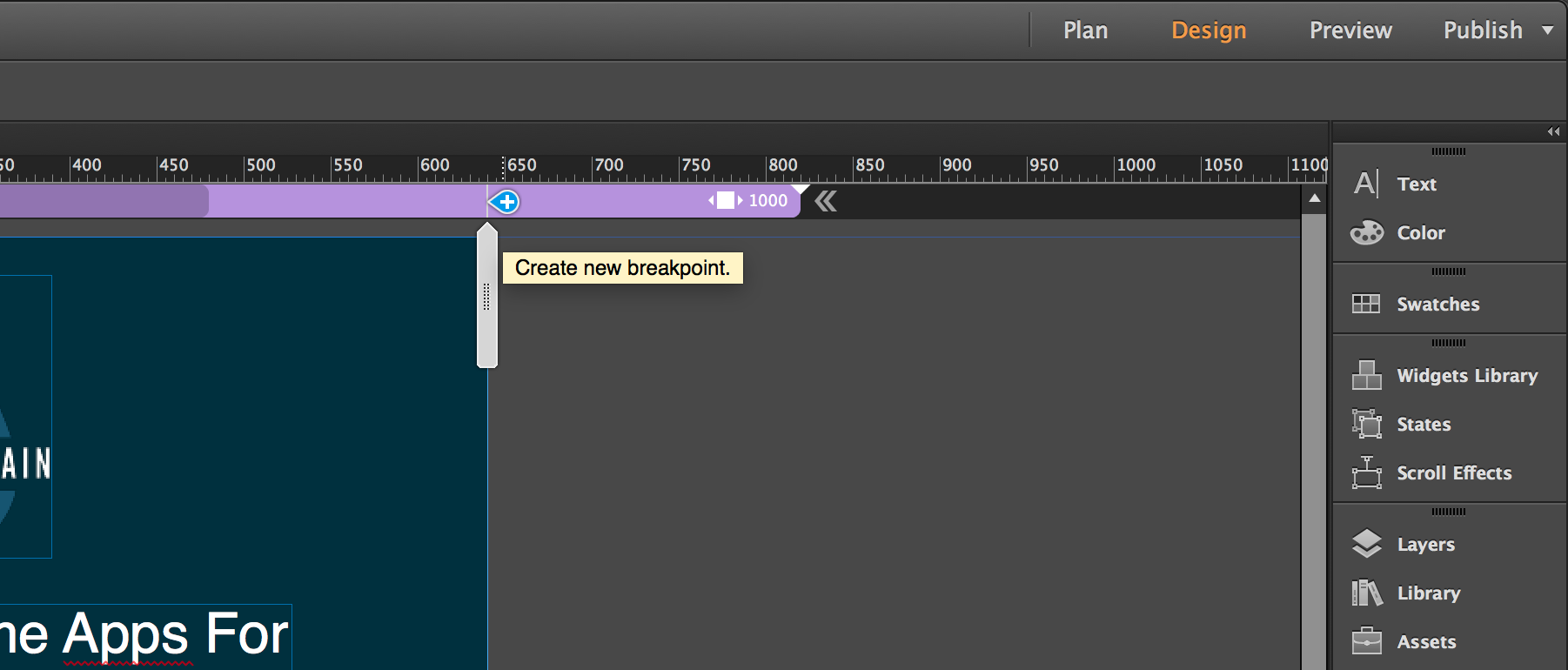
Once you’ve created your site you’ll see that the design mode of Adobe Muse has also been overhauled to put responsive design tools front and center with its new responsive ruler. This multi-colored bar stretches edge-to-edge across the document window giving you full access to your site’s breakpoints at all times.

In addition to the ruler, there’s also a resizing handle on the right side of your document that allows you to drag your website in and out, which simulates changing browser size.

Working with Breakpoints
Breakpoints aren’t a new concept by any means, but if you’re new to responsive design, you might not know exactly what they mean. As you drag your site window in and out using the responsive ruler, you will notice that pieces of your content start to look a little off. Some things will grow, some will shrink, and others will just get misaligned and look out of place. This is where breakpoints come in.
As your site starts to break down, you can fix that by adding a break point. With responsive design there’s really no right or wrong breakpoint to choose. Sure, there are widely accepted breakpoint ideas out there, like 1024 px for tablets or 320 px for phones, but in truth you should allow the content to determine your breakpoints. After all, the content of a website is the most important element, and you want to make sure it’s front and center at all times.
Adding breakpoints in Muse is super easy. As you drag your site inward using the responsive ruler, simply click the breakpoint pin (see figure below) and Muse will automatically create a breakpoint for you.

I should also note that breakpoints can be added to Master Pages as well as individual pages in Muse, giving you the ability to customize each individually if you wish. When you create breakpoints on a master page, they will appear on each subsequent page’s responsive ruler to give you an indication of where they exist.
See also: Free Adobe Muse Keyboard Shortcut Cheat Sheet
Pinning 2.0
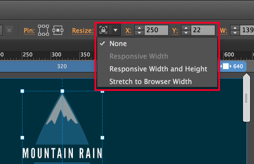
Pinning objects in Muse has been around for a while now. However, in this update of Muse there’s a whole new side to the pinning equation. Once you’ve set your breakpoints in Muse, you then need to start adjusting your content to fit within your new, smaller window size. Muse has new options in the options bar that make this task very simple as well.
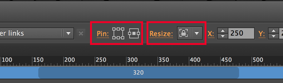
The new pinning options allow users keep objects in a static position even when the browser window changes. In addition to that, you can also change a single object’s resize options. This means that you can set an object to stay at a fixed size, stretch to fill the browser window, or even adjust its width and height as the browser window grows or shrinks.
Migrating Existing Websites
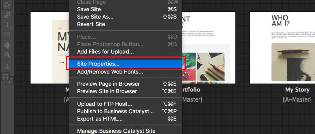
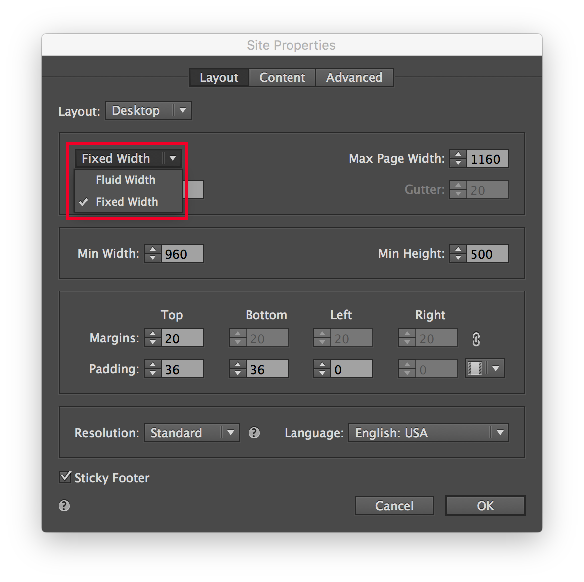
I’m sure all of this sounds great, but you’re probably wondering what becomes of the website you already have, right? Well, don’t worry, all of that work won’t go to waste because Adobe has added the ability to convert an existing Adobe Muse-based website into a fluid width project with a few simple clicks. All you have to do is open the Site Properties dialog box by choosing File > Site Properties and then change your site from fixed to fluid width. This won’t automatically add breakpoints or rearrange your content, mind you, but it will enable your website to be responsive and ease the transition for you.
A New Set of Starters
If you’re still feeling intimidated by all of this, that’s ok! Adobe has also developed some new responsive starter files for Adobe Muse as well. Both of these starter files come equipped with pre-installed breakpoints and all of the content reflowed and repositioned accordingly, making it much easier to see exactly how this new workflow is intended to be used.


A Whole New World of Possibilities
Adobe Muse continues to be one of the most innovative products in the “no code required” realm of web design. With this new update Adobe has brought Muse up to date with, and surpassed, many of the existing products on the market, and they’ve done so in a way that only Adobe could do it, really. As a Muse user, I’m excited about responsive design becoming part of my workflow, and I think you will be too!
This article was last modified on January 8, 2023
This article was first published on February 9, 2016
Commenting is easier and faster when you're logged in!

Recommended for you

InDesign Magazine Issue 69: Wireframing and Prototyping
We’re happy to announce that InDesign Magazine Issue 69 (January, 2015) is now a...
Before&After Design Tip: Small Size, Big Impact
When it comes to impactful design, little things mean a lot.
Before&After Design Tip: Position Text for Quicker Reading
When words are critical, put them at the center of the design.