

As technology evolves, so do the ways we experience information and media. With the success of the iPhone with its launch in 2007, the way we consume media—and our expectations—have changed dramatically.
Businesses without a website are not taken nearly as seriously by most people anymore, prompting the need for more sophisticated approaches. People no longer use telephone books to find companies or individuals to do business with. They perform Google searches, and today typically they do this on the go with a mobile device.
The mobile experience of your website is now more often than not becoming the first experience people have of your website, and it communicates to them whether or not you are outdated or professional. That is why designing your website to be “mobile first” is a priority. What is meant by “mobile first web design,” is the idea of designing your website with an eye towards how it presents on mobile devices as the first priority rather than an afterthought.
There are two web design methods you can employ: adaptive or responsive.
See also: The Quickest Way to Create Mockups from a Live Web Page
Adaptive Web Design For Mobile Devices

Adaptive Web Design is the earlier form of how mobile websites were developed. Essentially a completely separate website or web page is created and when some visits your site from a mobile device, they are redirected to a new site or page built specifically for that purpose. This technique uses either Javascript or PHP code in most cases to detect a mobile device and then redirect a user based on that.
The downside to adaptive web design, is the need to maintain two versions of a website. The advantage is giving audiences an experience that was custom tailored to a mobile device specifically, instead of a scaled down version of a desktop based website.
Responsive Web Design for Mobile Devices
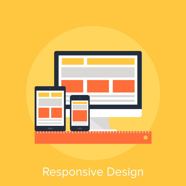
Responsive Web Design is the more current and popular form of web design for mobile devices today. Responsive web design takes advantage of CSS (Cascading Style Sheets) to manipulate the look, structure, and scale of a desktop website, and makes it respond to the screen size it is being viewed on and adjust accordingly, usually in real time.
The benefits of responsive web design vs. adaptive web design and why it is the current popular trend, is the fact that it allows a designer to maintain just one website that can work seamlessly across any device it needs to, while maintaining a consistent experience.
See also: Understanding Web Design, Hand Coding, and WYSIWYG
Which is Better? Adaptive or Responsive Web Design?

While many web designers and developers will argue that responsive web design is superior, the more honest answer is that it depends on your goals and the nature of what you’re doing. There are some businesses and individuals who would benefit more from one solution than the other. Like any design scenario it comes down to understanding what the user is trying to accomplish and providing that experience.
If you were creating a mobile-ready version of your design portfolio for example, you may want to make it very easy for whoever is visiting the mobile version of your site to get a sense of your work, without having to click anything right away. You could accomplish this with either responsive or adaptive web design. But what if you wanted to control the experience completely in a unique way that makes more sense for a mobile user? In that case adaptive web design might make more sense. If your priority is consistency in visual presentation and branding, maybe responsive makes more sense. It all comes down to your execution and intentions.
See also: Translating Print Skills to Web Design
Some Things to Keep in Mind For Mobile Web Design
Mobile experiences are very different from the viewing of traditional websites on desktops and laptops. You can’t predict whether or not the user will be viewing in landscape or portrait mode, so your website will have to be designed in a way that can accommodate both.
There are additional functionality options involved in mobile web design, such as the ability to dial a phone number just by tapping on it.
Image optimization and overall file size matter more when it comes to mobile websites than desktop websites. While cellular data speeds are faster than ever, you can’t predict connection speeds, conditions, or whether or not a user has a limited data plan. When designing you should try to keep file sizes and images sizes as small as possible without compromising quality. For designers there can be a temptation to take advantage of the high DPI of mobile devices, but this can cause slower loading times and bad user experiences.
Keep in mind that since the experience of mobile devices and the habits associated with them are different than typical desktop web browsing, the standard rules do not apply. Mobile device users are more likely to scroll and not be put off by it, than they would be having to click a link and wait for a page to load.
This article was last modified on October 16, 2015
This article was first published on October 16, 2015
Commenting is easier and faster when you're logged in!

Recommended for you

Before&After Design Tip: Position Text for Quicker Reading
When words are critical, put them at the center of the design.

Communication Arts 7th Annual Typography Competition
Communication Arts magazine, a professional journal for those involved in visual...

UX Design is Not Just a Web Design Thing
For the past few years, UX Design (user experience design) has been all anyone h...