

Here’s a quick design tip on working with photos from issue 43 of Before&After Magazine.
A photographic banner is a simple way to beautify a website or blog. But how do you fit such an extremely shallow space? By cutting an extreme slice!
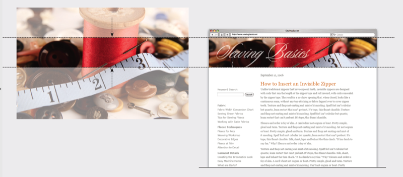
You’ll be surprised by how much a slice can show. Look for one that has some of everything—in this case, needle and thread, buttons, tape measure. Here, high color contrasts (red, yellow, white, black) are a bonus; they boldly distinguish each element.
CreativePro members can download original content from Before&After Magazine, a beloved resource that taught a generation of newly minted digital designers how to design and communicate effectively with the written word. See our archive here.
© John McWade/Before&After Magazine, courtesy of Gaye Anne McWade.
This article was last modified on January 4, 2026
This article was first published on September 27, 2024
Commenting is easier and faster when you're logged in!

Recommended for you

Before&After: Design a Peekaboo Brochure
This brochure with a narrow front panel gives a peek at the inside, which opens...

Before&After Design Tip: Don’t Trap the Space
Empty space surrounded by text and images can weaken your design.
The Before & After Collection
John McWade’s treasury of design instruction finds a new home at CreativePro.