

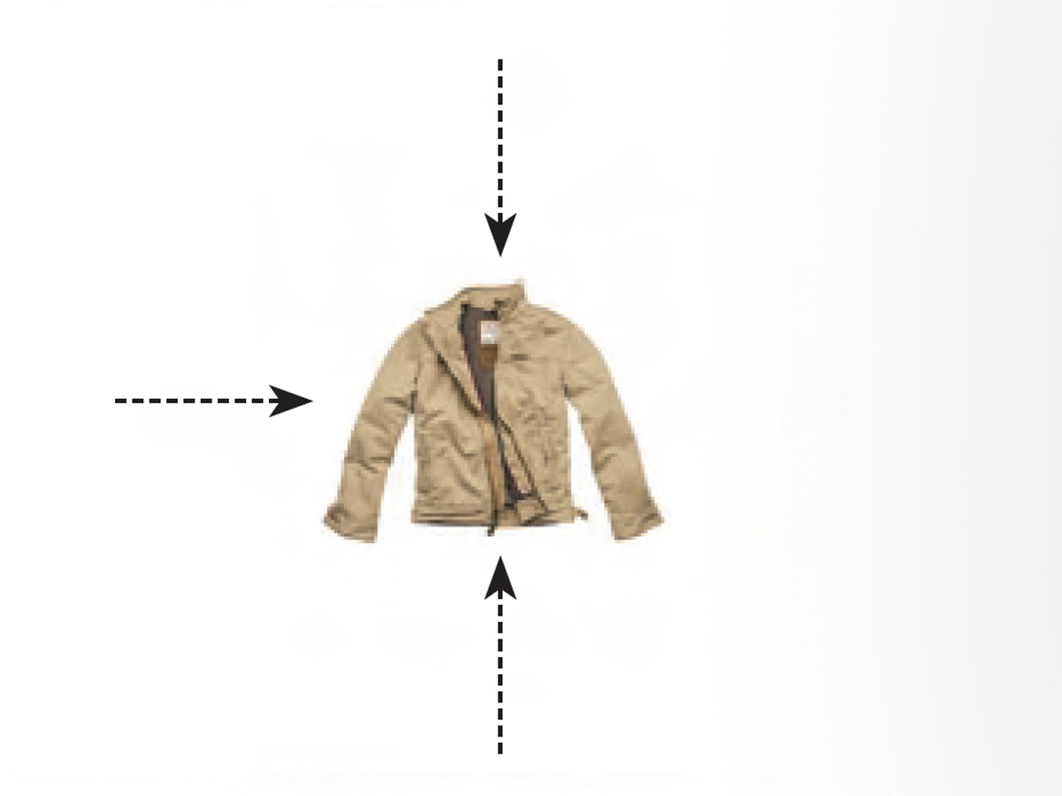
Before&After Design Tip: Condense Your Design
Think small and focused to to get good results easily.
Have an account? Sign in
"*" indicates required fields
You agree that CreativePro Network may send you emails, including the newsletter selections above. You can unsubscribe at any time.
By signing in, you agree to our Terms of Use and acknowledge our Privacy Notice.
New user? Create an account
By signing in, you agree to our Terms of Use and acknowledge our Privacy Notice.
Welcome to the CreativePro archive of Before & After magazine articles.
Published from 1990–2014, Before & After magazine was the gold standard for educational material aimed at professional graphic designers and anyone else who wanted to learn “how to design cool stuff.”
Since the articles focused on design principles and techniques instead specific software, they are “evergreen” and just as relevant today as when they were first published.
You can read about the history of the Before & After magazine, and its founder, John McWade, in this article.
CreativePro members enjoy full access to download Before & After articles in PDF format, which preserves the original look and feel of the magazine.
The shorter design tips are available free to all.
Think small and focused to to get good results easily.
When it comes to impactful design, little things mean a lot.

Learn how combining photographs with data can enliven your charts.
A little pop of color can increase clicks on a hyperlink.

Empty space surrounded by text and images can weaken your design.
When words are critical, put them at the center of the design.

Photos of faces in a row or group should be presented uniformly

Learn how to effectively crop portraits using eye level as your guide

Learn the first rule of photo cropping
When space is tight simple, bold, and brief

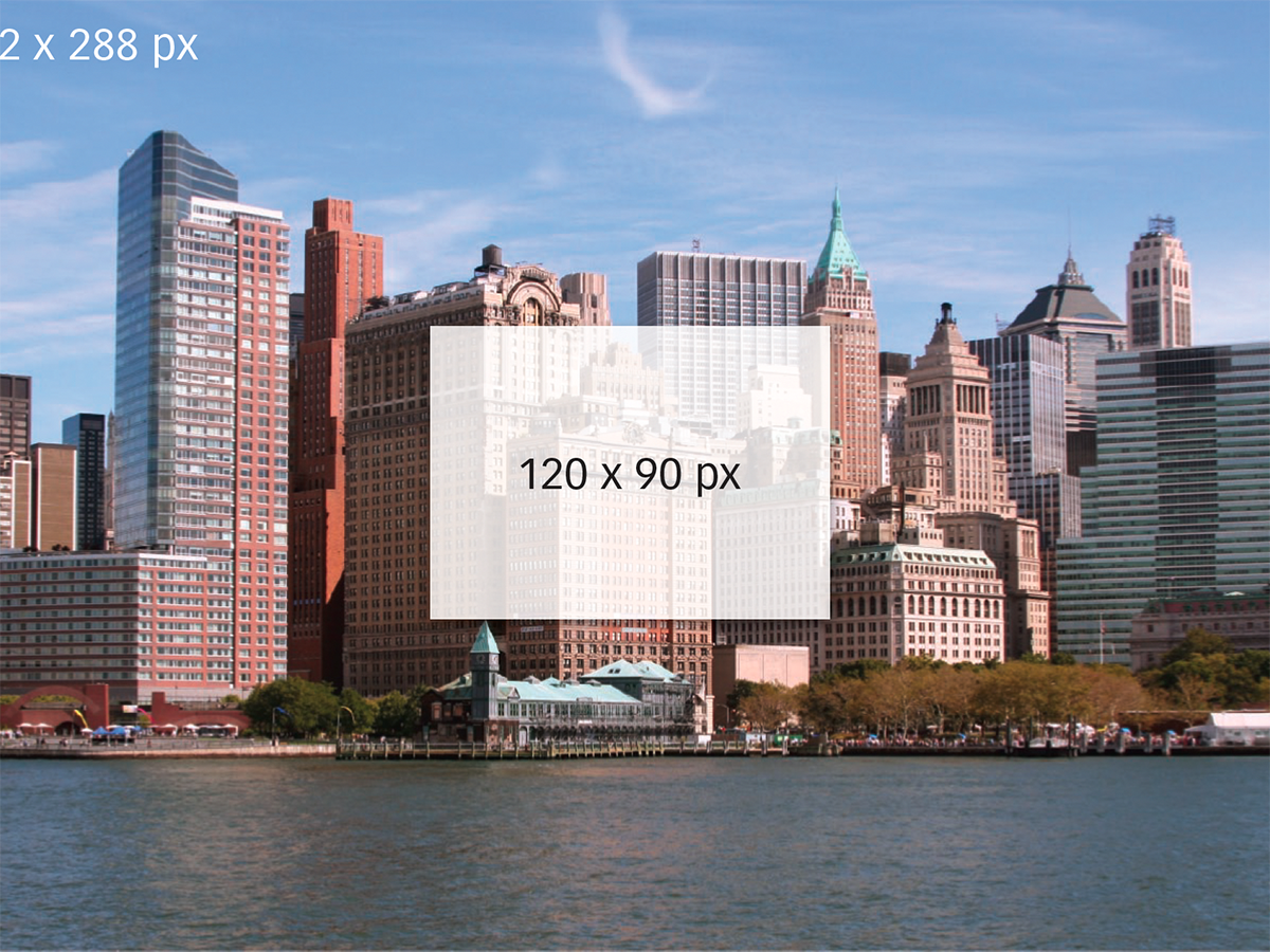
How to get the effect you want by changing the size, angle, and cropping of a photo

Text and photos must work together to convey a message