
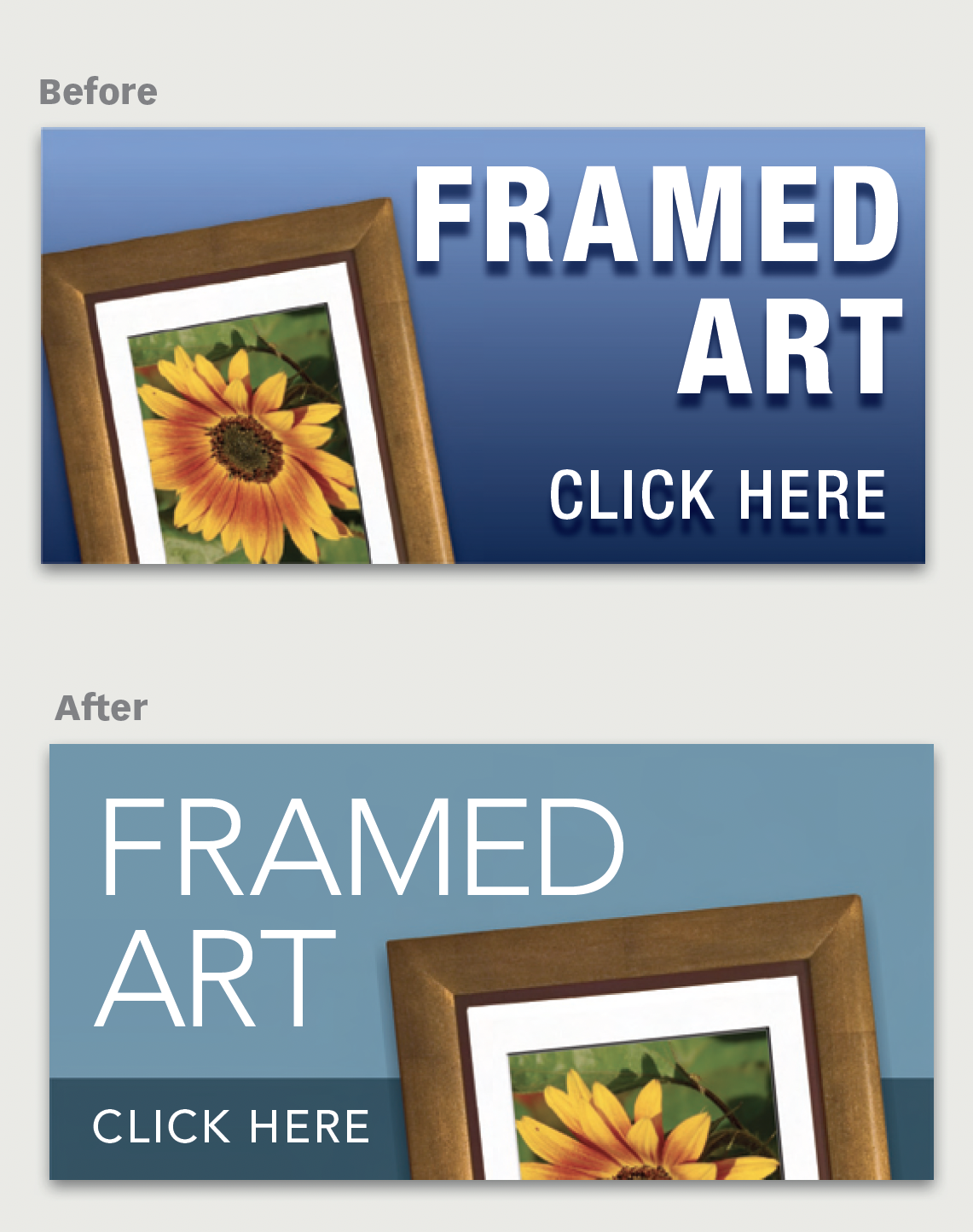
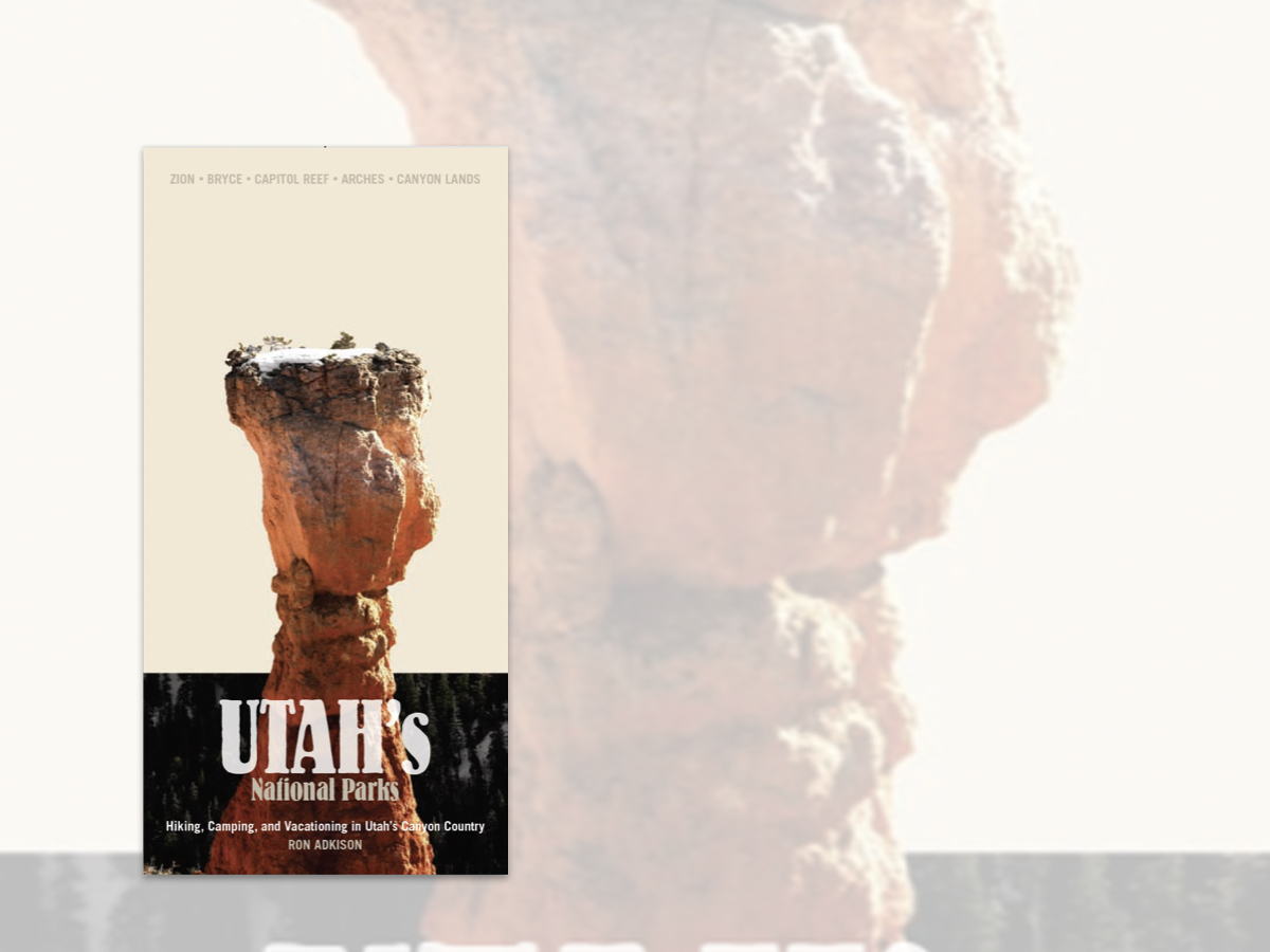
Here’s a quick design tip using space effectively from issue 42 of Before&After Magazine.
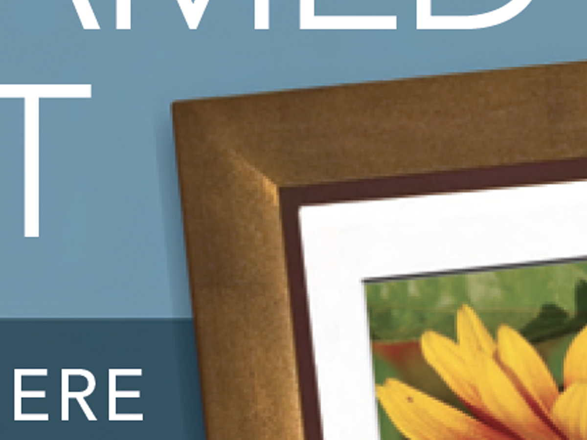
This designer got it right except for one thing: His image and headline trapped empty space uselessly in the center.
CreativePro members can download original content from Before&After Magazine, a beloved resource that taught a generation of newly minted digital designers how to design and communicate effectively with the written word. See our archive here.
© John McWade/Before&After Magazine, courtesy of Gaye Anne McWade.
This article was last modified on January 3, 2026
This article was first published on January 24, 2025
Commenting is easier and faster when you're logged in!

Recommended for you
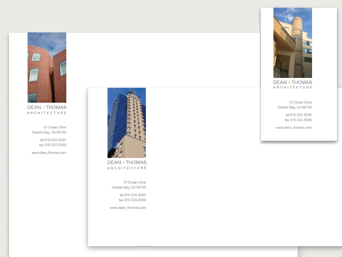
Before&After Design Tip: Design Stationery That’s Almost a Brochure
How to create a consistent look on letterheads, envelopes, and business cards
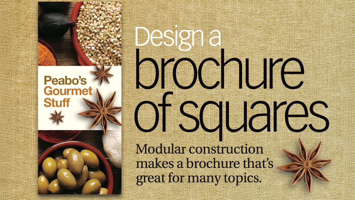
Before&After: Design a Brochure of Squares
Modular construction makes a brochure that's great for many topics.
Before&After Design Tip: Good Design Must Have a Focal Point
Learn how to create a focal point that will give your design holding power.