
Here’s a quick design tip on web design from issue 42 of Before&After Magazine.
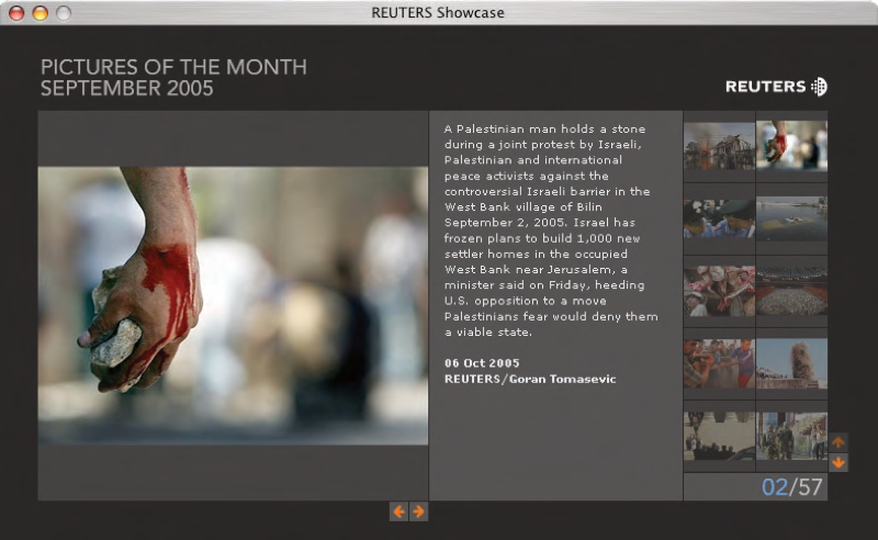
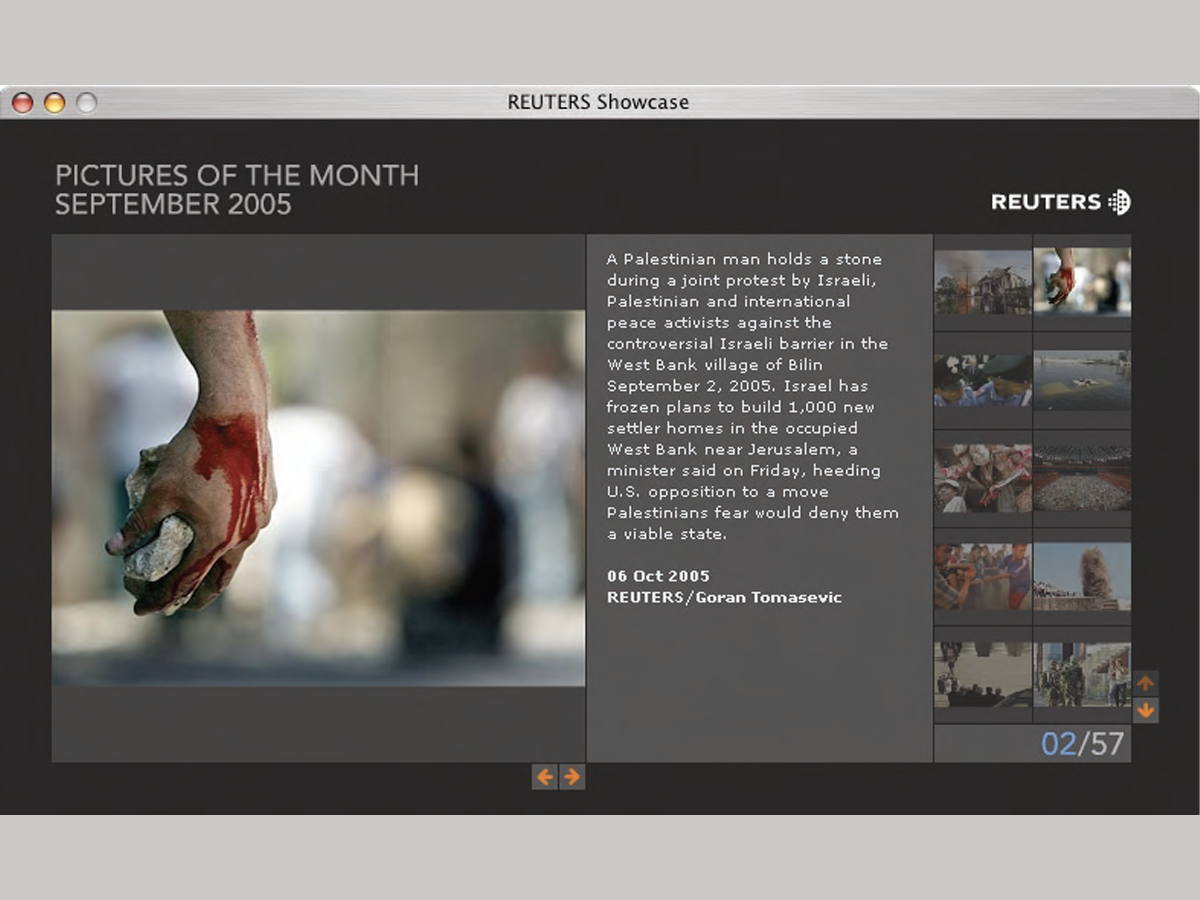
News photographers on breaking stories can snap dozens of images, often in minutes, but none has news value without a descriptive caption. For deadline-pressed photo editors, Reuters puts its captions where they’re easiest to read: in the center of a visual field. When words are critical, center is the place to put them; off to the side they will be less frequently read. The added benefit—an attractive, visually balanced page.
CreativePro members can download original content from Before&After Magazine, a beloved resource that taught a generation of newly minted digital designers how to design and communicate effectively with the written word. See our archive here.
© John McWade/Before&After Magazine, courtesy of Gaye Anne McWade.
This article was last modified on January 3, 2026
This article was first published on January 17, 2025
Commenting is easier and faster when you're logged in!

Recommended for you
Before&After: Make Desktop Holiday Cards
If you need to make your own quick and easy holiday card, this one fits the bill...

Design Tip: Choosing Background Colors
Quick tips for choosing background colors to go with photos

Before&After: Picture It Twice
Use the same image twice—differently—to fill your space beautifully.