Here’s a quick design tip on for combining photos with chart data from issue 42 of Before&After Magazine.
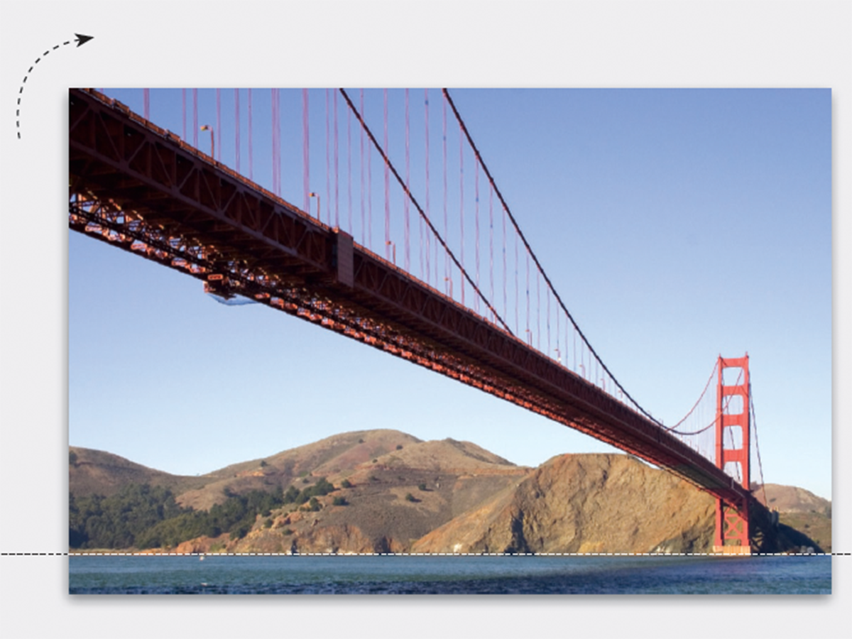
Charts are useful for showing trends and relationships, but ordinary rows, columns and lines are so forgettable. A photographic illustration behind, beside, or interacting with the data can enliven your data

.
CreativePro members can download original content from Before&After Magazine, a beloved resource that taught a generation of newly minted digital designers how to design and communicate effectively with the written word. See our archive here.
© John McWade/Before&After Magazine, courtesy of Gaye Anne McWade.
This article was last modified on January 3, 2026
This article was first published on February 7, 2025
Commenting is easier and faster when you're logged in!

Recommended for you

Before&After: Design Without Rulers
Put away your ruler; here’s how to design the way you see!

How to Highlight Text for Clarity When Designing a Presentation
Learn how to bring attention to important text for better clarity when designing...