
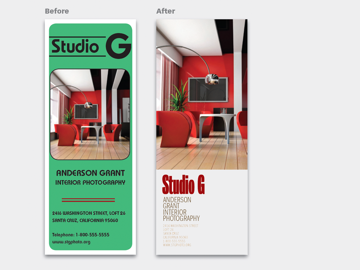
Fiddling and fussing to get your words and images to look good together can be tough. Styles are often incompatible, details clash, contrasts can be wrong. A better way is to think like a lazy person and keep your image and type apart. Keep each one simple, and keep their interaction to a minimum. This almost always yields a good design, and the results are easy to repeat! This 12-page article from issue 48 of Before&After Magazine shows you how to segregate your page into two zones—image here, type there—to yield a handsome, super-clean design in less time.

Segregating the page into two zones—image here, type there—yields a handsome, super-clean design in less time, and it’s easy to repeat!

© John McWade/Before&After Magazine, courtesy of Gaye Anne McWade.
Commenting is easier and faster when you're logged in!

Recommended for you

Before&After: Make a Theme to Tie Your Design Together
A butterfly graphic creates a focal point, color, and continuity and turns a gra...
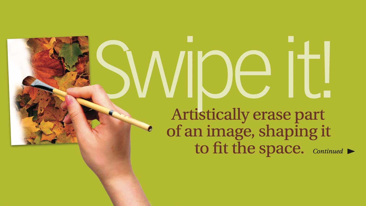
Before&After: Shape a Feathered Edge
Artistically erase part of an image, shaping it to fit the space

Before&After: Design a Flier That Sells
The key to an advertisement that sells is simple: Keep all eyes on the product.