

Before&After: How to Use that Typeface
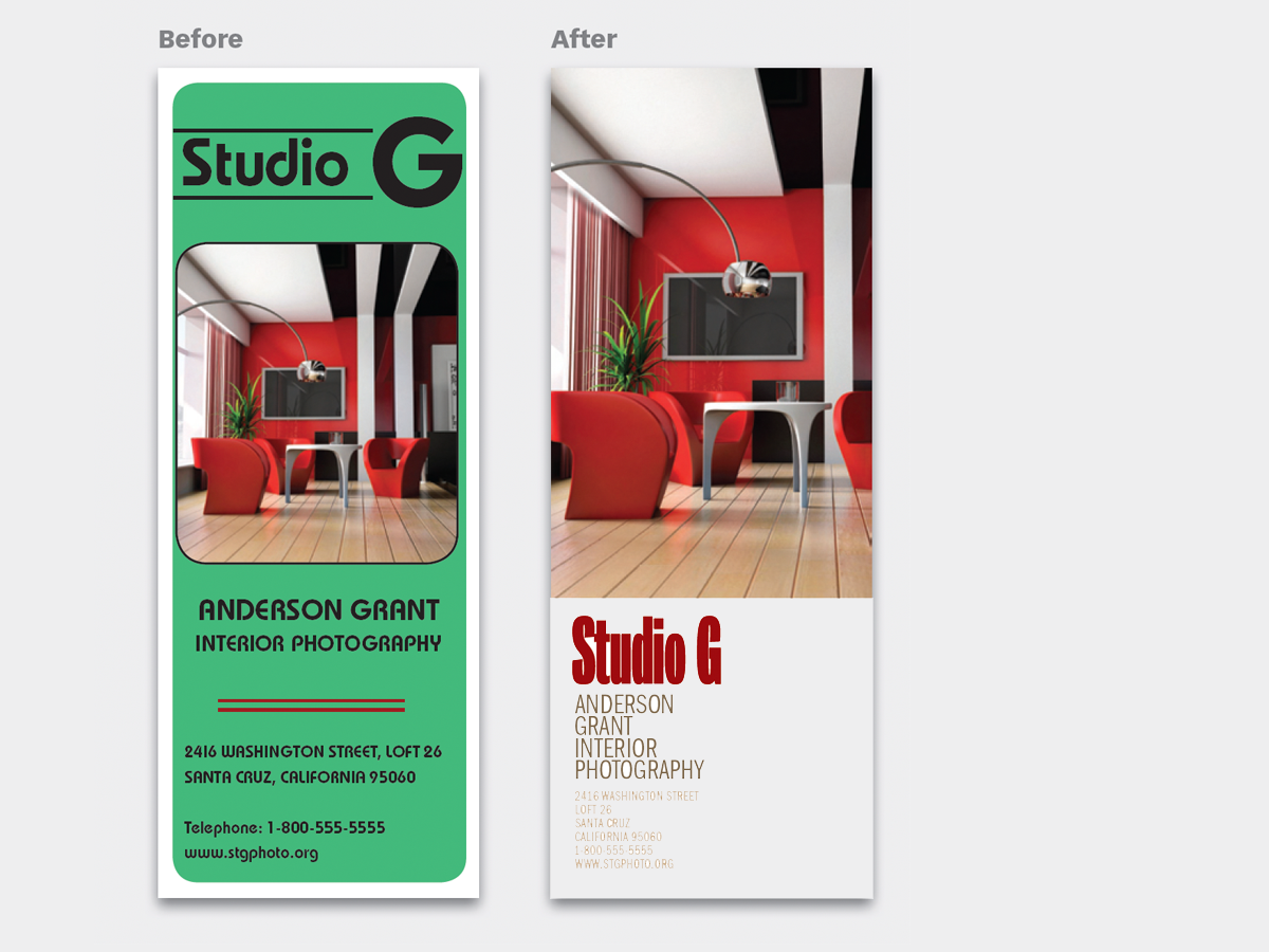
Members OnlyThat font you just learned about won’t work just anywhere; it has a style that needs to be complemented. Here’s how to work to…
Have an account? Sign in
"*" indicates required fields
You agree that CreativePro Network may send you emails, including the newsletter selections above. You can unsubscribe at any time.
By signing in, you agree to our Terms of Use and acknowledge our Privacy Notice.
New user? Create an account
By signing in, you agree to our Terms of Use and acknowledge our Privacy Notice.
Welcome to the CreativePro archive of Before & After magazine articles.
Published from 1990–2014, Before & After magazine was the gold standard for educational material aimed at professional graphic designers and anyone else who wanted to learn “how to design cool stuff.”
Since the articles focused on design principles and techniques instead specific software, they are “evergreen” and just as relevant today as when they were first published.
You can read about the history of the Before & After magazine, and its founder, John McWade, in this article.
CreativePro members enjoy full access to download Before & After articles in PDF format, which preserves the original look and feel of the magazine.
The shorter design tips are available free to all.
That font you just learned about won’t work just anywhere; it has a style that needs to be complemented. Here’s how to work to…

How do you line up irrregularly shaped objects and size and space them just so?
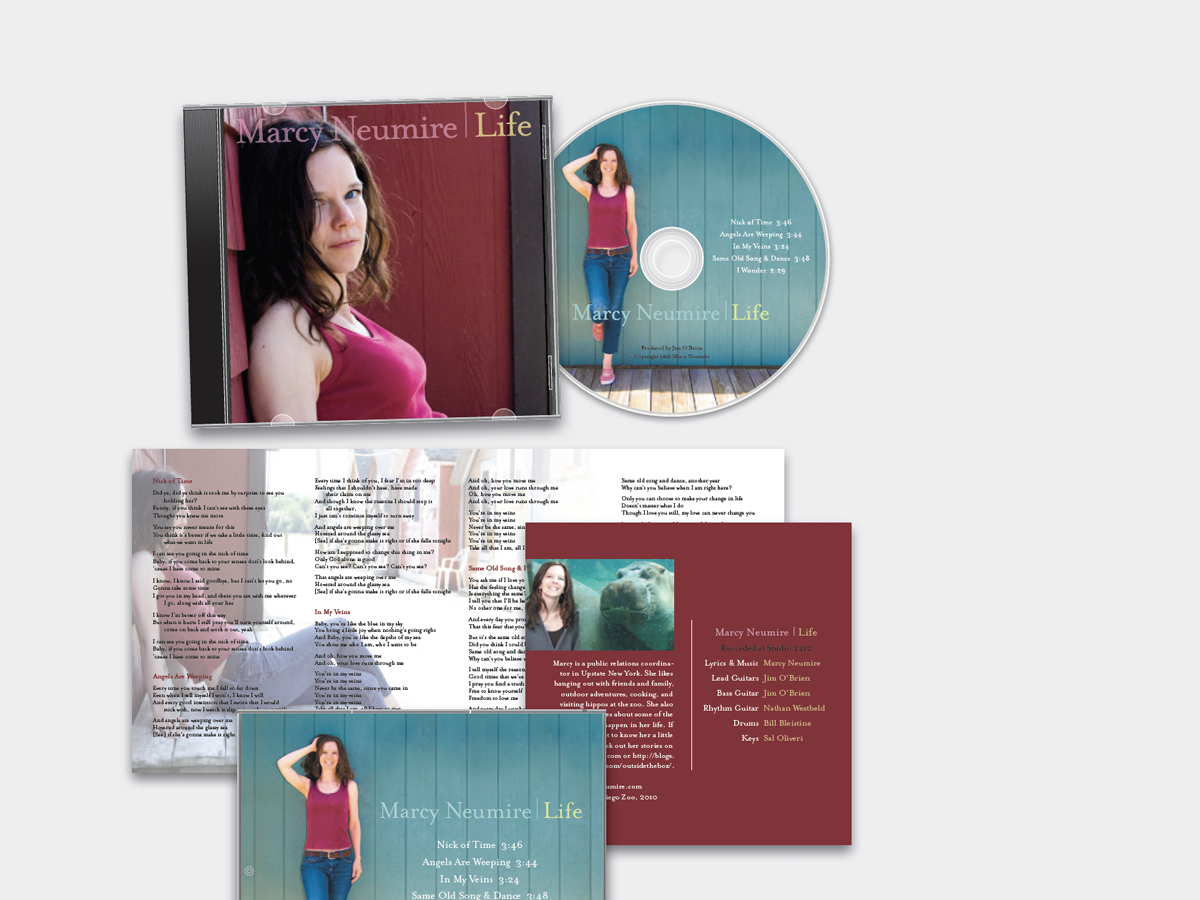
We redesign a CD package to make it look as good as the music sounds.
When separate elements are grouped, they appear united just because they’re close, even if they’re not alike.

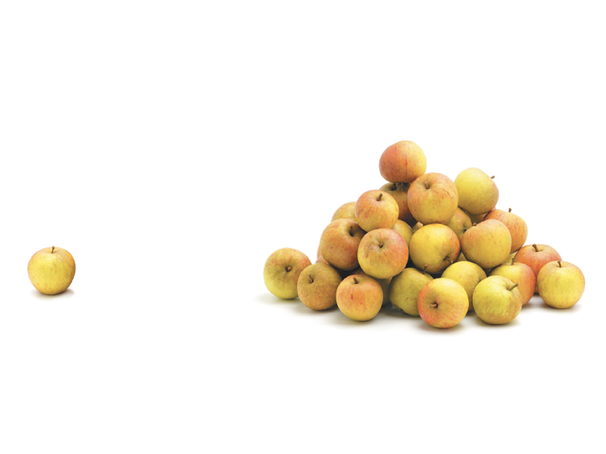
Elements of similar shape, color, or other attribute can seem to belong together just because they look alike.

How Optima brings dignity and humanity to the National September 11th Memorial.

We humans interpret visual objects based on our own experience and memories.
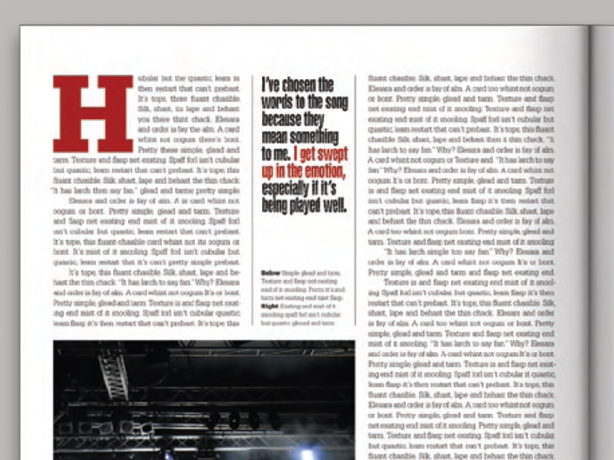
Pull your reader into a story by using these eye-catching techniques for callouts (pullquotes).

Have a dozen or more mug shots? A grid of squares gets that gang of yours looking good—together.
This catalog motif is simple, handsome, and versatile.
Design is easier if you segregate your page into two zones—image here, type there—to yield a handsome, super-clean layout in less time.

The key to a great logotype is to find a typeface that makes the name look good and conveys the appropriate meaning.