
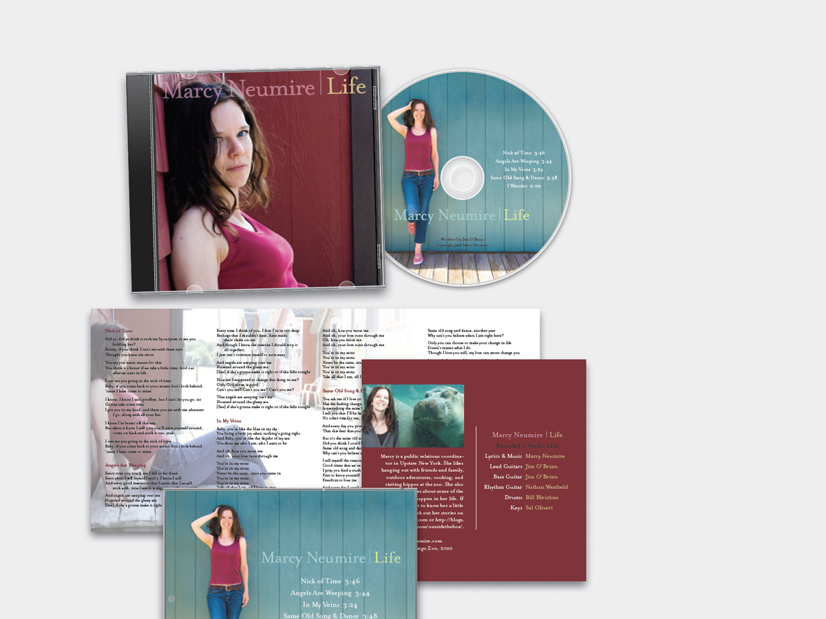
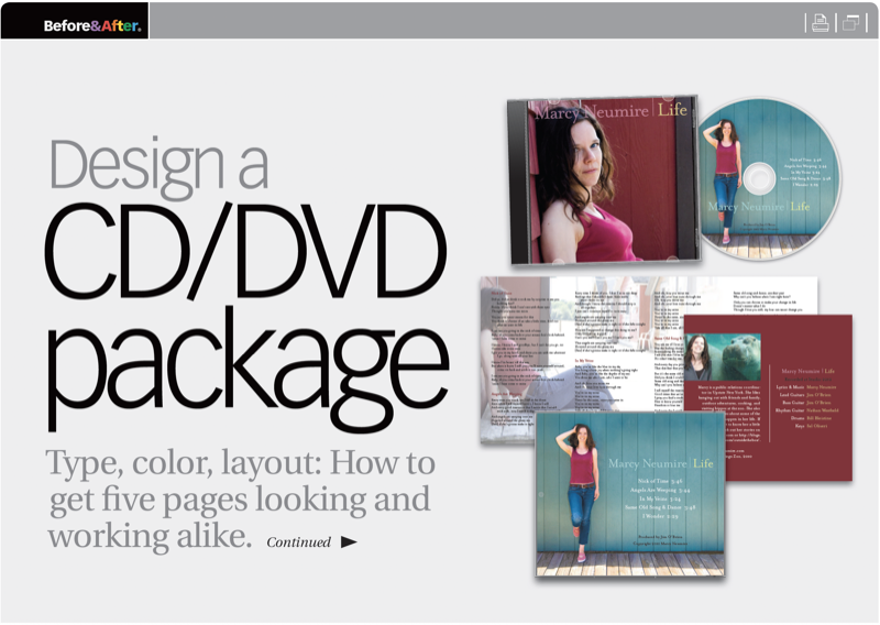
The ideal project is one in which client and designer work from the beginning to realize a common vision. But so many more projects are like this one, where the photos had already been taken; the course had already been set. So starting in the middle of the job, here are the changes we made, and why, to get this album looking as good as the artist’s music sounds. This 21-page article from issue 52 of Before&After Magazine takes us along on a redesign that uses type, color, layout to get five pages looking and working alike.
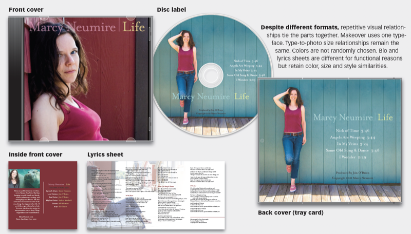
Two new photos, a pleasing, unpretentious typeface, and repetitive colors and layouts unify the design and convey Marcy’s simple style and music.
© John McWade/Before&After Magazine, courtesy of Gaye Anne McWade.
Commenting is easier and faster when you're logged in!

Recommended for you

InDesigner: Ebook Expert Laura Brady
Anne-Marie Concepción provides a close-up glimpse of Laura Brady’s ebook design...

17 Great Tools for Designers
Every designer, regardless of their niche, needs certain tools of the trade to g...
Before&After: Picture Your Presentation
Better than charts and bullet points, photographs will give your audience an emo...