

Downloadables are an exclusive benefit for CreativePro members! (Not a member yet? Join us and get $10 off with the discount code: DOWNLOAD)
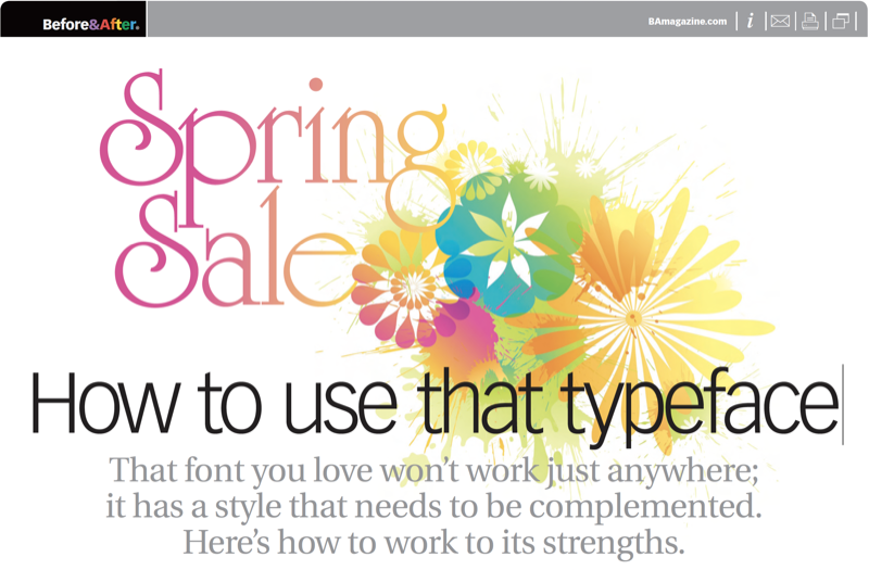
Before you use a font you’ve just seen, you’ll want to know if the lines, shapes and little doodads that made it so appealing to you will work as well in your project. How to tell? Reading a typeface is a little like reading a real face. Tiny differences in the arch of an eyebrow, the curve of a lip, and the contour of a cheekbone convey real presence, personality, and attitude. This 13-page article from issue 48 of Before&After Magazine teaches you how to make the most of a new font and work to its strengths.
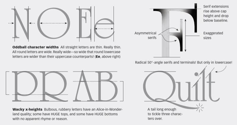
University Roman is full of swashy idiosyncracies that give it a handmade style especially suitable for fanciful and romantic topics.
© John McWade/Before&After Magazine, courtesy of Gaye Anne McWade.
Commenting is easier and faster when you're logged in!

Recommended for you

TypeTalk: Typographic Hierarchy
One of the most important aspects of designing with type is the establishment of...

Font Aid for the Philippines
Since 1999, The Society of Typographic Aficionados has organized series of chari...
Scanning Around With Gene: A Printed “Teaching Machine” from 1894
I grew up in the era of so-called “new math,” a fairly radical and short-lived a...