
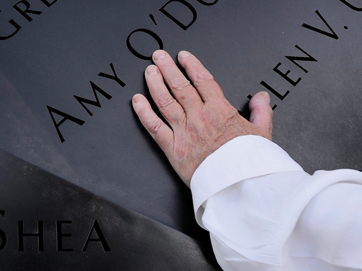
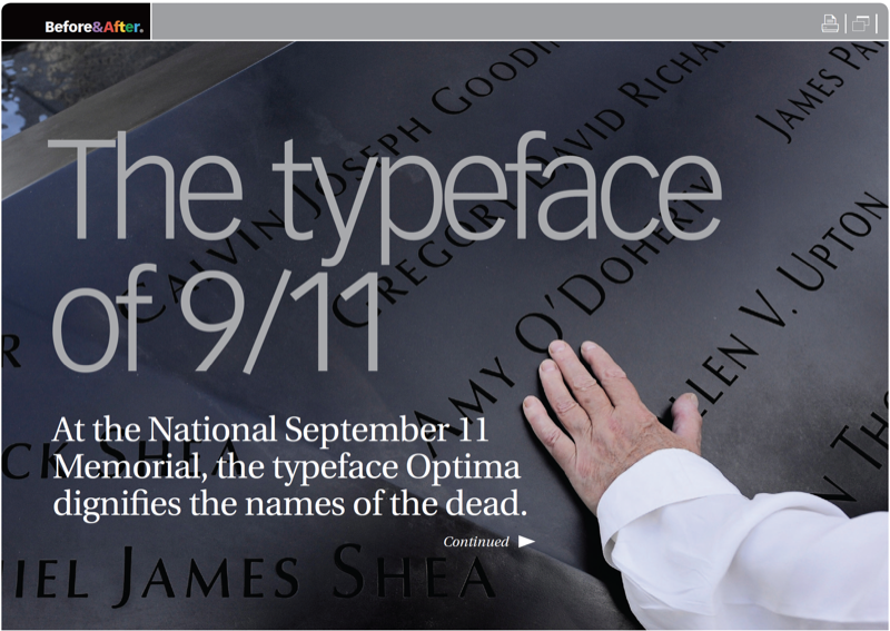
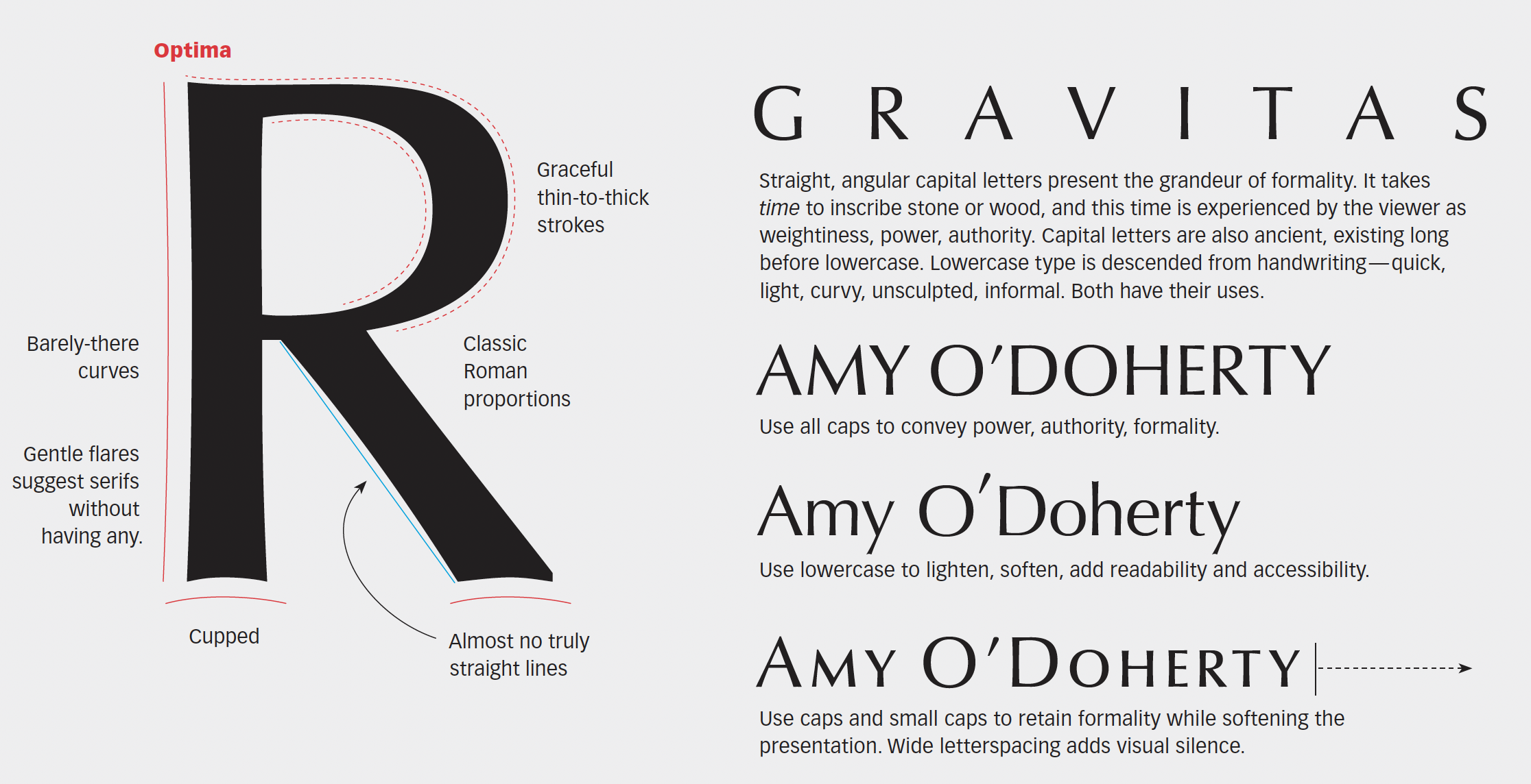
The National September 11 Memorial, Reflecting Absence, conveys loss, nobility, even atonement, in a place of immeasurable sorrow. Optima is the typeface chosen for the work. A typeface of classic Roman shapes and proportions but without serifs, Optima’s graceful lines and uniquely flared strokes evoke the past and future at the same time. This 7-page article from issue 51 of Before&After Magazine shows you how, at the National September 11 Memorial, the typeface Optima dignifies the names of the dead.
Because Reflecting Absence is both a national memorial and a personal one, its type must play two roles. To do so, its names are set formally in full capital letters plus small caps, which soften and humanize without the informality of lowercase.
© John McWade/Before&After Magazine, courtesy of Gaye Anne McWade.
Commenting is easier and faster when you're logged in!

Recommended for you

TypeTalk: What Are Web Fonts?
TypeTalk is a regular blog on typography. Post your questions and comments by cl...
Scanning Around With Gene: A Printed “Teaching Machine” from 1894
I grew up in the era of so-called “new math,” a fairly radical and short-lived a...

Michigan State Supreme Court to Decide the Definition of 14 pt Type
It’s been said that democracy is a fragile thing, but can it really be tha...