Think You Know What OpenType Is? Think Again! Part 2
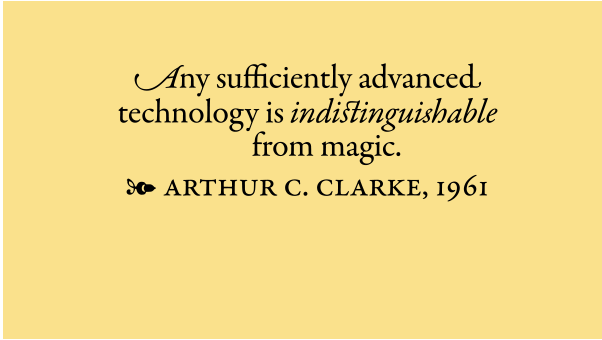
OpenType is today’s font format of choice for design professionals. Compared to its predecessors (PostScript) Type 1 and TrueType, OpenType is infinitely more sophisticated, with features that make a font more like software (which they technically are) that just a simple font. The primary features of OpenType fonts are:
- They are platform independent
- They can have a built-in “brain” (aka glyph substitution)
- They can accommodate thousands of characters
The first two are covered in Part 1. OpenType’s Expanded Character Set deserves its own spotlight, as it is a very broad feature that is immensely valuable to graphic designers.
Expanded Character Set
One of the most useful and exciting features of an OpenType font is the ability to contain over 60,000 glyphs. This means there is virtually no limit to the number of glyphs an OpenType font can contain, compared to a measly 256 in their predecessor font formats. (Don’t let that number intimidate you, as I’ve never encountered more than 2500 glyphs in a font.) This came to be because OpenType was originally developed to accommodate non-Latin language systems that contain thousands of glyphs representing words, not letters. This capability is a tremendous boon to designers who have had to do without many important or decorative glyphs that have not been available in digital format, but might have been in previous typesetting technologies such as Phototype and hot metal. Here is a rundown of the most valuable glyph categories. Keep in mind that these additional characters are available in some, but not all, OpenType fonts.
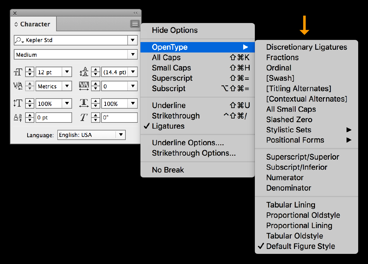
When using InDesign, all OpenType features are located in the Control panel and Character panel menus.
Multiple Figure Styles
Figures, also referred to as numbers and numerals, come in more than one style. In fact, there are four that are commonly called for in professional work. They consist of two design styles: lining and oldstyle figures, as well as two kinds of spacing: proportional and tabular. Each has different characteristics with varying uses. Once you determine which ones you need for a particular job, check for them in any fonts you are considering to see if they contain what you need. Do this by looking at the bottom of the OpenType panel where they are listed, and if they are not bracketed, they should be in the font.

OpenType fonts often contain four figure styles, which can be accessed at the bottom of the OT panel.
Fractions & Fraction-making Capacity
Diagonal fractions are called for in all kinds of text. OpenType’s expanded character set can accommodate many more than the basic three (¼, ½ and ¾) found in Type 1 and TrueType fonts. Some OpenType fonts contain an extended set of prebuilt fractions, which can be accessed by typing in the horizontal fractions, highlighting, and then selecting the Fraction command located in the OpenType options in most design software. Other fonts have the ability to create any arbitrary fractions on command, using the same method.
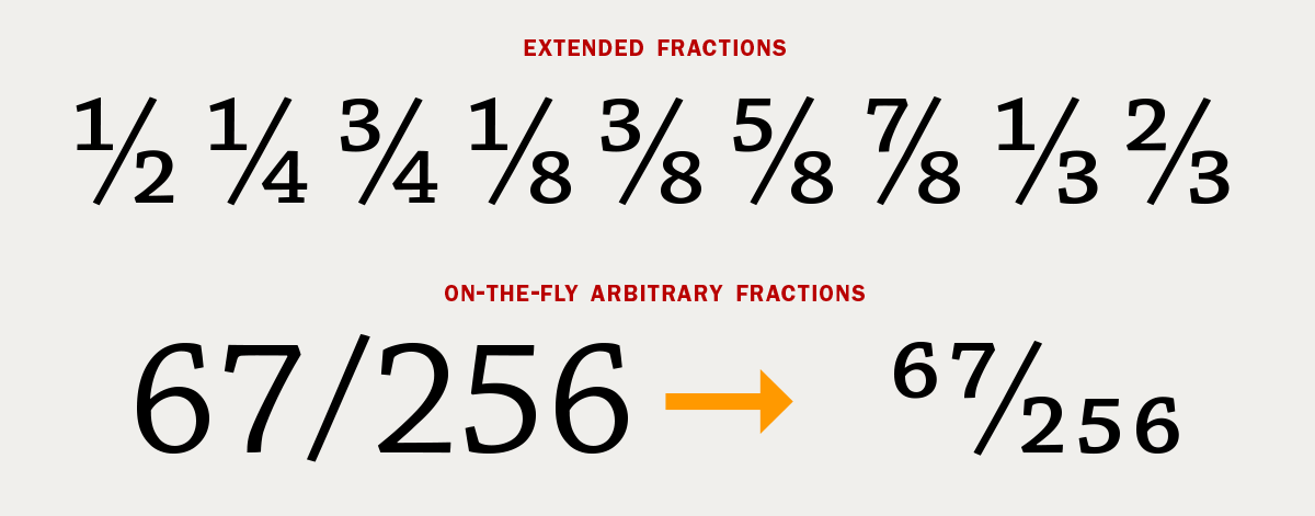
Some OpenType fonts contain an extended set of diagonal fractions (upper). A select few can convert any arbitrary fraction to a diagonal fraction (lower).
True-drawn Small Caps
Small caps are capital letterforms that are shorter than cap height. True-drawn small caps are designed by the typeface designer specifically for each font, and are the only kind that should be used in professional typesetting. True small caps eliminate the need for the computer-generated variety, which are just reduced caps that are too light, and often too narrow as well as too tightly spaced. If a job calls for small caps, be sure to determine ahead of time if a font has the true variety so you don’t wind up with the fakers in the middle of a job.
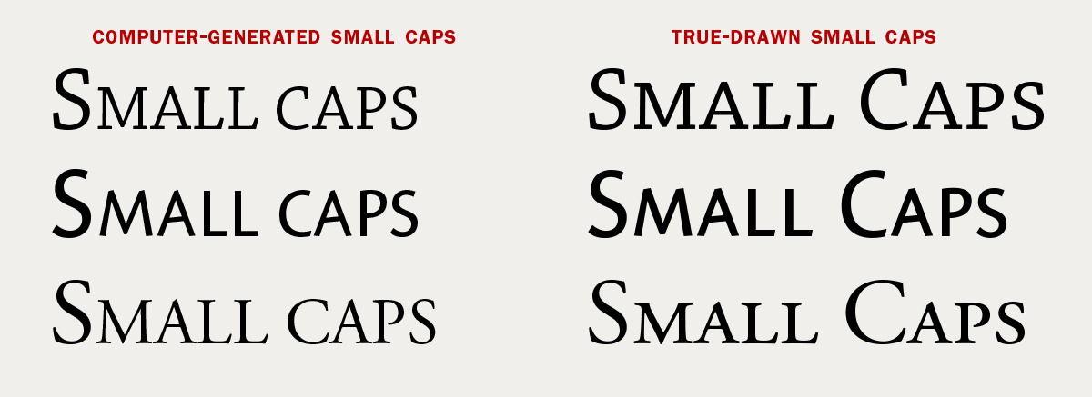
The difference between computer-generated small caps and the true-drawn variety is easy to see: the fakers are too light, and often too narrow and too tight.
Swash Characters
A swash is a flourish or stroke extension that is attached to a character for decorative purposes. They most commonly appear at the beginning or ending stroke of a glyph (usually referred to as initial and terminal swashes), but they can also be found in other places, including attached to ascenders and descenders, crossbars, and glyph apexes.
Swash characters are most often optional glyphs that are used to customize a setting by making a word or setting stand out, as well as to look more elegant and eye-catching. Swash caps are usually used at the beginning or the ending of a word, phrase, or sentence. Swash lowercase characters can be used anywhere as long as they don’t crash into other characters, or create a busy, unattractive appearance. Less is more when it comes to swashes, so use them prudently, and with attention to the overall appearance of your type.
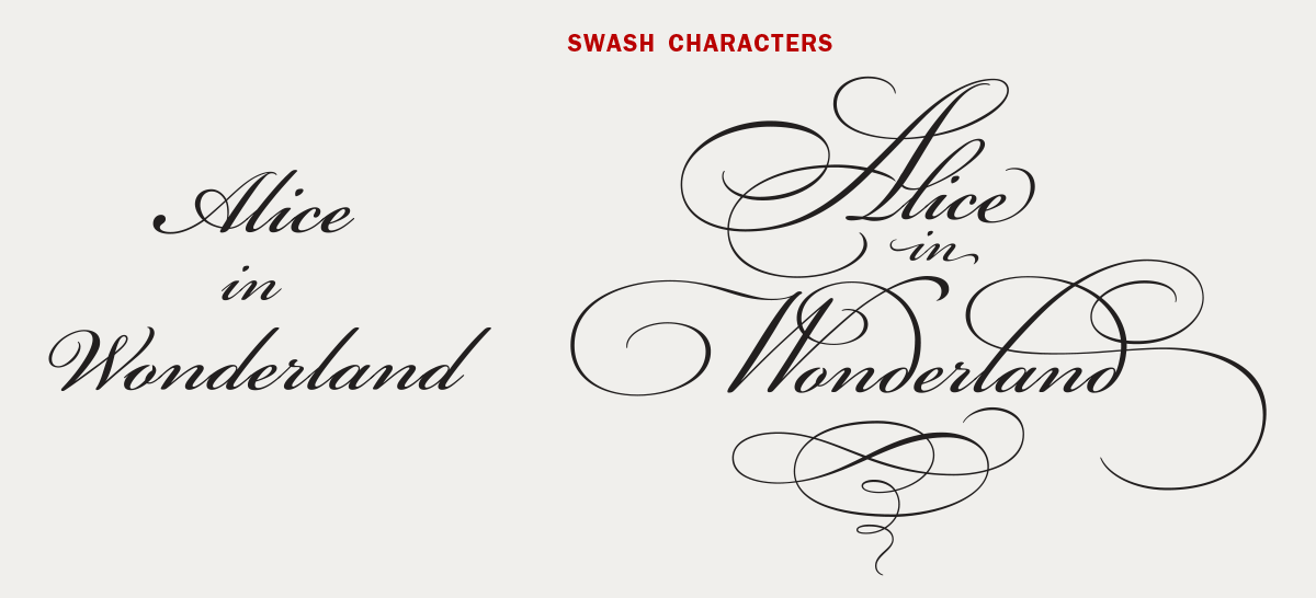
Swash characters can convert a plain vanilla setting into a highly decorative one, as shown above. Set in Bickham Script Pro.
Standard & Discretionary Ligatures
A ligature is a glyph formed from connecting or combining two or more characters. Standard ligatures are created to improve the look of characters that crash, collide or combine in an unattractive way. Prior to OpenType, there was only room for two standard ligatures: fi and fl. Many OpenType fonts have as many as the designer deems necessary in any give typeface. These often consist if fi, fl plus ff, ffi, ffl, and sometimes Th.
Discretionary ligatures are more decorative in nature, and are useful to create variety, enhance appearance, and offer the option of customization of any given text. They can be historic, ornamental, elegant, or just plain fun. Common discretionary ligatures are ck, sp, st, rt, as well as other historical forms.
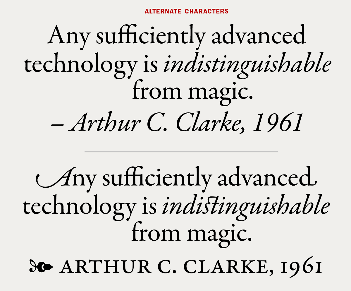
Many OpenType features are used to convert this simple setting into a more typographically expressive one. It uses swashes, standard and discretionary ligatures, contextual alternates, dingbats, true-drawn small caps, and proportional oldstyle figures – all available in Adobe Garamond Premiere Pro.
Contextual & Stylistic Alternates
Many OpenType fonts contain other kinds of alternate characters. Contextual and stylistic alternates are those that are intended to be used in certain situations, such as to improve spacing or connections in a handwriting font. All alternates can be found in the Glyphs panel, but can appear under different categories, such as contextual, stylistic or titling alternates, discretionary ligatures, swash characters, and small caps. Taking the time to explore all alternate characters in any give font, as well as where and how to locate and access them will allow you to take the most advantage of these valuable features.
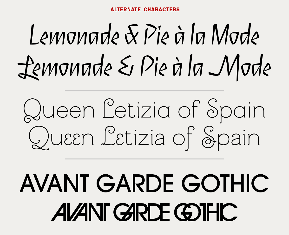
Alternate characters can change the look and personality of type as demonstrated in these settings set in Serge, Mandevilla, and ITC Avant Garde Gothic.
Stylistic Sets
Some OpenType fonts with numerous alternate glyphs have them grouped into Stylistic Sets. These are specific groupings that allow for the fast and easy insertion of multiple glyphs. A font can accommodate up to 20 Sets, which can be selected individually, or in non-contiguous multiples. This eliminates the task of selecting each alternate character individually, which can be especially tedious and time-consuming in lengthy text. Each Stylistic Set can contain a single glyph, or several that harmonize well, or have similar or related characteristics. Only a small percentage of OpenType fonts utilize this feature, but the ones that do make the designer’s job faster and easier.
Stylistic Sets are located in InDesign’s OpenType options. Sets that aren’t available in any given font are bracketed. Note that Stylistic Sets are only available and accessible in Adobe InDesign at this time, and not in Illustrator or other Creative Suite apps.

Trilon makes excellent use of Stylistic Sets to make alternate glyphs easy to use, especially when setting lengthy text.
Flourishes, dingbats, and other graphic symbols
Some OpenType fonts have decorative or graphic glyphs. They can be used for embellishment, to separate paragraphs or other information, create borders, and many other uses. The best way to check for these is via the Glyphs panel. They are usually located on the bottom of the panel, and sometimes under a subcategory such as Dingbats as well as Access All Alternates.
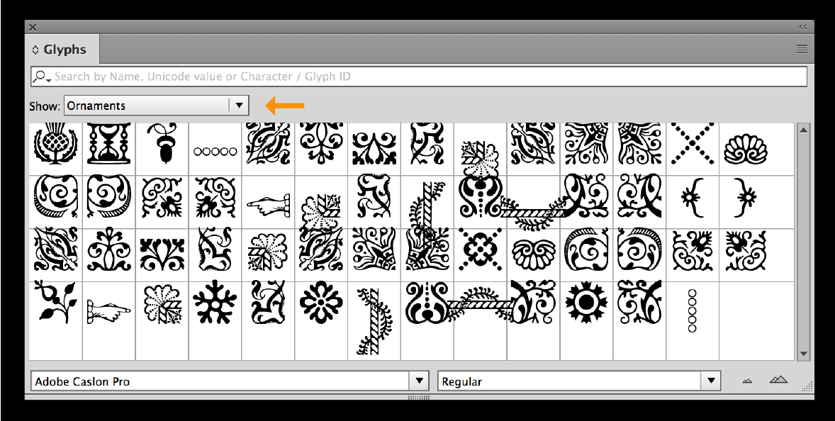
Adobe Caslon Pro contains many lovely, historic ornaments, which can be found under the Ornaments subcategory of the Glyphs Panel.
OpenType & Digital Media
The use of any of the above-mentioned special characters is no guarantee that they will display for every viewer of a web site or other digital media. More and more of today’s most popular browsers support OpenType features, but not every viewer has the most current OS as well as the most updated browser version. The same unpredictability goes for other digital media. You can try checking with a site such as caniuse.com, which provides up-to-date browser support tables for support of front-end web technologies on desktop and mobile web browsers. But always do your research before beginning a digital design project, as support for OpenType features is one that is ever changing; always consider the range of devices, platforms and browsers of your intended audience when using these features.
* * * * *
All of these OpenType features are important tools to help the designer both express and enhance a message. Explore them all, as they can take a job from just adequate, to a professional treatment that both hits the mark, as well as one that stands out from the crowd.
This article was last modified on May 15, 2023
This article was first published on October 31, 2016
Commenting is easier and faster when you're logged in!
Recommended for you

Finding, Filtering, and Organizing Fonts in Illustrator
The Illustrator 2026 font browser includes libraries and new options for browsin...

TypeTalk: The Work of Creative Contrarian Art Chantry
Art Chantry's work is quirky, shocking, and non-conformist, but underneath is a...
TypeTalk: Investigating Insouciant
TypeTalk is a regular blog on typography. Post your questions and comments by cl...


