


What a year 2015 has been for us at CreativePro.com and for you, our readers! Thank you for your continued support.
A quick recap: Over the past 12 months we’ve published over 200 original articles that covered your favorite topics: design, typography, photography, color, layout, and the business of graphic design. Also, CreativePro.com freshened its design, added some features, and moved the entire site (remember, we’ve been publishing since 1999!) to a new publishing platform without missing a beat. We cleaned up and consolidated our mailing lists — CreativePro Daily, we hardly knew ye — oh wait, we knew ye pretty well. But our CreativePro Weekly e-newsletter handily picked up those subscribers, and we’re doing our best to make sure each issue is more useful and interesting than ever.
We (Mike Rankin, the editor; and co-publisher Anne-Marie Concepcion) went through the year’s worth of posts and cherry-picked the most noteworthy to share with you. The posts we summarize below were either some of the most-viewed articles, or the ones most commented-upon, or simply, ones that we liked the best.
Happy (re-)reading!
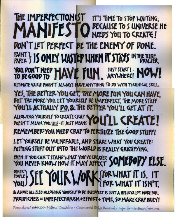
Paralyzed by Perfectionism? You Need the
Imperfectionist Manifesto!
We think author Melissa Dinwiddie brought a profound sense of relief to all of us designer-perfectionist types with this marvelous post from April 2015. Follow her story here and learn why she concluded, “My adventure with the Imperfectionist Manifesto poster was a triumph for me in practicing imperfectionism, as well as practicing my Golden Formula: self-awareness + self-compassion = the key to everything good.”
Mastering Photoshop Smart Objects: Layer Comps
Layer Comps? Is that a new feature in CC? No, Photoshop has had a Layer Comps panel since the Pleistocene era. But to grok why you might want to use layer comps in your own design workflow, you need a master teacher like Bart Van de Wiele to show you in this well-done, snappy video. We love how he levels it up by combining them with Smart Objects, too.

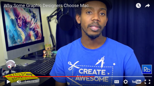
Is Mac or PC Better for Graphic Designers?
Oh you know this had to be one of the most-visited, most-commented posts of the year, right? Of course. Roberto Blake wanted to update the perennial Mac vs. PC debate for 2015. Yes, he did find legitimate reasons why a graphic designer might prefer OS X or Windows, which he spelled out quite clearly in his video, and bullet-by-bullet in the accompanying post. But did that stop you from commenting? Nope! Your contributions were just as illuminating.
Sharpen Color Awareness with Fun Vision Test
So you think you’ve got an eye for color? Erica Gamet brought this enjoyable little color vision test from a site called iGame to our attention, and the post took off like a rocket. Definitely one of the most visited and shared posts of the year.

Sorting Out the Dress Mess
There is no way we could let 2015 sneak away without reminding everyone of the biggest controversy of the year: Was The Dress White and Gold, or Black and Blue? Mike Rankin came down definitively on the side of black and blue, and linked to a few color tests and explanations to help us understand what the heck happened there.

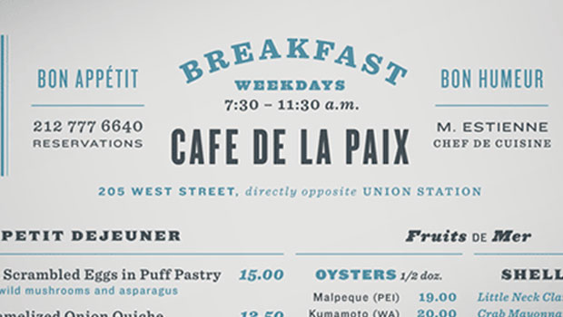
TDC Typeface Design Winners 2015
Every creative professional, regardless of their specialty, shares a passion for new, beautiful typefaces. It was no surprise that Ilene Strizver’s detailed post of the Type Director’s Club typeface design winners, full of type specimen eye candy, with links to each winning typeface, was one of our most popular posts this year.

(Bonus: Mike’s blog post from July, “25 New Free Fonts,” was another popular one. We creative pros just love our typefaces! Check it out, the ones he found are all legitimate, free-to-use-commercially typefaces.)
How to Make Amazing Halftone Effects with Adobe Photoshop
If you’re making a print publication, you’re working with halftones. But did you know exactly what a halftone is, and how Photoshop has some amazing hidden tricks for creating special effects with them? David Blatner (CreativePro.com’s other co-publisher) dazzled everyone when he revealed a few of these truly amazing effects.

How to Set Up Your Documents So That
Your Printer Won’t Hate You
We just loved the title for James Wamser’s post. He works for a large commercial printer as a Customer Education rep, so he has a foot in both camps: front-end designer/clients and back-end prepress vendors. Read his entertaining and illuminating tips on how to prep your files so your printer will love you. (Which would have been a much more boring title.)

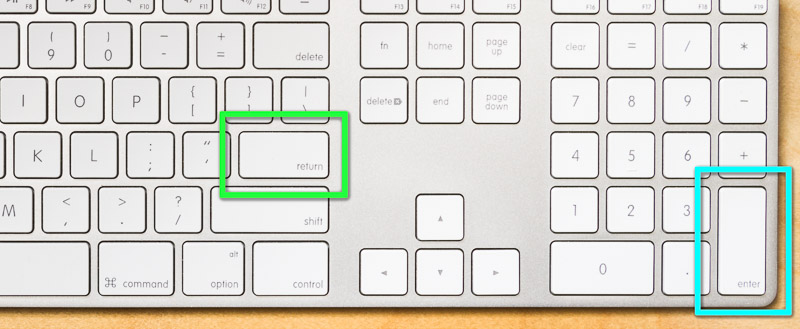
A Tale of Two Enter Keys
Who knew an article about a couple keys on the keyboard could be so fascinating? We’re happy that Conrad Chavez convinced us it would be! Through his post, so many people were finally able to understand the difference between the Enter key and the Return/Enter key, and how each does quite different things in InDesign, Photoshop, and other apps.
QuarkXPress 4.1: Worth the Upgrade?
The very first post on CreativePro.com, on August 31, 1999, was “Welcome to CreativePro.com” (warning: many out-of-date links). The next post, the first actual “topic” post to appear on the site, was this one, David Blatner’s ruminations on the new version of QuarkXPress (note: he was not impressed). We just love that CreativePro.com has such a wealth of content, an historical record of sorts of what was and continues to be important to those of us lucky enough to be working in the creative fields. Enjoy this blast from the past, and we look forward to bringing you more great stories in the future!

This article was last modified on August 30, 2020
This article was first published on December 30, 2015
Commenting is easier and faster when you're logged in!

Recommended for you

TypeTalk: To Hang or not to Hang…
TypeTalk is a regular blog on typography. Post your questions and comments by cl...
Four Techniques for Combining Fonts from H&FJ
The email newsletter from the Hoefler & Frere-Jones type foundry is a real g...
TypeTalk: Good-looking Figures
TypeTalk is a regular blog on typography. Post your questions and comments by cl...