

Because they’re so familiar, the design of everyday things can become invisible. We just don’t notice good or bad design choices in the things we take for granted.
For example, consider the humble concert ticket. You probably haven’t spent two seconds considering how ugly most of them are—if you even use paper tickets any more.
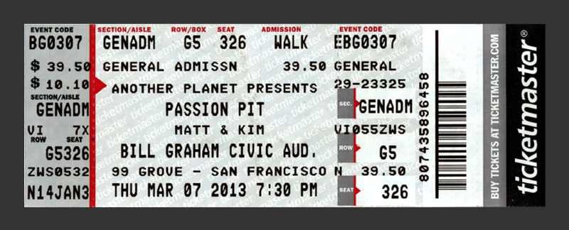
But these items are valuable and important (at least temporarily). They need to be functional: easy to carry, to scan, and to use in finding your seat. And if you’re sentimental, tickets serve as precious reminders of good times.
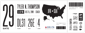
Matthew Lew, a graphic designer and student at California College of the Arts, decided to look at concert tickets with a fresh eye and found them really lacking in both visual appeal and utility. So he came up with a thoughtful redesign, and wrote it up in an article called Dear Ticketmaster. It makes you wonder, why didn’t someone think of this before?

And while you’re thinking about redesigning everyday objects, check out Boarding Pass/Fail, which shows several attempts at vastly improving the design of airline boarding passes.

The article even includes a downloadable Illustrator file that you can use to create your own boarding pass redesign.
This article was last modified on December 12, 2013
This article was first published on December 12, 2013
Commenting is easier and faster when you're logged in!

Recommended for you

TypeTalk: Biting the Bullet
TypeTalk is a regular blog on typography. Post your questions and comments by cl...

CreativePro Week 2026 Preview: 5 Indispensable InDesign Sessions
Five sessions InDesign users can't afford to miss
Font Sizing Guidelines Part 2: Spacing Considerations
Q. How does font size affect its spacing? A. In the most recent TypeTalk, we dis...