


History is cruel to typefaces—especially text faces—and very few stand the test of time. For every Caslon or Garamond there are a hundred also-rans left along the road for reasons of taste, economics, or technology. The craving—and craze—for new faces has led to the revival of scores of old metal typefaces, but many deserving faces have been ignored. Here, I’d like to call attention to my top ten candidates for faces that ought to be available in digital form but aren’t. In a future column, I’ll train the same lens on display faces.
Now, it’s possible that some of the faces I’m about to name have indeed been revived—or slavishly copied—but with new names that have hidden them from me in the sea of typefaces (about a quarter-million by now) that are commercially available. If you know of any such, both I and your fellow readers would be happy to hear about them, so do speak up.
There are also a lot of bad revivals out there, or at least revivals that have, let’s say, lost the spirit of the original. Let’s start with one of those, since nominally the face still exists, but in a withered form.
The first face is ITC Figural, the International Typeface Corporation’s 1992 remake of Oldrich Menhart’s 1940 original (see Figure 1). The general character shapes remain in ITC’s take, but gone are Menhart’s pen-inspired details, its edginess, its brightness. In its revived form, the face has been rationalized, smoothed out, and to my eye, made boring. Having the ITC version is better than having no Figural at all, but a faithful rendition of the original, last made by the Czech foundry Grafotechna, would be a treat.

Figure 1: With its generous proportions, especially in the uppercase, Figural creates an open and uncrowded impression on the page. Many characters appear faceted, as if drawn by a nibbed pen. The italics are particularly sparkling. A close-up above shows how these sharp features (left) have been ground down and regularized in the ITC version (right), stripping the face of much of its personality.
Another leading light among the missing is Barbou, a transitional face (a rare enough thing its own right) released by Monotype in 1925. It is itself a revival of an 18th-century French face, and it has a fineness and refinement of stroke that rules it out for use on anything but good-quality paper. If you do a web search for this face, you’ll find that I’m not the first to mourn its absence in digital form. The sample in Figure 2 was enlarged from 12-point, as the face was never cut in a size larger than 14-point, and this was the only decent sample I could find to scan.

Figure 2: Commercializing typefaces was an expensive proposition in the 1920s, and Barbou was eventually pushed aside in favor of Monotype’s Fournier, whose design drew from similar historical precedents.
Continuing on in alphabetical order, we come to Columbia, as designed by Walter McKay in the 1950s. Type history is littered with faces named Columbia, some extinct, some contemporary. McKay’s is a sturdy text face that has a solid color on the page, reminiscent of a Scotch face but lighter in touch (see Figure 3). It’s a super-versatile face that doesn’t draw attention to itself and would work well on any substrate—including electronic screens—and works pretty well in display roles as well, especially with its Bold Condensed complements.

Figure 3: Its lack of immediately distinguishing features is perhaps Columbia’s most distinguishing figure. But its tall ascenders, open counters, and generous proportions give it great readability.
Emergo (Figure 4) is another face that leaves me scratching my head. How can this face not be available today? It?s the work of Sem Hartz for the Dutch foundry Enschedé in the 1940s. Its strokes vary very little in weight and its serifs are tiny, giving it a clarity that reminds me of Hermann Zapf?s Optima. But the fact of those serifs make it a superior text face, if a bit pale on the age. Its delicacy allows it—maybe even calls for it—to be set in a larger point size than you?d normally consider for text. As with Eric Gill’s Perpetua, its italic capitals are unusually small.
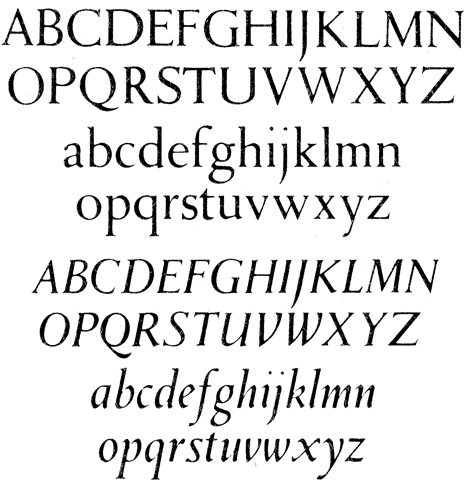
Figure 4: Emergo is simply lovely, if a bit spidery for some tastes. In a relatively large text size on coated or polished paper it would glimmer. My apologies for the poor quality of the scanned sample, enlarged from a small point size.
Joseph Blumenthal’s Emerson (released by Monotype in 1936) is another sturdy all-purpose text face whose presence on the page reminds me of Cheltenham, but whose features and bearing are more refined. It was probably considered insufficiently distinctive to be worth the effort of revival, and that’s a shame. Shown in Figure 5, the face is based Spiral, the designer and publisher’s only other typeface, named for Blumenthal’s Spiral Press.

Figure 5: Its wide stance and old-style color give Emerson a timeless quality, both workmanlike and very handsome.
Does the world really need yet one more Garamond? Well, yes, if it’s G. W. Jones’s 1930 Estienne, which once graced Mergenthaler Linotype’s sample books but has now sunken below the waves like so much lead. I like it for its modest x-height and consequent long ascenders and descenders (see Figure 6). There aren’t enough faces left with these qualities, and text set in them have a certain perkiness on the page that today’s taller x-height faces don’t often muster. The relatively wide set of the lowercase characters makes up for their short stature.

Figure 6: Not all Garamonds are created equal, fortunately, and Estienne preserves an old-fashioned ratio of short to tall that sets it apart from most contemporary evocations of Garamond’s work.
There are several digital typefaces available by the name of Fontana, but none are versions of Giovanni Mardersteig’s 1936 beaut. With the vertical stress of a transitional, it bears some resemblance to Baskerville but has a more contemporary aesthetic. Perhaps “timeless” is a better description, as the 1930s aren’t as contemporary as they used to be. Seen in Figure 7, it’s a fresh-looking all-purpose text face in a world that has too few of them.

Figure 7: Fontana was released commercially by Monotype in 1961 but was never digitized. With its generous counters and set widths, it would brighten up a printed page. It would also seem to be a good candidate for high-resolution e-book work.
Publishing economics being what they are, more and more type is appearing on cheap paper and electronic displays. Both substrates are challenging to a typeface, which makes a face such as Dick Dooijes’s Lectura (Figure 8) so valuable. Designed in 1966 for Amsterdam Type Foundry, it has a 60s-style large x-height and was designed specifically for enhanced legibility. Since Amsterdam’s demise, the face’s design rights have passed down to Linotype, so it’s not like Lectura has irretrievably disappeared.
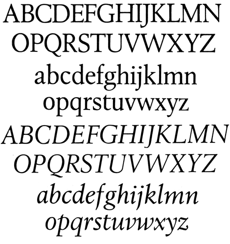
Figure 8: Lectura has a clean, commercial, and unpretentious feel to it. It’s a classic case of form following function.
Jan van Krimpen designed both of the last faces on my list: Lutetia and Romulus (the latter a very popular name for typefaces, as it turns out). Lutetia (Figure 9) is an elegant face with slender capitals that don’t jump out of the text at you. On the page, it has the brightness of a modern without the distracting contrast of stroke weight. It is stately without being stuffy. It has a lovely italic complement, and as released by Enschedé in 1925, a collection of swash capitals. There?s really nothing else like it, and its absence in digital form is a great loss.
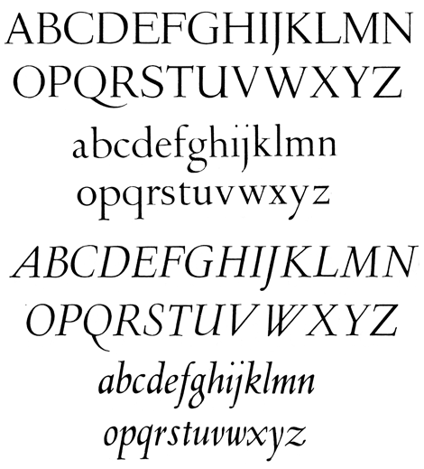
Figure 9: Lutetia doesn’t conform to today’s typographic norms in terms of color (it’s rather pale), contrast (it has very little), or assertiveness (it borders on reticence), and yet it seems totally contemporary.
Romulus, from 1931, shows van Krimpen’s aesthetic again, but with spikier, modern serifs all around, which make the type more animated. Its wider set gives it a more imposing impression that Lutetia, but its overall affect is harmonious, active but not distracting. Aspects of the overall feel of the face appear again, 20 years later, in Georg Trump’s more muscular Trump Mediaeval.
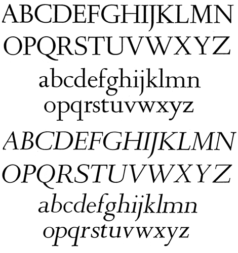
Figure 10: Romulus is great book face and all-around text workhorse. Too bad it’s not available in digital format. Despite being over 80 years old, it’s thoroughly contemporary in look and feel.
You can find samples of many of the faces mentioned here by using a web search engine, but some of them only appear in old foundry sample books or out-of-date compendia of typefaces. But in all cases, I think, the original art exists to allow faithful digital replicas to be created. I hope that someone, somewhere will take up the cause of these of these typographic ghosts and breathe new life into them. As consumers, you can help by writing to your favorite foundry or type designer to advance the cause of these neglected classics.
Because even if there are already a quarter-million typefaces available in the world, a quarter-million-plus-ten would be even better.
This article was last modified on December 17, 2025
This article was first published on April 3, 2013
Commenting is easier and faster when you're logged in!

Recommended for you

Working With Bulleted and Numbered Lists in InDesign
With a little care and effort up front, you can create great-looking numbered an...

SkyFonts Service Goes Live
SkyFonts, the cloud-based font rental service by Monotype Imaging has been offic...
Three New Type Designs from FontShop
Press Release FontShop is launching several original and useful new designs: FF...