
Welcome to the debut of TypeTalk, a monthly question-and-answer column on typography. You ask, and noted type authority Ilene Strizver answers! Just send your questions to “typetalk at creativepro.com.”
Name that Font!
Q. Once in a while I’m asked by a client to use a typeface I don’t recognize. What’s the best way to identify the typeface?
A. Good question. We designers often see an unfamiliar typeface in a publication, corporation, or ad campaign and want to use it.
Many large foundries and font distributors will help you via email or phone, but I think the best font-recognition system is WhatTheFont?. This system, which MyFonts developed with the University of Birmingham in England, analyzes fonts and finds the closest match from a database of more than 50,000 fonts. All you have to do is scan a sample of the typeface and upload it. Your scan can be color or black and white, and it doesn’t have to be high resolution (although that helps). Be sure to check out the site for exact specifications and search tips.
If WhatTheFont can’t figure it out, you can submit your image to the WhatTheFont Forum, where type enthusiasts may help. You can also view other submissions and comments.
Bad Software!
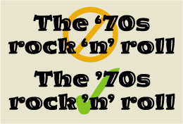
Q. What’s the correct punctuation in phrases such as “the ’70s,” or “rock ‘n’ roll”? My software automatically sets an open quote (so they look like “the ‘70s” and “rock ‘n’ roll”), but I was told that’s wrong.
A.You’re right to want to use smart punctuation (also called curly quotes or typographer’s quotes) rather than a foot mark (also called primes). The phrases you mention contain contractions, which use apostrophes to indicate omitted characters. In a font, an apostrophe is the same character as a closed single quote (Figure 1).

Figure 1. The wrong punctuation (top) and the right punctuation (bottom).
The challenge with today’s software is to set an apostrophe, or closed quote, at the beginning of a word, where most programs default to open quotes. There are several ways to achieve this:
- Manually insert the apostrophe, or closed quote, with its keyboard command.
- Access it from a glyph or character palette.
- Copy an apostrophe from another word and paste it into place.
- Fool the software by typing a character immediately before the apostrophe, then deleting that unnecessary character. (For example, type “19’70″” and delete “19”. The apostrophe will remain.)
Mutt and Jeff Typefaces
Q. Why do different fonts typeset in the same point size look so different in height and width?
A. In the days of metal type, point size referred to the height of the metal body onto which the type was cast. This height was determined by the distance from the top of the tallest ascender to the bottom of the longest descender, often found in such seldom-used characters as the florin. Since this measurement has no specific relationship to the cap height and x-height of a typeface, the overall size of typefaces of the same point size often varied, sometimes dramatically.
In the age of digital type, this measurement has become rather arbitrary because type designers and foundries assign the height based on their internal guidelines. Some try to keep cap heights consistent, while others go for the x-height and the overall color and texture. Because of this, typefaces set at the same exact point size can look dramatically different (Figure 2).
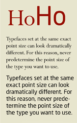
Figure 2. Perpetua and Neo Sans look dramatically different set in the exact same point sizes (52 pt. and 12/14 pt. respectively).
Don’t Commit a Type Crime
Q. What are the rules about altering someone’s font (a stroke, for instance, or the weight) when using the typeface in a logo or a headline?
A. It’s not uncommon for a designer to want to modify a character or two in a logo or headline, especially to improve the connection and relationship between them. This is sometimes called type tailoring. But is this legal? Not always!
When you buy a font, you’re not buying the typeface, just a license to use it. Most foundries let you, the end-user, modify a font for your own use as long as it’s not for resale or redistribution, but some foundries don’t. The only way to know for sure is to read the End-User License Agreement (EULA) that comes with every font. For instance, most EULAs prohibit you from sharing the software (yes, a font is considered software) with anyone. Make sure to read the EULA that came with your font before making any modifications so you won’t commit a type crime.
If you’re still unsure, call the foundry or designer of the typeface; some that don’t permit modifications in their EULA may give you permission on a case-by-case basis.
Perfect Drop Caps
Q. When I set drop initials (also called drop caps), should all lines of type next to it be indented the same amount, or should the first line be closer to the initial letter so it more obviously goes with it?
A. In a perfect world, yes, the first line of type should tuck into certain drop caps or initials to make it read as part of the same word, unless the initial is a word itself, such as “I” or “A.” While an uppercase P, T, or Y might not require this — their shape creates a natural connection to the rest of the word — others letters, such as A, D, E, and G, might call for the first line to be positioned closer to the initial than the rest of the indented lines for better readability.
Unfortunately, this kind of typographic customization isn’t always possible with publications that are heavily formatted for speedy and automatic layout, such as newspapers, magazines, and books. But if you have the time, flexibility, and desire to create fine typography, customize your initial letter treatment for a more professional look (Figure 3).

Figure 3. The first line of this paragraph is tucked into the U to eliminate the large space which would make the first word harder to read.
Have a type question? Send it to Ilene at “typetalk at creativepro.com”
Ilene Strizver, founder of The Type Studio, is a typographic consultant, designer, writer, and educator specializing in all aspects of visual communication, from the aesthetic to the technical.
Ilene formerly was the director of typeface development for International Typeface Corporation (ITC) where she developed more than 300 notable text and display typefaces. Her latest book, Type Rules! The designer’s guide to professional typography, 2nd edition, has received numerous accolades from the type and design community. She conducts Gourmet Typography workshops internationally.
This article was last modified on January 10, 2022
This article was first published on January 25, 2007
Commenting is easier and faster when you're logged in!

Recommended for you
Scanning Around With Gene: When Letraset Was King
I was a freshman in college when I had my first confrontation with dry-transfer...
Will the Real Garamond Please Stand Up?
Frank Romano, Professor Emeritus at the Rochester Institute of Technology, recen...

Using Stylistic Sets
Elegant typography is just a click away with the context menu and these eight gr...