




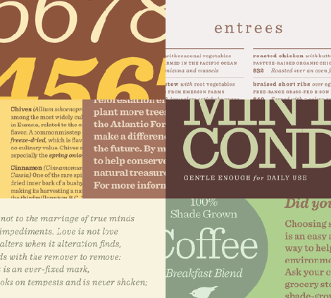
Is any typeface more in-the-know than a Clarendon? These smart looking slab serifs have the timeless style of a charcoal gray suit, or a well-chosen pair of horn-rimmed glasses: they’re approachable, welcoming, and effortlessly persuasive. Yet they’re tough to use — out of the question for setting text — because they lack italics.
Enter Sentinel®, a new slab serif from H&FJ. A new take on this lovely and useful style, Sentinel is a refreshingly complete family in twelve weights (Light through Black, with italics throughout) that’s designed to shine in sizes both large and small. Featuring text-friendly features like short-ranging figures, and our Latin-X® character set for extended language support, H&FJ is delighted to present the entire Sentinel family for just $199.
For more information and to see more samples, go to www.typography.com.
This article was last modified on December 14, 2022
This article was first published on May 18, 2009
Commenting is easier and faster when you're logged in!

Recommended for you
Font Sizing Guidelines Part 2: Spacing Considerations
Q. How does font size affect its spacing? A. In the most recent TypeTalk, we dis...

The Candy Wrapper Archive is One Sweet Collection of Package Design
If you’re looking for a little typographic inspiration, thoughts on the evolutio...

Drop Cap Tips: Kerning and Sizing
InDesign can make decent-looking drop caps at the push of a button, but I always...