

This article appears in Issue 4 of CreativePro Magazine.
Whether you’re pitching a layout concept or selling your services as a résumé designer, mocking up your work benefits both you and your client by simulating what a digital design would look like in the real world. With a wide range of uses, mastering some basic mock-up production skills is essential for many creatives. Most mock-ups come in one of two flavors: flat JPGs where you paste in your artwork (with varying degrees of additional work required for best results), and layered PSDs featuring Smart Objects and/or a range of such additional features as editable props, backgrounds, shadows, and more. In this article, we’ll explore how to work with both a JPG and a PSD mock-up, but first—we’ll build an entire mock-up from scratch. Yes, from scratch! Who says you have to have source files to start with? You’ll be surprised by what you can create from nothing with just some basic Photoshop know-how.
Before You Start
Before diving in, there are a few things you should consider. What kind of mock-up do you need? Are you mocking up a book cover or a multi-page PDF? How many pages of your multi-page PDF do you need to showcase—the entire document or just enough to communicate an idea? What size is your design or creation? If you’re trying to mock up an A4 document, don’t expect it to work with a template intended for square documents. You’ll also want to consider the format of the mock-up scene itself (not the document depicted within, but the containing PSD or JPG). Is the file square? Vertical? Can it be easily adapted if needed? Once you know what you’re looking for, where do you find it? A quick Google search will turn up plenty of sites offering free mock-ups. As you might expect, the
quality and ease of use will vary wildly. Some files may be surprisingly good, but most will likely require some finesse before they’re actually usable. If you have an Adobe ID, you can find a spattering of simple JPG mock-ups included among the free asset collection at Adobe Stock. We’ll take a look at these in more detail in the second practice project so you can see how they work. To give you an idea of what to look for in a PSD mock-up, our third practice project showcases a paid example from Creative Market, where there’s no shortage of eye-catching options to be found by searching with keywords like mock-up and scene. Just make sure to read the product descriptions carefully so you know how much editability and customization a particular product offers to avoid being disappointed. Some may look fantastic, but aside from simplifying the overall process, they may be more limiting than you expect. Paying money for a mock-up file doesn’t guarantee you’ll get a well-crafted, ready-to-go PSD. (You could just as easily be paying for a flat JPG or a poorly built PSD.) Save yourself the frustration by carefully reading the descriptions and reviews before checkout. No matter which type of mock-up you end up working with, before you can start building it, you’ll need to export your design into a Photoshop-friendly format like JPG or PNG. In the examples included here, we’ll be mocking up two PDFs created in InDesign. To get them out of InDesign and into Photoshop, after opening the files in InDesign, choose File > Export. Create a new folder for the soon-to-be-exported files, choose JPEG for Format, then click Save (Figure 1).
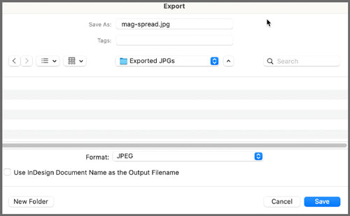
Figure 1. Create a folder for the exported files, and choose JPEG for the format.

Figure 2. Decide to export pages or spreads, some or all of the document, and the resolution necessary for your project.
Three Ways to Mock It Up
To help you make sense of what mock-ups are all about, we’ll take a look at three ways to create them. First, we’ll create an entire mock-up from scratch. Then we’ll explore how to use Smart Objects to turn a flat JPG into a reusable mock-up template. And finally, we’ll dig into a paid template to see what all the bells and whistles are about.
Create a mock-up from scratch
Having previously exported all three pages of the sample document, we’ll jump right into Photoshop and create a new document by choosing File > New. Because we’re mocking up a printable PDF for an Etsy product (and Etsy requires images at least 2000 px wide), enter a width of 2000 pixels and a height of 1333 pixels, then click Create (Figure 3).
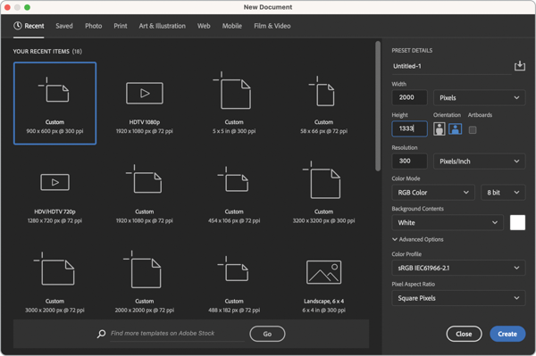
Figure 3. To create a mock-up of a product PDF for an Etsy listing, create a new Photoshop document with a width of 2000 pixels and a height of 1333 pixels.
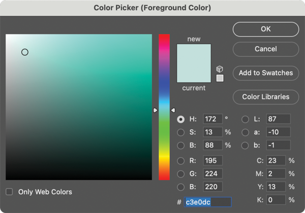
Figure 4. Choose the first of two colors for the background gradient.
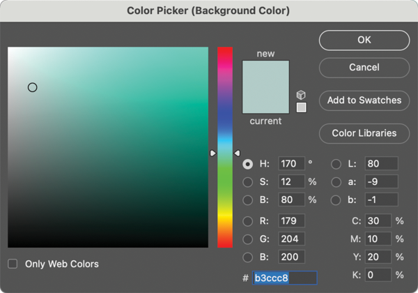
Figure 5. Select a second color for the background gradient that’s slightly darker than the first.

Figure 6. From the bottom of the Layers panel, click to create a gradient adjustment layer.
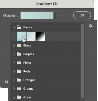
Figure 7. Click the disclosure triangle next to the gradient preview to open the gradient presets and select the first option within the Basics folder to create a gradient from your current foreground and background colors.
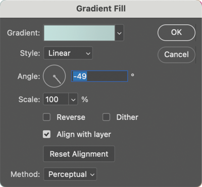
Figure 8. Set Style to Linear, Angle to –49 degrees, Scale to 100%, and be sure Reverse is turned off.
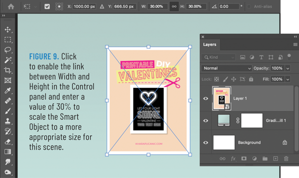
Figure 9. Click to enable the link between Width and Height in the Control panel and enter a value of 30% to scale the Smart Object to a more appropriate size for this scene.

Figure 10. Position pages 2 and 3 behind page 1 by adjusting their positions within the Layers panel. If desired, rotate them slightly to better offset them from page 1.

Figure 11. An angle of 131 degrees positions the drop shadow to the bottom right, consistent with the background gradient where the darker color appears in the bottom right.
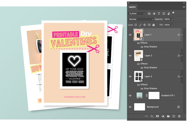
Figure 12. Copy the layer style by holding Option/Alt and dragging the drop shadow from Layer 3 to Layers 1 and 2.
- Add a subtle texture to the background using a Pattern Overlay style. I like the Stone_Sandstone texture from Photoshop’s 2019 default collection. (You will have to load this included pattern collection into the Patterns panel before it’s accessible as an option in the Layer Style dialog box. To do so, choose Window > Patterns, then from the panel menu, choose Legacy Patterns & More.)
- Further develop and reinforce the lighting in the scene by adding one or two additional gradient adjustment layers, this time using the Black to Transparent default with an angle of 131 degrees.
- Reduce the pure white of the pages that screams “I’m digital!” by grouping them into a folder and using a clipped adjustment layer (thereby affecting only the page layers and nothing else), reducing the levels output of the highlights from 255 to something closer to 250.
Check out Figure 13 to see what this scene looks like with these additional details. It’s pretty remarkable what you can pull off in a hurry, entirely from scratch. In the next example we’ll explore how to use Smart Objects with an existing JPG image and how they can save you a ton of time in the future.
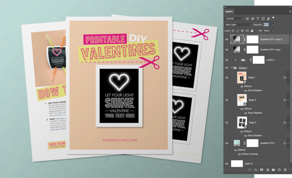
Figure 13. For additional realism, I added a couple more Gradient adjustment layers to enhance the scene lighting, a Levels adjustment layer to tone down the brightness of the page layers, and a Pattern layer style to add some texture to the background.
Insert your design into an existing JPG using Smart Objects
Building a mock-up from an existing photo featuring a “blank” means not having to guess at the perspective or behavior of real-world objects in a given environment. And—depending on how the image was created—you can often make use of the existing highlights and shadows on the object. (Or at the very least, take your lighting cues from them.) In this example, we’ll start with a JPG from Adobe Stock’s free collection that anyone with an Adobe ID can license at no cost. (Would you believe their free collection includes more than 70,000 assets? It’s a great resource!) Once you license and download the file, open it in Photoshop and you’ll see the image shows a blank tri-fold document with each panel formatted for US Letter (Figure 14). If you look over in the Layers panel, you can confirm that as a JPG, it offers are no existing layers to work with, meaning we’ll have to create our own.
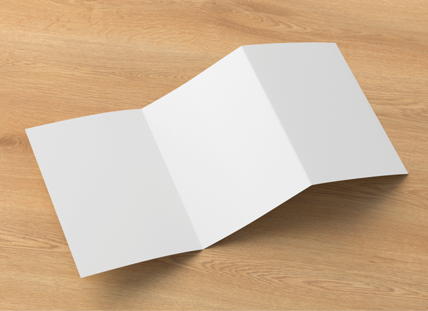
Figure 14. This JPG from Adobe Stock (file number 258742821) is available to anyone with an Adobe ID to license at no cost from Adobe’s free collection featuring more than 70,000 assets.
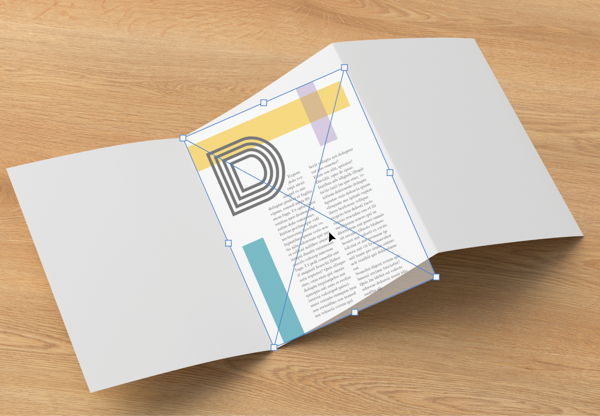
Figure 15. When transforming the page to fit the corresponding panel, focus on aligning the corner points of one side (left or right) first.
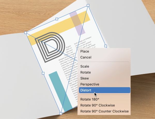
Figure 16. After aligning one side of the page to the panel, right-click within the bounding box and select Distort before aligning the other two corners.
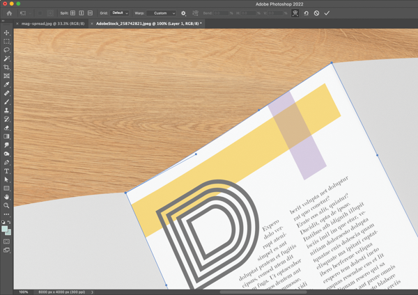
Figure 17. To match the natural bow of the blank document in the scene, after aligning all four corner points, right-click within the bounding box for a second time, then choose Warp.
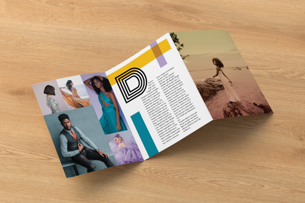
Figure 18. With Smart Objects for each of the three panels, the completed mock-up now serves as an easily editable template that you can reuse to showcase additional designs quickly and easily.
Using a professionally generated mock-up template
This magazine mock-up available from Creative Market has a lot going for it. A quick peek at the product description reveals that the 11 included photo-realistic files measure 3000 × 2400 pixels, feature organized sets of layers complete with Smart Objects (including a changeable background with applied perspective). The files also include the option of showing or hiding the built-in shadows and reflections (in case you want to change them and add your own), and as we’ll soon see, one of the renderings includes a custom-built action to create a shallow depth-of-field effect. Cool! There’s also a PDF help file included. The only thing that’s glaringly missing from the description is what size of layout the mock-up is intended to showcase. (I can tell you from personal experience with this collection that though it’s not quite US Letter size, it is acceptably close, at least for my purposes.) Some creators are better at including these details than others, but for the price (currently $15), it’s still a bargain. (For comparison, here’s another collection that includes stylish touches like ambient shadow overlays and textures, and features two sizes: A4 and US Letter. It currently sells for $30.) Opening scene six from the $15 collection, we can see that the situation in the Layers panel is indeed nice and tidy (Figure 19). The orange, color-coded layers indicate the Smart Objects for editing. They’re conveniently labeled Left Page and Right Page, so you won’t confuse which is which.

Figure 19. An example of the neat and tidy Layers panel that can often (but not always) be found within PSD mock-up templates
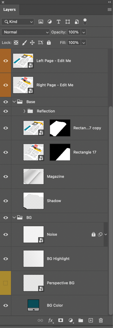
Figure 20. Digging deeper into the Layers panel of the PSD mock-up template, notice that it includes an easy option for changing the background color, the ability to hide reflections, and a Smart Object (Perspective BG) for inserting a photographic background that will automatically be made to match the perspective of the scene.

Figure 21. The final mock-up after changing the background and using the template collection’s included action to create the shallow depth-of-field effect
Take Your Mock-ups Even Further
If mock-ups turn out to be your jam, there are several ways to keep the party going and expand your options even more.
Shoot your own mock-up images
You don’t have to be a professional photographer to capture a great mock-up image. Figure 22 is a greeting card mock-up I photographed with my phone, using a blank card and envelope overlaid atop a piece of 12 × 12 inch scrapbook paper, with a pencil and some mini clothespins as props. Captured on the floor using the indirect light from a neighboring window, it required minimal effort to achieve arguably good results using found objects from around the house. (Read: cheap!)

Figure 22. An example of a greeting card mock-up captured with my iPhone, using only available window light, featuring a blank card/envelope along with various props from around the house
Explore mock-up scenes
Some of my favorite and most frequently used mock-up assets are known as scenes. (These are sometimes also referred to as “Scene Creators” or “Scene Generators.”) Unlike a stand-alone mock-up collection, commercially available scenes generally include a vast collection of backgrounds and props (possibly photographed but often photo-realistically rendered in 3D), all intended to work interchangeably with coordinating colors, perspective, and lighting. You literally drag and drop to create whatever you need, whether building a mock-up scene or just creating a stylish image for a marketing message. Either way, they’re undeniably fun to play with and offer seemingly limitless possibilities. (Here’s an example from Design Cuts that features over 275 individual objects, backgrounds, and pre-made scenes.)
Curate a collection of your favorites
Once you get the hang of what works for you and your projects, you can build up a library of virtual props and backgrounds to draw from. These assets may include images you capture (or render) yourself, collections you’ve purchased, and/or freebies you’ve scored along the way. Over time, you can curate collections for different themes you might use frequently, like kid-friendly toy props, or super-niche categories, like winter drinks and related accouterments. The more experience you gain, the faster you’ll be able to showcase your work with increasing variety. Indeed, the hardest part may be deciding which is your favorite. A camera-slinging design nerd, author, and serial crafter, Khara Plicanic makes learning fun for everything from Photoshop and type design to sewing and crochet. Find her classes and download her free, goodie-filled Creative Toolkit at KharaPlicanic.com. How do you showcase digital products like ebooks, PDFs, and other creations that don’t actually exist in the physical world—and thus, can’t be photographed? There’s a mock-up for that. (And if not, it’s easier than you might think to create one.)
Commenting is easier and faster when you're logged in!

Recommended for you

How to Remove a Head in Photoshop
I was once asked by a newspaper to produce images of a range of celebrities, sho...

Making Illustrative Effects in Photoshop
Combine illustration and photography to create an intriguing image. Drawing skil...

A Script to Collect All Objects With A Particular Object Style
In the course of my editorial duties here at CreativePro, from time to time I...