
All About Digital Planners
Digital planners are hot and whether you want to buy one, sell one, or make one for your own use, we’ll get you up and running in no time.


This article appears in Issue 6 of CreativePro Magazine.
I don’t remember how I first came across the fascinating cottage industry of digital planners (I suspect an Etsy algorithm had something to do with it), but I distinctly remember that it struck me as clever and adorably kitsch, but also perplexing. Right away, I had so many questions. How exactly do digital planners work? Why had I never thought to design or use a PDF in this way? Are all these Etsy sellers and YouTubers really making a living marketing and selling themed PDFs? If so, why have I not seen, heard, or read of this? Are people really willing to pay $30 for a PDF they can digitally scribble on—despite the fact that it can’t sync data with actual calendar software like the Google and macOS Calendar apps?
In a nutshell, I didn’t get it. But I wanted to.
After recovering from the initial shock of discovering that a larger-than-you-would-believe portion of the digital planner community creates them with Keynote, PowerPoint, or Canva, I felt compelled to offer the world a more robust workflow alternative.
Tempted by the prospect of passive income, I wondered: How much more efficiently could a digital planner be created in InDesign?
I decided to find out.
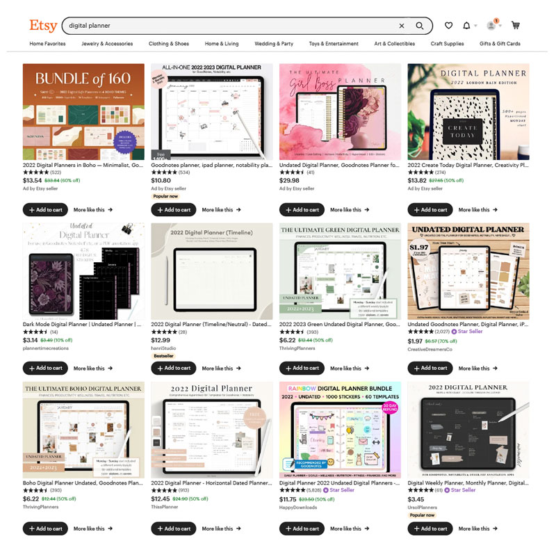
A tiny sample of the digital planners for sale at Etsy
What Exactly Is a Digital Planner?
Let’s start at the beginning to be sure we’re clear on what we’re talking about. Essentially, a digital planner is a PDF that you load into a note-taking app on a tablet so you can write over it with a stylus in much the same way as you would take a pen to a traditional paper planner or notebook (Figure 1). It’s a way of combining the tactile act of note-taking (in your own actual handwriting, no less) with some of the flexibility, convenience, and paperless advantages of the digital realm.

Figure 1. A digital planner is a PDF designed to be used in conjunction with a note-taking app on a tablet and written on as if it were a traditional paper planner. Unlike a general PDF notebook, a digital planner contains extensive hyperlinked navigation, often with skeuomorphic design to mimic a real-world notebook.
These digital planners are made to look and behave like traditional paper planners, complete with visual depictions of digital coils and binder rings, paper textures, and scene lighting. Remember the skeuomorphism that was trendy in the ’00s? Yeah, that. Available in a dizzying array of formats, layouts, and color-coordinated themes, many come with matching “digital stickers” or “widgets” that allow for endless decoration, color coding, personal expression, and customization by the user.
Their core functionality comes from a robust architecture of hyperlinked pages that operate much as a paper planner would. Tap on a virtual tab labeled January, and the page will jump to the corresponding month view. From there, tap on any individual week to jump to the corresponding week view.
Other, more full-featured digital planners also come with alternative layout options and a slew of additional pages for every kind of goal planning, list-making, intention-setting, and journaling whim you don’t even realize you have yet. It’s not uncommon for these planners to have anywhere from 600 to 1,000 or more hyperlinked pages.
The associated note-taking apps that bring the planners to life make it easy to export select pages for printing or sharing, and because they synchronize your planner across your different devices, you can check your grocery list from your smartphone before you get home and realize you forgot the marinara sauce again. (Though nothing guarantees that you’ll actually remember to check. But there’s probably an app for that, too.)
The easiest way to get a feel for digital planners and how they work is to dive down the YouTube rabbit hole of videos featuring demonstrations, tutorials, tips, and hacks for setting up your own. (You can find a quick, no-nonsense overview here, with another, more broad demonstration here.)
Grab a cup of tea or coffee, and let all the pretty handwriting and inspirational quotes galvanize your inner Type A personality while you discover how to tap your way to the vision board of your dreams.
Supplies for getting started
If you make it out of the rabbit hole and want to give digital planning a try, you’ll need four basic things:
- Tablet
- Stylus
- Note-taking app like GoodNotes (a one-time purchase of $7.99, iOS) or Notability (free version or $11.99/year, iOS and Android)
- PDF planner
I agree with the artists, designers, and veteran digital-planner aficionados alike who recommend adding a screen protector such as Paperlike ($39.99 for a pair) to make your tablet’s surface less slick and feel more like writing and drawing on actual paper. (Android equivalents are harder to find, but depending on your device, Paperfeel might work for you.)
Some popular PDF creators offer free planners (with registration) you can test drive before purchasing. There’s also a dazzling selection of planners on Etsy that range in price from a few bucks to $30 and more. You can even find a PDF clone of the traditional Franklin Planner for roughly the same price as the venerable organizer.
The basic digital planning process
Once you purchase or create the PDF you plan to use as your planner, transfer it to your tablet (via iCloud, AirDrop, Dropbox, Google Docs, etc.), then launch your note-taking app of choice and import it.
You’ll find that most sellers of digital planners include extensive tutorials and support for getting started. From here, it’s just a matter of learning how to use your chosen note-taking app to make the most of the available tools.
Those tools include digital pens, markers, and highlighters. Some editing tools, like the selection lasso in GoodNotes, make it easy to resize, recolor, or reposition things you’ve written (or drawn), while other tools allow you to add images and graphics.
One of the GoodNotes features I love most is how easy it is to add, copy, rearrange, bookmark, or delete pages as needed. If you run out of room for all your lofty and inspiring goals, just copy and insert more of your favorite planner pages, and you’ll never run out again. (Finally, a planner that can accommodate your endless ambition!)
Creating Your Own Digital Planner
Naturally, as a creative professional (you are reading CreativePro Magazine, right?), you can certainly build your own digital planner with InDesign. With some planning and a thorough review of the ins and outs of working with cascading parent pages, tables, auto-flow text, and hyperlinks, you’ll be in a great position to start.
Your digital planner can have as many features and options as you’re willing to build into it. Just know that the number of pages and links you’ll need to manage and keep track of can snowball quickly. I recommend starting small, with just a year and monthly view, for a total of 13 pages. Then you can consider adding a few pages with more features like to-do lists, meal planning, or goal planning. Once you get the hang of it, you can add in weekly views and, ultimately, even daily views.
Document setup
You’ll first want to figure out which kind of layout makes the most sense for you: Would the tall space of a vertical planner be helpful? Or does a wide, horizontal layout suit your needs better? If you’re torn between the two, a third option would be to use both! Because InDesign lets you mix page sizes and orientations within a single document, you can build each layout however it works best, then just rotate your tablet as needed when working with the resulting PDF.
Vertical layouts generally display a single planning page at a time (Figure 2). But a horizontal layout could be designed as a single page or made to appear as an open notebook—with simulated facing pages (Figure 3). Either way, as far as InDesign is concerned, you’ll want to set up your document without actual facing pages.

Figure 2. A vertical digital planner format generally features a single-page layout.
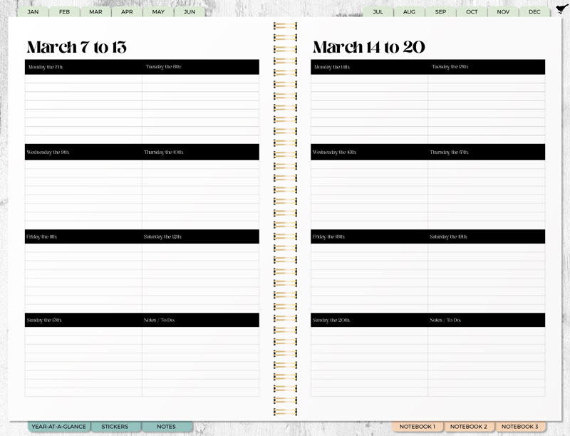
Figure 3. While technologically a single-page layout, a horizontal digital planner layout can be designed to evoke a physical planner with two facing pages.
The exact pixel-perfect dimensions for page size will vary by device and app, but in general, US Letter and A4 work well. (Keep in mind that a lot of people like to print pages from their planner, so a standard size page will make that easier.)
Building the document
Part of the fun of designing a digital planner is all the virtual bits that make it look like a traditional planner. (Oh, the irony.) With such assets as pretend binder rings and paper textures readily available from places like Creative Market, you’ll have plenty to choose from when building your virtual book.
If you’re feeling adventurous, it’s not difficult to create your own virtual coil bindings from scratch in Photoshop. (Amazingly, people somehow manage to do so with Keynote and PowerPoint, too.)
At first glance, these skeuomorphic elements seem to be purely ornamental, but they can serve a navigational purpose, too. For example, some designers choose to use the virtual coils as a link to jump to the cover page or table of contents. And as you might expect, the virtual tabs along the top, side, or bottom edge link to related pages.
If you don’t intend to use photo-realistic elements in your design, you might have a bit more real estate to work with. But you’ll still need to make room for some sort of navigational system connecting all your pages.
When building a planner of a scope that could eventually flirt with a four-digit page count, your ability to leverage cascading parent pages and styles will make or break you. If you build the main structure—the skeuomorphic design elements and main navigation—on the default parent page, known as A-Parent, then you can create a separate parent page for each of the other layouts (like monthly and weekly views), each based on the original A-Parent page (Figure 4).

Figure 4. For maximum efficiency and flexibility, the navigation and elements of the planner were built on the A-Parent page. Each layout variant was then built on a separate parent page based on A-Parent. Any change made to any element on the A-Parent would automatically be inherited by the other parent pages. (Here you can also see the parent pages I created for an alternative weekly layout as well as a daily layout I ended up not using.)
This ensures that all the design elements and navigational components exist only on the A-Parent, and any changes made to them will be inherited by (passed on to) all the other parent pages that are based on the A-Parent. (Get it? Genetic engineering, made simple!)
It would be easy to create a completely undated planner, call it good, and just be done with it already. (And really, who could blame you?) While taking the undated route definitely has its appeal from the perspective of a planner creator, as a user I’d never bother with an undated planner—and certainly wouldn’t pay for a planner that I still had to date by hand.
There are several ways to approach adding dates to your planner. But how to automate the process? After much experimentation, research, and copious amounts of coffee and chocolate, I came up with two techniques that work quite well. While both methods include tables and begin with using Excel to generate a year’s worth of dates, the first method allowed me to automatically date the entire year in less than five minutes.
Auto-dating: Method 1
Our first method uses tables with the dates as one text file flowing through a series of threaded text frames overlaid on top. I copied the data from Excel (formatted in a long, single column), and pasted the entire, year-long string of dates into the primary text frame (Figure 5).
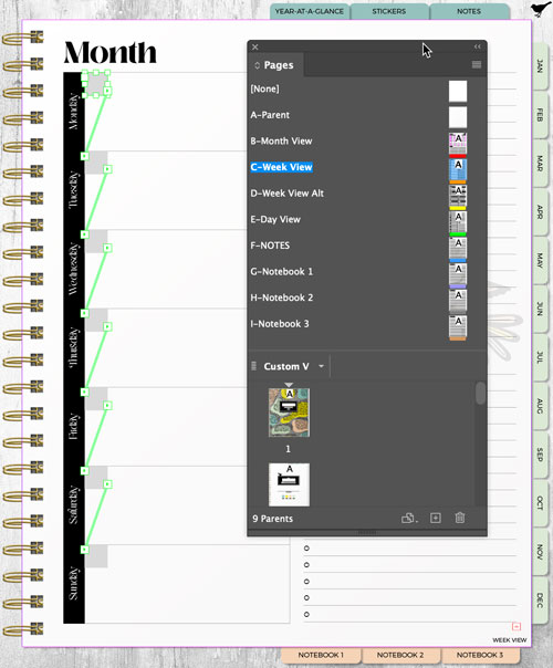
Figure 5. After using Excel to generate a year’s worth of two-digit days of the month, the entire string of data was pasted (as plain text) into a threaded, auto-flowing, primary text frame overlaying a table containing the days of the week.
Applying an object style ensures that even when a parent page item is overridden on individual pages, tweaking the design will be a breeze.
With Smart-Text Reflow enabled in InDesign’s Type preferences, the dates will string themselves through the series of text frames and InDesign will automatically generate additional pages as needed to accommodate a year’s worth of dates.
Once the dates are in, you can use Find/Change to replace every paragraph return with a frame break (Figure 6).
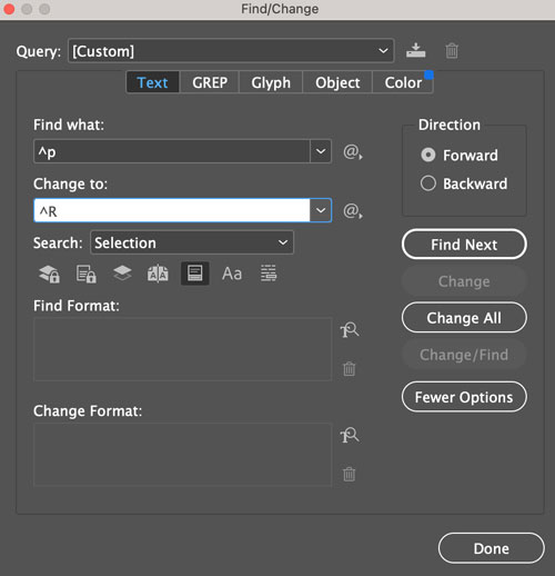
Figure 6. To force each two-digit date into its own text frame, I used Find/Change to replace each paragraph return with a frame break.
This automatically pushes each date into the next threaded text frame (Figure 7).
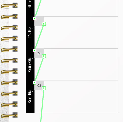
Figure 7. The dates are now in their final weekly view position, after Find/Change replaced 365 paragraph returns with frame breaks.
To bump the days of the month to the correct days of the week, add frame breaks to the top of the text thread (in this case, I added five frame breaks to bump Jan 01 down to Saturday, the sixth day of the week) to ripple everything downstream and into place. Then, tweak the related paragraph and object styles as needed, and just like that—all your weekly layouts for the entire year are dated. (And your coffee is still hot!)
I used the same method to add dates to all 12 monthly views, pasting the same text from Excel into a different series of threaded, text frames positioned on top of a different table that again, provided the overall structure and headings (Figure 8).

Figure 8. Threaded text frames made it possible to automate a year’s worth of monthly views just as quickly.
Before you cringe at the thought of text frames overlaying a table that’s otherwise mostly empty (except for the days of the week in this example), consider that this method is lightning fast, and the only text frames you have to create are those on the corresponding parent page. For an entire year of weekly views, I created a single text frame and duplicated it six times for a whopping total of—seven.
Auto-dating: Method 2
This second method also relies on Excel to generate the dates, but this time using three columns instead of one. The first column contains the days of the week while the second houses the days of the month. The third is added in InDesign and actually left blank (this will make sense in a moment).
Instead of copying and pasting the Excel data as plain text, place it by choosing File > Place. Select Show Import Options and for Formatting, choose Formatted Table (Figure 9).
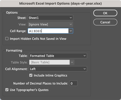
Figure 9. Enabling Import Options when placing an Excel document allows the data to be placed as a table, maintaining its formatting.
Assuming you still have Smart-Text Reflow enabled in your preferences, this will bring it in as a table and flow the data across as many pages as needed (Figure 10).

Figure 10. After importing the two-column Excel document as a formatted table, I used InDesign to add a third, blank column on the right to provide the structure I was looking for.
To achieve the desired visual aesthetic, I rotated the days of the week to run vertically and formatted their column with a black fill and white text, narrowing it accordingly. What appears to be a “gray square” containing the date is actually paragraph shading set to column-wide with the width reduced as needed. This left the third (blank) column as a placeholder, giving the end user room to write. The final touch was setting the stroke weight for the vertical divider between cells to zero, making it appear as though the dates are (you guessed it) sitting in a separate frame within the larger, empty cell (Figure 11).

Figure 11. To achieve the look I was after, I rotated the days of the week vertically, added a black fill, changed the text to white, and narrowed the column to suit the text. Though the date appears as if contained within a separate gray frame, it’s actually a regular table cell with column-wide paragraph shading applied to the text and a reduced width. The third (blank) column completes the structure. Finally, the stroke weight for the vertical divider between cells was set to 0.
Personally, I found that this method was far more labor-intensive (for both me and my computer’s processor) than the first method. A giant table spanning 83 pages was incredibly slow to render when making edits and more of an overall pain to work with. But if you have a problem with using text frames on top of tables, maybe you’ll find the trade-off worth it.
Hyperlinking the planner
Without hyperlinks, the only way to get around the planner would be swiping, which would eliminate a major convenience of a digital product. And while I’m not aware of a way to fully automate the interlinking of all these pages as needed, I did find a few ways to make the process simpler, faster, and more streamlined.
Because the planner I built features only monthly and weekly views, I “only” had to create links from the navigational tabs to all their respective locations, from the year-view page to each of the 12 months, and from each week of each month to the corresponding week view. It sounds horrendous, but it turned out to be less awful than I expected.
One way to reduce the pain is to auto-date the planner using the first method of combining tables with text frames. This allows you to hyperlink each of the text frames as you create them on their respective parent pages, which means InDesign can include copies of the hyperlinks when generating all the new pages to auto-flow the dates. You’ll still have to redirect them later, but it will save you from having to click Create New Hyperlink a boatload of times.
Additionally, if you rename the first hyperlink that you create on a given parent page (for example, Week 1), and then duplicate it (rather than creating new ones) for any additional hyperlinks, InDesign will maintain that naming structure as it generates the duplicate links on all new pages, automatically adding a numerical sequence to the end—which makes everything far more recognizable in the Hyperlinks panel later. Sadly, InDesign doesn’t include a leading zero for numbers less than 10, so even if you later sort the hyperlinks by name, LINK 2 will always show up between LINK 19 and LINK 20.
I created a custom keyboard shortcut—Option/Alt+R—for renaming hyperlinks. (Renaming a hyperlink is not considered “editing” and is therefore not included within the Edit Hyperlink dialog box that you access by double-clicking the link from within the Hyperlinks panel.) So now, I only needed to rename the links without a two-digit numerical sequence, which wasn’t too much of a chore (Figure 12).

Figure 12. Whether you tap from the last week in January or the first week in February in the monthly view, you will want end up on the same page in the weekly view. For weeks that mark the transition between two months you need two associated hyperlinks. I linked to the same page and added the suffix of b to the second hyperlink.
The weekly views that span the end of one month and the beginning of the next are destinations from both of the related monthly views. This means that whether you tap on the last week of January or the first week of February in the monthly view, you will end up on the same weekly view. (I added the suffix b to the name of the second hyperlink to keep the page destinations clear.)
At this point in my digital planner test build, all that was left to do was edit the hyperlink destinations, which went smoothly because they were all in order, grouped by name. I could just go down the list, double-click, type in the page number, and press Return/Enter.
I added bookmarks for the cover page, the year view, and each of the month views. The GoodNotes app will translate these bookmarks into a table of contents, which some users might find helpful and of course, would be another selling feature. (You could also choose Layout > Table of Contents in InDesign to automatically generate one; just be sure to enable the option for generating PDF bookmarks if you want GoodNotes to add this functionality.)
Exporting and optimizing your planner
One of the important selling points of a high-value digital planner is being “lag-free.” This means that when the user navigates to a page, it loads instantly. If you build your planner thoughtfully, using raster images sparingly and sizing them accordingly, the end result should be lag-free.
Though consumers refer to these documents as “interactive PDFs,” they’re not exported as such. Instead of choosing Adobe PDF (Interactive) for the format, choose Adobe PDF (Print), modifying the Smallest File Size preset to include Bookmarks and Hyperlinks (Figure 13).

Figure 13. Though digital planners are often referred to as “interactive PDFs,” they are exported from InDesign using the Adobe PDF (Print) format. I used the Smallest File Size preset, edited to enable Hyperlinks and Bookmarks.
Finally, to reduce the file size even more, I opened the PDF in Acrobat and chose File > Reduce File Size. This reduced the final file size by about a third—and I can proudly report zero lag.
Plan for Success
So there you have it, a look at the little-known (but furiously devoted) world of digital planning. With your design chops and InDesign skills, the only question left is: What will you call your Etsy shop?
Commenting is easier and faster when you're logged in!

Recommended for you

Advice for In-House Graphic Designers
Often In-House Graphic Designers are overlooked when it comes to advice and cont...

This Week in InDesign Articles, Number 20
The tablet is... almost here? here? Whatever the case, you need to check out the...

7 Creative Freelance Business Tips
Running a freelance business can be challenging, particularly if you have never...