


Key Tips for InDesign, Illustrator, and Photoshop
50 great tips and tricks that unlock the power of InDesign, Photoshop, and Illustrator

This article appears in Issue 13 of CreativePro Magazine.
Straight from the minds of our amazing CreativePro authors, this collection of quick tips and trick will open the door to increased creativity, productivity, and satisfaction in using InDesign, Illustrator, and Photoshop.
Banning Basic Appearance

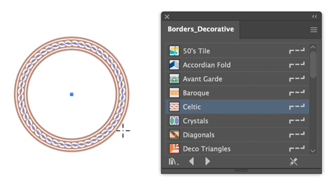
One basic task that can stymie new (or occasional) Illustrator users is drawing with brushes. You pick a brush from the Brushes panel, grab the Line Segment tool or a shape tool, and start drawing. But the brush is not applied to your new artwork. What gives? The culprit is a setting in the Appearance panel. By default, New Art Has Basic Appearance is turned on. Turn it off and you can apply brushes while drawing new objects (Figure 1). Just remember to turn that setting back on to avoid any surprises when you no longer want to draw with brushes.
Heads Up, Brushes!

When you’re painting in Photoshop, you can use the Heads Up Display (HUD) to modify your brush on the fly (Figure 2). On macOS, hold Control+Option and drag left/right to decrease/increase the brush size. Drag up/down to decrease/increase the brush hardness. On Windows, Control+Alt+Right-click and drag left/right to change the brush size or up/down to change the brush hardness. If you’d rather be able to change the brush opacity in the HUD, go to Preferences > Tools and turn off Vary Round Brush Hardness Based On HUD Vertical Movement.

Export One Item

To export a single item from a Creative Cloud Library, view the Library using the Creative Cloud app. Right-click the item and choose Export A Copy.
Setting Vertical Text

Here’s a super easy way to set type vertically in InDesign. Use the Line tool to draw a vertical line (hold Shift as you drag to make it perfectly vertical). Remove the stroke from the line if necessary. Then, click the line with the Type On A Path tool (Shift+T) and add some text. Apply the font and size you want. To ensure all characters align properly, set the paragraph alignment to Justify All Lines. Next, choose Type > Type On A Path > Options. In the dialog box, choose Stair Step from the Effect menu. Apply as much Tracking as needed to space the characters as desired. Finally, use the Direct Selection tool to set the spacing between words by dragging either indent marker (Figure 3).

Make a Library from a Document
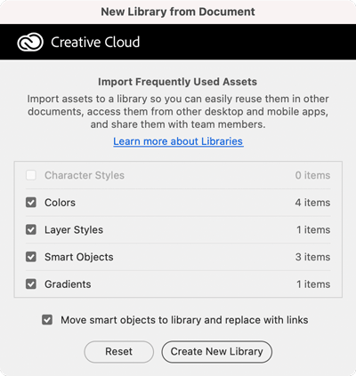
Got a Photoshop document full of content that you’d like to put into a CC Library for sharing and easy reuse? Easy! Just go to the Libraries panel menu and choose Create New Library From Document. You can include layers, colors, gradients, layer styles, and character styles (Figure 4). Note that in order to add layers to a Library they must be converted to Smart Objects first. You also have the option to replace layer content with linked versions of your new Library items.
Again, Please
Need to repeat a transformation (like Move, Scale, Rotate, etc.) precisely? Adobe’s Big Three apps all have commands that apply the last transformation you performed to whatever you have currently selected.
- Photoshop: Edit > Transform > Again (Command+Shift+T/Ctrl+Shift+T)
- Illustrator: Object > Transform > Transform Again (Command/Ctrl+D)
- InDesign: Object > Transform Again > Transform Sequence Again (Command+Opt+4/Ctrl+Alt+4)
The Shortest Path to Options
When you have some type on a path in InDesign you can quickly access the Type On A Path Options dialog box by holding Option/Alt and double-clicking the path with either selection tool.
Howdy, Neighbor!
If you ever tried using Photoshop’s Nearest Neighbor interpolation method when scaling content, you might have wondered why they even keep it in the program; it usually produces very pixelated results. But there is a perfect use for Nearest Neighbor: when you want to clean up a screenshot. Select a good area adjacent to what you want to remove, press Command/Ctrl+T, and set the Interpolation to Nearest Neighbor in the Options bar. Shift-drag over the stuff you want to remove and press Return/Enter. Voilà! It’s like the stuff was never there (Figure 5). Just remember to turn off Nearest Neighbor when you’re done, or photo content that you transform later on will look terrible.

Be Scrupulous with Symbols
When you are designing content with mathematical symbols in InDesign, take a second to typeset them correctly.
- To use a real minus sign (?), use the Glyphs panel and start typing minus in the search field.
- To use a real multiplication sign (×), do the same but start typing multiply.
Dude, Where’s My Tint Slider?
You’ve applied a color to an object in Illustrator using a process RGB or CMYK swatch. Now you just want to lighten it a bit by lowering the Tint value. This should be easy, right? Just go to the Properties panel, click the stroke or fill thumbnail and then click the Color Mixer button to reveal the Tint slider (Figure 6). You can also get to the Tint slider by going to the Appearance panel and Shift-clicking the small arrow next to the fill or stroke thumbnail. But, if you’re not using a Global swatch, you’ll see RGB or CMYK sliders instead of Tint. Global swatches are easy to spot because they have a small white triangle in the corner of the thumbnail. To convert a non-Global swatch into a Global one, double-click the swatch in the Swatches panel and turn on the Global option in the Swatch Options dialog box. Just be warned that any objects you previously formatted with the swatch will not be colored with the new Global swatch. You’ll have to select those objects and apply the Global swatch manually.

Grid Up and Go
You can create a grid while placing multiple images with the Gridify feature in InDesign. With multiple images loaded and ready to place, use the Up and Down Arrow keys while dragging to add or remove rows and columns to form a grid the images will be placed into.
Use the Command/Ctrl key to add space between rows and columns. While drawing with the Text tool, you can use Gridify to create automatically linked text frames! (Figure 7)

Press the spacebar before releasing the drag to set the number of sides and star inset on a grid of polygons. Press the spacebar again to toggle Gridify back on. And, once you’ve used Gridify, InDesign can remember the number of rows and columns you last used by loading multiple images and dragging while pressing Shift+Command/Ctrl.
Duplicating a Layer Mask
If you’ve spent time and effort crafting the perfect layer mask in Photoshop and need to use it on another layer, there’s an easy way to do so. To duplicate the mask, hold Option/Alt and drag it to the layer where you want to add it. If the layer already had a mask, Photoshop will ask you if you want to replace it.
Quick Dotted Strokes
Need a quick dotted line in Illustrator? In the Stroke panel select the Round Cap option and turn on the Dashed Line. Then set the first Gap value to the distance you want between one dot and the next. If you don’t need to maintain a precise distance between dots, turn on Align Dashes To Corners for a neater appearance (Figure 8).

Re-format All Hyperlinks
Instead of using Find/Change to change all hyperlink character styles in InDesign, use the Edit Hyperlink dialog box:
- In the Hyperlinks panel, select those you want to change.
- Choose Edit Hyperlink from the Hyperlinks panel menu.
- Most of the dialog box will be grayed out, but you can choose a different character style from the Style menu in the Appearance section (Figure 9).
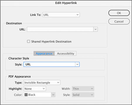
When you click OK, the character styles will update throughout the document.
Align to Column Guides with Object Styles
For publications with columns, you can align objects precisely to the left column guide with a series of object styles in InDesign.
- Calculate the distance of each column from the left margin of the first column (Figure 10).
- For each column, create an object style with everything deactivated. Under Size And Position Options, set your position to X Only and the X Offset amount to the distance you calculated (Figure 11).


Select an object, and apply one of these styles to align it to the column of your choice (Figure 12). You can avoid using the mouse at all with keyboard shortcuts in the Object Styles definitions or by using Quick Apply.

Artboards Away!
Artboards have their uses in Photoshop, especially if you’re doing web or UX design. But having them in your file can make some tasks harder. For example, the Crop command doesn’t work in a file with artboards. And for many (if not most) jobs you just need a file with layers, not artboards. So, if your Photoshop file has artboards that you don’t want, how do you get rid of them while preserving the content they contain? There are a couple of methods, but the simplest one is to select the artboard(s) that you want to remove in the Layers panel, right-click them, and choose Ungroup Artboards. You’ll find the same command in the Layers menu. Or press Command+Shift+G/Ctrl+Shift+G (Figure 13).

Math Is for Machines
If you don’t enjoy calculations, put InDesign to work! In most value fields, InDesign can perform simple equations by using +, –, /, and * .
For example, if your photo has an X coordinate of 1.5 in. and you need to move it to the right 1?8 in., type +.125 after the value of 1.5 in. and press Return/Enter. If you need your frame to be 2.5 times wider, append the value with *2.5 in the field. In this case, instead of a full equation, you could instead enter a percentage amount (250%).
InDesign can also convert units of measure. If your document is set up in inches and you enter 25cm in the page width field, it will be converted to 9.8425 inches.
You can combine units (Figure 14). Enter 12mm+6.25 in. to add 12mm to a 6.25-inch-wide frame.

Using Text as a Frame
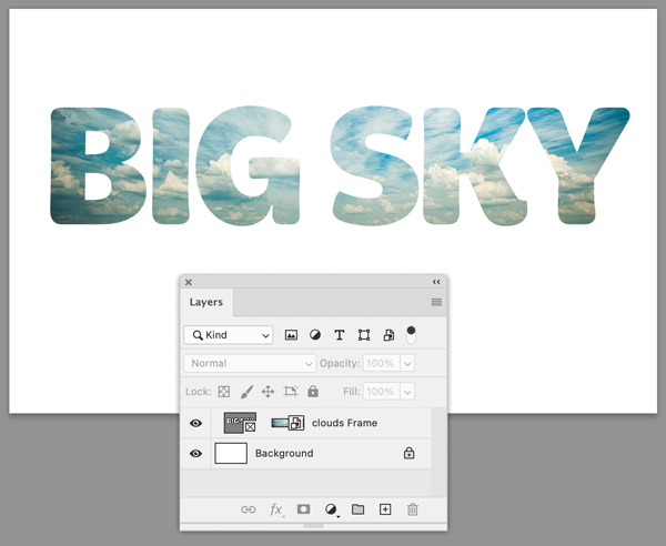
It only takes a few seconds to place an image in text in Photoshop. In the Layers panel, right-click a text layer and choose Convert To Frame. In the dialog box that pops up, confirm the size you want and click OK. Drag and drop an image from your computer into the frame. That’s it! The image is placed in the frame as an embedded Smart Object (Figure 15). Double-click its thumbnail to edit it in a separate window. Or, if you’d rather place the image as a linked Smart Object that you can update if/when the image file changes, hold Option/Alt as you drop it into the frame.
Import, Schimport
You could import a Creative Cloud Library into your account with menu commands. But it might be quicker and easier at times to drag the CCLIBS file into the Libraries section of the Creative Cloud app.
Sync Styles into Multiple Documents
Let’s say you have a lot of documents and that you want to give them all a new look by redefining their styles.
You could open them one by one and import their paragraph styles manually. But there is a faster way.
- Create an InDesign Book (File > New > Book).
- Add your source document.
- Choose Page Numbering Options from the panel menu, and deselect Automatically Update Page & Section Numbers. (This will keep page numbers intact in the documents you’ll be working with.)
- From the panel menu, verify that Automatic Document Conversion is checked, or select it to turn it on.
- Add the rest of the documents to the Book panel.
- Set your source document as the Style Source (Figure 16).
- Select all the style choices in the Synchronize Options dialog box (Figure 17).


You can run Synchronize Book from the panel menu to update the documents to match the model. You don’t even have to open them!
Vector Shapeshifting
InDesign sports a Convert Shape command (found in the Object menu) that lets you make any object into a rectangle, triangle, ellipse, and so on (Figure 18). Oddly, Illustrator doesn’t offer a similar feature, but it does allow you to change between ellipses and rectangles via a live effect. Just select the object(s) and choose Effect > Convert To Shape (Figure 19). In the Shape Options dialog box, choose Absolute and enter the desired width and height. The effect can be modified or removed via the Appearance panel. Or, if you want to make the change permanent, choose Object > Expand Appearance.


More Than Just for Books
When you are working in InDesign on any sort of project that helps readers navigate through any sort of document, you should explore creative options with tables of contents—even if they are far from traditional.
In Figure 20, you can see multiple tables of contents used in a sample magazine layout.
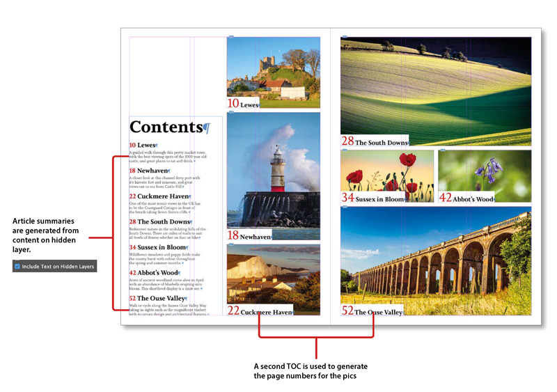
In the first TOC on the left page, the descriptive text you see exists only in the TOC, and many designers would just type it in after generating the TOC text. But if you change that text, your changes disappear if you update the TOC.
The solution: Put the descriptive text on a hidden layer on the first page of the article. Then make sure that the Include Text On Hidden Layers option is checked in your table of contents style definition.
The other TOC generates the page numbers and heads used with the teaser photos.
To update all your TOCs at once, you can use a free script, Update TOCs, from Keith Gilbert.
A Clearer Canvas
By default, Photoshop displays a drop shadow around the canvas, which can make it difficult at times to distinguish the pixels at the edges of your image. You can replace the drop shadow with a solid black border or nothing at all in Interface preferences (Figure 21). There you can also change the borders used around artboards and images in full-screen mode.

A Shortcut to [None]
If you’ve assigned keyboard shortcuts to your character styles, you’ve probably tried in vain to do so to the default character style [None].
You can assign a keyboard shortcut (Edit > Keyboard Shortcuts) to activate a script to apply [None]! Here are two free scripts that will work.
- Apply Character Style None, by Kasyan Servetsky
- SelApplyStyleNone, by Marc Autret (Indiscripts)
Fit Layer in Window
In Photoshop, you can hold Option/Alt and click a layer name in the Layers panel to fit that layer’s content in the window.
You Know… the Thing
In InDesign, Photoshop, or Illustrator (but not in the Creative Cloud app), you can right-click an item in a Creative Cloud Library and add a description. That information will appear in a tooltip (Figure 22), or you can search on that term.

Adding a description will help you find files easier, or you can use it to add specific placement instructions. It’s great for when you have lots of Libraries and can’t remember which one has the thing you need (or what the thing is called).
Get Griddy with It
While you’re drawing an image frame in InDesign, you can turn it into a grid, using the arrow keys to add or remove rows and columns.
That method works only while you’re creating the frame. To create a grid of small frames from one large frame that you’ve already drawn, use the MakeGrid script in your Sample Scripts folder (Figure 23).

Moving with Precision
Need to move something a precise distance in Photoshop? There’s an easy way but it’s hidden in plain sight. And there’s no math involved: Select the object, press Command/Ctrl+T (for the Transform command), and in the Options bar, click the little triangle between the X and Y values. This changes those X and Y values from absolute to relative. They’ll start out at 0,0. Now enter the value you want to move the object horizontally or vertically and press Return/Enter or click the Commit button in the Options bar.
Find/Change Finicky Formatting
In InDesign you’ve got a list of names and addresses that need a paragraph style applied to the first line of each block of data. Entries are separated by hard returns, so you might think that you can search for two hard returns and replace them with one return and the paragraph style—but you will end up with the style applied to the last line of the previous entry (Figure 24).

GREP to the rescue! Here are settings for a Find/Change with GREP, recently shared on the InDesignSecrets Facebook group.
- Find (GREP): (?<=\r)(\r)(.+)
- Change: $2
- Change Format: (choose desired paragraph/character style)
The expression uses a Positive Lookbehind to match the end of a paragraph followed by one or more characters, but only when they are directly preceded by another end of paragraph. It replaces what it finds with the text after the second end of paragraph.
You will still need to manually apply the heading style in the first entry, but the rest will be taken care of (Figure 25).

Adjust InDesign’s Crop Marks
If you’re using InDesign to create a PDF to submit to a printer and want to add crop marks, make sure (with your printer’s blessing) to move them a little farther from the trim to prevent them from even coming close to being visible in print (Figure 26).

Set your crop marks in the Marks And Bleeds panel of the Print dialog box. The default crop distance is .0833″—consider increasing it to 9 points (.125″).
Spiral Strokes
Spirals are easy enough to make in Illustrator. There’s a dedicated tool for making them nested with the Line tool in the Toolbar. It’s also easy to add a stroke that tapers off towards the center of the spiral. Start by applying a stroke with the weight that you want in the center of the spiral. Then use the Width tool (Shift+W) to drag perpendicular to the path at the outer end of the spiral to increase the stroke width at that end (Figure 27).

Parental Rights
Designing a book in InDesign? Don’t use too many parent pages in your document—keep it simple with these tips!
- Instead of creating a parent page for each chapter, use text variables to create dynamic running headers in one parent for the whole book.
- In your chapter opening paragraph style, define a paragraph rule with a color of [None] to create space at the top of the first page of your chapter.
- When a section of a book requires a different number of columns, consider using split column (in the Span Columns section of the New Paragraph Style/Paragraph Style Options dialog box) in your paragraph styles to create the proper column configuration automatically as the text flows.
Get Rich Quick
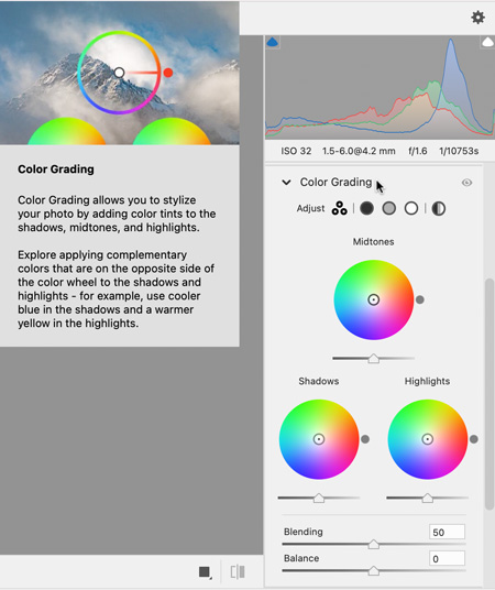
The Camera Raw dialog box is so jam-packed with features that it can be intimidating to new users. Fortunately, many controls will display animated rich tooltips if you pause your pointer over them (Figure 28). Once you get the hang of things you can turn these off in Camera Raw Preferences. Click the gear icon at the top right of the Camera Raw dialog box. Then, go to General Preferences and deselect Show Rich Tooltips.
Vertically Centered Text
In InDesign have you ever experienced the frustration of setting text to be vertically centered in a frame only to see that it sits far too low? In Text Frame Options (Command/Ctrl+B) go to Baseline Options and change the First Baseline Offset from the default Ascent to Cap Height (Figure 29).

Smart Object Shortcut
There are many benefits of working with Smart Objects in Photoshop. So, it’s a bit of a mystery why Adobe never gave us a keyboard shortcut for converting content to Smart Objects. But that doesn’t mean you can’t create your own. Choose Edit > Keyboard Shortcuts. At the top of the dialog box, choose Shortcuts For Application Menus. Tip open the Layer menu commands and scroll down until you see Convert To Smart Object. Click in the Shortcut column and enter your desired key combination (Figure 30).

Concentric Circles
The easiest way to get a set of concentric circles in InDesign is to use the Polar Grid tool in Illustrator. You can find it under the Line Segment tool in the Toolbar. Double-click the Polar Grid tool (or press Return/Enter with the tool) to open its Options dialog box. Set the Number of Concentric Dividers value to how many circles you want and set Number of Radial Dividers to zero. When you click OK, the circles will be created and grouped (Figure 31). Copy and paste the group into InDesign, where you can size and format it as you like. You can bring arcs, sprials, and rectangular grids into InDesign in a similar fashion.

Keyboard Swatchcuts
When you’re experimenting with different colors in InDesign, you can navigate through the Swatches panel from the keyboard. First, click a swatch thumbnail. Then, hold Command+Option/Ctrl+Alt and click the same swatch’s thumbnail a second time. You can now use your Up and Down Arrow keys to apply different swatches.
Group Appearances
In Illustrator, you can apply appearance attributes like strokes and fills to groups instead of (or in addition to) applying strokes and fills to the individual objects within the group. This allows you to do things like apply a stroke that only goes around the group but doesn’t overlap any group members. Use the Appearance panel to add a stroke to the group, then drag it in the panel below the Contents (Figure 32).

Camera Raw-to
In Camera Raw you can apply Auto settings for any Basic adjustment by Shift-clicking its name (Figure 33).

Merge, Baby, Merge
Are you confident enough to skip InDesign and go straight to PDF with Data Merge? Once you have everything set up, choose Export To PDF from the Data Merge panel menu. For some projects, this might be reckless. But some jobs are just that simple!
Converting Libraries between Personal and Team
If your Creative Cloud membership allows you to create both Personal and Team Libraries, it’s important to know how to move between the types. Learn more about Team Libraries at helpx.adobe.com.
To convert a Personal Library to a Team Library:
- In the Creative Cloud app, make sure your Libraries are displayed in Icon view. Then, move your pointer over a Library icon to reveal the ellipsis in the top-right corner.
- Click it and choose Move To Team.
Fitness Training
In InDesign, you can make all photos fit automatically when placed into an empty frame. Here’s how:
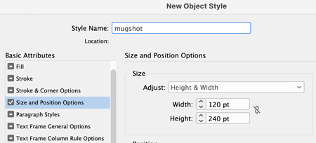
- Create or select an empty frame. Create a new object style. In the list of basic attributes, choose Size And Position Options. If you need all photo frames to be an exact size, choose Height and Width to set that size for your frames (Figure 34).
- In Frame Fitting Options, choose Fill Frame Proportionally, and make sure the middle reference point is chosen.
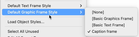
- To make this object style the default for your project, select it in the Default Graphic Frame Style menu in the Object Styles panel menu (Figure 35). Or, simply drag the default style icon in the panel to your new style. Your photos will resize automatically when they are placed—and you can easily make global changes to the frame options, by editing the object style.
Give Yourself a (Better) Break
When you convert text to outlines in InDesign each line is saved as a compound path, and multiple lines are grouped together. It’s easy enough to ungroup the lines, but teasing apart words or letters within a line is not so easy. For example, you can’t apply different fills or strokes within a line of outlined text. So, before converting text to outlines, make sure each “chunk” you want to wield independendently is on its own line (Figure 36).

Bespoke Grids and Guides
You can make custom grids and guides in Illustrator with any number of rows and columns you like. Start by adding a rectangle over the entire area you want to fill with your grid. Choose Object > Path > Split Into Grid. Turn on Preview in the dialog box, and then set the number of rows, columns, and any gutter values you want (Figure 37). Click OK. Then, choose View > Guides > Make Guides, or press Command/Ctrl+5.

Also, putting your bespoke guides on their own layer makes it easier to control their visibility and to keep them out of harm’s way when you’re drawing.
Sharing Styles and Swatches
If you are part of a team and want to push out standard styles and colors for InDesign, one cool way to do it is with Snippets.
Make a single-page document using all the styles and swatches others on the team will need. Export it as a Snippet.
Anyone can simply drag or place this IDMS file (Figure 38), and wham!—everything is there for them (Figure 39).


and all their styles and colors in one fell swoop.
Duping Artboards and Their Contents
In Photoshop, to duplicate the currently-selected artboard along with its contents, Option/Alt-click any plus (+) icon that appears around the artboard. The new artboard is added in the direction of the + icon you clicked. Want something even faster? With an artboard selected in the Layers panel, press Command/Ctrl+J to duplicate it to the right with its contents.
Neutralize Sharpening Artifacts with Luminosity Mode
When you apply sharpening to a Smart Object in Photoshop it’s applied as a Smart Filter. This gives you the opportunity to remove any weird color artifacts by changing its blending mode. In the Layers panel, double-click the Blending Options icon. Then, in the dialog box, change the mode from Normal to Luminosity (Figure 40).

Caption Alignment in a Snap
A frustrating thing about making captions under photos in InDesign is how to position them precisely relative to the bottom of the photo.
Build an object style with the proper top inset spacing. Now, you can position the caption and, with Smart Guides, snap the top of the caption text frame to the bottom of the image, as in Figure 41.

Reset Your Tool(s)
In Photoshop, the Tool Preset Picker is at the top left of the window, just to the right of the Home button. Right-click the picker to quickly reset options for the current tool, or all tools (Figure 42). This is especially handy with brushes when you’ve been monkeying with a lot of options and just want to get back to all the defaults.

Swatches from the Real World
Use the Adobe Capture mobile app to bring color combos from the real world into any app that gives you access to your CC Libraries.
In Capture on your mobile device, choose Create, scroll down to Colors, and tap the Create button. Now point your device at something with color combinations that you like: a painting, your friend’s outfit, office supplies, your dog, whatever.
Tap the middle of the screen and move the circles around to create your five-color palette (Figure 43). Tap the checkmark.

On the next screen, tap any color to adjust it using the color sliders (Figure 44). Tap Save, name your theme, choose a CC Library to save to, and tap Save again.

The Keymasters
- David Blatner
- Steve Caplin
- Anne-Marie Concepción
- Laura Coyle
- Nigel French
- Erica Gamet
- Monika Gause
- Keith Gilbert
- Alan Gilbertson
- Tony Harmer
- Julieanne Kost
- Jeff Potter
- Mike Rankin
- Laurie Ruhlin
- Robin Schneider
- Julie Shaffer
- Bart Van de Wiele
- Russell Viers
Commenting is easier and faster when you're logged in!

Recommended for you

Creating 3D Jigsaw Effects in Photoshop
Creating a fantasy scifi image such as this one takes a while, but it involves a...

How to Customize Vector Stock Artwork in Illustrator
Transform pre-made art into a rich illustration that will delight your clients.

Advanced Layer Blending in Photoshop
Photoshop’s Layer Modes provide several ways of enabling you to see throug...