
Vectorizing Logos
- Vectorizing Logos
- Using Neural Filters in Photoshop
- Working with Tabs in InDesign
- Backups for Busy Creatives
- Creative Pro Font Collection Vol. 4
May 2024


Letter from the Editor
What’s your favorite trio of all time? Harry, Ron, and Hermione? Luke, Leia, and Han? Aragorn, Legolas, and Gimli? Moe, Larry, and Curly? All fine choices in my book. But because you’re reading CreativePro Magazine, I think there’s a good chance your favorite trio is Photoshop, Illustrator, and InDesign. And I’m delighted to report that we have strong articles on each of Adobe’s Big Three programs in this issue. Any one of them could have been the cover story.
I ended up choosing Vectorizing Logos by Kat Kremser for a few reasons. First, branding has never been more important. In today’s ultra-competitive marketplace every company’s logo has to look its best or it will send a damaging message of mediocrity to the consumer. Second, it’s a common problem designers everywhere have to solve. Clients have been supplying us with crummy lo-res logos forever and will continue to do so for as long as there are clients and logos. Third, it’s a transferable skill. Converting any raster image to vector makes it resolution independent so it can look good in any size or medium. And mastering the logo cleanup process will make you more adept at working with vector art in general.
The runner-up for the cover spot was Nigel French’s take on using Neural Filters in Photoshop. We all know that, for better or worse, Adobe is committed to implementing features that leverage machine learning in all their programs. So perhaps it’s not surprising that Nigel found some of the filters to be incredibly useful, while others are simply a waste of time in their current form.
For InDesign, we have the ultimate guide to tabs by Pariah Burke. This piece evolved from a monster six-part series of posts Pariah wrote back in the bloggy days of InDesignSecrets. It was outstanding content, sadly locked in an unwieldy format and languishing in obscurity. We slimmed it down, buffed it up, and modernized it to serve as your go-to reference when dealing with tabs in InDesign.
Next, Jeff Carlson weighs in on a topic that’s as boring as it is important. Wait, what? Don’t get me wrong, Jeff is an amazing writer, and the article isn’t boring at all. But, the topic is one that many creatives don’t get excited about, even though they know it’s of the utmost importance: backing up files. All hard drives fail at some point. So, finding the right backup solution can make the difference between a minor inconvenience and a complete data disaster. Seriously, if you don’t have a backup strategy right now, skip over the first three articles and read Jeff’s first. It might be the most important article you read this year.
Finally, our Resource of the Month is the fourth CreativePro font collection, carefully curated by our guru of glyphs, Jeff Potter.
Enjoy!

Recommended for you
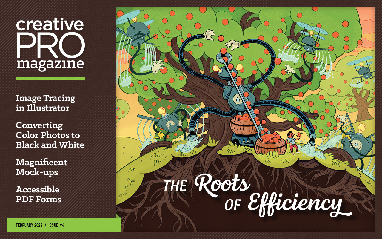
The Roots of Efficiency
The Roots of Efficiency Image Tracing in Illustrator Monochrome Magic Magnificen…

All-Star Tips
Tips and Tricks Features Hidden in Plain Sight InDesigner: InDesign Magazine Scr…
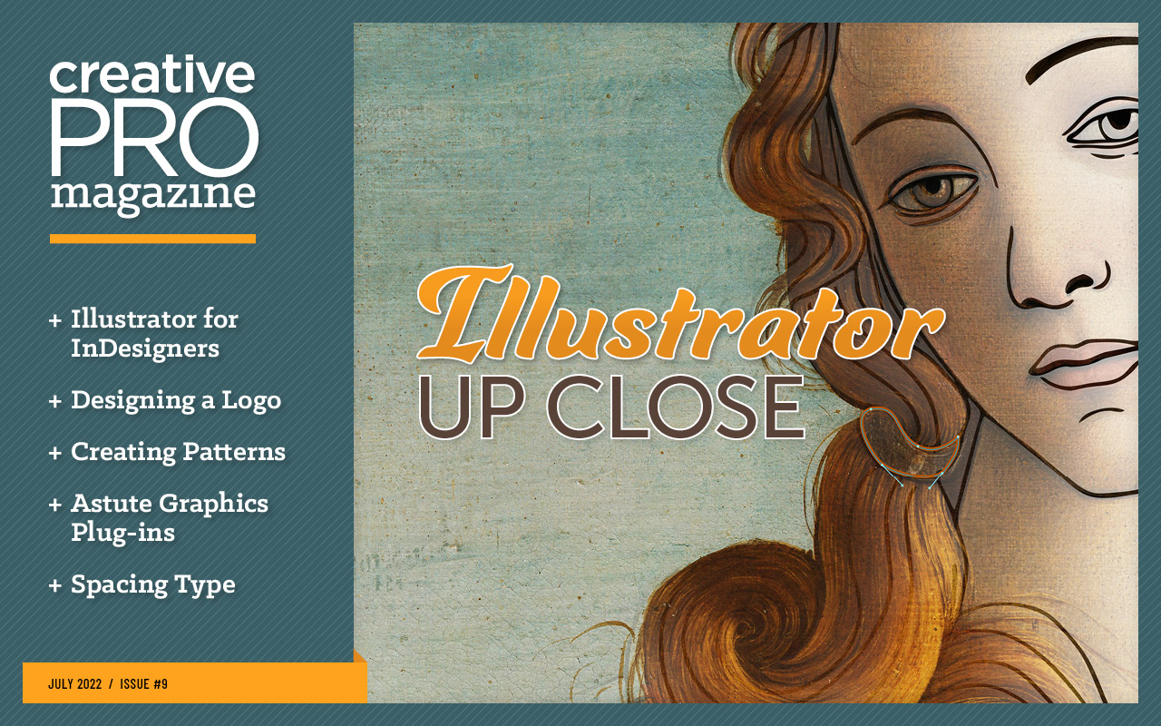
Illustrator Up Close
Illustrator for InDesigners Creating a Logo in Illustrator Patterns in a Nutshel…