
Vectorizing Logos in Illustrator
Explore the image preparation tips, advanced settings, and bonus clean-up tips that help you get great results when converting a logo from pixels to paths.

This article appears in Issue 31 of CreativePro Magazine.
It’s no secret that the Image Trace feature has something of a mixed reputation among Illustrator users. A bad Image Trace result is glaringly easy to spot and notoriously difficult to work with, so traditionally created vector art is usually superior in quality. There are times, however, when tight deadlines and budget constraints can make it impossible to manually re-create artwork.
One common scenario all designers face at some point is receiving an “original” logo file from a client that is a low-resolution JPG or PNG. These files just won’t cut it for most design applications, including print work, large signage designs, or prepping files for certain production techniques.
This is where understanding how to quickly get the best results from Image Trace can save the day. The Image Trace panel recently underwent a redesign and gained some new settings that can help make the tracing process less painful. Before you jump into tracing, however, consider a few image preparation steps that can set you up for success.
Preparing Your File for Better Tracing
When it comes to vectorizing any image, the quality of your source file is the most important factor in determining the success of the tracing result. Ideally, your source image should be as large as possible, with a minimal number of colors and overall high contrast. It’s also important to avoid images with effects such as gradients, shadows, or bevels, as these can seriously muddle the tracing results (Figure 1).

with a few, flat colors (right).” width=”800″ height=”262″ /> Figure 1. Try to avoid source images that are too small, are blurry, or include complex effects like gradients (left). Aim for clear images with a few, flat colors (right).
If the image you receive has any of the above issues, it may be best to start in Photoshop for a little pre-editing. You can take some steps that can dramatically improve your final image trace:
- Adjust the image’s contrast or levels to create cleaner distinctions between colors.
- Use Photoshop’s new Neural Filters, such as Super Zoom, and advanced sharpening techniques to enlarge the image and improve its clarity.
- Remove any busy backgrounds and isolate the logo’s base shape from shadows or other effects by using Select Subject or the Object Selection tools.
While you may not get perfect results, any improvements in these areas will be very helpful in reducing the amount of manual cleanup work you’ll have to perform using Image Trace.
Exploring the Image Trace panel and settings
Once you’ve prepared your image, it’s time to get vectorizing. You can start by dragging the file into a new Illustrator document or importing it by choosing File > Place. I like to position the image in the center of my artboard and then adjust the artboard size by choosing Object > Artboards > Fit to Selected Art.
Tip: Keeping a copy of your logo on screen makes it easier to spot tracing issues by comparing the trace result to the original. Use the Artboard tool (Shift+O) to select the artboard, and duplicate it by holding Alt or Option while clicking and dragging.
How to start an image trace
To begin the image trace, select your logo image and then click the Image Trace button in the Quick Actions section of your Properties panel (Figure 2). You can also find this button in the Control Bar at the top of your window.

Figure 2. You can find a shortcut to begin a new image trace in the Quick Actions section of the Properties panel.
If you used the Image Trace button in either the Properties panel or the Control Bar, you’ll need to click the Menu button to open the full Image Trace panel and access the tracing options (Figure 3).

Figure 3. Locate the Menu button to open the full Image Trace panel if it’s not visible on your screen.
Alternatively, you can open the Image Trace panel by choosing Window > Image Trace and begin the trace by clicking the Trace icon in the bottom-right corner of the panel. If you set up a copy of the image as suggested above, your workspace should look something like Figure 4.
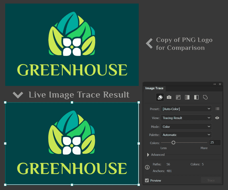
Figure 4. It’s helpful to have a copy of the original image visible in your workspace to compare the details as you work.
Choosing presets and controlling colors
The very first set of options you’ll encounter are the color preset buttons across the top of the panel (Figure 5). Illustrator may have auto-detected the correct setting based on your image, or you may need to choose a more appropriate preset to start with. In the case of a multicolor logo like our example, the Auto-Color preset is a great place to start, but you’d want to choose the Black and White setting for a simple one-color logo.
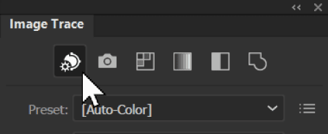
Figure 5. Quickly select a color preset using the buttons at the top of the panel.
If you take a look in the Preset menu, you’ll note there are 11 default presets to choose from. Don’t get too nervous about choosing the “right” preset, as you can adjust and customize the settings, no matter which one you start with.
The Tracing Result Information at the bottom of the panel is important to keep an eye on (Figure 6), particularly to see how many colors your trace result consists of and how complex the generated paths are. Also, be sure that the Preview box remains checked so that you can see the results of your trace in real time as you adjust the tracing options.
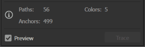
Figure 6. Check the Information section to see how many colors, paths, and anchors will be in the final trace result.
In the case of our sample logo, the Auto-Color setting has correctly identified five colors, which you can see listed in the Information section. If you are seeing too many or too few colors, drag the Colors slider to the exact number of colors you want to appear in the final result (Figure 7). This will ensure that extra colors don’t pop up when we adjust the Advanced settings in the next step.

Figure 7. You can manually set the target number of colors for your trace using the Colors slider.
Tip: If specific colors must be included in your final logo, you can create a swatch group and direct the Image Trace function to use only those colors by changing the Palette option to Document Library, then select the appropriate color group in the Colors menu (Figure 8).

Figure 8. You can choose a predefined color group from your Swatches panel for complete control over the palette.
Tweaking Advanced settings for improved trace accuracy
Next, we’ll take advantage of the real power of the Image Trace feature: the Advanced settings. Make sure your document is at a zoom level that allows you to clearly see the logo details as you adjust settings and that your tracing reference is handy for you to check the results against. Next, click the arrow to access the Advanced tracing options (Figure 9).
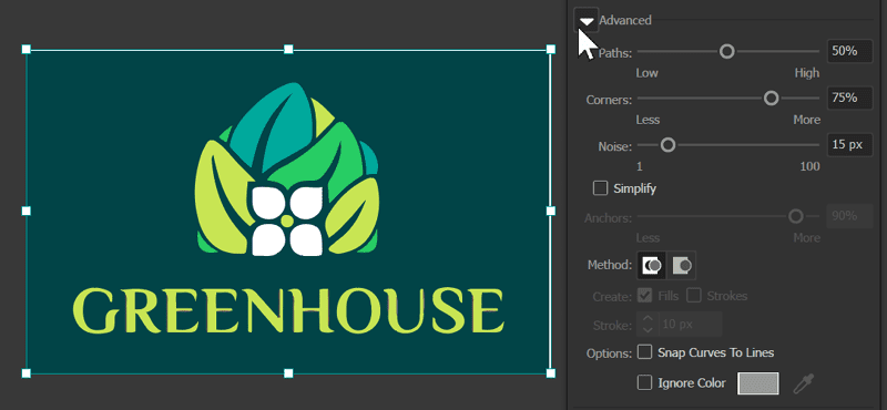
Figure 9. Use the arrow to expand the Advanced settings area of the Image Trace panel.
The three main settings to experiment with in this section are Paths, Corners, and Noise, and experiment is definitely the key term here. The settings of these three parameters interact with each other as you adjust them, and the best way to understand how they work is to observe the live results as you set different levels. I recommend starting at 50% for Paths, 50% for Corners, and 10 pixels for Noise.
You can begin making adjustments from there, starting with Paths. This setting adjusts how closely the traced vector shapes follow the original pixel shapes. With lower values, the path is looser, smoother, and less tightly aligned to the original art.
Tip: To get a better look at the path accuracy, use the View menu and switch to the Outlines with Source Image option to see an overlay of the generated paths compared to the original pixels (Figure 10).

Figure 10. The Outlines with Source Image view will show a faint preview of the new vector paths over a dimmed copy of the original raster image.
A low Paths setting results in more simplified, stylized lines, while a very high percentage will result in rough paths as the program tries to closely adhere to the original pixel borders of shapes (Figure 11).

Figure 11. A preview of the Paths parameter set to 1% (left), 50% (middle), and 100% (right)
While the optimal setting for each of these Advanced controls will be different for every image, when tracing logos in particular, a Paths percentage between 60% and 80% usually gives an acceptable level of accuracy.
The Corners setting determines how much emphasis is placed on sharp angles in your image. When you increase this value, the tool is more likely to identify and create corner points at sharper angles (Figure 12).

Figure 12. As you adjust the Corners setting, keep an eye on the trace preview, particularly where you know there should be sharp corners.
In my sample trace for this logo, I found that I needed to set the Corners percentage quite high before I saw sharp corners that matched the source image. Keep in mind that you will likely need to adjust all three of these settings multiple times before finding the right balance, so don’t be too concerned if things don’t look perfect at this stage.
Next, adjust the Noise setting. You can think of Noise as a filter that helps to smooth out your image. When you increase the Noise value, Illustrator will ignore smaller areas or specks that are smaller than the value you set.
A good rule of thumb here is to use values between 20 and 50 pixels for higher resolution source images, while a lower value between 1 and 10 pixels typically works better for smaller images. A noise value that’s too low for your current image will usually produce unwanted extra paths around the edges of your shapes (Figure 13).
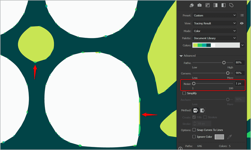
Figure 13. When the Noise level is set too low, extra paths and artifacts will appear around the edges of shapes.
For the example image, a value of 24 px cleared up the edge artifacts and got closer to the original paths. After adjusting this value, you can then go back and experiment more with the Paths and Corners to find a balance between accuracy and simplicity. In the end, I turned down the path percentage to around 70%, which worked better once I found the proper level for Corners and Noise (Figure 14).
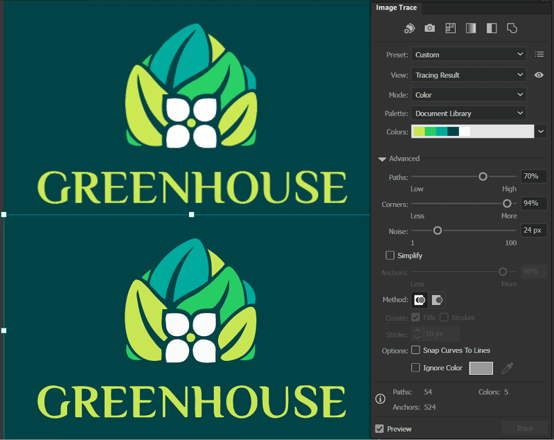
Figure 14. Make further adjustments as needed and compare to the source image to make sure details match as closely as possible.
Advanced options
For most simple traces, like the example we’ve been working with so far, the options covered above will be all you need to adjust to get a nice, usable vector result. In some specific cases, however, you may need more specialized options, so let’s quickly explore the additional controls that appear in the Advanced section of the Image Trace panel:
- Simplify: By reducing the number of anchor points, this option simplifies your image, making it cleaner and easier to work with. (The option is not available when you’re using the Overlapping method.)
- Method: The Method option in Image Trace lets you choose between Abutting, which creates cutout paths with edges that precisely meet, and Overlapping, where paths slightly overlap each other. Note that you’ll need to switch to Overlapping in order to use the Ignore Color option.
- Create Strokes or Fills: If the logo or artwork you are tracing is line art, set this option to Strokes to create stroked, open paths instead of filled shapes.
- Snap Curves to Lines: This option straightens slightly curved lines that are close to 0 or 90 degrees. It’s ideal for simple geometric artwork with lots of straight lines, and a good option to try out if you are attempting to vectorize type.
- Ignore Color: This recent option replaces the previous Ignore White option and allows you to easily remove the background color of traced artwork, whether it’s on a white background or any other solid color.
Image Trace vs. Retype for vectorizing fonts
Image Trace in Illustrator, while powerful, often falls short in perfectly replicating fonts or lettering. A promising solution to this challenge is the new Retype feature, currently in beta, which will analyze a raster image and search against the installed fonts on your system and the Adobe Fonts library to attempt to identify the original font used (Figure 15). For best results when re-creating vector lettering, it’s always preferable to use the original font when possible.

Figure 15. Retype will attempt to identify the original font of text in a raster image.
If you are unable to identify or access the original font, you may want to consider tracing your source image twice: once with the settings optimized for tracing the graphical elements of the logo and again with the settings optimized for tracing the text. This approach allows for the highest quality reproduction of both elements, which can then be combined for the final design.
Final Steps: Expanding, Ungrouping, and Clean-Up Tips
Once you are happy with the Image Trace settings and results preview, you’ll need to expand the trace before you can work with the individual vector paths created. You can find the Expand button in the Control Bar, or in the Quick Actions section of the Properties panel; you also can choose Object > Expand (Figure 16). After expanding, be sure to also ungroup the resulting paths by choosing Object > Ungroup.
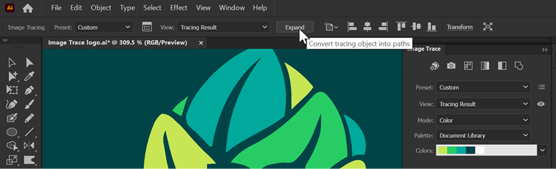
Figure 16. To be able to work with the vector shapes created by Image Trace you must first expand the trace.
You now have a vector version of your traced logo that you can edit and refine as you would with any other vector artwork. When it comes to traced art, your paths will rarely be perfect from tracing alone.
There are a few common issues to look out for, such as traced circles or other geometric shapes that have lost their perfection. In those cases, it’s usually best to use the Shape tools or the Convert to Shape effect to rebuild those pieces (Figure 17).

Figure 17. Geometric shapes like circles will rarely be traced perfectly and are easy to replace or rebuild.
Another side effect of image tracing can be rough paths. While you can use the Smooth slider in the Image Trace panel during the initial conversion, this applies to the entire image and often oversimplifies certain areas.
Instead, you can use the path smoothing tools on individual shapes after you’ve expanded the tracing result to better target the areas that need to be further refined. Finally, you will likely need to do some manual manipulation of paths and points with the Direct Selection tool to get things looking as accurate and clean as possible (Figure 18).
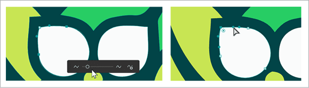
Figure 18. Try using Object > Smooth on shapes or paths that need additional smoothing, or use the Direct Selection tool to edit individual nodes.
As you work with Image Trace, remember to experiment with settings to get a feel for what gives the best tracing results for various types of images. As a final tip, if you find that you’ve created the perfect setting combination and you’d like to be able to reuse it later, you can save a preset by clicking the Manage Presets button to the right of the Preset menu in the Image Trace panel.
Commenting is easier and faster when you're logged in!

Recommended for you
Creating a Logo in Illustrator
Learn to combine, shapes, symbols, and typography to make a great logo.
History and Usage of the Ampersand
Everything you need to know about one of the most beautiful symbols in Latin-bas...
From Paper to PDF: Vectorizing Hand-Drawn Artwork with Photoshop and Illustrator
I have a close friend, Mike Manoogian, who is a brilliant lettering and logo des...