Working with Tabs in InDesign
Your guide to tab spacing, alignment, leaders, and more

This article appears in Issue 31 of CreativePro Magazine.
The question is timeless.
“I have a name, address, and a company name,” one reader wrote to the InDesign Secrets blog 15 years ago or so. “I want to follow each one of those with a dotted underline that goes all the way to the right edge of the [text frame]. How do I do that?”
From the answer to this reader blossomed six posts from then-contributor Pariah Burke. Since then, at least one generation of design professionals has come of age, and many of us can still benefit from understanding the fundamentals of using tabs in InDesign.
We have assembled, updated, and condensed Pariah’s thorough original posts from 2007 into a single article here, updating them as appropriate into a timeless tutorial for good and creative typography.
—The Editors
A Tab Panel Deep Dive
The “dotted underlines” our reader referenced are examples of tab leaders, which in their basic form are dots, dashes, and underscores.
Begin by setting your text in a series of two lists, separated by a single tab character (Figure 1), shown as the » symbol when Show Hidden Characters is enabled.

Figure 1. Don’t be alarmed at misaligned text when you start creating your tabs. Use only one tab.
Highlight all the lines of text, and open the Tab Ruler (Type > Tabs), which will automatically size itself to the width of your highlighted text and position itself above your text.
Select the appropriate tab stop
alignment character. In this case, you probably want a right-justified tab, so click the third arrow at the top of the panel (the arrow has a tail pointing left).
With the Right-Justified Tab button active, click the blank area immediately above the ruler to set the tab stop or tab marker, which will insert the same symbol as the button you selected.
Notice that the X field (technically, the “tab position field”) along the top of the Tabs panel shows the marker’s position. You can adjust the position with your pointer or by changing the measurement. To position the text flush to the right of your text frame, you can select the tab stop and type the frame width into the X field.
Tip: If you accidentally add another marker instead of selecting the first, drag the extra marker down into the ruler itself to make it disappear.
Any text after the tab will automatically appear flush right, aligned exactly to this tab stop (Figure 2).
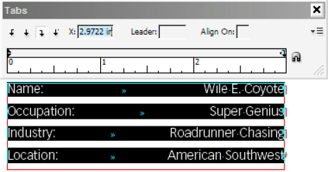
Figure 2. Your right-justified tab stop defines the right-hand margin of content following your tab. Position the tab at the edge of the ruler to set your text flush to the right side of your text frame.
Now, add the leader! First, reselect the tab stop. In the Leader field, add a single period and press the Tab key (Figure 3) to create a dot leader.
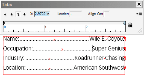
Figure 3. The Leader field controls the glyph, or glyph sequence, that repeats and fills the tab space.
If you’d rather a different kind of leader—say, dashes or a solid line instead of dots—you can use any character you want! An em dash (—) will create a solid horizontal line at the midpoint of the text’s x-height, and an underscore character (_) will create a solid baseline rule. In fact, you can use up to eight glyphs to create a repeating sequence.
Whatever you enter in the Leader field will be repeated as many times as necessary to fill the space between columns.
You’ll notice additional buttons in the Tab panel for left-justified tab and center-justified tabs. When the tab stop is defined as left-justified, the left edge of text following your tab character will align to that point. If it’s center-justified, your text will appear centered. We’ll explore the fourth button, for custom alignment, later in this article.
Tip: For complex text with multiple lines, consider using a multiple-column frame, a table, or text defined with split columns.
Format Your Leaders
Tab leaders use the same formatting as the surrounding text, so if you change the attributes of the entire paragraph, the leader will change as well.
Often, that’s exactly what you want—but sometimes, you will want the tab leader to look a little different (Figure 4). Here’s how to change it.

Figure 4. By default, leaders pick up the formatting of the adjacent text. You can change that by formatting the leaders separately.
First, set your text, and create the tab leaders. Close the Tab Ruler.
As you can see with invisible characters shown (Type > Show Hidden Characters), tabs are characters, and they can be formatted like any other character. Use the Type tool to select just the tab character (which is now also visible as the leader) and override the formats, using the Character, Swatches, Color, or Gradient panels.
Want a leader that is a lighter shade of its current swatch color? Open the Colors panel, and drag the Tint slider to the left. Pick a new swatch to change the leader color entirely. Adjust the Tracking setting to loosen or tighten the spacing between periods. How about larger periods? No problem: Boost the font size. You can even adjust the vertical or horizontal scale or change the font entirely.
Of course, any changes you make to the tab and leader count as overrides to your paragraph style. If you ever force-reapply the style or otherwise clear overrides, you will lose your carefully formatted tab leaders.
That’s why you should create a character style just for the leader.
With the leader still highlighted, open the Character Styles panel (Window > Styles > Character Styles). Click the New button at the bottom of the panel to create a new style, which you can rename and edit (Figure 5).
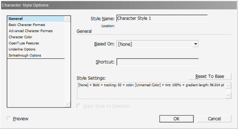
Figure 5. Tabs are characters, and you can define the local formatting of your tab leader as a character style.
After you apply the style to your text, highlight the tabs in the list’s other lines and assign the same character style to each.
Similarly, the location of the tab stop and the fact that it has a leader is also an override. You should redefine your paragraph style (Figure 6) to update the placement and type of your tab.
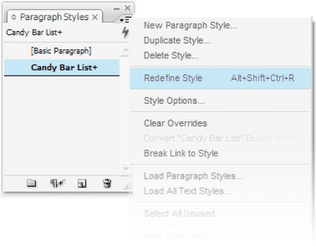
Figure 6. If you edit your tab stops locally, be sure to redefine your paragraph style to save your work.
Tip: If you plan to have multiple lists with different tab settings, you will want to create a series of new paragraph styles, differing only in the tab settings, all based on your original.
Use Nested Styles with Your Tabs
So far, we’ve talked only about applying character styles manually: selecting each tab one at a time and applying a style from the Character Styles panel. Manual application of character styles to a few tab spaces here and there isn’t a hassle. However, when you’re producing a long list of sports scores, a product catalog, or something else with more than a handful of tabbed lines, manual application is a procedure you want to employ as rarely as possible.
Fortunately, InDesign can easily automate the application of character styles to tab spaces via nested styles.
The concept of nested styles is simple: Do this until it’s time to do that. By combining character styles with specific trigger characters or marks, you tell InDesign to format text up to or through a specific character with a certain style. For instance, you could easily have InDesign automatically format your tab spaces with a different font, color, and tracking without altering the text on either side of the tab. It may sound complicated, but trust me—it’s a snap.
First, prepare by creating your paragraph and character styles. My project is a price list (Figure 7).

Figure 7. I’ll set my text with tabs and basic dot leaders in place, create my paragraph styles, and then format and build my character styles based on my formatting of the top line.
As you can see, I start out with one typeface and color, switch to a second for the tab leader, use a third for the product item number, then go back to the second style for the next tab, and finish off with three other character styles for the item price. (The dollar digits use the underlying formatting in the paragraph style.)
Because the formatting of the first style, the item name, can be handled by a paragraph style, I’ll begin by creating that new paragraph style: Cat Line. That style will also store the other paragraph-level attributes like the positioning of tab stops, line spacing, and so on.
Jumping past the item name, my first formatting change is the tab space. I’ll highlight that and create a new character style–Cat Line Tab–to preserve those settings. Next is the item number, which gets its own character style, Cat Line SKU, followed by the three style overrides in the price. Because both tab spaces use the same formatting options, they can use the same character style.
Highlight and then create a character style from each change in character formatting in your text.
Apply your paragraph style to the rest of your tabbed lines of text.
Now, edit your paragraph style. Go down to the Drop Caps and Nested Styles section (Figure 8).
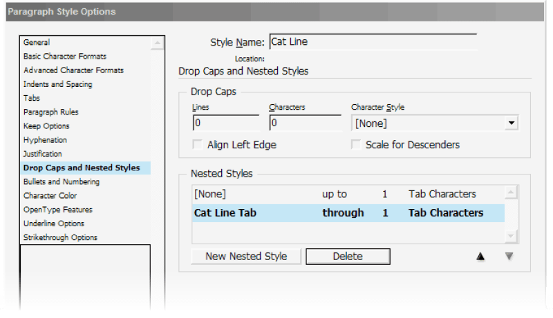
Figure 8. Edit Nested Styles in your paragraph style to apply a sequence of character styles.
In the Nested Styles section, click the New Nested Style button. The first column offers a menu of all your character styles as well two special ones, [Repeat] and [None]. Set the style to [None] to leave the text as formatted by the paragraph style.
For the remaining three columns, set values of: Up To, 1, and Tab Characters. This directs InDesign not to apply any character style from the beginning of the paragraph until the first tab, however long that might be.
Click the New Nested Style button again to insert a new row beneath the first. This nested style will tell InDesign how to format the tab space itself. Choose the appropriate character style, and then set the other three options to: Through, 1, Tab Characters.
The difference between Up To and Through in the second column is simple: The former has InDesign apply a style until but not including the specified character or mark, while the latter has the application include the specified character or mark in the style.
These directives are also successive. Because we first said, “Do nothing until you get to the tab,” InDesign ends that directive at the tab. When the first command ends, the next begins, formatting text after that (the tab itself) until InDesign encounters the specified character (the same tab); thus, it applies the character style to a single character, the tab.
The next two nested styles are virtually identical. With my price list, I need a nested style that formats the product item (SKU number) between the two tabs (Cat Line SKU, Up To, 1, Tab Characters) and then the second tab (Cat Line Tab, Through, 1, Tab Characters). Set up those, and your list should be completely formatted, or nearly so.
The price is just as easy to format, but instead of telling InDesign to look for tab characters, I’ll tell it to look first for a dollar sign, then a period (between the dollar and cent amounts), and, finally, to format the cents themselves, to apply a style through two digits (numerals). Although the trigger character column includes a menu of useful characters and marks, you can type just about anything else (like a dollar sign or period) into that field. Figure 9 shows all the nested styles I used.
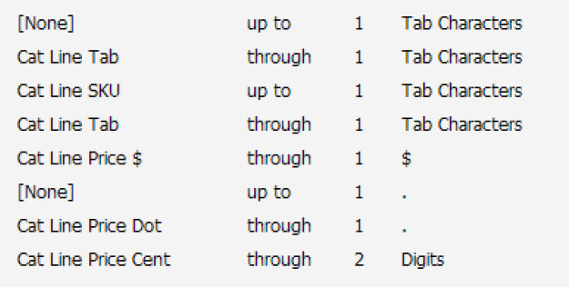
Figure 9. The final list of nested styles to format my price list
Here’s the best part. Begin a new line of text, and apply your updated paragraph style. Begin typing. Nothing’s happening, right? Press your Tab key, and keep on typing. InDesign applies the nested styles, formatting text, as you type! (It’s okay to ooh and aah at this point.)
As long as you use that paragraph style, InDesign will watch your typing for the nested style trigger(s) you configured, be that tab characters, dollar signs, or anything else. When InDesign encounters a trigger, it applies the character style and watches for the next trigger. You need never manually apply character styles to multiple tabbed lines again!
Tips and Tricks
Let’s wrap up with some sundry tips, tricks, and mini-topics that should help you streamline your tab work and polish the results.
Right Indent Tab
Use the Right Indent Tab command (Type > Insert Special Character > Other > Right Indent Tab) to insert a right-aligned tab, at the paragraph’s right indent, without having to open the Tabs panel.
The right indent tab shows within text as a special character when hidden characters are shown. The purpose of this command is to make short work of columnar text. After you insert a right-indent tab, any text to the right of the insertion point aligns to the right.
Although the right-indent tab isn’t managed on the Tabs panel, assigning a dot, dash, or other leader does require its use. Set a tab stop outside the right margin of the text frame, and give that tab stop the leader (Figure 10). If you already have tabs defined within the text frame area, the right-indent tab will pick up and use the leader assigned to the last tab stop on the ruler.

Figure 10. Define a leader for a right indent tab by defining a tab positioned outside the length of your line.
One of the greatest benefits of a right-indent tab is its flexibility. Because it is a special character that sends text to the right frame edge or indent as opposed to a regular, fixed-position tab stop, it adjusts itself automatically if you widen or narrow the text frame.
Tabs inside tables
Also on the Type > Insert Special Character > Other submenu is a command to insert a tab. Why on earth would Adobe create a menu command for a function already included on every keyboard manufactured in the last 80 or so years?
Tab is included as a command for a couple of reasons: first, to make it easier to include in InDesign (and InCopy) scripts, and, second, to give you the ability to insert tabs in places where the keyboard’s Tab key has another function—such as within tables.
If your cursor is inside a table cell when you press the Tab key, the cursor jumps to the next column. To use tabs inside a table cell, use the Tab menu command. If you need to insert several tab spaces inside table cells, save yourself a little time (and wrist strain) by copying and pasting the special tab character.
End Nested Style Here
For InDesign to begin or stop using a particular character style automatically in your nested style, you must specify a break point—a marker of some type—that tells it to stop, either before or after. But what do you do if your content doesn’t have such easily definable markers?
Enter the End Nested Style Here marker, an invisible, zero-width character that can be inserted anywhere in text as a break point for a nested character style (Figure 11). No matter what condition or breakpoint character the nested style is supposed to be looking for, if the End Nested Style Here marker is included in your text, InDesign will stop applying the nested character style at that point.

Figure 11. Here, a nested style applies a smaller, all-caps slab serif character style (LEAD-IN) through the colon character (A). If the text doesn’t include that character, InDesign will apply that character style through the full paragraph (B). When you insert the End Nested Style Here character, it will stop a nested style in its tracks (C).
Obviously, the End Nested Style Here marker, which appears as a backslash (\) when you show hidden characters, must be inserted manually, reducing the utility of using nested styles to automate formatting in the first place. If you can’t define an exact breakpoint character for your nested style condition, define the most common one as the nested style start/stop condition. Then, use End Nested Style Here only as an exception when the usual condition can’t be met.
Align On
In the Tabs panel, you’ll find buttons for four kinds of tab stops: Left-Justified Tab, Center-Justified Tab, Right-Justified Tab, and Align to Decimal Tab. The first three are self-explanatory. But the fourth?
Most people think they know all about Align to Decimal (Align On) tab stops, but many of them would be surprised to learn that you can use this feature to align a tab to any character.
True, its most common purpose is to line up prices or statistics in a list. In such cases, all numbers are aligned such that their decimal points are stacked regardless of how many digits appear before or after decimal points (Figure 12). That’s how it works in the United States. You can change the Align On field to a comma to do the same for numeric data in many countries.

Figure 12. By default, Align On aligns to a decimal point (A), but you can change it to a comma for some international conventions (B).
When you use an Align to Decimal Tab stop, the Align On field activates. In this field you can type (or paste) any single glyph and press Enter/Return, or Tab, to commit that glyph as the align-on marker. For instance, if you chose the letter A as your align-on marker, InDesign will position text following the tab in all affected lines to align to the first instance of the letter A to the tab stop (Figure 13).
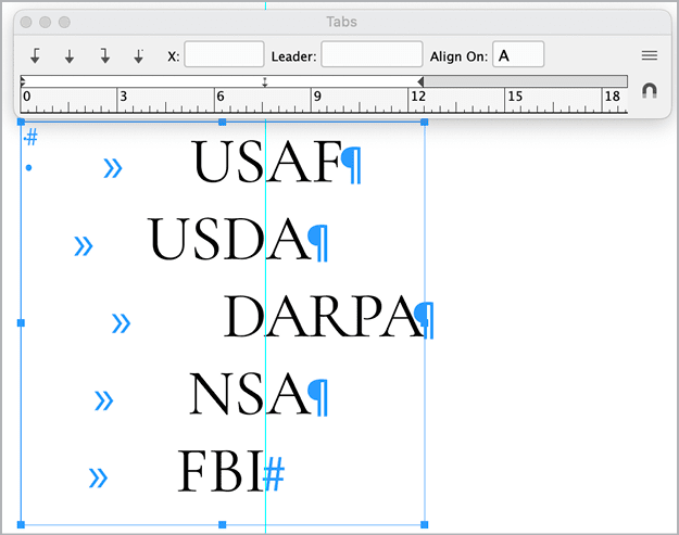
Figure 13. Five lines align on the capital A glyph. If no letter A follows the tab stop, InDesign positions the text flush right, to the left of where the letter A would align if it were there, as in the last line and as shown by the ruler guide.
Although you’ll almost always align to decimal points, commas, or other numeral punctuation, aligning on other glyphs can be a useful creative tool for aligning text in display type.
Fading leaders
When you apply a gradient to a tab, its leader will fade from one color into another (Figure 14).
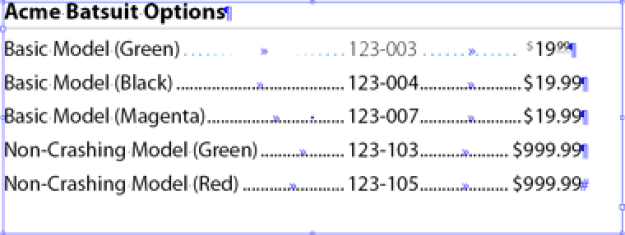
Figure 14. Make your leaders less obtrusive by coloring them with a gradient.
This is one of my favorite little tricks. Tab leaders are incredibly useful and necessary for leading a reader’s eye horizontally through columns of text like a table of contents, but sometimes they’re too obtrusive. This is particularly so, I find, in one-color documents; you can also soften the leaders by using tints, by making their leader glyphs smaller, or by tracking them looser. But sometimes, no matter what you do, they look out of place.
Experiment on your own leaders; see how they look with subtle or even bold gradient color or tint changes.
Double leader underlines
You can combine tab leaders and character underlines for interesting effects. Figure 15 shows what you get when you apply a custom underline defined with a gradient swatch to tabbed lines with nested character styles.

Figure 15. There is no end to what you can do with tabs and nested styles.
Commenting is easier and faster when you're logged in!
Recommended for you

How to Create Custom Dot Leaders in InDesign
Learn how to create custom dot leaders to use with tabs in InDesign, then use st...

Typing Tab in a Table Cell
Need to type a tab inside a table cell? Here's the tip you were looking for!

Tip of the Week: Repeating Tabs
There are three new Links panel icons in InDesign CC that you'll see when workin...


