
How to Be a Better Graphic Designer: Sweat the Details
Nigel French reminds us how much the little things matter in design.


This article appears in Issue 49 of CreativePro Magazine.
Graphic design is, by its nature, a detail-oriented profession. We are trained to notice things that most people overlook, and our work demands a constant interplay between macro-level decisions and micro-level refinements.
This attention to detail is part of what makes us professionals. It’s also what makes us vulnerable: When the details are off—even slightly—we invite criticism, not just from other designers but from anyone with an eye for error or who is part of a snarky Facebook group.
First, Do No Harm
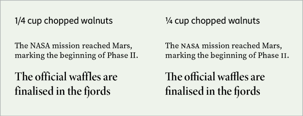
Sweating the details starts with getting the basics right. This means ensuring typographic correctness: using real apostrophes instead of straight quote marks, checking that dashes are appropriate to their usage (e.g., hyphen, en dash, em dash), avoiding double spaces after periods, and verifying that spelling and grammar are correct (Figure 1).

Figure 1. When we get these things wrong, our work doesn’t just look amateurish—it becomes an easy target. Nothing activates the inner pedant like an extraneous apostrophe or misused opening single quote mark at the start of a date. That kind of slip-up can overshadow an otherwise strong design.
Obvious, I know, but it’s still amazing how much work gets published with easily avoidable typos (Figure 2). Such mistakes are embarrassing and potentially expensive—and I write as someone who once got the author’s name wrong on the spine of a book. Proofread your work. And then proofread it again. Better yet, have someone else proofread it.
 alt=”” class=”wp-image-14423214″/>
Typography Should Not Be an Afterthought
Typography is the voice of your design. Poor typography undermines clarity, authority, and tone.
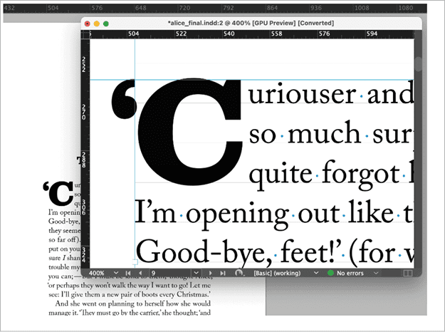
Professional designers use the full arsenal of typographic controls available to them—OpenType features like true small caps, oldstyle figures, ligatures, discretionary ligatures, fractions, and superscripts—to elevate the reading experience (Figure 3). There’s a world of typographic nuance at your fingertips, but it’s hiding in plain sight (partly because InDesign doesn’t make these features as discoverable as they should be). Make sure you know the full potential of your fonts.
Mind the Visual Alignment
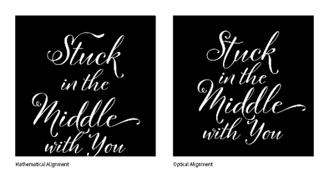
Even when everything is technically “aligned,” it might not look aligned. That’s where optical alignment comes in.
Objects of different shapes or densities often need to be nudged slightly to appear visually balanced (Figure 4). The classic example is centering type: Mathematically centering it can leave it feeling off, especially with glyphs that have more visual weight on one side. The same principle applies to aligning text blocks, logos, or icons. Don’t rely solely on guides or snapping; use your eyes.
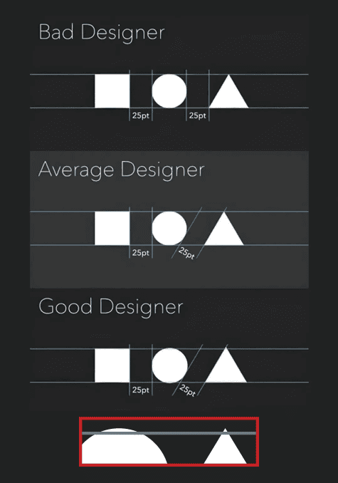
When layout elements feel just a little off, it’s often because we’ve trusted the ruler instead of the rhythm. Visual alignment is a small thing that makes a big difference (Figure 5).
Be the Advocate for the Text
Even if you didn’t write the content, you are its ambassador. Design and writing are inextricably linked, and poor writing will always undermine even the most elegant layout. As a designer, you should feel empowered to raise concerns when the writing is unclear, too verbose, or grammatically incorrect. Tact is essential, but silence is complicity.
Sometimes it’s appropriate to offer gentle editorial feedback. Other times, especially when deadlines are tight, I’ve found myself engaging in quiet, unsanctioned edits to improve flow and clarity. I don’t necessarily recommend this—it’s risky—but there’s a balance to be found between respecting the author’s voice and protecting the integrity of the overall piece.
Language Is Evolving; So Are Standards
Texting, memes, social media, and global English have all influenced how we write and read. What it means to be a literate person is different today than it was 20 years ago. While we should respect this evolution, we must also understand our responsibility as visual communicators: to be intentional, to avoid ambiguity, and to support comprehension.
Grammar pedantry can become tiresome. But clarity is never out of fashion. As George Orwell wrote in his 1946 essay “Politics and the English Language:”
A man may take to drink because he feels himself to be a failure and then fail all the more completely because he drinks. It is rather the same thing that is happening to the English language. […] It becomes ugly and inaccurate because our thoughts are foolish, but the slovenliness of our language makes it easier for us to have foolish thoughts.
Orwell’s point still resonates: Sloppy writing fosters sloppy thinking, and vice versa. Sloppy typography enables both.
Zoom In, Zoom Out
While sweating the details, don’t lose perspective. Obsessing over kerning pairs or preventing widows and orphans is worthwhile only if the overall layout works. Just as we zoom in to fine-tune, we must also zoom out to assess the hierarchy, rhythm, and structure of the entire design (Figure 6).
The best designers move fluidly between micro and macro views. They understand that the success of a design depends both on the smallest refinements and the overall impact. The big idea gives the work meaning; the small details give it credibility.
The Accumulative Effect of Care
It’s often said that good design is invisible. That doesn’t mean it’s effortless. It means the effort is so integrated, so coherent, that the viewer doesn’t notice any single element calling undue attention to itself. That effect comes from caring deeply about the details.
It’s not about showing off; it’s about giving the text the care it deserves. Readers won’t thank you for using the correct ellipsis or figure style. They won’t notice that you adjusted the baseline of a bullet to better match the surrounding type. But they will feel that the piece reads well, flows cleanly, and feels considered.
If you get it right, most people won’t even notice. And that’s a good thing. It’s about making the content easier to read and more trustworthy.
Paint the back of the fence
There’s a phrase sometimes used in design, but also more broadly in life: painting the back of the fence. It means putting as much care into the parts that no one sees as you do into the parts that are on show. It’s a mark of professionalism and pride—an understanding that the hidden structure of a piece influences its longevity, usability, and integrity.
In print design, it could mean building your InDesign files so parent pages, paragraph styles, and layers are logically named and consistently applied, even if the client never opens the file. When revisions are needed six months later, that quiet diligence will pay off.
In branding, it might involve creating secondary logo lockups, alternate color versions, and usage guidelines for rare scenarios. Most of these will never appear in the brand’s day-to-day communications, but when an odd request comes in—say, a one-color embroidery or a dark-background billboard—the solutions are ready, tested, and on-brand.
In digital and interactive PDFs, painting the back of the fence can mean adding descriptive alt text to every image, setting the tab order, and ensuring bookmarks and navigation work flawlessly. Most users won’t notice, but for those who rely on accessibility features, this care transforms the experience from frustrating to seamless.
Good designers don’t do these things because they expect applause. They do them because the work deserves it. Painting the back of the fence is a quiet statement: This was built to last.
Beyond typography
Sweating the details extends beyond type. It’s equally important in how you prepare your files.
Use logical, consistent naming for your files, but also for the styles, layers, and swatches that make up the files.
In Photoshop, check resolution, verify that you’re using the appropriate color profiles for your intended output, and make sure any masks are clean—not feathered into mush or hastily painted.
In Illustrator, precision matters: Align your points, use gradients intentionally, avoid unnecessary anchor points, and keep your vector shapes clean.
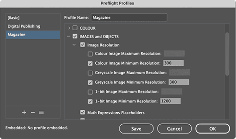
Use InDesign Preflight as a safety net to check your documents before exporting (Figure 7). It can help catch missing fonts, overset text, color mode issues, and other problems that might otherwise go unnoticed.
These technical refinements may not be glamorous, but they’re part of the invisible infrastructure of design. When done right, few will notice. When done poorly, they will be all anyone sees.
Professionalism Is in the Details
There’s a popular quote attributed to various people, the kind that appears on inspirational posters: “Character is what you do when no one’s watching.” Even though my inner cynic finds inspirational posters a bit cloying at the best of times, I cite it here because it captures the essence of why details are so important.
Sweating the details doesn’t mean being a perfectionist or a typographic snob for its own sake. It means doing the work even when the client isn’t looking over your shoulder, literally or figuratively. It’s about how we show respect—for our craft, for our clients, and for the people who read what we design.
Commenting is easier and faster when you're logged in!

Recommended for you

TypeTalk: The Creative World of Gail Anderson
Anderson's bold and innovative type work has graced the covers of book covers, B...
Designing Books
In in-depth look at the process of designing a book from start to finish, throug...

InDesign Magazine Issue 134: InDesign and Acrobat
We’re happy to announce that InDesign Magazine Issue #134 (June 2020) is now ava...