
Finding Your Typographic Rhythm
Learn the typographic techniques for designing layouts that don’t miss a beat.

This article appears in Issue 1 of CreativePro Magazine.
Imagine listening to a favorite piece of music—the harmonies, the groove, how it flows, moving effortlessly from one passage to the next. Now imagine listening to music that is out of tune, off tempo, and played without intent. How did you feel?
When you listen to music, the repetition of patterns of sound, words, and notes establishes its rhythm. The same is true for typography: We use letters to form words on the page as blocks of text, then arrange the space around these blocks to give the type rhythm and the document structure. Done well, this creates something that is both pleasurable to look at and easy to read.
Rhythm is an important feature for typography because readers, just like music lovers, prefer patterns of order and consistency over chaos. Random or unexpected spacing undermines the rhythm and flow of the text and, consequently, the reading experience. Chaos has its place, but for the purpose of this article I’m assuming our goal is to create layouts that are highly readable and in the service of our content.
If we aim to create a layout where each part relates to every other part, we need to use a design that is modular. No content or spacing element is random (even if we want it to look random). Because the most granular level of our content is the type, it makes sense to base our modular design on the letters. And the smallest unit or module, the one from which all others are scaled, can be derived from the spacing of our type.
When we work with type, we are manipulating space. While the reader may be concentrating on the letter and the words they form, as designers we are considering the spaces between those letters, between the words, and between the lines of words, as well as the spacing between paragraphs and the more macro spacing of margins.
Well-set type should have an even texture. Start with a well-designed typeface, and you’re halfway there. But even with a great typeface, however, careless spacing of letters, words, and lines can break the rhythm and disrupt its evenness. As a good drummer aims to keep the beat as steadily as possible, so too a good typographer aims to set the text as evenly as possible—and that requires some careful attention (Figure 1).

Figure 1. A two-page spread using justified text, where the hyphenation and justification settings have been adjusted to ensure an even text color and word spacing that is as consistent as possible. The word spaces are shown in isolation.
Type Choice and Handling
When we read, we quickly scan chunks of content and pick out repeating shapes and patterns which we extrapolate into something we can comprehend. For those patterns to be recognizable, our type should have a good balance of space inside and outside the letters. Typefaces designed for immersive reading offer a subtle balance between regularity and novelty. Lowercase letters are designed to fit together, allowing us to read words as shapes. At the same time, the occasional eccentricity holds our attention. These flourishes should be enough to make the typefaces distinct.
It’s beyond the scope of this article to get into the decisions involved in typeface selection, but suffice to say, once you have chosen your typeface, there are ways to use it to make it perform more rhythmically. For example, you can use OpenType features like real small caps, oldstyle numerals, and real fractions to sustain the horizontal rhythm (Figure 2).
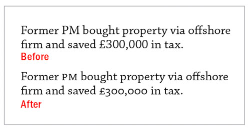
Figure 2. Because they are matched to the x-height, small caps and oldstyle numerals can help maintain the rhythm of the type.
Another example would be avoiding multiple lines in all caps, because the absence of ascenders and descenders makes the word shapes harder to see, and so disrupts the rhythm (Figure 3).

Figure 3. Long passages in all caps are harder to read because, without ascenders and descenders, the word shapes are too similar.
Letter Spacing
The spacing of our type has a big impact on its rhythm. We want our letter spacing to be as even as possible, but because of the different letter shapes and the near-infinite number of possible letter combinations, inconsistencies are inevitable. This is where kerning comes in—to make something inherently uneven look even.
Thankfully, you don’t have to manually kern every letter pair in your body text. That’s what InDesign’s automatic kerning is for. But which method to choose: Metrics or Optical? In general, if you’re working with a professionally designed font at common body text sizes, you’re better off with Metrics, which uses the kerning settings that the type designer baked into the font (Figure 4).

Figure 4. Metrics versus Optical kerning
For those times when you want to tweak a few kerning relationships between specific characters in body text, check out the Adjust Kerning script by Peter Kahrel, which was the Script of the Month in Issue #150 of InDesign Magazine.
In addition to choosing the kerning method, we need to oversee the automatic kerning and watch out for any anomalies that may show up. And because inconsistencies in letter spacing become more noticeable as type size increases, we should be prepared to use some light-touch manual kerning on headlines and display type.
There are times, too, when you’ll want to use tracking—the adjustment of spacing across a range of characters—to speed up or slow down the tempo of the type. If you’re doing this to fix composition problems like widows and orphans, this stretching of time should be imperceptible to the reader and used to avoid the bigger problem of short and stray last lines, which disrupt the rhythm of the text (Figure 5).

Figure 5. When applying tracking to fix widows or orphans, set the increment to the smallest possible value: 1/1000 of an em.
Tracking, especially applied to lowercase text, breaks up the flow of the text and—except when fixing widows and orphans—is best avoided. However, there are occasions when using aesthetic (as opposed to medicinal) tracking can benefit the typographic rhythm: One is with headings, which are typically bigger than the body text. Because letter spacing can appear larger in display type, reducing the tracking can make heads and subheads hold together better and the spacing look more in proportion with that of the body text (Figure 6).

Figure 6. Applying negative tracking to headlines (–25 in this example) keeps the letter spacing visually proportional to the letter spacing of the body text.
Another scenario is when setting text in all caps, or on white text against a dark background. Adding a small amount of positive tracking to break the text apart can make it more readable (Figure 7).

Figure 7. Tracking applied to small caps
Word Spacing
Along with the letter spacing, we should consider the word spacing—the amount of space between each word. According to Robert Bringhurst, author of The Elements of Typographic Style (considered “the finest book ever written about typography” by the type designer Jonathan Hoefler), the optimum size of word space for a typical text face is one quarter of an em, or about the same as the set width of a lowercase t.
(An em is a relative measurement that is the same horizontal width as the type. So, in 8 pt type an em is 8 points, in 12 pt type an em is 12 points, and so on.)
It is this unit, the humble word space, from which the whole of our modular design can be scaled up. With left-aligned text, the size of the word space is fixed, but with justified text it is necessarily elastic, to create the flush right edge of the text frame. In both cases, because InDesign’s word spacing options are expressed in percentages rather than ems, you’ll need to measure the spaces that certain settings yield, and once they are what you’re after, lock them in (Figure 8).

Figure 8. Measuring word spaces. The 100% magenta rectangles are exactly one quarter of an em. The lighter shapes vary in width due to the justified alignment.
Both ragged and justified alignments involve compromises. The extra space on the line has to go somewhere.
For left-aligned text the extra space goes at the end of the line. We need to ensure that the lines modulate in a pleasing way—avoiding very short lines being followed by very long ones. At the same time, a gentle ripple down the right side might appear unintentional, like half-baked justified text. If asymmetry is what you’re after, then make sure that asymmetry is what you have.
For justified text, the extra space is distributed between the word spaces, and it’s a trade-off between the evenness of the word spacing and the frequency of the hyphenation.
Rhythmically it’s a choice between the staccato patterns of left alignment and the resolving patterns of justified alignment (Figure 9).

Figure 9. Left (ragged) versus justified alignment showing how the “extra” space on the line is distributed
Consistent word spacing contributes to typographic color and creates a rhythm that makes reading easier. If the word spacing varies due to poor justification settings or a rag that’s too uneven (or not uneven enough), the reader is likely to be distracted. Again, using rhythmic terms, they miss a beat. Their reading is slowed, their comprehension potentially reduced, and a slight irritation, imperceptible at first, but which grows with each recurrence, creeps in as they trip up on inconsistencies like rivers and gaps that are to reading what the cracks and pops of scratched vinyl are to music.
Measure
Our next consideration—and a significant factor for the horizontal rhythm of the page—is the column width or measure. Typically, this is expressed as a number of characters, and you have a good degree of latitude in choosing your optimum number. In book design, a 66-character line (including spaces) is regarded as ideal by many, but in reality, anywhere between 40–75 characters can be made to work, if there’s attention to all the other details (Figure 10). This is where the exact science breaks down and nuance, discretion, and economic compromise take over. Among the factors to consider are the nature of the content, the size of the page, and the print budget.

Figure 10. Use the Info panel to help determine the column measure.
Leading
Thus far, I’ve been referring to the horizontal rhythm of type and how it is influenced by letter spacing, word spacing, and the width of the measure. Let’s now talk of vertical rhythm, which is determined by the depth of the column or page and, especially, by the leading. Of all the things that can be said about leading, perhaps the most important is that it should be consistent. Whatever size you choose, keep your vertical spacing at that size—or at a fraction or multiple of that size.
One way to achieve this is through the use of a baseline grid, which functions like a metronome for your type. As with a metronome, you can set the pulse to the quarter note or subdivide it to eighth notes, or even sixteenth notes (Figure 11).

Figure 11. Starting with a point size of 10 pt, the word space is 2.5 pt (1/4 of an em). Extrapolating up from this base unit, the leading value is 12.5. Setting the grid increment to the base unit allows more flexibility in distributing spacing above and below the subhead, while still keeping the subhead on the grid.
If you find working with a baseline grid too restrictive, then subdivide the grid increment. For example, rather than use an increment of 12 points, halve or even quarter the number to give yourself more “notes,” or in layout terms, more flexibility with the spacing between elements. Rather than having the grid dictate a whole line space above your subheads, take that spacing value and add more space above than below, just so long as the total spacing is a multiple of the baseline grid increment.
If you prefer not to use a baseline grid, that’s okay. You can work to your own internal rhythm if you don’t like working with a “click track,” but the rhythm needs to be there.
Layout Grid
Rhythm requires pauses. Just as the consistent use of type helps establish important connections in your layout, so does the consistent use of white space. When we listen to music there are intentional breaks that are an essential part of the composition, separating sound from silence. These breaks or spaces give the music form and context. In a similar way the relationship between the different elements of our page owes much to the spaces between them.
There’s no need to reinvent the wheel here. Standard best practices—a single space after a period, first-line indents of 1 em, a half line space between bullet list items—all contribute to the rhythmic flow of the text and establish trust with the reader. The lengths of the paragraphs will vary and be unpredictable, but this will be counterbalanced by the reliability of these typographic conventions.
Larger areas of white space that is not incorporated into our paragraph styles—for example, margins—can be scaled up from our base number: the size of our word space. Here’s where a layout grid comes in handy: By dividing the page into smaller, evenly spaced areas, a layout grid lets us create spacing blocks that fit together harmoniously in multiple permutations. Using a layout grid lets us ensure that all the elements on the page look like they are meant to be exactly where they are—like they belong together.
The rhythm of consistent spaces helps the reader recognize the flow from spread to spread. Margin sizes, the sinkage of feature stories or chapter openers from the top of the page, uniform spacing around images and graphic elements—all create a rhythmic pattern that readers will recognize and come to rely on (Figure 12).

Figure 12. A modular grid for an A4 spread using 7 columns and 10 rows
Hierarchy
Consistency and an even type color are essential, but taken in isolation they could be monotonous—no one wants to listen when every instrument is played at the same tempo and at the same volume. This is where the hierarchy of our type comes in, helping to break up the page into discernible and inviting chunks. Headings, subheads, pull quotes, captions, and images add dynamics to our composition and create syncopated rhythms that play off the beat of the body text.
When it comes to determining how much bigger or louder these headings or accented notes should be, you can apply a modular scale—a sequence of numbers that relate to one another in a meaningful way. This scale can be based on musical intervals or on time-honored proportions like the golden ratio (1:1.618) or a Fibonacci sequence.
Some modular scales have larger increases between values—for instance, an Octave (1:2)—while others, like The Minor (1:1.2), have smaller increments. Your best choice will depend upon how many levels of hierarchy you need. For example, if your project has six levels of heads, you’ll want to choose a scale that allows for more subtlety between steps. Once again, we don’t have to reinvent the wheel: The traditional typographic scale that served pre-digital typographers for centuries, the legacy of which we have on our font menus, is a good place to start (Figure 13).

Figure 13. Examples of modular type scales applied to different levels of head
Coda
Although the use of typographic rhythm is no guarantee of a good layout, a lack of typographic rhythm is a guarantee of a bad one. While a reader may not be able to articulate what it is they find uninviting about a layout, they will on an instinctive level discern discrepancies in spacing, and this will diminish their enjoyment, and perhaps even their comprehension, of the piece.
One last point: If some of this advice sounds like I’m overthinking things, that may be because you’re already doing a lot of this intuitively, using your own internal design “soundtrack.” Play on!
Commenting is easier and faster when you're logged in!

Recommended for you

Drop Cap Tips: Kerning and Sizing
InDesign can make decent-looking drop caps at the push of a button, but I always...
TypeTalk: The Quick Brown Fox
TypeTalk is a regular blog on typography. Post your questions and comments by cl...
Daily Dishonesty
If you’re a fan of clever hand-lettered typography, check out a blog calle...