


Typography is largely about tweaking the spaces between characters. Kerning, as I discussed in an earlier column, is the microsurgery of type tweaking, adjusting one pair of characters at a time. But sometimes a more blunt instrument is called for, and that’s the tracking adjustment: tightening or loosening the spacing between all characters across a swath of type. It’s useful for getting large type to look properly spaced, for making tiny type more readable, for shoehorning type into a snug place, and for fixing composition problems. It’s probably the most versatile type tool at your disposal.
Tracking Down the Meaning
Tracking is a measure of the spacing between all characters — spaces included — in a passage of type. The term comes from one of the earliest phototypesetting machines, which exposed images of characters on photographic film by means of a prism that moved along a toothed track. The spacing of the type related to the mechanism’s movement along this track, and the next thing you know, people were talking about how type tracked and what its tracking was. Despite changes in technology, the term has stuck.
All type can be said to have a tracking value of some kind. By default, all text-processing and page-layout programs set type with a tracking value of 0; that is, zero. This is the natural spacing of a typeface as expressed in its font, neither stretched nor squeezed.
When you assign a positive tracking value to a passage of type, you’re telling your program to set the type looser, by adding a specified amount of space between each and every character in it. Negative tracking values cause type to set tighter.
As shown below, adjusting tracking affects the spacing between every character, including spaces.

Most page-layout programs express tracking values in 1/1000 em, the value of an em being whatever the size is of the type you’re using. It’s the same increment used for kerning adjustments. By using this relative measurement (instead of say, 1/100 point), any tracking changes you apply affect the type proportionately, no matter what size you change it to. The tracking value scales right along with the type.
Tracking is a character attribute. If you apply a tracking value to a single pair of characters, it is essentially the same as a kerning change. The difference between the two is not just a difference of how many characters are affected, but a difference of intent. When kerning, you’re compensating for conflicting character shapes. When you adjust tracking, you’re doing so solely to adjust overall spacing: to tighten or loosen the spacing of a range of characters regardless of their shapes.
When your program is setting type with justified margins, and it’s squeezing and expanding character and word spaces to fill lines with type, it’s not altering the type’s tracking. Instead, it’s altering spaces on a character-by-character, word-by-word, line-by-line basis. If you consider type composition as a step-by-step process, calculating the type’s tracking comes before any hyphenation and justification decisions are made. The tracking values you assign create a base spacing formula upon which all other composition functions are built.
This being the case, you always want to make sure your tracking values are established before you do any hand kerning.
Big Type, Wee Type
The most common reason to adjust tracking is to compensate for apparent spacing changes when the size of your type increases or decreases.
Type appears to set more loosely the larger its point size. If you do nothing to type but alter its point size, it will look much looser at headline size than text size. Conversely, it will seem to become more tightly spaced as you reduce it to, say, footnote size. It’s only a trick of the eye, but when you’re setting type, you have to compensate for it, and tracking’s the tool for the job.
The two book covers below are a good example. In the top cover, I’ve used photo-editing software to give the title type the spacing it would have with a tracking value of 0, the norm for text-sized type. This makes it look somewhat too loose, especially the second line. The bottom cover shows how the book’s designer actually chose to tighten tracking to create more comfortable spacing.

The spacing of display type is a matter of taste, but it’s safe to say that if you set 72-point type with the same tracking as 12-point type, it’s going to look too loose. How much you choose to tighten it is up to you, and some designers like their display type very tight indeed. The magazine type below is so tight it squeaks.

No matter what your taste in type, it’s normally a good idea when tightening the tracking of display type to at least bring its spacing back to a normal look; that is, so it appears to have the same spacing feel as the text type that goes with it.
As with most spacing adjustments, the effect of tracking changes varies according to the typeface you’re using. Both of the following examples have had their tracking tightened by the same amount, but the results are quite different. The Sabon on top, while tight, looks fairly normal. The Baskerville Old Face at the bottom looks like it’s been put in a vise.

Ideally, these adjustments should be at least partially automated. After all, the need to track more tightly in larger point sizes is predictable, and fiddling with it isn’t the best use of your time. Likewise, the need to loosen tracking in very small sizes, as for footnotes, is something that should be done as a matter of course, and your typesetting program should help you out in this regard.
QuarkXPress has a nice system for doing just this. As shown in the screenshot below, for each typeface in your library, you can designate 4 point sizes — thresholds, in effect — at which type set in that face will automatically have its tracking adjusted by an amount you specify. In the example below, 2-point type will get a positive tracking value to make small type set looser. At 12-point, tracking reverts to normal, and then tightens in steps at 36-point and again at 96-point.

If you’re using InDesign, you can create generic styles that have particular tracking characteristics and use these as the basis of custom styles for specific jobs. It’s not exactly automated, but it does cut out some repetitive work.
Copy-Fitting
Layouts often oblige you to fill certain spaces with type; for example, a sidebar box. In the best of all possible worlds, an author or editor would have the chance to write to fit, but workflows and deadlines don’t always make this possible. When adjusting point size and leading are not an option to make a passage of text long enough or short enough to fit a given space, adjusting tracking can help. You can’t effect major changes like this, but you can often lose or gain the line or two it takes to make the difference.
While page-layout programs may have vertical justification tools to stretch or squeeze a passage of text into a given frame, they usually do this by adjusting leading. When you’re obliged to adhere to a baseline grid, this may not be possible. Or even if it is, it may not be enough by itself. Again, in these situations, tweaking tracking may make some short lines disappear or cause some long lines to overflow and add new lines to some paragraphs.
Take the two versions of a sidebar below. In the top sidebar, the little red plus sign indicates overset copy that won’t fit in the frame. In the bottom version, a slight tracking change (-8/1000 em) in one line was enough to allow a hyphenation that brought the overset copy into the previous line, and into the frame.
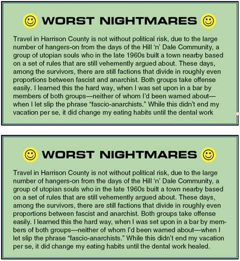
Keep in mind that in these situations the rules of good type composition trump the needs of page layout. The trick is to provoke new line endings without altering spacing so much that you create a noticeable difference in type color.
If you can’t meet your copy-fitting goals with only subtle tracking changes, something else will have to give: either the layout or the content.
Without stealing too much from the next column in this series, adjusting tracking is also the key to fixing widows and orphans, fragments of paragraphs that are too small or are badly placed in a column or on a page. As with copy-fitting, tracking adjustments alone won’t always work, but they’re a valuable tool in the struggle for good-looking pages.
This article was last modified on August 13, 2021
This article was first published on January 6, 2010
Commenting is easier and faster when you're logged in!

Recommended for you
Designing with Lead-ins
Lead-ins draw attention and add flair to text by highlighting the opening words,...

The Path to Beautiful Tables: Working With Table Rules
In this installment of our series on creating beautiful tables (see Part 1 here)...
