

 If you love type and want to know more about letterforms and the history of typefaces, this book is for you. Within the covers of Letterforms: Typeface Design from Past to Future, designer, author, and educator Timothy Samara takes readers deep into this topic, from past to present – and even their future. He expertly guides his audience through the aesthetics as well as the technical considerations of his subject.
The book begins with an overview spanning the invention of movable type to today’s digital typography, and ends with a showcase of contemporary fonts. It is organized into six thoughtful, beautifully designed and written categories:
Heritage: Introduction to the history of letterform design.
Legacies: Nomenclature and current aesthetic design conventions.
Foundations: Fundamentals of character structure and optics.
Evolution: Strategies and processes to help guide the budding type designer.
Reinvention: Envisioning structure and style in new ways for narrative and conceptual expression.
The state of the art: A showcase of contemporary directions in typeface design.

The evolution of Cuneiform writing from pictograph to abstract and logographic can be seen in this sequence of artifacts.

Shown above is the character set of the Ugaritic language, greatly simplified from its Cuneiform inspiration.

A grave marker from around 700 BCE shows an example of early Greek writing.
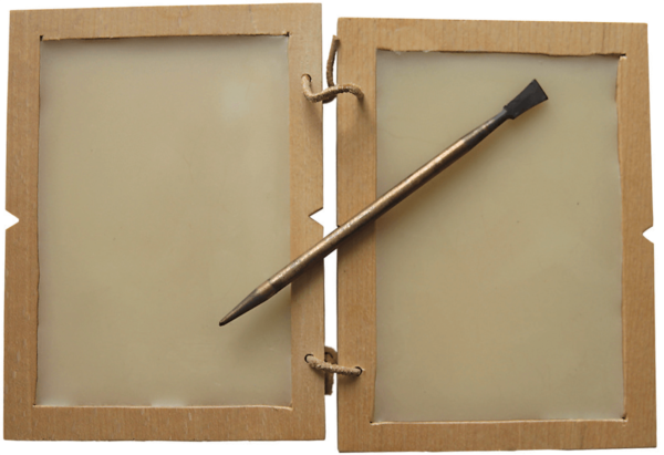
Roman generals in the field used a wood frame filled with heavy wax and an iron stylus to convey orders to their troops. When new orders were to be given out, the wax was heated and the previous order scraped away: hence, the idea of “starting with a clean slate.”
The author says, “From the time that I first showed interest in art, drawing letters was of great fascination to me.” This interest prevailed, and led him to his professional creative endeavors, eventually leading to this beautifully designed, informative volume. Samara’s true focus in the book is conveying the essentials of type design to practitioners, and thoughtfully and thoroughly explaining and illustrating the development of form and style. He walks you through letterform anatomy, stroke formation and rhythm, tool methodologies, structure and proportion, and lots more.”

A sampling of disparate script forms that proliferated across Europe after the Roman Empire fell and standardized writing was lost.

On the left is an industrial-era Victorian advertising poster. To its right is signage designed by Hector Guimard that exemplifies the organic Art Nouveau style of the 1880s.

This catalog cover for an exhibition devoted to Cubism features a custom, almost modular, geometric typeface design by the Dutch De Stijl architect and artist, Theo van Doesburg, in 1916.

This is a spread from type designer Jonathan Barnbrook’s monograph, The Barnbrook Bible, 2007.
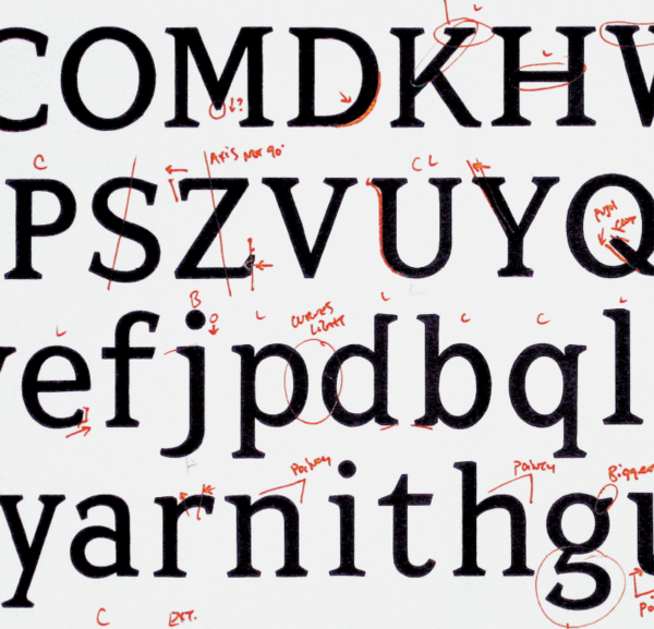
Design comments for a typeface in progress.
This well-researched volume contains hundreds of illustrations accompanied by interesting and informative explanations. It can be read cover to cover, or a section at a time. It can be enjoyed equally by professional type- and graphic designers, as well as non-professional letterform enthusiasts. This all makes for one excellent, timely reference work that designers can return to again and again in designing logos, wordmarks, signage, titling accents, and all of their graphic design work. If you want to be inspired and informed, this book is for you!
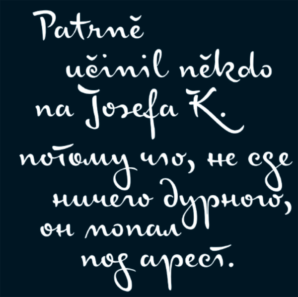
Julia Sysmäläinen, the designer of this fluid, energetic script, exploits OpenType’s capacity for extensive alternate glyphs to generate a specimen that is at once tightly refined and yet very humanly spontaneous.

The house type style of a boutique hotel, rooted in the square-shouldered industrial san serifs of the early 20th century, draws upon the mixing of multiple widths and weights. Designed by Mucca Design.

This delicate, ephemeral script by Juliasys Studio capitalizes on the intuitive algorithms of the OpenType format to create a stunningly fluid and natural hand.

Vintage blackletter types typically combine majuscules and minuscules of widely different proportion. This new one by Storm Type Foundry unifies them in a slightly condensed drawing that also features a relatively large lowercase designed for contemporary setting, and includes both solid and in line versions.
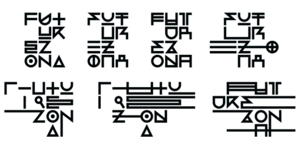
This striking, variable logotype organizes geometrically abstracted letterforms under a modular system which at times supports, and other times challenges, legibility.
This article was last modified on August 8, 2018
This article was first published on August 8, 2018
Commenting is easier and faster when you're logged in!

Recommended for you

All About Titling Fonts
When looking for just the right display typeface, have you considered a titling...

How to Create Beautiful Tables: Controlling Row and Column Spacing
In this new series of articles we’ll be looking at several key techniques for ma...
Proper Typography for Websites
In a previous post on my website, I wrote about the differences between typewrit...