

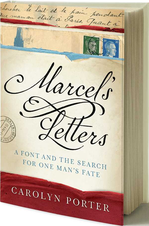
 Marcel is more than just a beautiful script typeface. It is the product of a fantastic journey undertaken by designer and typography geek Carolyn Porter to learn the fate of Marcel Heuzé, a Frenchman conscripted into labor during World War II, whose handwritten letters provided source material for the font. This international search led to Porter’s absorbing page-turner entitled Marcel’s Letters: A Font and the Search for One Man’s Fate (Skyhorse Publishers, June 2017), in which she shares the story of her search for answers.

Carolyn Porter standing next to her award-winning typeface, Marcel.
The P22 Marcel Family
It all began more than a decade ago when Carolyn Porter visited a now-closed antique store in downtown Stillwater, Minn. “I have an affection for old handwriting, and I had been keeping an eye out for old letters I could use as source material for a new font,” said Porter. “But until that day, I had not found letters that included enough raw material to work with.”
For her font, Porter needed a handwriting sample that had a complete array of both upper and lowercase letters, along with numbers. She found exactly what she had been looking for in a collection of letters written during World War II by a Frenchman named Marcel Heuzé. “I was drawn not only to Marcel’s beautiful, swashed handwriting, but to the papers the letters had been written on. The yellowed pages were covered with faded ink and stripes of blue and red had been painted in the background,” said Porter, who bought five of the twenty or so letters for sale. “They cost just over $6 apiece; $30 was all I felt comfortable spending that day.”
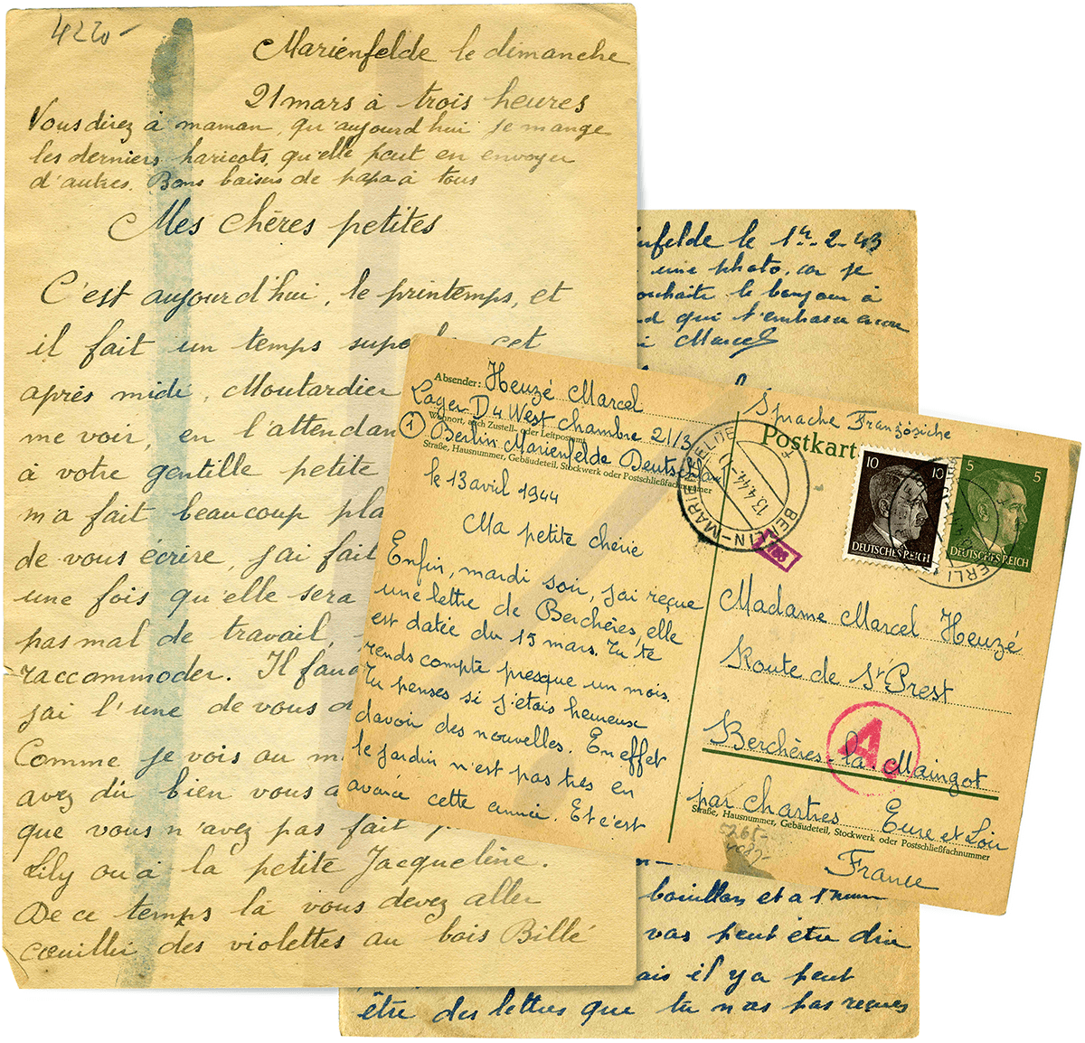
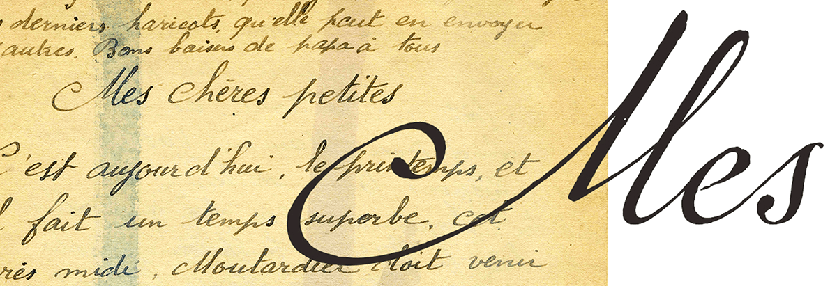
A collage of Marcel Heuzé’s original letters.
Over the next twelve years, Porter worked on the font in her spare time. She finished the font in late 2013, and was honored when P22 Type Foundry, a New York-based distributor that specializes in fonts based on art, history, and design, wanted Marcel to be part of their curated collection.
The result of years of research and design work, Marcel Script Pro features more than 1300 glyphs. The font is a highly readable running script that includes textural details that capture the look of ink on paper. Marcel Caps is a hand-lettered titling face intended as a companion to the Script. Marcel EuroPost One and Two each feature more than 200 postmarks, cancellation and censor marks, and other embellishments found on historical letters and documents.
Since its release, P22 Marcel Script has garnered five awards, including the prestigious Certificate for Typographic Excellence from the New York Type Directors Club, as well as typeface competitions by Communication Arts and Print magazines. However, the creation of the font is only part of this fascinating story.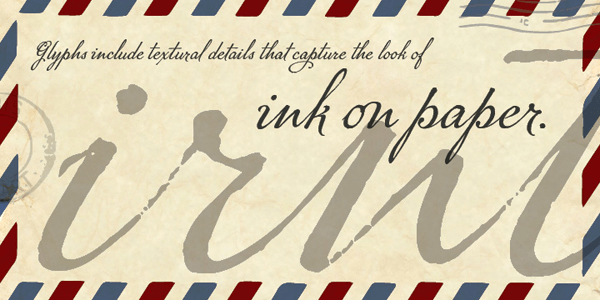
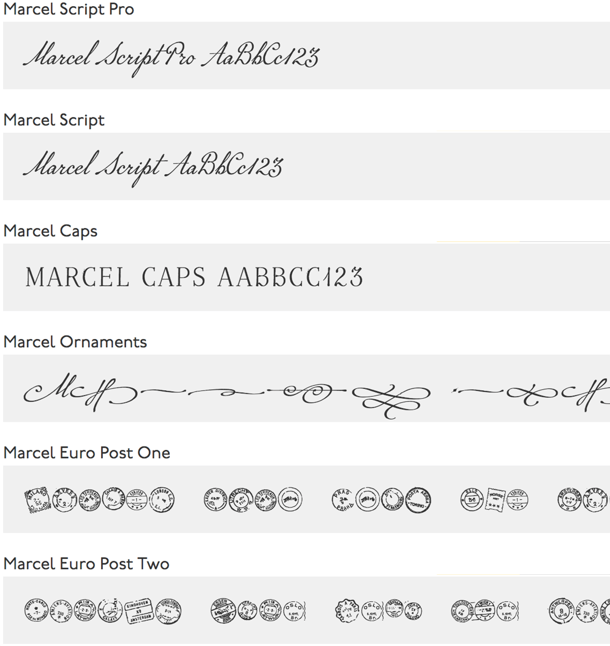
These fonts are all part of the P22 Marcel family.

A showing of some of the Marcel alternate glyphs.
Translating the Letters
A few years before the release of the font, Porter took on another project. Out of curiosity, she had one of Marcel’s letters translated. Porter, who does not speak French, was shocked to learn Marcel’s letters had been mailed from a labor camp in Berlin. “Marcel desperately missed his wife and three young daughters,” she said. She would come to learn that his wife and daughters were waging their own battle for survival in a village in the countryside southwest of Paris.
Porter says the peek into Marcel’s life that was revealed in that first translated letter left her yearning for answers. “Marcel had this incredible tenacity and hope, which was amazing considering where he was.” During the months Marcel was in Germany, he wrote letters to his beloved wife and daughters back home in rural France. The letters – stained, scarred and covered with censor marks – were the original source documents used to create this script typeface.
What began as a curiosity turned into an obsessive search for answers. “I had to know if he survived and made it home to his family,” she said. With the help of a genealogy researcher, Porter learned Marcel’s fate, which is revealed in the book. The genealogy researcher also helped Porter track down several of Marcel’s relatives in France. In the book, Porter pieces together answers from archives in Germany, France, and across the U.S., and shares the contents of these never-before-published letters.
The Design Process
Porter was kind enough to answer a few questions about this historic, authentic design:
What was the most difficult aspect of the design process?
The most difficult aspect of the process, in retrospect, was not having a clear path to completion. I think I naïvely presumed I could trace Marcel’s handwriting, vectorize the letters, and essentially be done. In particular, I didn’t understand the challenges involved in designing a connecting cursive script.
When I started on the project, I didn’t know other type designers, and I was unaware of the online resources that exist now (or, perhaps they didn’t exist back then – I don’t know). So, I pecked away at the project in the way that made sense to me, even though what I did often did not follow best practices or include the most efficient process. As I learned the software and tested the font, I would have to go back and correct technical aspects and refine aesthetics. The non-linear nature of the project could be both frustrating and discouraging; in the book I describe the process as a “merry-go-round of revisions that devoured evenings and weekends.”
The only way I was able to keep going was that I continued to believe I was close to completing the project. I was wrong about that, too, of course – in total the font took 12 years. But, if truly understood how much work was left to do, I don’t think I would have continued. When people ask, the primary skills I say a type designer needs are patience and tenacity.

The progression from original handwriting to a cleaned-up digitized glyph.
…and the most joyful aspect?
Two moments of joy come to mind:
The first was the moment of unbridled joy after I transferred glyphs from Illustrator to FontLab and could, for the first time, type an ‘a’ on my keyboard and make an ‘a’ appear on my screen. The moment was pure, child-like magic. The joy was short-lived, however because I could see flaws in stroke weights, and problems with angles and letter connections. It would take years to refine all those issues.
The second moment of joy is something that is longer lasting, so perhaps ‘joy’ isn’t even the right word. It’s a deeper kind of emotion. Marcel’s family told me that between finding his letters and designing a font based on his handwritten words of love, it was as if I had brought him back to life. I still sometimes get emotional when I think about how – what started as a silly little side project – has evolved into something bigger and more profound than a font. The project has brought joy to Marcel’s family, which in turn, has brought joy to me.

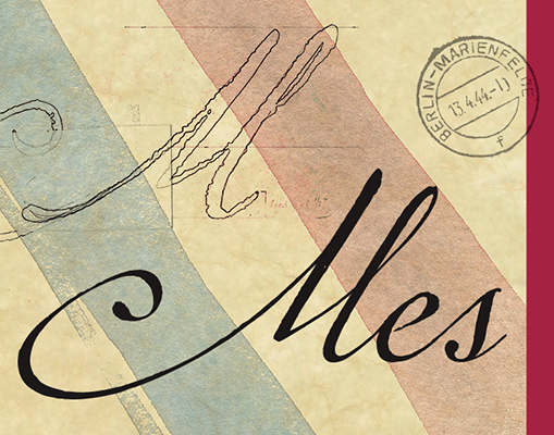
This and the images below are settings of the Marcel font.

* * * * *
The designer goes on to talk about some surprising outcomes of the book. “I have heard quite a few readers of Marcel’s Letters – those outside the world of typography as we know it – whisper admissions of being a closeted type geek. It’s as if they are delighted to learn there are other unapologetic type lovers in the world! I’ve heard other readers talk about gaining a new awareness of typography. It’s as if they are looking at the world with new glasses. One person even said, ‘I see fonts everywhere now!’”

Marcel in use.

This article was last modified on January 31, 2018
This article was first published on January 31, 2018
Commenting is easier and faster when you're logged in!

Recommended for you
The Defenders of Comic Sans
Comic Sans. Two words that can strike fear and loathing into the hearts and mind...
Set Type on a Circle, a Square, an S-Curve, Whatever
For most of the documents we create in InDesign, type marches straight across th...

The End of the Line
As job descriptions and responsibilities have been telescoped over the past coup...