
How to Be a Better Designer: Know Your Colors
To use color effectively, you have to be intentional, grasp the different color modes, and know how color is perceived by your audience.


This article appears in Issue 45 of CreativePro Magazine.
Color can whisper or shout, soothe or provoke, seduce or repel. It’s everywhere—on screens, in print, on packaging, in places and products. To use color effectively, you have to understand how it works.
Knowing your colors isn’t about memorizing the color wheel or collecting hex codes. It’s about fluency. It means a grasp of the different color modes, being aware of how color will be perceived by your audience, how it changes depending on context, and how to use it intentionally by harnessing the amazing digital tools at your fingertips.
Colors span a vast terrain—at last count there were about 16.7 million of them—so you have no shortage of material to work with.
Equal parts science and instinct, color is a lifelong study. While you’re honing your sixth sense for how to choose and combine colors, here are some essentials that designers need to know and some grounding precepts to latch onto.
Color Models
Let’s begin with color models, the differences between them, and when to use them, starting with RGB and CMYK.
RGB vs. CMYK
RGB is the color of light; CMYK (process) is the color of ink and pigment (Figure 1). Or to put it another way, RGB is additive (having higher numbers in your levels means more light); CMYK is subtractive (adding more to each ink makes your color darker by absorbing light).

As shorthand, you can think RGB = screen, CMYK = print. Admittedly, in a color-managed workflow, images remain in RGB and are converted to CMYK only in the exported PDF, but they will end up as CMYK!
Knowing this distinction gives insight into the eternal color problem: why things look different (duller) in print from how they look on screen. And once you’re aware of the problem, you can understand the need for color management as a partial solution.
Color management is the process of ensuring that colors are consistent and predictable across different devices—from camera to monitor to printer. Each device interprets and displays color differently, so color management uses standardized files of data called profiles as a Rosetta stone of sorts to translate colors accurately from one device to another.
Without color management, a vibrant blue on your screen might print as a dull purple, or a photo might look perfect on one monitor and washed out on another. Color management, which is all about achieving consistent color from screen to proof to press, is a difficult and jargon-ridden field, but as anyone who’s ever had a print job turn out unexpectedly knows, we ignore the issue at our peril.
Lab
Whether we know it or not, we all use Lab, a more abstract color mode that includes all visible colors (Figure 2). The thing is, you can’t print a Lab file, nor can you use a Lab file as an image on a website, so it’s a color mode that’s used, if at all, as a temporary state.
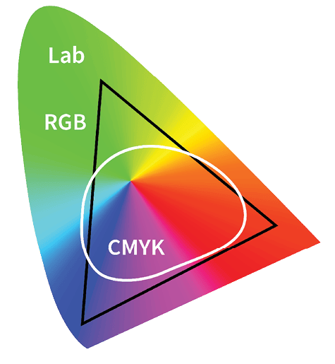
Some hardcore Photoshop users swear by it for color correction and heavy-duty image editing, but even if you don’t interact with Lab mode directly, it’s there working for you behind the scenes, translating the colors from one mode to another, when you make a conversion, most likely RGB to CMYK for print.
The color wheel and HSB
The color wheel (Figure 3) helps us understand color, particularly when you combine it with the Hue, Saturation, and Brightness color model.
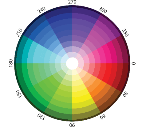
“What, another color model?” I hear you say. Yes, but HSB is intuitive and worth the effort, and it’s even supported in InDesign now.
Hues are referenced by their angle on the wheel; red is 0° (and 360°) midway along the radius of the wheel. If you move outwards from that midpoint, you add shade, ending in total black on the wheel’s outside perimeter; move in the other direction towards the center of the wheel—which is solid white—and you create a tint.
Knowing how colors are arranged around the color wheel gives you a vocabulary: complementary (opposite each other on the wheel), analogous (adjacent to each other), triadic (three colors spaced evenly). The wheel informs how to combine colors and how to perform effective color adjustments in Photoshop. Armed with two pieces of knowledge you can easily color balance your images:
- To fix a color cast of a certain color, you increase its color complement.
- Areas of neutral color will have equal R, G, and B values.
The Color Picker
Sure, you’ve used the Adobe Color Picker (Figure 4), but how well do you really know it? The tool is intuitive and provides a wealth of information.
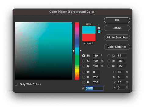
As you slide up and down the vertical bar to change the hue, watch the number of the angle change in the Hue field. Move horizontally on the color field to adjust the saturation of that hue. Move vertically to adjust its brightness.
The Color Picker also provides a numerical breakdown in five color models: RGB, CMYK, Lab, HSB, and hexadecimal. Plus, it gives you access to the color libraries of color matching systems, for a wholly different approach: spot color.
Spot color
Why, with all the methods we’ve seen here already, would we need spot color?
Unlike CMYK colors, which are created by mixing four inks during printing, spot colors are pre-mixed inks—each applied individually and specified using standard systems like Pantone, so printers and designers worldwide can match them reliably (Figure 5).
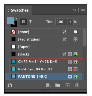
Digital swatch books from Pantone used to be included with InDesign, but since Adobe and Pantone have fallen out, access to Pantone colors and the definitions that simulate those colors on your screen comes at an additional cost. But even without this feature, you can use spot colors from other color-matching systems or create your own.
The first reason is to ensure consistent, accurate, and potentially more vibrant color in print—especially when a brand color needs to match precisely across different materials or jobs.
Another potential reason is economy: Perhaps you’re working on a job where there isn’t the budget for four-color process printing. Spot colors for a one-, two-, or three-color job will save you money.
At the other end of the budget spectrum, perhaps you want to extend the gamut, or range of colors, available in CMYK. If you want metallics, fluorescents, specialty inks, or varnishes, you need spot color.
Spot color swatches in your application are also used in printing techniques like die-cuts or foil stamping, where the color definition is used with the printer’s production process.
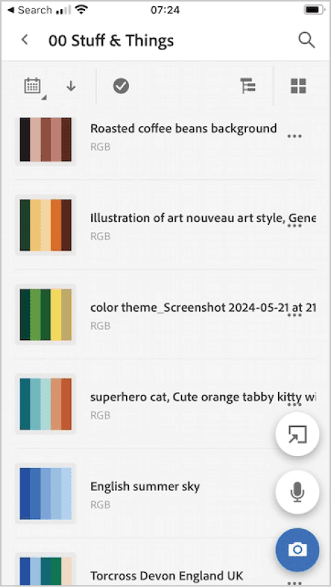
Figure 6. Adobe Capture allows you to capture color themes, store them in a library, and share them across applications.
Monochromatic drama
For every argument, there is a counter-argument, and some designers prefer to design without color. In a world that is a cacophony of color and in an advertising space of competing color, the most contrast—and arguably the most impact—can come from black and white.
Think of Apple’s early iPod silhouette ads, where bright backgrounds met bold black forms and crisp white devices, or the World Wildlife Fund’s panda logo, whose simple monochrome design is globally recognizable. In these cases, restraint creates clarity, and black and white becomes not a limitation but a powerful design choice (Figure 7).

A monochromatic approach is also useful—some might say necessary—when designing a logo, at least in the early stages. Most logos need to work in black and white as well as color. In the design phase, you want your client to focus on the shape and type rather than worrying about whether it should be this or that shade of blue. It’s only after the basic form of the logo has been agreed on that color should be introduced into the equation. To do so earlier could be a distraction.
Color is contextual
Color is famously unstable—not only do we need to factor in the difference between screen and print, but also the context of the color. For example, red on gray looks different than the same red on white. Warm colors seem to advance; cool colors recede. Yellow feels optimistic on a cereal box but garish on a legal website. Perception is slippery, and that’s the point: Color only means something because of what surrounds it (Figure 8).

Josef Albers’ exercises in his classic book Interaction of Color show how radically a single swatch can shift when its background changes. Color doesn’t exist in isolation. It’s relational.
As a designer, your job is to control that relationship—to make deliberate choices about placement, pairing, saturation, and value so that your colors work together and support your message.
Color and Culture
Color isn’t just visual—it’s cultural. Color perception is not universal—it’s deeply shaped by experience.
If you had to consider every possible association, you’d work yourself into a state of paralysis, fearful of inevitably alienating someone. Don’t sweat it too much; just be aware that your color choices send messages, intentional or otherwise.
- Red is auspicious in China, lucky in India, and aggressive in much of Western branding.
- White is the color of purity and weddings in some cultures and mourning in others.
- Purple can signal royalty or spirituality—or it can just feel dated, depending on how it’s used.
The rise of global brands means color decisions often carry international weight. But no matter the size of your audience, do your research. Better yet, test your palette across user groups. And read Nicte Cuevas’s article on color and culture in Issue 7 of this magazine.
Color and emotion
Designers often reach for color to set a mood—and for good reason. Color is emotional shorthand, but for every positive connotation there is a corresponding negative:
- Blue can be calming or corporate, depending on the tone.
- Green can be organic or sickly.
- Bright orange might say “fun,” or these days it might say “authoritarian.”
- A soft pink with a warm gray is romantic. That same pink next to black becomes punk.
Of course, this link between hue and feeling is highly subjective; the emotional weight is real, but context is everything. Value, contrast, and combination play a vital role.
Color grading
If you’re working with photography, video, or image-heavy layouts, you can control the atmosphere with color grading, or taking a photo that’s too warm and cooling it down (or vice versa) to match your layout to create visual coherence across a range images so they feel curated, rather than cobbled together.
To color grade in Photoshop, you can use adjustment layers, but I prefer to use the Camera Raw filter, which has a dedicated Color Grading tab (as does Lightroom), as well as some handy presets to use as a starting point.
Grading isn’t decoration—it’s direction (Figure 9). It tells the viewer how to feel, what to focus on, and what kind of world they’re entering.

Color and accessibility
Color should never be the sole way to communicate information. Roughly 1 in 12 men and 1 in 200 women experience some form of color blindness. Web Content Accessibility Guidelines (WCAG) aren’t just red tape; they’re real design considerations.
If your form fields, charts, or buttons rely only on color to convey meaning, they are broken for users who live with color blindness. Illustrator and Photoshop both let you simulate how your project will look to those who can’t see the full spectrum.
Smarter Color Work
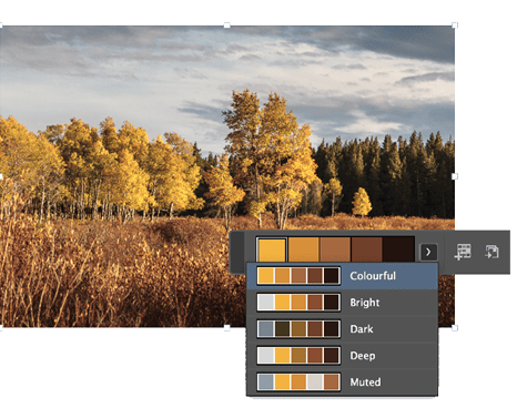
Figure 10. Using the Color Theme tool in InDesign
Build Your Eye
The best way to get better with color? Pay attention. Study book covers, menus, sports uniforms, album art—everything. Take screenshots of great interfaces. Snag color palettes from movie scenes. Ask why a certain combination works—or doesn’t. Treat color not as decoration but as information.
You don’t need to chase novelty. In fact, many of the most effective palettes are rooted in historical design, art movements, or fashion. Learn to see them, remix them, and put them to use in your own way.
You won’t become a color genius overnight, but you’ll learn to work faster, test smarter, and build a deeper vocabulary of choices.
Color is a conversation. The more you listen, the better you’ll speak.
Commenting is easier and faster when you're logged in!

Recommended for you

Q&A with Steve Laskevitch: Rocket Scientist, InDesign Guru, Pizza Snob
Q&A with Steve Laskevitch, who is presenting at The InDesign Conference 2025

Tip of the Week: Use the Story Editor When Designing With Text
This InDesign tip on using the Story Editor when designing with text was sent to...

Using RGB Images in InDesign, from Photoshop to Final PDF
A step by step guide to entering the twenty-first century by using a RGB workflo...