
Color and Culture
Go beyond a pretty palette to create authentic, inclusive designs for any audience.

This article appears in Issue 7 of CreativePro Magazine.
There’s a lot more to color than meets the eye. Sure, as designers we all use some fundamental principles of color psychology (e.g., green = nature), but there are many more meanings to explore when you start to grasp the connections those hues have to heritage and culture.
Technology has brought us all closer than ever. And with a broader awareness comes a responsibility to understand the impact our communication has in a diverse community.
Have you ever considered the cultural impact of colors used in your branding, illustrations, or photos? In certain contexts, colors make someone feel excluded, hurt, or even insulted—no matter how well intentioned your usage. In fact, you can evoke a feeling of culture shock in segments of your audience when you fail to recognize the many connections between color and culture.
Culture shock is a subject not many people discuss, but it is very real. I know this, because I experienced it firsthand when I moved to the United States to start college at the University of Houston. I learned English at a Venezuelan-American school, and I thought that would allow me to fit in easily. But speaking the right language wasn’t enough for me to feel included in the community around me. I didn’t fully understand this until years later.
At the time, I was a young, confused Latina immigrant that carried three wonderful cultures in her heart but struggled to fit in. I was born in Mexico City, raised in Venezuela, and fueled by my Colombian and Mexican blood. While I felt so blessed to be living the American dream, I missed the traditions, language, colors, and life energy that I had known before.
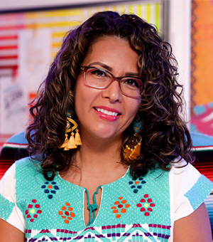
My parents encouraged me to blend in to fit in. I tried, but a massive empty void consumed my heart. I wondered why my parents were telling me that I had to be less vocal about my culture (Figure 1).
Figure 1. Image courtesy of Nicte Cuevas, Nicte Creative Design
It just didn’t feel right. Something told me I shouldn’t try to blend in. So, I looked for answers from Latino and Hispanic leaders, but I couldn’t find people that looked like me. As the search continued, I realized I was getting frustrated at the biased generalization portrayed toward Latinos and Hispanics. Advertisers, marketers, creatives, and brands continually use green, red, and white—often sprinkled with maracas and sombreros—to depict our community. This is a cultural bias that uses the colors of the Mexican flag. And while using those hues can create a sense of patriotism for some, it doesn’t reflect the rich heritage our entire Latino and Hispanic community has—not even Mexico’s! No one noted these problems back then, but in my heart, I was aching to say something.
In Venezuela, I had friends from all over the world. We shared traditions and lunches—okay, more like I begged them for their food. That rich cultural experience, where we all had a curiosity for heritage and customs, was gone when I moved here.
Once I encountered discrimination and racism, something clicked. I wanted to change that dark perception some people have towards minorities. That is when I knew that I had to celebrate and amplify cultural heritage through design. In short, I had found my calling. Nearly 20 years later, I focus on helping brands, businesses, creatives, and marketers define colors in much richer terms than CMYK, RGB, HEX, and PMS.
Hispanic and Latino: Two Terms Often Misunderstood
The terms Latino and Hispanic shouldn’t be used interchangeably. Although we often see this in the marketplace, it excludes specific communities. Latino(s) refers to North, Central, and South American and Caribbean people. This term links to our countries. On the other hand, Hispanic(s) refers to our language and those who speak Spanish. Naturally, it includes people from Spain. If you use the term Hispanic without including Latino, you exclude people from Brazil who speak Portuguese. This terminology has caused some grief for Brazilians who are part of our Latino community yet often get excluded when we use the term Hispanic only.
Cultural Color Modes
Somewhere along the way, we lost our traditional connections to color. We drifted from diverse modes of storytelling through textiles, manuscripts, and art to the one-size-fits-all approach of mass media. So today, most people can identify color’s connection to emotion in art or fashion, but not in graphic design. Consequently, many creatives forget emotion and focus instead on leveraging color harmony for pure aesthetics. Or they follow the generic “best practices” that they’ve been told will generate the most sales. But, simply making your call-to-action button green doesn’t create a relatable experience or emotion for your brand.
Perceiving color is an emotional experience
Each one of us carries a unique personal collection of color associations. Perhaps you feel nostalgic when you see the color of your first car. Or you feel energized when you see the colors of your favorite team. These associations can stir up happy memories or negative ones. But at the root of it all is emotion.
Our reaction to color connects the psychological with the physiological. These reactions relate to personal experiences, consciously or subconsciously. A client may dislike your brand colors because of traumatic experiences closely tied to specific colors. You might love the color of your first bike, or you might hate it because you fell off and broke your arm. While you can’t possibly predict an individual’s personal reaction towards colors, having a broad understanding of this concept will help you craft designs with more accurate emotional impact.
Color creates bridges to past experiences, but it also evolves into a new significance influenced by trends, movements, and global crises. Certain hues hold global symbolism connected to specific emotions. For example, many organizations use blue for their branding to instill trust, leadership, confidence, and professionalism in corporate America. Brands like McDonald’s, Whataburger, Wendy’s, and Burger King leverage red and yellow hues to trigger hunger (Figure 2).

Figure 2. Notice anything these restaurant logos have in common?
The more they drive that physiological reaction, the more sales they make. Companies that build a brand rooted in the common good can ingrain a more profound emotional value through color recognition. Susan G. Komen, charity: water, and March of Dimes all tie their brand colors to a meaning (Figure 3).


Figure 3. Susan G. Komen has strongly associated their work fighting breast cancer with the feminine color pink. Charity: water chose the bright yellow Jerry Can as a symbol of hope. March of Dimes uses purple to symbolize the color of a premature baby.
The influence of trends on color
The media, society, and trends also influence our psychological association with particular colors. One early example is blue for boys and pink for girls. It wasn’t until the early 20th century that U.S. clothing manufacturers wanted to sell more infant and kids clothing, so they started color-coding clothes. Prior to that it was common for all babies to simply wear white. Major department stores like Macy’s started color-coding pink for little girls. Eventually, the trend caught on. Later on, punk culture added an element of toughness to pink with the “pink is punk” expression (Figure 4), but not everyone embraced that. We still see pink’s impact on girls and women via the “pink tax.” Here’s some homework for you: The next time you’re out shopping, look at the price difference between pink and blue products (Figure 5).

Figure 4. Punk music aficionados can now buy the Sex Pistols album on pink vinyl.

Figure 5. For retailers, more pink means more green. Source: Twitter
Women, on average, pay 7% more for essential goods and services, and it’s not because we get some magical benefit for paying premium prices. According to the campaign Ax The Pink Tax, women spend an extra $1,351 per year because of gendered marketing.
Color trends are not always bad—they can guide us to new thoughts, movements, experiences, and even socioeconomic insights. Color psychology is starting to matter more for brands as they have seen the emotional impact on the perception of their products or services. However, as color trends evolve and shift, it’s essential to maintain an understanding of how that affects our communication as creatives. You can learn more about color trends from watching my popular LinkedIn Learning course on the subject (Figure 6).

Figure 6. Color trends are a powerful resource for your workflow for design and creativity. It’s not about a fashion statement—not all brands get to walk the catwalk to showcase their creativity. So why continue to think of color as a fashion statement and not a powerful emotional driver?
The unspoken color reaction: Culture
Today, most culture talk from brands focuses on shared company values—from beliefs and experiences to themes of identity and sense of belonging. Our cultural heritage is a far more significant value for unity. However, that is always left behind. Our shared beliefs are passed from generations, traditions, language, rituals, shared trauma, and historical struggles. Many diverse nations turn to color through art and music to tell their stories, honor heritage, and drive unity.
Naturally, our stories and connection to color vary from country to country. In Western culture, we might associate green with wealth or greed, but green is a sacred color in Islamic culture. Mourning is seen differently across the world. In China and Japan, you wear white to mourn, while the Western culture wears black. Día de Muertos (Day of the Dead) is a holiday that started in Mexico and, sadly, is often mistaken as a “Mexican Halloween.” La Catrina (an elegant skeleton lady) is the iconic image of Día de Muertos and represents how comfortable Mexicans feel with death (Figure 7).
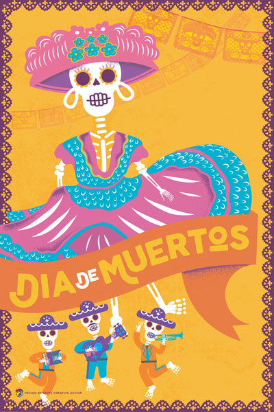
Figure 7. Día de Muertos poster courtesy of Nicte Cuevas, Nicte Creative Design
Each November 1st and 2nd, we celebrate life and honor our loved ones no longer with us through music and ofrendas (altars). We adorn these colorful altars with flowers, candles, photos, foods, and drinks that our loved ones enjoyed in their living life.
Every color on the altar for Día de Muertos has a symbolic connection (Figure 8). White connects to purity and hope, pink is for celebration, red is for blood, orange represents the sun and holy light, yellow is the color of death and the marigolds that guide the spirits to their altars, and purple represents pain, grief, and mourning. Some of these colors are perceived similarly in other cultures. For example, while Thailand doesn’t observe Día de Muertos, they also use purple to symbolize mourning. You just have to do your research to understand the meaning of specific colors in context.
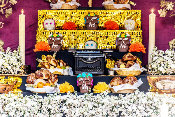
Figure 8. An ofrenda (altar); photo: Adobe Stock
Politics, history, and color
Working with color and culture on a global scale can get tricky when navigating symbolism, heritage, politics, and democracy. Within a worldwide audience, the meaning behind color can drastically shift.
When I lived in Venezuela and Hugo Chávez became president, he divided the country through drastic measures: He masked a dictatorship behind socialism and rallied all his supporters to wear red. Soon, violence broke out; a sea of red shirts and bohinas (berets) spread out in the streets of Caracas, with people chanting and screaming his name (Figure 9).

Figure 9. Hugo Chávez addresses a rally of red-clad supporters in 2012. Source: Venezuelanalysis.com
Chávez used red to fuel violence and hate but masked it by saying it represented his passion for his country. Psychologically and culturally, red became a symbol of division, violence, pain, and opposition. This hue had such a dramatic impact on my life that I refused to wear it for several years, even after moving to the United States. Just ask any Venezuelan who was lucky enough to flee and seek freedom. To this day, I still get uneasy when I see a red beret and have to remind myself I’m not at home anymore.
A more positive example of the cultural significance of colors comes from South Africa, where the Ndebele people have used colors and patterns in murals to preserve their cultural identity. The Ndebele women paint their homes with beautiful geometric designs that include sharp black lines and bold colors (Figure 10).

Figure 10. Bold and colorful designs are the hallmark of Ndebele homes in South Africa.
Historians and researchers have tried to gain a deeper understanding of what the patterns and colors mean. However, the Ndebele community does not share this knowledge as it connects to their historical struggle to resist colonialism. After losing a war with the Boers in 1833, the Ndebele community turned to symbolism for communication. The patterns painted on their homes served as a language that only the Ndebele people understood.
One Ndebele artist, Dr. Esther Mahlangu, changed the narrative and has brought awareness of their cultural traditions to the world. At the age of 10, she followed the footsteps of her mother and grandmother and learned how to paint Ndebele geometric patterns on murals using feather brushes. Dr. Mahlangu evolved her work and has painted on a variety of non-traditional surfaces, such as helmets, canvases, BMW’s signature art car (Figure 11), and even the tails of the planes for British Airways.

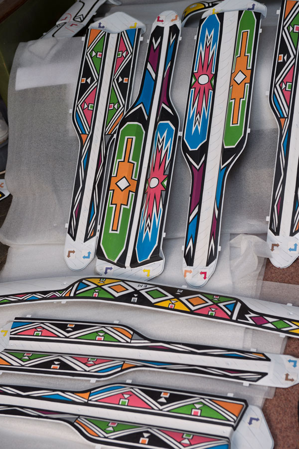
Figure 11. Dr. Esther Mahlangu and the custom interior panels she designed for the BMW 7 Series
From the hues we choose for our branding to the colors that saturate our lives in art and music, color plays an intricate role in how cultures communicate their values. We need to understand these cultural nuances to serve clients and brands better as creatives. The more you continually invest in learning how your color selections influence psychological, physiological, and cultural reactions, the more you fortify the value behind the work you do as a creative.
Avoiding Cultural Bias in the Use of Color
As you learn the workings of color and culture, remember that flag colors are not an adequate solution for cultural representation. Many countries share the same flag colors, but each country has a unique and rich heritage, traditions, and culture. The United States flag includes red, white, and blue, but so do many others, including the UK, France, Russia, Norway, Cuba, and Puerto Rico. Mexico and Italy share the same colors, but their traditions and cultural heritage are different. Used with care, however, flag colors can impart a feeling patriotism and national pride (Figure 12).
Figure 12. Artwork symbolizing the Brazilian people using their flag colors
Just attend a soccer game, and you’ll see how passionate fans can get about their country’s colors (Figure 13). It’s incredible how something as simple as a color can bring people together in a powerful way. However, uniting a country together through color at a sports match is different from when you need to tell a story about cultural heritage for a brand.

Figure 13. Soccer fans in France celebrate their team’s World Cup victory in a colorful way.
When you’re unsure how to connect colors and cultures, you have to dig deeper than the first page of Google search results. Do some reading to understand the origins and meaning of different colors in different cultures. Colors communicate various things, and what may be beautiful in one culture may be viewed as offensive in another. However convenient it may be, a quick Google search will not provide a color’s generational cultural symbolism. The internet does provide extraordinary access to information at the click of a button, but it’s crucial to get your information from the most thorough and reliable sources. Failing to have an accurate understanding of color and culture can be detrimental to your work, as you risk potentially insulting an entire community.
For example, in the 1950s, Pepsi installed light blue vending machines in Southeast Asia, and their sales plummeted because that hue symbolizes death and mourning there (Figure 14).

Figure 14. Pepsi lost significant market share as a result of using light blue vending machines in Southeast Asia. Image courtesy of Nicte Cuevas, Nicte Creative Design
Imagine how much time, money, and effort could have been saved if a designer at Pepsi had educated the marketing and advertising teams about the cultural implications of light blue. Of course, brands didn’t always consider issues of cultural heritage and inclusion back then. And while we have made more progress about this in the past few years, we still have much work to do. You can certainly see it with photography and illustrations. Try going to any stock image site (including Adobe) and search Latino or Hispanic. I guarantee you will find photography and even illustrations of women in provocative poses, people wearing mariachi hats shaking some maracas, cactus plants, and chile images to spice things up. If we continually rely on what stock image providers tell us culture is, we fuel the misrepresentation of all our diverse communities.
Cultural Impact Through Color
Color will always be a primary form of visual communication. We can recognize a stop sign because of its color and shape, no matter what language it’s written in (Figure 15). When color can wield such symbolic power across every culture, it’s imperative that we get it right in our design work.

Figure 15. You don’t have to be fluent in Spanish to know what this sign is telling you.
Don’t skip the research
Let’s talk about Bruno for a moment. When Disney was working on the movie Encanto, the creative team traveled to Colombia to immerse themselves in the culture and study it (Figure 16). The insights they gained allowed them to accurately depict Colombian traditions and heritage with our rich, colorful, and energetic way of life. If you haven’t watched it yet, I won’t spoil the movie. I will say that you see only minor references to our flag colors as a cultural experience. The film allows people around the world to experience Colombia through music, architecture, history, and family culture with colors from flora and fauna (Figure 17). It all takes us on a deep emotional journey. Imagine how different the experience would be if all they used were the yellow, blue, and red flag colors to represent the Colombian culture. I think many Colombian people would have been infuriated.

Figure 16. Colonial Architecture in Guatapé, Colombia; photo: Adobe Stock
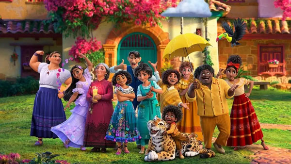
Figure 17. Encanto bursts with authentic colors of Columbian nature and culture.
Instead of leaving color selection as the last step in your brand design or creative process, consider who the audience is and their cultural heritage from the very beginning. Generalizing culture and ethnicity hurts brands and the experience you deliver as a creative. If you aren’t a part of that culture, you’ll need to start by understanding the community, language, heritage, and historical experiences.
I recommend what I call an empathy mapping methodology and dedicate a focus to the culture and heritage of your audience. This empathy mapping process allows you to put yourself in their shoes to think, see, hear, fear, and feel what they feel—not basic demographics. As a great empath, I developed an empathy mapping methodology that includes culture and communication and use it as the starting compass for brand strategy and design. You can access my workbook Define Your Ideal Client Using Empathy Mapping (Figure 18) on my website for a small fee.

Figure 18. Image of Empathy Mapping Worksheets from Nicte Creative Design
Develop partnerships for inclusion
Another great way to be sure you’re using color in ways that honor culture is to develop partnerships with experts. We’re not all blessed with the resources of Disney, so an alternative to doing months of research or traveling to immerse yourself in a culture, you could hire someone who specializes in design and inclusion. Just be sure to thoroughly screen your information sources. Don’t assume that someone is a cultural expert just because they are a part of a demographic. Instead, look for local or national partners who understand the history, traditions, influences, and color connections to a particular culture. You can start with local organizations focused on arts, folklore, and cultural history. They can point you in the right direction. Establishing an inclusion partnership helps you communicate effectively, and in turn, you honor a community and its culture.
A Powerful Palette
As creatives, we can wield incredible power. We can enhance experiences, excite senses, help drive sales, and build brand recognition. Still, I believe our most powerful capability is using color and culture to bring communities together. I hope the ideas and examples in this article help you to see colors in a new light and use them to bring authenticity and depth to your design work for any audience.
Commenting is easier and faster when you're logged in!

Recommended for you
How to Make Graphics Flow with Text in InDesign
Khara Plicanic demonstrates how to add a graphic between paragraphs so it flows...

Convert Fonts to Graphics with Font Pestle
We’ve had stories about amazing scripts that can build custom fonts from a...
Hermann Zapf Sketchbook Kickstarter Project
I’ve been known to fall down the rabbit hole of Kickstarter projects, and...