


Previously, I discussed how to assign custom designs to bar charts. Illustrator has some other chart types and you can also customize some of them using the same principles.
The other chart types that you can individually design are ones with markers: Line graphs, scatter graphs, and radar graphs. By default, their markers are ugly. Most of them are way too large and filled with an unattractive default gray color.

Line graph, radar graph, and scatter graph with their default markers
Fortunately, they can be turned off. To do that, open the Graph Options by choosing Object > Graph > Type, or from the contextual menu. Then deselect Mark Data Points.
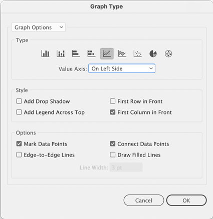
The Graph Type dialog box where you can turn off markers by deselecting Mark Data Points
Of course, there will be situations when you want markers on your graphs, and for those times you can design a custom style for them. So, let’s see how to do that starting with the simplest option where you can just draw a different shape to replace the data points. We’ll use the Radar graph as an example.
In order to better tell the lines apart, you should apply different shapes to each to replace the default gray squares. It’s as easy as drawing new shapes using Illustrator’s shape tools. Then apply different colors to them. In this first test we will deliberately disregard the size of the shapes just to see what happens.

Let’s use the orange triangle to replace the squares
To create a graph point design from a shape, select it and then choose Object > Graph > Design. This is the same dialog box you use to create the custom graph columns.
Tip: In a project where you’ve created a lot of custom graph design elements you might have a mixed list of custom column designs as well as points. So, to keep things organized use a consistent naming convention. For example, you can add a prefix to the name to mark the design as a point. This can save you time later on when you’re scrolling through all the designs you’ve created. Of course, you can also use the preview to tell what’s what.
For this first step, just create one design to test how Illustrator applies it to the marker.

Creating a new design and renaming it
When you have created the point design, the next step is to apply it to the graph. Like with columns, you first select the existing points. To do so, use the Group Selection tool and click on one of the points of a line, then click a second time to select all of the points on one data row. Then choose Object > Graph > Marker to open the dialog box. Select one of the designs you created from the list and click OK.

The design applied to the graph, and the original marker artwork for comparison
Illustrator will fit the design into the previously existing data point. This might not always be desirable, e.g. for ellipses or triangles which need to be slightly larger than squares in order to look the same size.

Different shapes need to be of different dimensions in order to look the same size.
So, to get the look we want we must make Illustrator scale the design to a specific size. For that, we can use the same trick we saw in the article on custom column designs: an invisible square. The square acts as the proportional reference for scaling the point design. And like in a custom column design, it needs to be at the bottom of the object stack.
You can just draw a square in any size. But you can also design your custom point design on top of the existing chart. Then when you’re done, select the existing square with the Direct Selection tool, copy it and paste it behind the custom design. Apply a stroke and a fill of none. Also, it’s important to carefully position it proportionally to the visible design.

After designing the custom markers, copies of the no-stroke, no-fill square have been added to each.
When you have placed the invisible square, select both the design and the square and then create the new graph design out of it.
Now that we know about the invisible square trick, we can boldly go ahead and operate freely with our designs, knowing that we can scale our makers to any size.
In our next line chart the points should be little thermometers with the numbers plotted beside them.
First build the design and then put a text object beside it using the same code as in the column chart designs: %00.
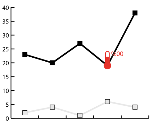
The custom design on top of the graph. Notice how the line crosses the text, potentially making it illegible.
Since it’s possible that our design (and/or the text) will be positioned on top of the graph line, we need some separating element to keep things legible. Filling all “holes” with white or stroking design and/or text on the outside works well.

Any “holes” in the design are filled with white
A stroke on the outside of a text can be set up in the Appearance panel. To do that, select the text object using the Selection tool. Then in the Appearance panel, apply a stroke to the text object. Move it into the Characters area in the panel and assign an appropriate stroke width. Although Illustrator’s chart feature dates from the Stone Age, this method still works!

A stroke added to the text object in the Appearance panel
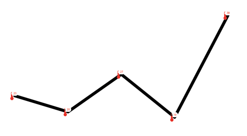
Again, you need to add a square as a reference for size and placement.

The square is the reference for scaling and positioning the design.
If the square has a fill or is not in the back of the design, the marker design will be assigned in the wrong way. So, you might get a graph that looks like this.
When there is no reference object, the design gets scaled the wrong way.
With the no-stroke, no-fill square in place, create a graph design by selecting the marker artwork and then choose Object > Graph > Design.

New design for the line graph
To assign the marker designs to the graph, use the selection method you know already: click the marker once with the Group Selection tool. Then click again to select all the squares on one line of the graph. Then choose Object > Graph > Marker and select the design.
You can then choose Object > Graph > Type to add a suffix to the value axis to include the degree character. Unfortunately, you can’t insert a narrow space in there.

Adding the degree sign after the values

The graph with assigned marker designs
And there you have it. Adding attractive (and legible) custom markers to graphs in Illustrator isn’t hard once you know how to do it. So you never have to settle for ugly graphs again.
Commenting is easier and faster when you're logged in!

Recommended for you
Working with Illustrator’s Color Libraries
Illustrator has more options for adding colors to a document than just mixing co...

CreativePro Magazine Issue 10 Now Available
New articles on advanced photo techniques, Lightroom and Photoshop on the iPad,...

Adobe MAX 2021: Larger Forces at Work
A look at everything new in Creative Cloud apps and services, and the strategy d...