is now part of CreativePro.com!

How to Add Swatches with the Free Version of Pantone Connect

11

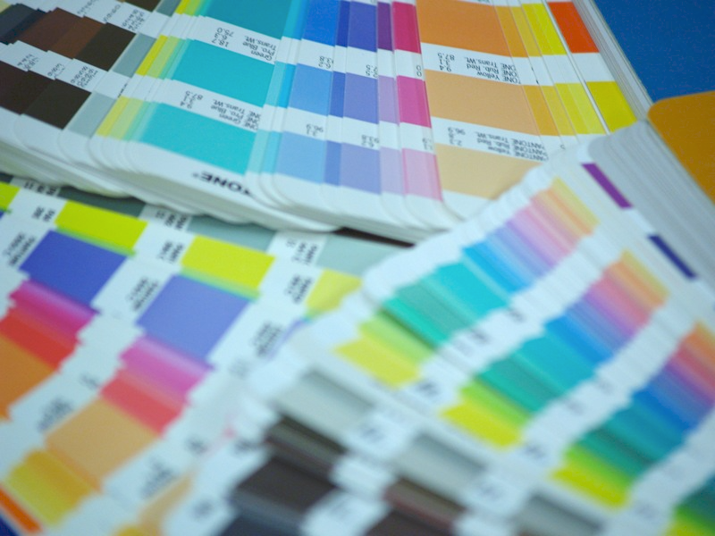
Recently, the news of a plan to remove Pantone color libraries from Adobe apps in March 2022 has caused quite a stir. For folks who will need to work with these swatches going forward, Pantone is offering their Connect plug-in. You can install it for free, but if you want to be able to search for and add specific Pantone colors to your Swatches panel, you need to subscribe to the paid version (currently $8/month or $36 for the first year, and $60/year thereafter). Or do you?

At a recent Twin Cities InDesign User Group, Paul Nylander showed a nifty trick for getting Pantone colors into your Swatches panel as Lab colors, which you can then convert to spot colors.

Here’s how:

Install the Pantone Connect plug-in.

Pantone Connect panel in InDesign

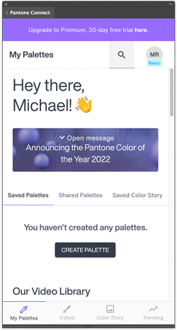
Make sure you have nothing selected in your layout.

Search for the color you want to add to your swatches.

Pantone Connect panel in InDesign

In the Pantone Connect panel, click the name of the color, not the color square.

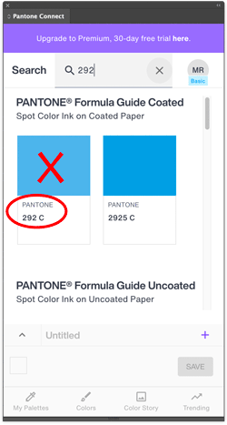
This makes it appear as the current fill or stroke color in your document. (If you had nothing selected.)

Right-click the color on the toolbar or Control panel and choose Add to Swatches. You can also just click the New Swatch button on the Swatches panel. You’ll get a new Lab color swatch.

At this point, you can edit the new swatch to change the Color Type to Spot, and give it the correct name.

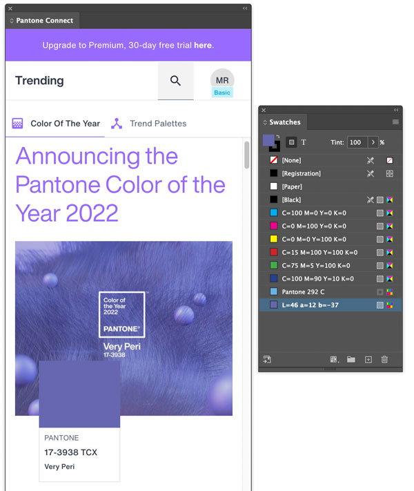
This trick also works for spot colors that don’t exist in the outdated Pantone libraries currently installed with InDesign, like the 2022 Color of the Year, 17-3938 TCX Very Peri.

Pantone Connect Very Peri 2022 Color of the Year

You might be wondering how accurate those Lab values are. In my tests, they were very close to what you’d get from the built-in swatch libraries. Not dead-on, but certainly in the ballpark, section, and row.

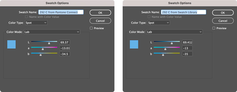
And since your print service provider is the one responsible for using the correct spot ink, you really just need to worry about telling them which ink to use and getting the spot color swatch applied in all the right places. The color you see in InDesign is just a decent approximation.

Whether this trick will be disabled in some future version of the Pantone Connect plug-in is anyone’s guess. But for now, it gives you a simple workaround for adding any Pantone color to your Swatches panel in InDesign without coughing up the dough for more subscription software.

Thank you, Paul!

Editor in Chief of CreativePro. Instructor at LinkedIn Learning with courses on InDesign, Illustrator, Photoshop, GIMP, Inkscape, and Affinity Publisher. Co-author of The Photoshop Visual Quickstart Guide with Nigel French.
  • Paul Nylander says:

    You’re welcome, Mike!

    I suspect the difference between the L*a*b values from Pantone Connect and the old built-in Pantone libraries have to do with with fact that the Adobe libraries haven’t been updated in years.

    Not that it really matters that much, since they are just RGB equivalents for on-screen approximations, anyhow.

    • Dov Isaacs says:

      It certainly DOES really matter that much whether the L*A*B* values are correct!

      Why? It is absolutely NOT just a matter of “on-screen approximations.” The L*A*B* values are also used for the “alternate color space” when printing to a hard copy device, especially digital printers, for which the particular spot color is not available or is possibly approximated via CMYK process colors plus perhaps gamut-expanding additional colorants (such as with Hexachrome CMYKOG).

      Part of the “issues” with Pantone has been that Pantone has been making changes to color definitions over the years. Those definitions must be constant. If one has existing content using a particular color definition and then updates that content by placing content using a color with the same name but with a different definition, there is a major problem. Which definition prevails for rendering? How do you alert designers and production personnel about the differences? Do you offer a choice? This gets quite messy! It simply is not a matter of Adobe or any other publishing software developer providing new, incompatible color swatch definitions even if Pantone thinks that the newer values are better.

      Unfortunately, this problem has been building up over the last decade or more. The recent changes in Pantone’s business models simply aggravates an existing problem.

      • Mike Rankin says:

        No need to shout, Dov. Monitors use RGB, so yes, what we see in InDesign is always at best “a decent approximation” of LAB colors, regardless of how the swatches were created. The difference in LAB values in the two methods is very small. ≤.5% per channel. I suspect anyone whose work demands that kind of precision in digital print won’t blink at ponying up the $60/year for Pantone Connect when the libraries disappear in March. And as I wrote, it doesn’t matter one bit if your intent is to use the swatches to produce real spot color separations. The fact that the trick works at all is probably just a bug that Pantone will fix at some point, so in the long run it’s all moot.

        The real story here is people once again having to find workarounds to cope when software companies charge them more money each year while offering less in return. It’s a phenomenon InDesign users are well acquainted with. The outdated, soon-to-vanish color libraries are just one tiny example.

  • Bill Bowman says:

    This is just another disappointing cash grab. The number of subscriptions that I have to pay out and manage is simply exhausting…it’s death by a thousand cuts! I have become a lot more particular about my subscriptions over the last couple of years.

  • VICTOR CIMPERMAN says:

    The link to the plugin is not working. When I go to the link the web page keeps flashing off and on.

  • John Mindiola says:

    Hello, Mike. Thank you for putting this together. I just tried it today (April 13th) and unfortunately it didn’t work. The plugin asked me to upgrade. Bummer. So, the workaround I’ve been using is…
    1. Search/browse for color.
    2. Hover over a color and click the little three dots to open a fly-out menu.
    3. Select Add to Palette.
    4. Name and save the palette.
    5. Click My Palettes at the bottom of the plugin.
    6. Find your palette and click Download as Image (down-facing arrow below the palette’s name).
    7. Scroll down and select the last option because it includes RGB and HEX equivalents.
    8. Create new swatches in InDesign, Illustrator, or Photoshop based on those values. It’s an approximation, as you mentioned, but it’s better than nothing.
    9. You can make the new swatches spot colors, if necessary.

  • JeleS says:

    This workaround doesn’t appear to work anymore (Apr 2023). I’m signed in to my free Pantone Connect account. I search on the color I need, and click on the color name (with nothing selected in my document). It no longer loads the color into the current document, and instead loads the Pantone Connect subscription page. :(

  • cellolott says:

    HiThere, I’ve tried Jason Hoppe’s method (Ai2022-save .ase-import in Ai2023) and it works. Let me know ;)
    https://youtu.be/zkZof002At8
    HaveAniceDay

    • Mike Rankin says:

      Yes! Jason’s method is a good one. You can also copy the ACB files from the 2022 versions of Adobe apps and install them in 2023 (and presumably, beyond) to keep access to the Pantone libraries.

  • >
    Notice: We use cookies on our websites to give you a great online experience. If you keep browsing, we'll assume you're ok with this. For more information, see our privacy policy. By closing this banner, you agree to the use of cookies.I AGREENo